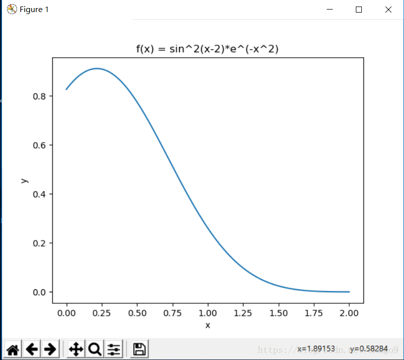
Exercise 11.1: Plotting a function
Plot the function
f(x) = sin^2(x-2)e^-x2
over the interval [0; 2]. Add proper axis labels, a title, etc.
代码展示:
import matplotlib.pyplot as plt
import numpy as np
import math

a = np.linspace(0,2,256,endpoint=True)
S=(np.sin(a-2))*(np.sin(a-2))*np.power(math.e, -a*a)

plt.plot(a,S)
plt.title('f(x) = sin^2(x-2)*e^(-x^2)')
plt.ylabel('y')
plt.xlabel('x')
plt.show()
结果:
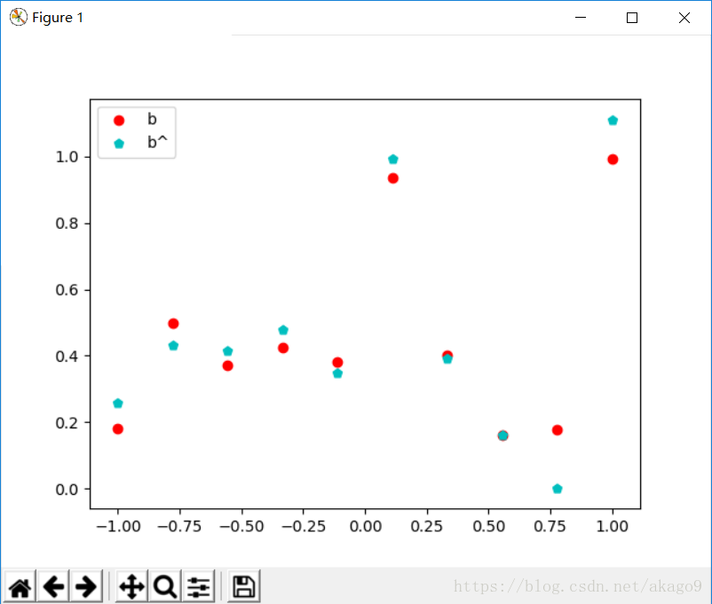
Exercise 11.2: Data
  Create a data matrix X with 20 observations of 10 variables. Generate a
vector b with parameters Then generate the response vector y = Xb+z where z
is a vector with standard normally distributed variables. Now (by only using
y and X), nd an estimator for b, by solving ^b = arg min bkXbyk2 Plot
the true parameters b and estimated parameters ^b. See Figure 1 for an
example plot.
代码展示:
import numpy as np
import matplotlib.pyplot as plt
from scipy import linalg
X=np.random.randint(1,10,size=(20,10))
z = np.random.normal(0,1,size=(20,1))
b = np.random.rand(10,1)

y = np.dot(X,b) + z
x = np.linspace(-1,1,10)

bf = np.array(linalg.lstsq(X, y)[0])
plt.scatter(x,b,c='r',marker='o',label='b')
plt.scatter(x,bf,c='c',marker='p', label='b^')
plt.legend()
plt.show()
结果:
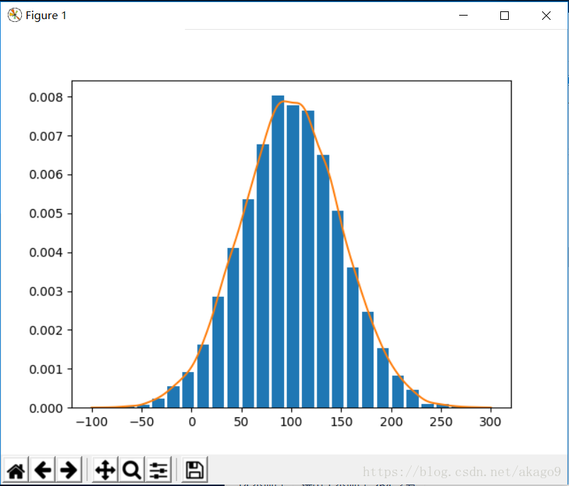
Exercise 11.3: Histogram and density estimation
  Generate a vector z of 10000 observations from your favorite exotic
distribution. Then make a plot that shows a histogram of z (with 25 bins),
along with an estimate for the density, using a Gaussian kernel density
estimator (see scipy.stats). See Figure 2 for an example plot.
代码展示:
import numpy as np
import matplotlib.pyplot as plt
from scipy import stats
z = np.random.normal(100, 50, 10000)
kernel = stats.gaussian_kde(z)
ind = np.linspace(-100,300,1000)

plt.hist(z, 25,rwidth=0.8,density=True)
plt.plot(ind, kernel.evaluate(ind), label='kde')
plt.show()
结果: