
import 'package:flutter/material.dart';
class buttonDemo extends StatelessWidget {
@override
Widget build(BuildContext context) {
return Scaffold(
appBar: AppBar(
title: Text('title'),
actions: <Widget>[
IconButton(
icon: Icon(Icons.add),
onPressed: () {},
)
],
),
body: Column(
mainAxisAlignment: MainAxisAlignment.center,
children: <Widget>[
Row(
mainAxisAlignment: MainAxisAlignment.center,
children: <Widget>[
RaisedButton(
child: Text('普通按钮'),
onPressed: () {
print('普通按钮');
},
),
SizedBox(width: 5),
RaisedButton(
child: Text('颜色按钮'),
color: Colors.cyan,
textColor: Colors.white,
onPressed: () {
print('颜色按钮');
},
),
SizedBox(width: 5),
RaisedButton(
child: Text('阴影按钮'),
color: Colors.cyan,
textColor: Colors.white,
elevation: 10,
onPressed: () {
print('阴影按钮');
},
),
],
),
SizedBox(
height: 10,
),
Row(
mainAxisAlignment: MainAxisAlignment.center,
children: <Widget>[
Container(
width: 100,
height: 50,
child: RaisedButton(
color: Colors.cyan,
textColor: Colors.white,
child: Text('按钮宽高'),
onPressed: () {
print('按钮宽高');
},
),
),
SizedBox(width: 10),
RaisedButton.icon(
onPressed: () {
print('图标按钮');
},
icon: Icon(Icons.search),
label: Text('图标按钮'),
textColor: Colors.white,
)
],
),
SizedBox(height: 10),
Row(
mainAxisAlignment: MainAxisAlignment.center,
children: <Widget>[
Expanded(
child: Container(
margin: EdgeInsets.all(10),
height: 40,
child: RaisedButton(
color: Colors.cyan,
textColor: Colors.white,
splashColor: Colors.red,
child: Text('全屏按钮'),
onPressed: () {
print('全屏按钮');
},
),
))
],
),
SizedBox(height: 10),
Row(
mainAxisAlignment: MainAxisAlignment.center,
children: <Widget>[
RaisedButton(
child: Text('圆角按钮'),
color: Colors.cyan,
textColor: Colors.white,
splashColor: Colors.red,
shape: RoundedRectangleBorder(
borderRadius: BorderRadius.circular(10)
),
onPressed: () {
print('圆角按钮');
},
),
Container(
height: 100,
child: RaisedButton(
child: Text('圆形按钮'),
color: Colors.cyan,
splashColor: Colors.red,
textColor: Colors.white,
shape: CircleBorder(
side: BorderSide(color: Colors.red
)),
onPressed: () {
print('圆形按钮');
},
),
),
SizedBox(width: 5),
FlatButton(
child: Text('扁平按钮'),
textColor: Colors.white,
color: Colors.cyan,
onPressed: () {
print('扁平按钮');
},
),
SizedBox(width: 5),
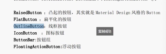
OutlineButton(
child: Text('线框按钮'),
textColor: Colors.red,
color: Colors.amber,
onPressed: () {
print('线框按钮');
},
)
],
),
Row(
mainAxisAlignment: MainAxisAlignment.center,
children: <Widget>[
ButtonBar(
children: <Widget>[
RaisedButton(
child: Text('普通按钮'),
onPressed: () {
print('普通按钮');
},
),
RaisedButton(
child: Text('普通按钮'),
onPressed: () {
print('普通按钮');
},
),
MyButton('自定义按钮',color: Colors.cyan,width: 120,height:40,pressed: (){
print('自定义按钮');
},)
],
)
]),
],
),
);
}
}
class MyButton extends StatelessWidget {
final double width;
final double height;
final pressed;
final text;
final color;
const MyButton(this.text,{Key key, this.width=40.0,this.height=30.0,this.pressed=null,this.color=Colors.red}) : super(key: key);
@override
Widget build(BuildContext context) {
return Container(
height: this.height,
width: this.width,
child: RaisedButton(
color: this.color,
child: Text(this.text),
onPressed: pressed,
),
);
}
}