前言
今天接着上一篇来写关于自定义View方面的东西,我是近期在学习整理这方面的知识点,所以把相关的笔记都放到这个Android自定义View的专栏里了,方便自己下次忘记的时候能回来翻翻,今天的内容是关于Paint画笔方面的一个应用,做一个Demo——仿QQ运动步数进度效果。
一、案例效果分析
首先上一张效果图,大家一起来看一下:

通过上面的这张图,我们来分析一下,该如何去实现这个效果呢?我们采用从整体到局部的思路来分析哈:
整个效果分为四个部分,那么我们就要分四步去绘制它:
- ①、固定不变的大圆弧(color、border width)
- ②、动态变化的小圆弧(color、border width)
- ③、靠上方的提示文字
- ④、中间的步数文字(color、textSize)
二、分步骤绘制
首先重写onDraw()方法,我们需要在这个方法中进行绘制:
2.1、自定义属性
在上面我们已经分析过了实现思路,那么现在我们就来根据这个思路一步一步的去完成这个效果的实战开发。OK,上一篇我们已经介绍了自定义View的套路步骤,现在依然是按照这个步骤来,先来第一步,自定义属性配置,在res/values下新建attrs.xml文件,在里面定义需要的相关属性:
    <!--仿QQ运动步数效果-->
    <declare-styleable name="QQStepView">
        <attr name="outerColor" format="color" /> <!--外圆弧颜色-->
        <attr name="innerColor" format="color" /> <!--内圆弧颜色-->
        <attr name="stepBorderWidth" format="dimension" /> <!--圆弧宽度-->
        <attr name="stepTextSize" format="dimension" /> <!--步数文字大小-->
        <attr name="stepTipSize" format="dimension" /> <!--提示文字大小-->
        <attr name="stepTextColor" format="color" /> <!--文字颜色-->
    </declare-styleable>
做完这一步之后,别管三七二十一的先在自定义的QQStepView的构造方法中把自定义属性获取了:
    private int mOurterColor = Color.RED; //默认值
    private int mInnerColor = Color.BLUE;
    private int mBorderWidth = 20;
    private int mStepTextSize = 20;
    private int mStepTipSize = 32;
    private int mStepTextColor = Color.RED;

    public QQStepView(Context context) {
        this(context, null);
    }

    public QQStepView(Context context, @Nullable AttributeSet attrs) {
        this(context, attrs, 0);
    }

    public QQStepView(Context context, @Nullable AttributeSet attrs, int defStyleAttr) {
        super(context, attrs, defStyleAttr);
        //获取自定义属性
        TypedArray array = context.obtainStyledAttributes(attrs, R.styleable.QQStepView);
        //两个参数:第一个属性:attrs中定义的属性,格式R.styleable.name_attribute,第二个参数:默认值
        //比如:<declare-styleable name="QQStepView"> <attr name="outerColor" format="color" /> </declare-styleable>
        //那么这里的name则为QQStepView,attribute则为outerColor
        mOurterColor = array.getColor(R.styleable.QQStepView_outerColor, mOurterColor);
        mInnerColor = array.getColor(R.styleable.QQStepView_innerColor, mInnerColor);
        mBorderWidth = array.getDimensionPixelSize(R.styleable.QQStepView_stepBorderWidth, mBorderWidth);
        mStepTextSize = array.getDimensionPixelSize(R.styleable.QQStepView_stepTextSize, TransferUtil.sp2px(mStepTextSize));
        mStepTipSize = array.getDimensionPixelSize(R.styleable.QQStepView_stepTipSize, TransferUtil.sp2px(mStepTipSize));
        mStepTextColor = array.getColor(R.styleable.QQStepView_stepTextColor, mStepTextColor);
        array.recycle();
    }
2.2、在布局中引用
首先我们在页面顶部标签中先定义命名空间:
<layout xmlns:android="http://schemas.android.com/apk/res/android"
    xmlns:app="http://schemas.android.com/apk/res-auto">
然后在布局中通过 全类名 引用我们的自定义控件,通过命名空间app引用自定义属性:
<com.jarchie.customview.view.QQStepView
    android:id="@+id/mStepView"
    android:layout_width="wrap_content"
    android:layout_height="wrap_content"
    android:layout_marginLeft="20dp"
    android:layout_marginRight="20dp"
    app:innerColor="@color/innerColor"
    app:outerColor="@color/colorPrimary"
    app:stepBorderWidth="15dp"
    app:stepTextColor="@color/colorPrimary"
    app:stepTextSize="34sp"
    app:stepTipSize="40sp" />
2.3、初始化画笔
在文章的一开始我们分析了这个完整的效果需要分成四块去绘制,所以这里定义四个画笔,每个画笔去绘制它自己那部分,职责分工先确定了,初始化的工作我们也是放在了构造方法中去完成:
//分别定义四个画笔:外圆画笔、内圆画笔、提示文字画笔、步数文字画笔
private Paint mOurterPaint, mInnerPaint, mTextPaint,mStepPaint;

//在构造方法中初始化定义的画笔,这里省略了构造方法,直接贴上初始化部分的代码
        //设置外圆画笔
        mOurterPaint = new Paint();
        mOurterPaint.setAntiAlias(true); //设置抗锯齿
        mOurterPaint.setStrokeWidth(mBorderWidth);
        mOurterPaint.setColor(mOurterColor);
        mOurterPaint.setStrokeCap(Paint.Cap.ROUND); //设置下方为圆弧形
        mOurterPaint.setStyle(Paint.Style.STROKE); //画笔空心
        //设置内圆画笔
        mInnerPaint = new Paint();
        mInnerPaint.setAntiAlias(true);
        mInnerPaint.setStrokeWidth(mBorderWidth);
        mInnerPaint.setColor(mInnerColor);
        mInnerPaint.setStrokeCap(Paint.Cap.ROUND); //设置下方为圆弧形
        mInnerPaint.setStyle(Paint.Style.STROKE); //画笔空心
        //设置提示文字画笔
        mTextPaint = new Paint();
        mTextPaint.setAntiAlias(true);
        mTextPaint.setColor(mStepTextColor);
        mTextPaint.setTextSize(mStepTipSize);
        //设置步数画笔
        mStepPaint = new Paint();
        mStepPaint.setAntiAlias(true);
        mStepPaint.setColor(mStepTextColor);
        mStepPaint.setTextSize(mStepTextSize);
2.4、测量宽高
初始化的工作完成之后,接下来需要做的就是测量了,因为在绘制之前我们肯定是需要先测量大小,确定大小之后画笔才能知道该去画多大的啊。这里为了好看,我们给它确定大小的时候确定它为正方形,我们在使用自定义控件的时候给的大小可能是wrap_content,也可能是某个具体的值,并且宽高的值也可能是不一样的,所以这里我们规定宽高值都取宽和高中值较小的:
    @Override
    protected void onMeasure(int widthMeasureSpec, int heightMeasureSpec) {
        super.onMeasure(widthMeasureSpec, heightMeasureSpec);
        //调用者在布局文件中可能是wrap_content,可能是宽度高度不一致
        //获取模式 AT_MOST 40dp
        //宽度高度不一致取最小值,确保是个正方形
        int width = MeasureSpec.getSize(widthMeasureSpec);
        int height = MeasureSpec.getSize(heightMeasureSpec);
        setMeasuredDimension(width > height ? height : width, width > height ? height : width);
    }
2.5、分步骤绘制
首先绘制外面的大圆弧:
关于绘制相关api详见:https://blog.csdn.net/JArchie520/article/details/78199580
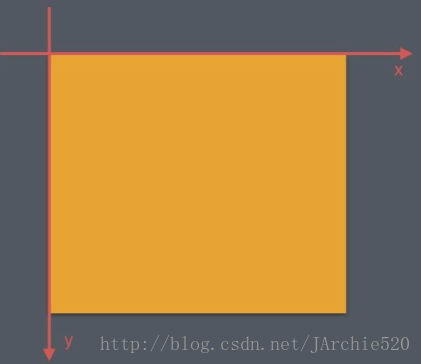
首先来看上面这张图,这里的坐标系和我们平时在数学中学的两维坐标系不同,android中每个View自己有一个坐标系,原点是View左上角的那个点,水平方向为X轴,向右为正向左为负,竖直方向为Y轴,向下为正向上为负,然后我们使用
drawArc(float left, float top, float right, float bottom, float startAngle, float sweepAngle, boolean useCenter, Paint paint)方法来绘制弧形或扇形,通过查看源码我们可以发现,它底层是通过一个椭圆来描述弧形的,其中参数left、top、right、bottom是所在的椭圆的边界坐标,startAngle是弧形的起始角度,X轴的正向为0度的位置,顺时针为正逆时针为负,sweepAngle是弧形范围角度,useCenter表示是否连接到圆心,为true表示连接,就是扇形,为false表示不连接,就是弧形。所以我们通过RectF来确定圆弧的外轮廓的位置,然后调用api绘制,这里起始角度为135°,扫过的角度为270°:
@SuppressLint("DrawAllocation")
RectF rectF = new RectF(mBorderWidth / 2, mBorderWidth / 2, getWidth() - mBorderWidth / 2, getHeight() - mBorderWidth / 2);
canvas.drawArc(rectF, 135, 270, false, mOurterPaint);
然后绘制内圆弧:
由效果图可以看出,内圆弧扫过的角度是由当前步数跟最大步数之间通过折算得到的一个比例值,所以我们先定义最大步数和当前步数两个变量值:
private int mStepMax; //总步数
private int mCurrentStep; //当前步数接着根据百分比乘以总的度数270°就得到了当前步数扫过的角度:
//画内圆弧:不能写死,是根据步数计算出来的百分比
if (mStepMax == 0) return;
float sweepAngle = (float) mCurrentStep / mStepMax;
canvas.drawArc(rectF, 135, sweepAngle * 270, false, mInnerPaint);
然后绘制提示文字:
关于文本绘制及基线计算详见:https://blog.csdn.net/JArchie520/article/details/105610884
这里的文本就是固定的“今日步数”,我们这里取整个View的1/3位置显示这几个文字,直接调用drawText()绘制:
        //画文字
        String tipText = "今日步数";
        @SuppressLint("DrawAllocation")
        Rect tipBounds = new Rect();
        mTextPaint.getTextBounds(tipText, 0, tipText.length(), tipBounds);
        int start = getWidth() / 2 - tipBounds.width() / 2;
        //基线 baseLine
        Paint.FontMetricsInt metricsInt = mTextPaint.getFontMetricsInt();
        int dyH = (metricsInt.bottom - metricsInt.top) / 3 - metricsInt.bottom;
        int baseline = getHeight() / 3 + dyH;
        canvas.drawText(tipText, start, baseline, mTextPaint);
然后绘制步数:
因为也是文本的绘制,和上方的提示文字的绘制方法是一样的,这里我们选择整个View的1/2位置绘制:
        //画步数
        String stepText = String.valueOf(mCurrentStep);
        @SuppressLint("DrawAllocation")
        Rect textBounds = new Rect();
        mStepPaint.getTextBounds(stepText, 0, stepText.length(), textBounds);
        int dx = getWidth() / 2 - textBounds.width() / 2;
        //基线 baseLine
        Paint.FontMetricsInt fontMetricsInt = mStepPaint.getFontMetricsInt();
        int dy = (fontMetricsInt.bottom - fontMetricsInt.top) / 2 - fontMetricsInt.bottom;
        int baseLine = getHeight() / 2 + dy;
canvas.drawText(stepText, dx, baseLine, mStepPaint);到这里我们的绘制整个View的操作基本上就完成了,剩下的工作就是调用这个View显示了,在调用之前我们还需要做一步操作,我们需要设置最大步数和当前步数的值,大家考虑一下在哪里设置呢?有的人可能会直接写在了自定义View中,但是这样有个缺点,这样写就限制死了,如果有多个地方调用,并且显示的步数值都不一样,那么就要每次都改动这个View,导致程序的可扩展性很低,所以我们定义两个方法,将设置值的操作抛出去,哪里调用哪里设置,由于设置当前步数时它是一个不断变化的过程,所以我们在方法内部还调用了invalidate()方法,不断刷新绘制:
    //设置步数最大值
    public synchronized void setStepMax(int stepMax) {
        this.mStepMax = stepMax;
    }

    //设置当前步数
    public synchronized void setCurrentStep(int currentStep) {
        this.mCurrentStep = currentStep;
        //不断绘制,不断调用onDraw
        invalidate();
    }
三、调用显示
咱们新建了一个页面,在这里做调用操作,首先设置最大步数我这里设置了18000,接着使用属性动画,因为页面中大家也看到了是一个动画效果,通过属性动画将内圆弧和文字做成一个不断变化的效果,这里还给属性动画设置了插值器,这个插值器的效果是变化的过程是先快后慢的一个效果,调用的部分就是这么简单:
/**
 * 作者:created by Jarchie
 * 时间:2020/4/22 17:02:49
 * 邮箱:[email protected]
 * 说明:QQ运动步数进度效果
 */
public class QQStepActivity extends AppCompatActivity {

    @Override
    protected void onCreate(@Nullable Bundle savedInstanceState) {
        super.onCreate(savedInstanceState);
        final ActivityQqstepLayoutBinding binding = DataBindingUtil.setContentView(this, R.layout.activity_qqstep_layout);
        CommonFinishViewModel viewModel = new CommonFinishViewModel(this);
        binding.setViewModel(viewModel);
        //属性动画 后面会说
        binding.mStepView.setStepMax(18000);
        ValueAnimator valueAnimator = ObjectAnimator.ofFloat(0, 7890);
        valueAnimator.setDuration(1200);
        //设置插值器,先快后慢
        valueAnimator.setInterpolator(new DecelerateInterpolator());
        valueAnimator.addUpdateListener(new ValueAnimator.AnimatorUpdateListener() {
            @Override
            public void onAnimationUpdate(ValueAnimator animation) {
                float currentStep = (float) animation.getAnimatedValue();
                binding.mStepView.setCurrentStep((int) currentStep);
            }
        });
        valueAnimator.start();
    }
}
到这里就写完了,以上就是整个仿QQ运动步数进度效果的实现过程,代码相对来说并不复杂,因为我这是一个自定义View的系列案例,所以代码也放在了Github上方便查看!