之前已经用了python来画 matplotlib 的默认风格图形,现在还是用之前的表格来画Seaborn. 还是老规矩,直接上代码
import pandas as pd
import matplotlib.pyplot as plt
import seaborn as sns
sns.set()   #overrides the style and the graphics of all matplotlib graphs

Data = pd.read_csv('1.01. Simple linear regression.csv')

y = Data['GPA']
x1 = Data['SAT']

plt.scatter(x1,y)
yhat = 0.0017*x1 + 0.275
fig = plt.plot(x1, yhat, lw=4, c='orange', label='regression line')
plt.xlabel('SAT')
plt.ylabel('GPA')
plt.show()
下面是图形显示结果:
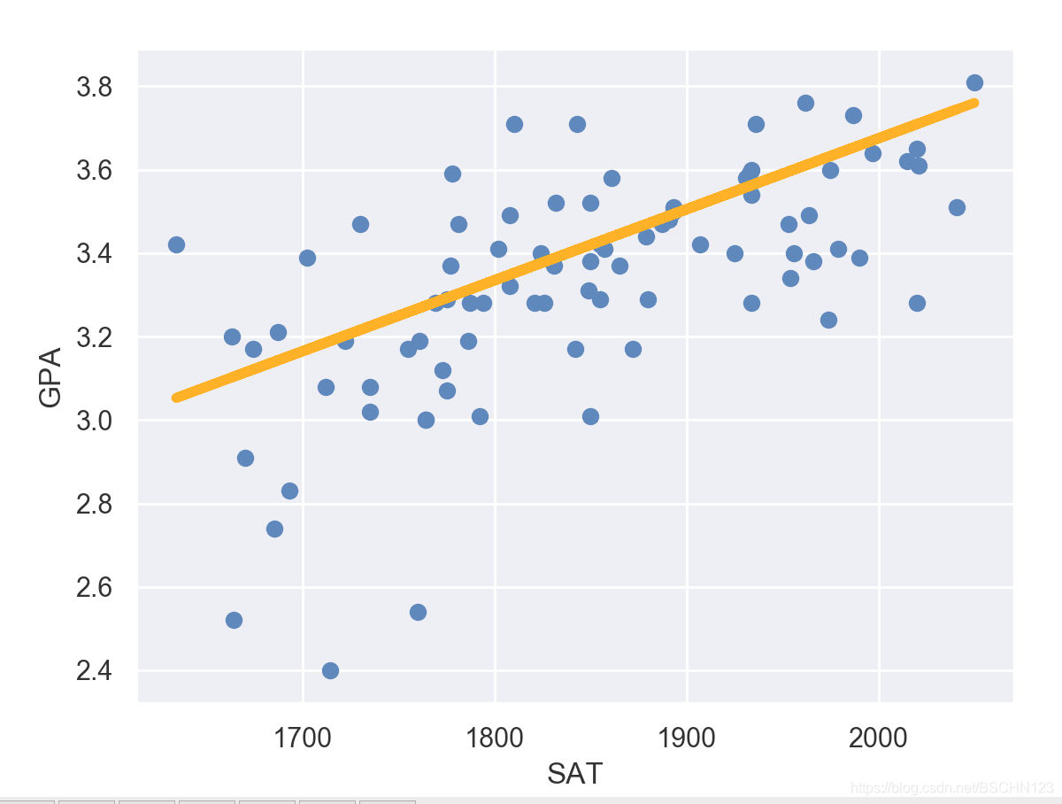
看到有什么不同之处了嘛?图形中出现了小方格,这样有助于看图。
如果有哪里写的不对,请指出来哦!