1、标准流(普通流/文档流)
标准流就是标签按照规定好的默认方式排列
(1)块级元素会独占一行,按照从上到下的方式排列
(2)行内元素会按照顺序,从左到右的顺序进行排列,遇到父元素则自动换行
(3)纵向排列标准流,横向排列用浮动
2、浮动的简单应用
(1)让多个块级元素水平排列在一行(这里将行内元素转换为了块级元素)
<!DOCTYPE html>
<html>
    <head>
        <meta charset="utf-8" />
        <title>test</title>
        <style type="text/css">
             .myclass1{
                background-color: red;
                width: 100px;
                height: 200px;
                display:inline-block;
            }

            .myclass2{
                background-color:black;
                 width: 100px;
                height: 200px;
                display:inline-block;
            }
             .myclass3{
                background-color: red;
                 width: 100px;
                height: 200px;
                display:inline-block;
               }

        </style>
    </head>
    <body>
        <span class="myclass1">1</span>
        <span class="myclass2">2</span>
        <span class="myclass3">3</span>
    </body>
</html>
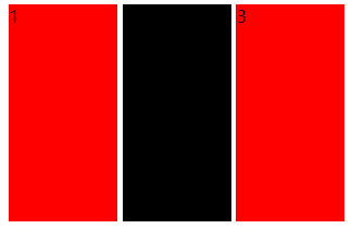
可以看出,块元素在显示的时候,他们之间会有空隙。
(2)添加浮动
        <style type="text/css">
             .myclass1{
                background-color: red;
                width: 100px;
                height: 200px;
                display:inline-block;
                float: left;
            }

            .myclass2{
                background-color:black;
                 width: 100px;
                height: 200px;
                display:inline-block;
                 float: left;
            }
             .myclass3{
                background-color: red;
                 width: 100px;
                height: 200px;
                display:inline-block;
                 float: left;
               }

        </style>
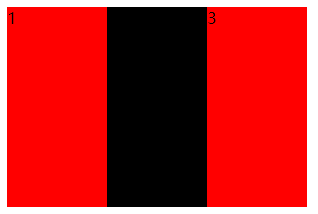
在标准流中不能实现的布局效果,在浮动中就可以很容易地完成,浮动可以改变标签的默认的排列方式。
3、浮动(左浮动与右浮动)
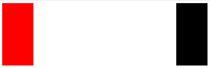
(1)左浮动
<!DOCTYPE html>
<html>
    <head>
        <meta charset="utf-8" />
        <title>test</title>
        <style type="text/css">
             .myclass1{
                background-color: red;
                width: 100px;
                height: 200px;
                display:inline-block;
                float: left;
            }

            .myclass2{
                background-color:black;
                 width: 100px;
                height: 200px;
                display:inline-block;
                 float: left;
            }


        </style>
    </head>
    <body>
    <div class="myclass1"></div>
    <div class="myclass2"></div>
    </body>
</html>

两个块元素本来是要每个div独占一行的,但是在添加了浮动以后就会合并到一行显示,因为设置的是左浮动,他们两个都是靠左排列的。
(2)一个左,一个右
<!DOCTYPE html>
<html>
    <head>
        <meta charset="utf-8" />
        <title>test</title>
        <style type="text/css">
             .myclass1{
                background-color: red;
                width: 100px;
                height: 200px;
                display:inline-block;
                float: left;
            }

            .myclass2{
                background-color:black;
                 width: 100px;
                height: 200px;
                display:inline-block;
                 float: right;
            }


        </style>
    </head>
    <body>
    <div class="myclass1"></div>
    <div class="myclass2"></div>
    </body>
</html>
4、浮动的特性
(1)浮动元素会脱离标准流(不再保留原来的位置,也就是说其它元素可以占用浮动元素的位置)
<!DOCTYPE html>
<html>
    <head>
        <meta charset="utf-8" />
        <title>test</title>
        <style type="text/css">
             .myclass1{
                background-color: red;
                width: 100px;
                height: 200px;

                float: left;
            }

            .myclass2{
                background-color:black;
                width: 200px;
                height: 300px;

            }


        </style>
    </head>
    <body>
    <div class="myclass1"></div>
    <div class="myclass2"></div>
    </body>
</html>
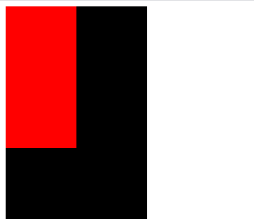
在对红色元素添加了浮动以后,他的位置是可以被其他的元素所占用的。
(2)浮动元素会在一行内显示并且元素顶部对齐
<!DOCTYPE html>
<html>

    <head>
        <meta charset="utf-8" />
        <title>test</title>
        <style type="text/css">
            .myclass1 {
                background-color: red;
                width: 100px;
                height: 200px;
                float: left;
            }

            .myclass2 {
                float: left;
                background-color: black;
                width: 200px;
                height: 200px;
            }
        </style>
    </head>

    <body>
        <div class="myclass1"></div>
        <div class="myclass2"></div>
    </body>

</html>

如果是标准流的话,他们是上下显示的,即一个div元素独占一行
(3)会具有行内块元素的特征
<!DOCTYPE html>
<html>

    <head>
        <meta charset="utf-8" />
        <title>test</title>
        <style type="text/css">
            .myclass1 {
                background-color: red;
                width: 100px;
                height: 200px;
                float: left;
            }

            .myclass2 {
                float: left;
                background-color: black;
                width: 200px;
                height: 200px;
            }
        </style>
    </head>

    <body>
        <span class="myclass1"></span>
        <span class="myclass2"></span>
    </body>

</html>

一般情况下,行内元素转换为块元素需要添加属性,但是,在添加了浮动以后就可以自动转换为块元素。
4、浮动元素和标准父级搭配使用
一般情况下,先用标准流的父元素排列上下位置,之后内部子元素采取浮动的策略排列左右位置
<!DOCTYPE html>
<html>

    <head>
        <meta charset="utf-8" />
        <title>test</title>
        <style type="text/css">
            .bigbox {
                background-color: #ffffcc;
                width: 1100px;
                height: 400px;
                margin: 0 auto;
            }
            .left{
                height: 400px;
                width: 300px;
                float: left;
                background-color: #fffcf5;
            }
             .right{
                height: 400px;
                width: 600px;
                float: right;
                background-color: #e3dc89;
            }
        </style>
    </head>

    <body>
        <div class="bigbox">
            <div class="left"></div>
            <div class="right"></div>
        </div>
    </body>

</html>

这里面一共有三个盒子,其中父盒子包含两个子盒子。没有父元素的话,盒子是直接靠近浏览器的边缘排列的,但是有了父盒子以后就只能在父盒子里面,也就是说父盒子能够限制子盒子的位置。