当今电子商务已经非常普及,网上购物已经成为人们生活的一部分,电商网站上的商品数量已经呈现几何级的增长.伴随着在线的商品数量的增长,商品的定价越来越成为一个问题。比如服装的价格会呈现出季节性的变化趋势,而且受品牌的影响很大,而电子产品的价格则根据产品规格而波动。
Mercari是一个日本C2C二手交易平台。他们们深深地了解零售商品定价这个问题。他们想向卖家提供定价建议,但这很难,因为他们的卖家可以在Mercari的平台上放置任何东西。
今天我们就来尝试对Mercar提供的数据做一下分析
EDA(探索性数据分析)
我们可以从这里下载Mercari提供的数据,数据包含两个文件,一个训练集(train.tsv)和一个测试集(test.tsv)。
train_id : train表的ID
name : 商品的名称
item_condition_id : 卖方提供的商品的新旧程度
category_name : 商品所属的类别
brand_name : 商品的品牌
price : 商品的售价。 这是我们预测的目标变量
shipping : 运费支付方式,1表示运费由卖方支付,0表示运费由买方支付
item_description : 商品的完整描述
我们首先加载一下我们所需要的包
import nltk
import string
import re
import numpy as np
import pandas as pd
import pickle
#import lda

import matplotlib.pyplot as plt
import seaborn as sns
sns.set(style="white")

from nltk.stem.porter import *
from nltk.tokenize import word_tokenize, sent_tokenize
from nltk.corpus import stopwords
from sklearn.feature_extraction import stop_words

from collections import Counter
from wordcloud import WordCloud
from sklearn.feature_extraction.text import TfidfVectorizer
from sklearn.feature_extraction.text import CountVectorizer
from sklearn.decomposition import LatentDirichletAllocation

import plotly.offline as py
py.init_notebook_mode(connected=True)
import plotly.graph_objs as go
import plotly.tools as tls
%matplotlib inline

import bokeh.plotting as bp
from bokeh.models import HoverTool, BoxSelectTool
from bokeh.models import ColumnDataSource
from bokeh.plotting import figure, show, output_notebook
#from bokeh.transform import factor_cmap

import warnings
warnings.filterwarnings('ignore')
import logging
logging.getLogger("lda").setLevel(logging.WARNING)
nltk.download('stopwords')
nltk.download('punkt')
接下来查看一下我们的数据
PATH = "./data/Mercari/"
train = pd.read_csv(PATH+'train.tsv', sep='\t')
test = pd.read_csv(PATH+'test.tsv', sep='\t')
print(train.shape)
print(test.shape)![]()
我看到数据量非常的大,训练集有140多万,测试集有将近70万.我们看一下train表中的数据类型:
train.dtypes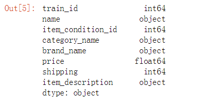
在这些变量中price是float型,我们可以把它看作是数值型变量(numerical variable),其他变量我们都可以看作做分类型变量(categorical variable)。
train.head()
目标变量: Price
我们首先查看一下价格的分布情况
train.price.describe()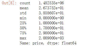
我们看到所有商品的平均价格是26元,但是价格分布呈现严重右偏趋势,最大极端值达到了200元。 对此我们要对price进行对数化处理,以便规避零值和负值,对数化处理是一种数据标准化处理的方法,常用于金融行业,经对数化处理后数据计算更加的方便。
plt.subplot(1, 2, 1)
(train['price']).plot.hist(bins=50, figsize=(20,10), edgecolor='white',range=[0,250])
plt.xlabel('price', fontsize=17)
plt.ylabel('frequency', fontsize=17)
plt.tick_params(labelsize=15)
plt.title('Price Distribution - Training Set', fontsize=17)

plt.subplot(1, 2, 2)
np.log(train['price']+1).plot.hist(bins=50, figsize=(20,10), edgecolor='white')
plt.xlabel('log(price+1)', fontsize=17)
plt.ylabel('frequency', fontsize=17)
plt.tick_params(labelsize=15)
plt.title('Log(Price) Distribution - Training Set', fontsize=17)
plt.show()
运费(支付方式)
运费的支付方式分为两种,一种由卖家支付,另一种由买家支付,我们想知道不同的支付方式是否会对价格产生影响。
train.shipping.value_counts()/len(train)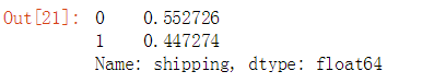
有超过一半(55%)的商品的运费是由买家支付的.有44%的商品是有卖家支付的运费。
prc_shipBySeller = train.loc[train.shipping==1, 'price']
prc_shipByBuyer = train.loc[train.shipping==0, 'price']

fig, ax = plt.subplots(figsize=(10,6))
ax.hist(np.log(prc_shipBySeller+1), color='orange', alpha=1.0, bins=50,
       label='Price when Seller pays Shipping')
ax.hist(np.log(prc_shipByBuyer+1), color='green', alpha=0.7, bins=50,
       label='Price when Buyer pays Shipping')
ax.set(title='Histogram Comparison', ylabel='% of Dataset in Bin')
plt.xlabel('log(price+1)', fontsize=17)
plt.ylabel('frequency', fontsize=17)
plt.title('Price Distribution by Shipping Type', fontsize=17)
plt.legend(['Price when Seller pays Shipping','Price when Buyer pays Shipping'])
plt.tick_params(labelsize=15)
plt.show()
我们发现由商家支付运费的平均价格要低于买家支付运费的平均价格 ,这是否预示着价格昂贵的商品需要承担更多的运费?商家为了赚钱而只对廉价的商品免运费?
商品类别
我们查看一下商品的类别,我们想知道商品的类别是否会和价格存在某种关系。
print("在 category_name 列中总共有 %d 个唯一值." % train['category_name'].nunique())
print("在 category_name 列中总共有 %d 个空值." % train['category_name'].isnull().sum())
print('----------------------------------------')
print('前5个最常见的类别是:')
print(train['category_name'].value_counts()[:5])
我们发现我们的 category_name是由三级类别构造(主类/中类/小类),为了发现各级类别是否对价格产生影响,我们需要需要拆分三级类别,将它们拆分一个主类,一个中类,一个小类:
def split_cat(text):
    try: return text.split("/")
    except: return ("No Label", "No Label", "No Label")

train['general_cat'], train['subcat_1'], train['subcat_2'] = zip(*train['category_name'].apply(lambda x: split_cat(x)))
test['general_cat'], test['subcat_1'], test['subcat_2'] = zip(*test['category_name'].apply(lambda x: split_cat(x)))
train.head() 
我们分别在训练集和测试集上将category_name拆分成了general_cat(主类),subcat_1(中类) 和subcat_2(小类)三个类。
print("general_cat(主类) 有 %d 唯一值." % train['general_cat'].nunique())
print("subcat_1(中类) 有 %d 唯一值." % train['subcat_1'].nunique())
print("subcat_2 (小类)有 %d 唯一值." % train['subcat_2'].nunique())
经过拆分以后,主类有11个类别,接下来我们查看这11个主类的分布情况
x = train['general_cat'].value_counts().index.values.astype('str')
y = train['general_cat'].value_counts().values
pct = [("%.2f"%(v*100))+"%"for v in (y/len(train))]

trace1 = go.Bar(x=x, y=y, text=pct)
layout = dict(title= 'Number of Items by Main Category',
              yaxis = dict(title='Count'),
              xaxis = dict(title='Category'))
fig=dict(data=[trace1], layout=layout)
py.iplot(fig)
在这11个主类中我们发现,"女性"类别在数据集中出现的频次最高,其次是"美容","儿童","电器","男性"等,由此看来,女性是网购的主力军啊。
x = train['subcat_1'].value_counts().index.values.astype('str')[:15]
y = train['subcat_1'].value_counts().values[:15]
pct = [("%.2f"%(v*100))+"%"for v in (y/len(train))][:15]

trace1 = go.Bar(x=x, y=y, text=pct,
                marker=dict(
                color = y,colorscale='Portland',showscale=True,
                reversescale = False
                ))
layout = dict(title= 'Number of Items by Sub Category (Top 15)',
              yaxis = dict(title='Count'),
              xaxis = dict(title='SubCategory'))
fig=dict(data=[trace1], layout=layout)
py.iplot(fig)
我们查看了前15个中类的类别,从分布上看中类都比较均匀,没有出现极端情况。
接下来我们要查看一下general_cat(主类)与价格之间的是否存在关系。
general_cats = train['general_cat'].unique()
x = [train.loc[train['general_cat']==cat, 'price'] for cat in general_cats]
data = [go.Box(x=np.log(x[i]+1), name=general_cats[i]) for i in range(len(general_cats))]

layout = dict(title="Price Distribution by General Category",
              yaxis = dict(title='Category'),
              xaxis = dict(title='log(1+price)'))
fig = dict(data=data, layout=layout)
py.iplot(fig)
所有主类的价格都呈现右偏的分布状况,"Men"类的价格中位数最高.
品牌
print("在训练集中的品牌名称(brand_name)有 %d 唯一值." % train['brand_name'].nunique())
x = train['brand_name'].value_counts().index.values.astype('str')[:10]
y = train['brand_name'].value_counts().values[:10]

trace1 = go.Bar(x=x, y=y,
                 marker=dict(
                 color = y,colorscale='Portland',showscale=True,
                 reversescale = False
                 ))
layout = dict(title= 'Top 10 Brand by Number of Items',
               yaxis = dict(title='Count'),
               xaxis = dict(title='Brand Name'))
fig=dict(data=[trace1], layout=layout)
py.iplot(fig)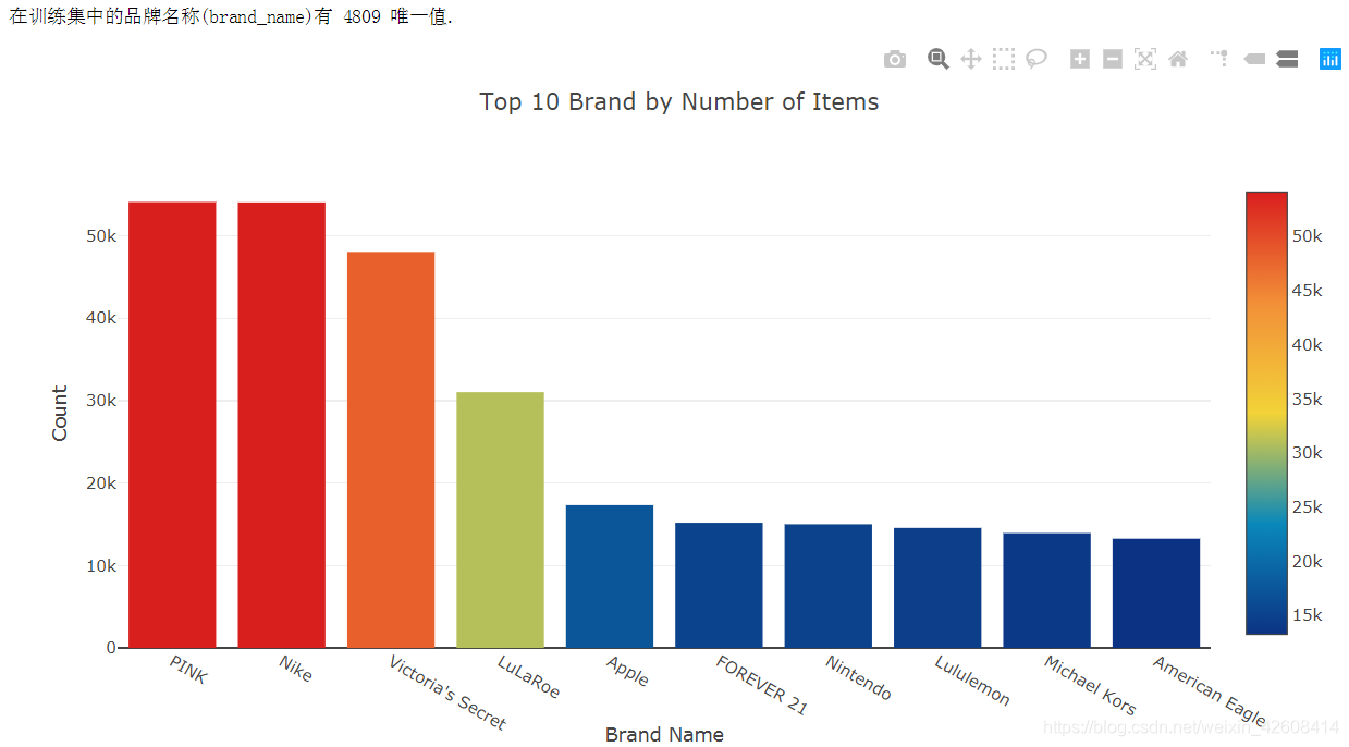
商品描述(Item Description)
商品描述是一段文本信息,我们不知道它是否和价格存在某种关系,是否更长的商品描述信息会使商品的价格更高呢?因为商品描述是非结构化数据,因此我们要对它进行解析,这将是最有挑战性的一项工作。我们会删除商品描述中的所有标点符号和英语中的停用词(如 a,the等),以及所有长度小于等于3的单词,最后我会还会对商品描述进行计数(word count)
def wordCount(text):
    try:
         # 小写化处理,并删除标点符号
        text = text.lower()
        regex = re.compile('[' +re.escape(string.punctuation) + '0-9\\r\\t\\n]')
        txt = regex.sub(" ", text)
        #分词并过滤掉长度小于3的单词和英语停用词
        words = [w for w in txt.split(" ") \
                 if not w in stop_words.ENGLISH_STOP_WORDS and len(w)>3]
        return len(words)
    except:
        return 0

train['desc_len'] = train['item_description'].apply(lambda x: wordCount(x))
test['desc_len'] = test['item_description'].apply(lambda x: wordCount(x))

train.head()
我们在train表中增加了一个字段des_len,用来记录item_description的单词数量。
接下来我们要查看一下商品描述中单词数量(desc_len)是否与价格之间存在关系。
df = train.groupby('desc_len')['price'].mean().reset_index()

trace1 = go.Scatter(
    x = df['desc_len'],
    y = np.log(df['price']+1),
    mode = 'lines+markers',
    name = 'lines+markers'
)
layout = dict(title= 'Average Log(Price) by Description Length',
              yaxis = dict(title='Average Log(Price)'),
              xaxis = dict(title='Description Length'))
fig=dict(data=[trace1], layout=layout)
py.iplot(fig)
我们发现当单词数量超过80以后,商品的评价价格会出现较大的波动。似乎还有商品没有描述信息(单词数量为0),因此我们还要检查一下商品描述信息中的空值情况,并且删除这些空值数据。
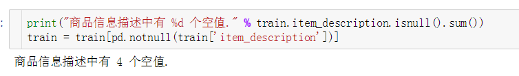
然后我们要空值记录删除
# 删除空值
train = train[pd.notnull(train['item_description'])]
文本处理-商品描述
预处理:分词
大多数情况下,NLP项目的第一步是将您的文档“分词/分句”,其主要目的是规范化我们的文本。 它通常包括三个基本步骤:
- 将描述分解为句子,然后将句子分解为单词
- 删除标点符号和停用词
- 将所有英文字母小写化处理
- 在这里,我们在分词的时候也只保留长度等于或大于3个字符的单词
stop = set(stopwords.words('english'))
def tokenize(text):
    try:
        regex = re.compile('[' +re.escape(string.punctuation) + '0-9\\r\\t\\n]')
        text = regex.sub(" ", text) # remove punctuation

        tokens_ = [word_tokenize(s) for s in sent_tokenize(text)]
        tokens = []
        for token_by_sent in tokens_:
            tokens += token_by_sent
        tokens = list(filter(lambda t: t.lower() not in stop, tokens))
        filtered_tokens = [w for w in tokens if re.search('[a-zA-Z]', w)]
        filtered_tokens = [w.lower() for w in filtered_tokens if len(w)>=3]

        return filtered_tokens

    except TypeError as e: print(text,e)

train['tokens'] = train['item_description'].map(tokenize)
test['tokens'] = test['item_description'].map(tokenize)
下面让我们来看看我们将描述信息预处理以后的效果
for description, tokens in zip(train['item_description'].head(),
                              train['tokens'].head()):
    print('description:', description)
    print('tokens:', tokens)
    print()
我们可以使用WordCloud包轻松查看每个类别中具有最高频率的单词:
# 创建一个字典,key= category ,values=.分类下的所有单词
cat_desc = dict()
for cat in general_cats:
    text = " ".join(train.loc[train['general_cat']==cat, 'item_description'].values)
    cat_desc[cat] = tokenize(text)


# 计算前4个分类中最常用单词的100个单词
women100 = Counter(cat_desc['Women']).most_common(100)
beauty100 = Counter(cat_desc['Beauty']).most_common(100)
kids100 = Counter(cat_desc['Kids']).most_common(100)
electronics100 = Counter(cat_desc['Electronics']).most_common(100)
def generate_wordcloud(tup):
wordcloud = WordCloud(background_color='white',
max_words=50, max_font_size=40,
random_state=42
).generate(str(tup))
return wordcloudfig,axes = plt.subplots(2, 2, figsize=(30, 15))
ax = axes[0, 0]
ax.imshow(generate_wordcloud(women100), interpolation="bilinear")
ax.axis('off')
ax.set_title("Women Top 100", fontsize=30)
ax = axes[0, 1]
ax.imshow(generate_wordcloud(beauty100))
ax.axis('off')
ax.set_title("Beauty Top 100", fontsize=30)
ax = axes[1, 0]
ax.imshow(generate_wordcloud(kids100))
ax.axis('off')
ax.set_title("Kids Top 100", fontsize=30)
ax = axes[1, 1]
ax.imshow(generate_wordcloud(electronics100))
ax.axis('off')
ax.set_title("Electronic Top 100", fontsize=30)
预处理:TF-IDF
tf-idf是Term Frequency-inverse Document Frequency的首字母缩写。 它是单词的一种量化表示,它体现了特定单词相对于文档的重要程度。 该指标取决于两个因素:
- 频率:单词在给定文档集中单词的出现的次数
- 逆向文档频率:单词在文档语料库中出现的倒数
可以这样思考:如果在所有文档中广泛使用的单词(如“a”,“the”,“and”等),则这些常用词无法表达出文档的实际意义或主题。 因此,“逆向文档频率”可以被视为惩罚诸如“a”,“the”,“and”等常用词的惩罚。因此,tf-idf可以被视为特定文档中词语相关性的加权。
from sklearn.feature_extraction.text import TfidfVectorizer
vectorizer = TfidfVectorizer(min_df=10,
                             max_features=180000,
                             tokenizer=tokenize,
                             ngram_range=(1, 2))

all_desc = np.append(train['item_description'].values, test['item_description'].values)
vz = vectorizer.fit_transform(list(all_desc))
这里的vz是一个tf-idf矩阵:
- 矩阵的每一行表示一条商品描述
- 矩阵的每一列表示一个商品描述中的一个单词
- 矩阵中某行某列的值表示某条商品描述中的某个单词的tf-idf分数。
# 创建一个字典用来映射分词和tf-idf值
tfidf = dict(zip(vectorizer.get_feature_names(), vectorizer.idf_))
tfidf = pd.DataFrame(columns=['tfidf']).from_dict(
                    dict(tfidf), orient='index')
tfidf.columns = ['tfidf']
下面是10个tf-idf分数最低的分词,这些都是常用词,它们无法体现文本的主题和含义。
tfidf.sort_values(by=['tfidf'], ascending=True).head(10)
下面是具有最高tf-idf分数的10个单词,其中包含非常具体的单词,通过这些单词,我们可以猜出它们所属的类别:
tfidf.sort_values(by=['tfidf'], ascending=False).head(10)
由于我们的tf-idf矩阵是一个高维矩阵,我们需要使用奇异值分解(SVD)技术来减小它们的维度。 为了使我们的词汇量可视化,接下来我们可以使用t-SNE将维度从50减小到2 ,使用t-SNE算法可以将维度降低到2或3。
t-Distributed Stochastic Neighbor Embedding (t-SNE)
t-SNE是一种降维的技术,特别适用于高维数据集的可视化。 目标是在高维空间中获取一组点,并在较低维空间(通常为2D平面)中找到这些点的表示。 它基于概率分布,在邻域图上随机游走,以找到数据中的结构。 但由于t-SNE复杂度非常高,通常我们在应用t-SNE之前会使用其他降维技术如SVD。
首先,让我们从训练和测试项目的描述中获取样本,因为t-SNE可能需要很长时间才能执行。 所以,我们可以先使用SVD将每个向量的维数降到30。然后再用t-SNE将维度从30降到2.
trn = train.copy()
tst = test.copy()
trn['is_train'] = 1
tst['is_train'] = 0

sample_sz = 15000

combined_df = pd.concat([trn, tst])
combined_sample = combined_df.sample(n=sample_sz)
vz_sample = vectorizer.fit_transform(list(combined_sample['item_description']))
vz_sample.shape![]()
from sklearn.decomposition import TruncatedSVD

n_comp=30
svd = TruncatedSVD(n_components=n_comp, random_state=42)
svd_tfidf = svd.fit_transform(vz_sample)
svd_tfidf.shape![]()
接下来我可以使用T-SNE算法将维度从30降到2
from sklearn.manifold import TSNE
tsne_model = TSNE(n_components=2, verbose=1, random_state=42, n_iter=500)

tsne_tfidf = tsne_model.fit_transform(svd_tfidf)
现在可以可视化我们的数据点了
output_notebook()
plot_tfidf = bp.figure(plot_width=700, plot_height=600,
                       title="tf-idf clustering of the item description",
    tools="pan,wheel_zoom,box_zoom,reset,hover,previewsave",
    x_axis_type=None, y_axis_type=None, min_border=1)

combined_sample.reset_index(inplace=True, drop=True)

tfidf_df = pd.DataFrame(tsne_tfidf, columns=['x', 'y'])
tfidf_df['description'] = combined_sample['item_description']
tfidf_df['tokens'] = combined_sample['tokens']
tfidf_df['category'] = combined_sample['general_cat']

plot_tfidf.scatter(x='x', y='y', source=tfidf_df, alpha=0.7)
hover = plot_tfidf.select(dict(type=HoverTool))
hover.tooltips={"description": "@description", "tokens": "@tokens", "category":"@category"}
show(plot_tfidf)
K-Means聚类
K均值聚类目标是从文档中找出k个有共性的内容(即k个聚类中心),它是以离聚类中心的平均欧式距离最短为标准。
from sklearn.cluster import MiniBatchKMeans

num_clusters = 30 # 选择30个聚类中心
kmeans_model = MiniBatchKMeans(n_clusters=num_clusters,
                               init='k-means++',
                               n_init=1,
                               init_size=1000, batch_size=1000, verbose=0, max_iter=1000)

kmeans = kmeans_model.fit(vz_sample)
kmeans_clusters = kmeans.predict(vz_sample)
kmeans_distances = kmeans.transform(vz_sample)
tsne_kmeans = tsne_model.fit_transform(kmeans_distances)
接下来我们要根据距离在2D的散点图上进行着色
colormap = np.array(["#6d8dca", "#69de53", "#723bca", "#c3e14c", "#c84dc9", "#68af4e", "#6e6cd5",
"#e3be38", "#4e2d7c", "#5fdfa8", "#d34690", "#3f6d31", "#d44427", "#7fcdd8", "#cb4053", "#5e9981",
"#803a62", "#9b9e39", "#c88cca", "#e1c37b", "#34223b", "#bdd8a3", "#6e3326", "#cfbdce", "#d07d3c",
"#52697d", "#194196", "#d27c88", "#36422b", "#b68f79"])

kmeans_df = pd.DataFrame(tsne_kmeans, columns=['x', 'y'])
kmeans_df['cluster'] = kmeans_clusters
kmeans_df['description'] = combined_sample['item_description']
kmeans_df['category'] = combined_sample['general_cat']

plot_kmeans = bp.figure(plot_width=700, plot_height=600,
                        title="KMeans clustering of the description",
    tools="pan,wheel_zoom,box_zoom,reset,hover,previewsave",
    x_axis_type=None, y_axis_type=None, min_border=1)

source = ColumnDataSource(data=dict(x=kmeans_df['x'], y=kmeans_df['y'],
                                    color=colormap[kmeans_clusters],
                                    description=kmeans_df['description'],
                                    category=kmeans_df['category'],
                                    cluster=kmeans_df['cluster']))

plot_kmeans.scatter(x='x', y='y', color='color', source=source)
hover = plot_kmeans.select(dict(type=HoverTool))
hover.tooltips={"description": "@description", "category": "@category", "cluster":"@cluster" }
show(plot_kmeans)
隐狄利克雷分布(LDA)
Latent Dirichlet Allocation(LDA)是一种用于发现语料库中存在的主题的算法。
LDA从固定数量的主题开始。 每个主题都表示为单词分布,然后每个文档表示为主题分布。虽然单词本身没有意义,但由主题提供的单词的概率分布给出了文档中包含有不同主题的感觉。
它的输入是一个词袋(BOW),即每个文档表示为一行,每列包含语料库中的单词计数。 我们将使用一个名为pyLDAvis的强大工具,为LDA提供交互式可视化。
cvectorizer = CountVectorizer(min_df=4,
                              max_features=180000,
                              tokenizer=tokenize,
                              ngram_range=(1,2))
cvz = cvectorizer.fit_transform(combined_sample['item_description'])

lda_model = LatentDirichletAllocation(n_components=20,
                                      learning_method='online',
                                      max_iter=20,
                                      random_state=42)

X_topics = lda_model.fit_transform(cvz)

n_top_words = 10
topic_summaries = []

topic_word = lda_model.components_  # get the topic words
vocab = cvectorizer.get_feature_names()

for i, topic_dist in enumerate(topic_word):
    topic_words = np.array(vocab)[np.argsort(topic_dist)][:-(n_top_words+1):-1]
    topic_summaries.append(' '.join(topic_words))
    print('Topic {}: {}'.format(i, ' | '.join(topic_words)))
下面我们要实现LDA的可视化,不过我们得先对X_topics进行降维,然后再进行LDA进行可视化。
tsne_lda = tsne_model.fit_transform(X_topics)plot_lda = bp.figure(plot_width=700,
plot_height=600,
title="LDA topic visualization",
tools="pan,wheel_zoom,box_zoom,reset,hover,previewsave",
x_axis_type=None, y_axis_type=None, min_border=1)
unnormalized = np.matrix(X_topics)
doc_topic = unnormalized/unnormalized.sum(axis=1)
lda_keys = []
for i, tweet in enumerate(combined_sample['item_description']):
lda_keys += [doc_topic[i].argmax()]
lda_df = pd.DataFrame(tsne_lda, columns=['x','y'])
lda_df['description'] = combined_sample['item_description']
lda_df['category'] = combined_sample['general_cat']
lda_df['topic'] = lda_keys
lda_df['topic'] = lda_df['topic'].map(int)
source = ColumnDataSource(data=dict(x=lda_df['x'], y=lda_df['y'],
color=colormap[lda_keys],
description=lda_df['description'],
topic=lda_df['topic'],
category=lda_df['category']))
plot_lda.scatter(source=source, x='x', y='y', color='color')
hover = plot_kmeans.select(dict(type=HoverTool))
hover = plot_lda.select(dict(type=HoverTool))
hover.tooltips={"description":"@description",
"topic":"@topic", "category":"@category"}
show(plot_lda)