动画效果
@keyframes:定义动画
animation-name:使用的动画名字
animation-duration:完成一个动画的时间
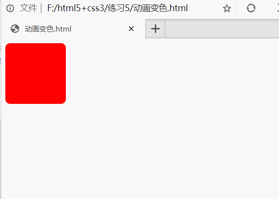
1.动画变色
<!DOCTYPE html>
<html>
	<head>
		<style>
			div{
				width:100px;
				height:100px;
				background:red;
				border-radius:8px;
				animation-name:myfirst;
				animation-duration:2s;
			}

			@keyframes myfirst{
				from{background-color:red;}
				to{background-color:yellow;}
			}
		</style>
	</head>
	<body>
		<div></div>
	</body>
</html>
效果
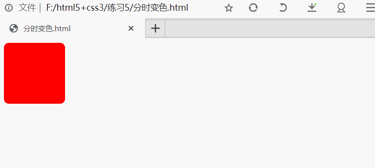
2.分时变色
<!DOCTYPE html>
<html>
	<head>
		<style>
			div{
				width:100px;
				height:100px;
				background:red;
				border-radius:8px;
				animation-name:myfirst;
				animation-duration:8s;
				animation-iteration-count:infinite;
			}

			@keyframes myfirst{
				0%   {background:red; transform:rotate(0deg);}
				25%  {background:yellow; transform:rotate(90deg);}
				50%  {background:blue; transform:rotate(180deg);}
				75%  {background:green; transform:rotate(270deg);}
				100% {background:red; transform:rotate(360deg);}
			}
		</style>
	</head>
	<body>
		<div></div>
	</body>
</html>
效果
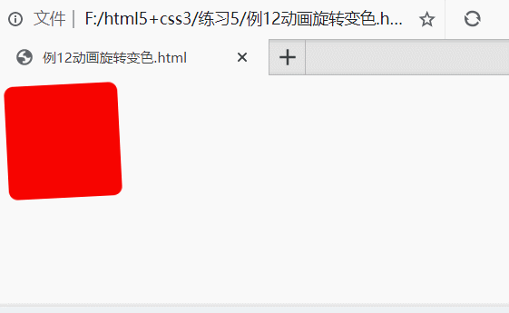
3.动画旋转变色
<!DOCTYPE html>
<html>
	<head>
		<style>
			div{
				width:100px;
				height:100px;
				background:red;
				border-radius:8px;
				animation-name:myfirst;
				animation-duration:4s;
				animation-iteration-count:infinite;
			}

			@keyframes myfirst{
				0%   {background:red; transform:rotate(0deg);}
				25%  {background:yellow; transform:rotate(90deg);}
				50%  {background:blue; transform:rotate(180deg);}
				75%  {background:green; transform:rotate(270deg);}
				100% {background:red; transform:rotate(360deg);}
			}
		</style>
	</head>
	<body>
		<div></div>
	</body>
</html>
效果
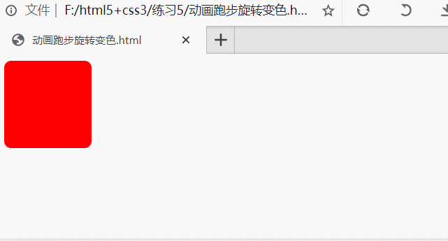
4.跑步旋转变色
<!DOCTYPE html>
<html>
	<head>
		<style>
			div{
				width:100px;
				height:100px;
				background:red;
				border-radius:8px;
				animation-name:myfirst;
				animation-duration:2s;
				position:relative;
			}

			@keyframes myfirst{
				0%   {background:red; transform:rotate(0deg);}
				25%  {background:yellow; transform:rotate(90deg);}
				50%  {background:blue; transform:rotate(180deg); }
				75%  {background:green;transform:rotate(270deg); }
				100% {background:red; transform:rotate(360deg);}
				from{left:0px;}
				to{left:400px;}
			}
		</style>
	</head>
	<body>
		<div></div>
	</body>
</html>
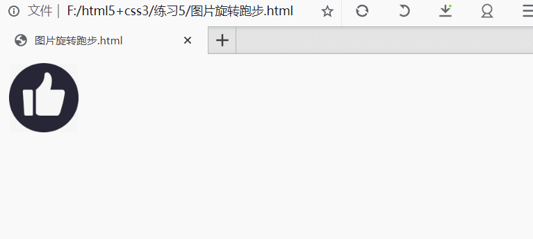
5.图片旋转跑步
<html>
	<head>
		<meta charset="UTF-8">
		<style type="text/css">
			img{
				width:80px;
				height:80px;
				animation-name:myfirst;
				animation-duration:2s;
				position:relative;
			}
			@keyframes myfirst{
				0%   {transform:rotate(0deg);}
				25%  {transform:rotate(180deg);}
				50%  {transform:rotate(360deg); }
				75%  {transform:rotate(540deg); }
				100% { transform:rotate(720deg);}
				from{left:0px;}
				to{left:300px;}
			}
		</style>
	</head>
	<body>
		<table>

			<td><img src="images/a.jpg"></td>

		</table>
	</body>
</html>
效果