基于Taro+react自定义弹出层组件|Modal框|Toast轻提示框|dialog对话框|msg信息框|仿微信对话框
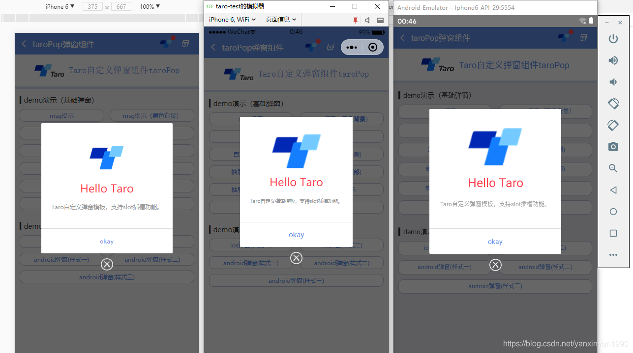
taro多端实践之:taroPop模态框组件 (H5+小程序+ReactNative)
taro的旨意是实现多端应用,不过网上大多taro弹窗组件都是针对H5及小程序的,而且一些特殊效果需重新开发,如是自己就试着开发,毕竟之前也有用taro做过自定义导航栏组件。
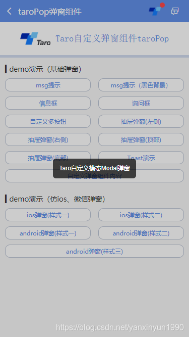
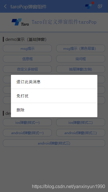
taroPop组件支持自定义弹窗类型(msg/toast/ios/android)/弹窗样式、多按钮事件/按钮样式、自动关闭、遮罩层、弹窗显示位置及自定义内容模板。
支持多参数配置
/**
 * @ 弹窗默认配置
 */
static defaultProps = {
    isVisible: false,       //弹窗显示

    title: '',              //标题
    content: '',            //内容
    contentStyle: null,     //内容样式
    style: null,            //自定义弹窗样式
    skin: '',               //弹窗风格
    icon: '',               //弹窗图标
    xclose: false,          //自定义关闭按钮

    shade: true,            //遮罩层
    shadeClose: true,       //点击遮罩关闭
    opacity: '',            //遮罩透明度
    time: 0,                //自动关闭时间
    end: null,              //销毁弹窗回调函数

    position: '',           //弹窗位置显示

    btns: null,             //弹窗按钮 [{...args}, {...args}]
}
用法
在页面引入taroPop弹窗组件
import TaroPop from '@components/taroPop'import Taro from '@tarojs/taro'
import { View, Text } from '@tarojs/components'
// 引入自定义弹窗组件
import TaroPop from '@components/taroPop'
export default class TaroPopDemo extends Taro.Component {
...
render() {
return (
<View className="taro-container">
...
{/* 引入弹窗模板 */}
<TaroPop ref="taroPop" />
</View>
);
}
}通过this.refs方式调用组件内show、close方法
this.refs.taroPop.show({...options})
this.refs.taroPop.close()
/**
* 显示弹窗事件
*/
show = (options) => {
this.setState({
...this.props, ...options, isVisible: true
})
}
/**
* 关闭弹窗事件
*/
close = () => {
this.setState({...this.props})
this.timer && clearTimeout(this.timer)
delete this.timer
typeof this.state.end === 'function' && this.state.end.call(this)
}
/**
* 点击遮罩关闭
*/
shadeClick = () => {
if(!this.state.shadeClose) return
this.close()
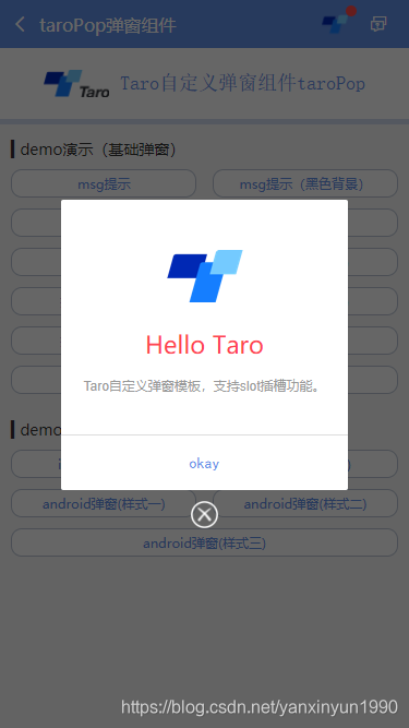
}另外还支持自定义弹窗内容模板,只需把页面上的模板写成如下即可,调用方式还和上面一样
<TaroPop ref="taroPopTpl">
    ...
</TaroPop>
◆ msg消息框效果

this.refs.taroPop.show({
content: 'Taro消息提示框(3s后窗口关闭)',
shade: true,
shadeClose: true,
time: 3,
anim: 'fadeIn',
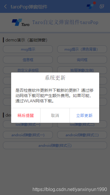
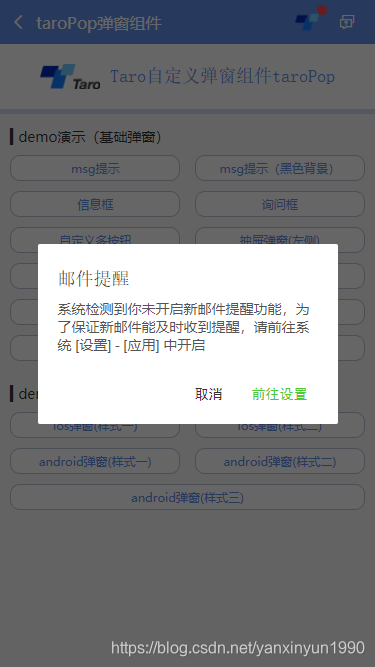
})◆ ios弹窗效果


let taroPop = this.refs.taroPop
taroPop.show({
skin: 'ios',
title: '消息提示',
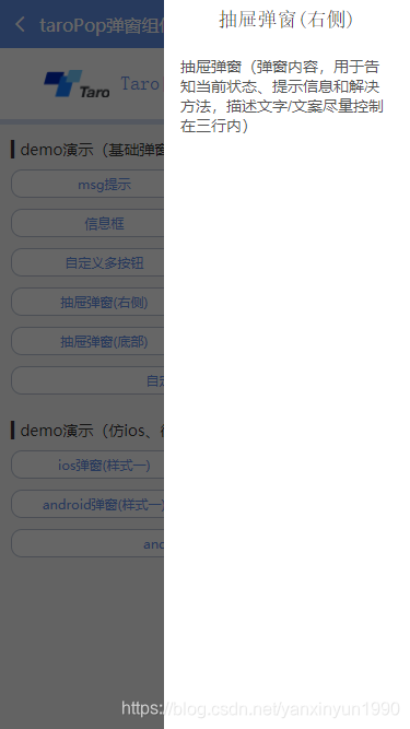
content: 'ios弹窗效果 (弹窗内容,用于告知当前状态、提示信息和解决方法,描述文字/文案尽量控制在三行内)',
shadeClose: false,
btns: [
{
text: '取消',
style: {color: '#6190e8'},
onClick() {
taroPop.close()
}
},
{
text: '不再提醒',
style: {color: '#6190e8'},
onClick() {
console.log('您点击了前往设置!')
}
}
]
})◆ 轻提示Toast效果
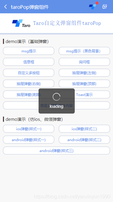
let taroPop = this.refs.taroPop
taroPop.show({
    skin: 'toast',
    content: 'loading',
    icon: 'loading', //success | info | error | loading
    shade: false,
    time: 3
})


对于不同端使用一些兼容性处理,需要判断各端环境并渲染相应模板,对于RN,则使用Modal
let taroEnv = process.env.TARO_ENV

// 渲染窗体
if (taroEnv === 'rn') {
    return (
        <Modal transparent={true} visible={isVisible} onRequestClose={this.close}>
            {renderTpl}
        </Modal>
    )
}else if (taroEnv === 'h5' || taroEnv === 'weapp'){
    return isVisible && renderTpl
}
另外对于样式兼容性也需要注意,尤其是编译到reactNative端,各种千奇百怪的问题,有些抓狂~~
/**
 * @Title     Taro自定义弹窗组件 - taroPop.js
 * @Time     andy by 2019-11-28
 * @About     Q:282310962  wx:xy190310
 */

import Taro from '@tarojs/taro'
import { View, Text, Image } from '@tarojs/components'
import { Modal, ActivityIndicator, TouchableHighlight } from 'react-native'
import classNames from 'classnames'
import './index.scss'

export default class TaroPop extends Taro.Component {
    /**
     * @ 弹窗默认配置
     */
    static defaultProps = {
        isVisible: false,       //弹窗显示

        title: '',              //标题
        content: '',            //内容
        contentStyle: null,     //内容样式
        style: null,            //自定义弹窗样式
        skin: '',               //弹窗风格
        icon: '',               //弹窗图标
        xclose: false,          //自定义关闭按钮

        shade: true,            //遮罩层
        shadeClose: true,       //点击遮罩关闭
        opacity: '',            //遮罩透明度
        time: 0,                //自动关闭时间
        end: null,              //销毁弹窗回调函数

        anim: 'scaleIn',        //弹窗动画
        position: '',           //弹窗位置显示

        btns: null,             //弹窗按钮 [{...args}, {...args}]
    }

    constructor(props) {
        super(props)
        this.state = {
            ...this.props,
        }
        this.timer = null
    }


    /**
     * @ 显示弹窗事件
     */
    show = (options) => {
        this.setState({
            ...this.props, ...options, isVisible: true
        })
    }

    /**
     * @ 关闭弹窗事件
     */
    close = () => {
        this.setState({...this.props})

        this.timer && clearTimeout(this.timer)
        delete this.timer

        typeof this.state.end === 'function' && this.state.end.call(this)
    }

    /**
     * @ 点击遮罩关闭
     */
    shadeClick = () => {
        if(!this.state.shadeClose) return
        this.close()
    }

    render() {
        let { isVisible, title, content, contentStyle, style, skin, icon, xclose, shade, shadeClose, opacity, time, end, anim, position, btns } = this.state

        let toastIcon = {
            loading: require('./skin/loading.png'),
            success: require('./skin/success.png'),
            error: require('./skin/error.png'),
            info: require('./skin/info.png'),
        }

        let taroEnv = process.env.TARO_ENV

        ...

        // 渲染H5、RN模板
        const renderTpl = (
            <View className="taroPop">
                {/* 遮罩 */}
                {shade ? <View className="atpop__ui_mask" style={{opacity: opacity == '' ? .6 : opacity}} onClick={this.shadeClick} /> : null}
                {/* 窗体 */}
                <View className="atpop__ui_main">
                    <View className={classNames('atpop__ui_child', skin && 'atpop__' + skin, position && 'atpop__ui_child-' + position)} style={style}>
                        {/* 标题 */}
                        {title ? <Text className={classNames('atpop__ui_tit', skin && 'atpop__ui_tit-' + skin)}>{title}</Text> : null}
                        {/* 内容 */}
                        {content ? <View className="atpop__ui_cnt">
                            {/* toast内容 */}
                            {icon && skin === 'toast' ?
                                <View className="atpop__ui_toast">
                                    {icon === 'loading' && taroEnv === 'rn' ?
                                    <ActivityIndicator color="rgba(255,255,255,.5)" size={24} /> : <Image className={classNames('atpop__ui_toast-img', icon=='loading' && 'atpop__ui_toast-img-loading')} src={toastIcon[icon]} mode="aspectFit" />
                                    }
                                </View>
                                :
                                null
                            }
                            {/* 文本内容 */}
                            <Text className={classNames('atpop__ui_cntxt', skin && 'atpop__ui_cntxt-' + skin)} style={contentStyle}>{content}</Text>
                        </View>
                        :
                        this.props.children
                        }
                        {/* 按钮 */}
                        {btns ? <View className={classNames('atpop__ui_btns', skin && 'atpop__ui_btns-' + skin)}>
                            {btns.map((item, i) => {
                                return taroEnv === 'rn' ?
                                <TouchableHighlight className={classNames('atpop__ui_btn', skin && 'atpop__ui_btn-' + skin)} activeOpacity={1} underlayColor='rgba(200,200,200,.3)' key={i} onPress={item.onClick}>
                                    <Text className={classNames('atpop__ui_btntxt', skin && 'atpop__ui_btntxt-' + skin)} style={item.style}>{item.text}</Text>
                                </TouchableHighlight>
                                :
                                <View className={classNames('atpop__ui_btn', skin && 'atpop__ui_btn-' + skin)} key={i} onClick={item.onClick}>
                                    <Text className={classNames('atpop__ui_btntxt', skin && 'atpop__ui_btntxt-' + skin)} style={item.style}>{item.text}</Text>
                                </View>
                            })}
                        </View>
                        :
                        null
                        }
                    </View>
                    {/* xclose */}
                    {xclose ? <View className="atpop__ui_xclose" onClick={this.close}><Image className="atpop__ui_xclose-img" src={require('./skin/error.png')} mode="aspectFit" /></View> : null}
                </View>
            </View>
        )

        // 渲染窗体
        if (taroEnv === 'rn') {
            return (
                <Modal transparent={true} visible={isVisible} onRequestClose={this.close}>
                    {renderTpl}
                </Modal>
            )
        }else if (taroEnv === 'h5' || taroEnv === 'weapp'){
            return isVisible && renderTpl
        }
    }
}
到这里就基本介绍差不多了,后续会继续分享一些实践案例~~
最后附上基于vue+uniapp自定义弹窗组件
https://blog.csdn.net/yanxinyun1990/article/details/101594213
https://blog.csdn.net/yanxinyun1990/article/details/102475628
