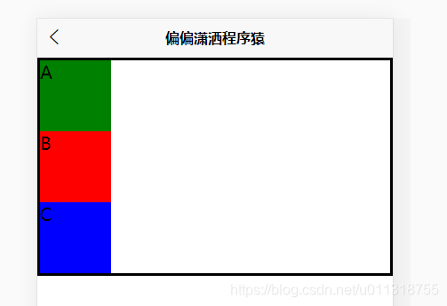
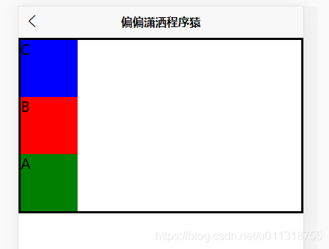
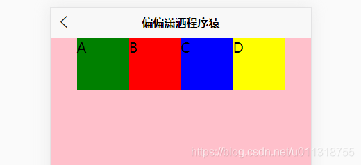
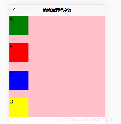
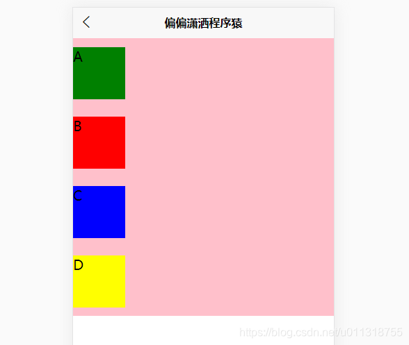
1.flex-direction:设置容器内部元素的排列方向
row: 定义排列方向 从左到右
row-reverse: 从右到左
column: 从上到下
column-reverse: 从下到上
图片介绍
flex-direction:row

flex-direction:row-reverse

flex-direction:column
flex-direction:column-reverse
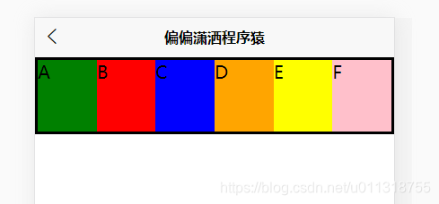
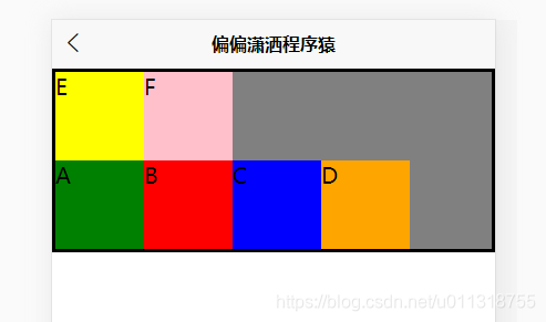
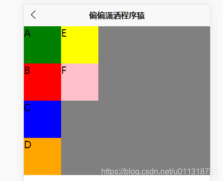
2.flex- :定义 flex 容器
nowrap: 不换行
wrap: 换行
wrap-reverse: 逆向换行
图片介绍
flex-wrap: wrap;(容器有高度则下一行平分高度)

flex-wrap: nowrap;(已经压缩元素)
flex-wrap: wrap-reverse;(容器有高度则下一行平分高度)
3.justify-content:设置元素在主轴上的对其方式
flex-start: (默认)左对齐 或者 向上对齐
flex-end: 右对齐 或者 向下对齐
center: 居中对齐
space-between: 两端对齐,元素之间平均等分剩余空白间隙部分
space-around: 元素两边平均等分剩余空白间隙部分,最左(上)或最右(下)和
元素之间距离是 1:2
图文介绍
justify-content: flex-start;

justify-content: flex-end;


justify-content: center;

justify-content: space-between;

justify-content: space-around;

4.align-items:设置容器中元素在交叉轴上的对齐方式
图片介绍(主轴为 row)
align-items: flex-start;

align-items: flex-end;

align-items: center;

align-items: baseline;

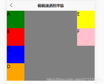
5.align-content:当轴线超过1条的时候,flex容器可以把多条轴线视为元素对待,
可以进行对齐
图片介绍(主轴从上到下)
align-content: center;

align-content: flex-start;
align-content: flex-end;

align-content: stretch;

align-content: space-between;
align-content: space-around;

6.成员项的属性
order:成员排列顺序
Fle-grow:用于设置元素的放大比例,默认为 0(撑满主轴剩余)
Flex-shrink:控制元素比例缩小(主轴满了为前提)
Flex-basis:设置元素固定或者自动空间的占比(对自己本身进行操作)
align-self:重写容器中元素在交叉轴上的对齐方式
