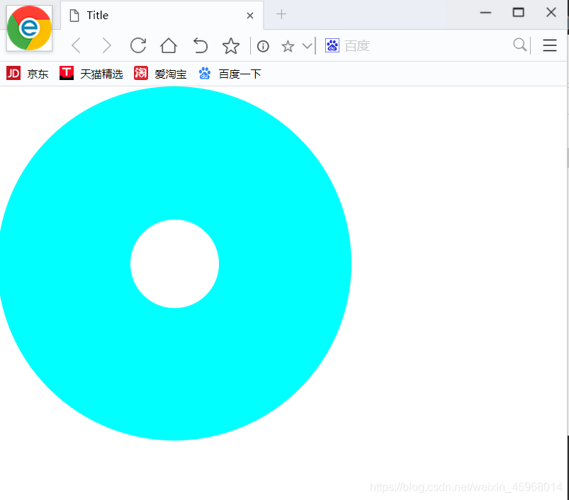
border-radius属
- css3的圆角边框实际是在矩形的是个角分别做内切圆,然后通过设置内切圆的半径来控制圆角的弧度。
- css3的圆角边框使用border-radius实现。基本语法是:border-radius:1-4 length|%/1-4 length | %
- length 的值不可为负值,/的前面的值是水平半径,后面的值但是垂直半径,无/则水平和垂直一样。顺序是top-left、top-right、bottom-fight、bottom-left,省略bottom-left,则与top-right相同,省略bottom-right与top-left相同,省略top-left与top-right相同
- 写法:border-top-left-radius:左上角
border-top-right-radius:右上角
border-bottom-left-radius:右下角
border-bottom-left-radius:左下角 - 画一个双圆例子如下
<!DOCTYPE<!DOCTYPE html>
<html lang="en">
<head>
    <meta charset="UTF-8">
    <title>Title</title>
    <style>
        *{padding: 0px;
        margin: 0px;}
        #one{
            width: 400px;
            height: 400px;
            background-color: aqua;
            border-radius: 50%;
            float: left;
            position: fixed;
        }
        #two{
            float: left;
            width: 100px;
            height: 100px;
            background: white;
            border-radius: 50px;
            position: fixed;
            left: 150px;
            top:150px;

        }
    </style>
</head>
<body>
<div id="one"></div>
<span id="two"></span>
</body>
</html>
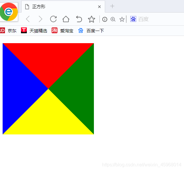
画一个正方形利用border-radius属性:
<!DOCTYPE<!DOCTYPE html>
<html lang="en">
<head>
    <meta charset="UTF-8">
    <title>正方形</title>
    <style>
        div{width: 0px;
            border-top:50px solid red;
            border-bottom: 50px solid rgb(199, 46, 135);
            border-left:50px solid rgb(86, 86, 226);
            border-right: 50px solid rgb(88, 69, 3);
        }
    </style>
</head>
<body>
<div></div>
</body>
</html>
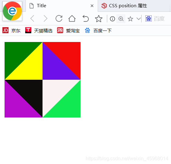
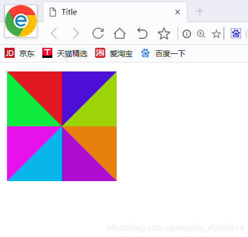
画两个正方形,利用border-radius属性的使用:
<!DOCTYPE<!DOCTYPE html>
<html lang="en">
<head>
    <meta charset="UTF-8">
    <title>Title</title>
    <style>
        #one{
            height: 0px;
            width: 0px;
            border-top:50px  solid rgb(226, 24, 34);
            border-left: 50px solid rgb(15, 235, 62);
            float: left;
        }
        #two{
            height: 0px;
            width: 0px;
            float: left;
            border-top:50px  solid rgb(75, 15, 214);
            border-right: 50px solid rgb(157, 212, 6);
        }
        #three{
            height: 0px;
            width: 0px;
            border-top:50px  solid rgb(229, 18, 236);
            border-right: 50px solid rgb(9, 182, 235);
            position: fixed;
            top: 58px;
        }
        #four{
            height: 0px;
            width: 0px;
            border-top:50px  solid rgb(230, 128, 13);
            border-left: 50px solid rgb(175, 14, 207);
            position: fixed;
            top:58px;
            left:58px;

        }
    </style>
</head>
<body>
<div id="one"></div>
<div id="two"></div>
<div id="three"></div>
<div id="four"></div>

</body>
</html>
css过渡效果
- css3 transition过渡就是平滑的改变一个元素的css值,从元素一个样式逐渐过渡到另一个样式。
- 必须规定两项内容:规定应用的过渡效果css属性名称,规定效果的时长。
- transition属性基本语法:transition:property duration timing-function delay;
- transition是一个复合属性
transition-property:规定过渡css属性名称。none、all、property
transition-duration:定义过渡效果花费的时间,time秒和毫秒
transition-timing-function:过渡效果时间曲线:linear、ease(慢速开始变快慢速)、ease-in、ease-out、ease-in-out
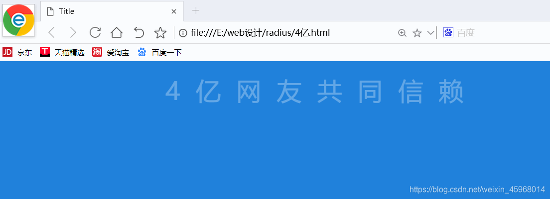
transition-delay:效果开始之前需要等待的时间 - 一段文字从分开过渡到一起列子:
<!DOCTYPE<!DOCTYPE html>
<html lang="en">
<head>
    <meta charset="UTF-8">
    <title>Title</title>
    <style>
        body{
            background:rgb(32, 129, 219);
        }
        p{
            color:rgba(255, 255, 255,0.3);
            letter-spacing: 10px;
            text-align: center;
        }
        p:hover{
            color:white;
            letter-spacing: 0px;
            transition: all 5s ease;
        }

    </style>
</head>
<body>
<p>4亿网友共同信赖</p>
</body>
</html>

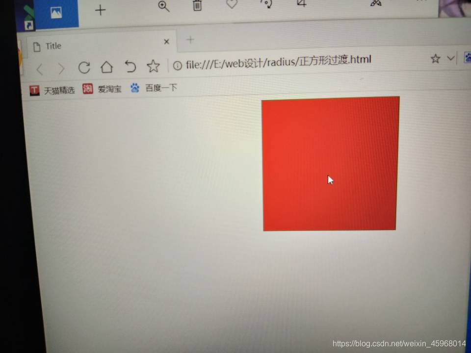
- 一个正方形变大改变颜色:
<!DOCTYPE<!DOCTYPE html>
<html lang="en">
<head>
    <meta charset="UTF-8">
    <title>Title</title>
    <style>
        #one{
            width: 150px;
            height: 150px;
            border:1px green solid ;
            background: green;
            margin: auto;
        }
        #one:hover{
            background:rgb(240, 15, 15);
            transition:all 3s ease;
            height: 200px;
            width: 200px;
        }
    </style>
</head>
<body>
<div id="one"></div>
</body>
</html>