UI
一、 Android中常用控件的使用方法
1. TextView
TextView常用指定代码如下所示:
1、android:text 设置文本的内容
2、android:textColor设置文本的颜色
3、android:textSize设置文本的字体大小(一般使用sp)
4、android:height 设置文本的高度(一般使用dp)
5、android:width 设置文本的宽度(一般使用dp)
6、android:inputType设置文本的类型,默认为普通文本,可选textPassword等类型(通常在EditText中使用)
7、android:ems 设置textView的宽度为N个字符的宽度
8、android:gravity设置文本框的内容相对于文本框的位置(可以使用多个属性中间用 “ | ”分割)
9、android:drawableLeft用于在文本框左侧绘制图片
10、android:drawableRight用于在文本框右侧绘制图片
11、android:drawableTop用于在文本框顶部绘制图片
12、android:drawableBottom用于在文本框底部绘制图片
13、android:hint 设置默认显示字体
14、android:textStyle设置字形,斜体,粗体等,多个属性用“ | ”隔开
15、android:ellipsize设置当文字过长的时候该控件如何显示。
16、android:maxLength:限制文本的长度,超出部分将会不显示
17、android:lines 设置显示的行数,即使没有数据也会显示
18、android:singleLine设置文本是否单行显示
19、android:clickable把其属性更改为true,为textView设置事件拦截
网传跑马灯效果的low版实现:
首先更改布局文件:
<?xml version="1.0" encoding="utf-8"?>
<RelativeLayout xmlns:android="http://schemas.android.com/apk/res/android"
xmlns:tools="http://schemas.android.com/tools"
android:layout_width="match_parent"
android:layout_height="match_parent" >
<!--首先设置布局为相对布局-->
<TextView
android:id="@+id/textView"
android:layout_width="wrap_content"
android:layout_height="wrap_content"
android:textSize="40sp"
android:singleLine="true"
android:ellipsize="marquee"
android:marqueeRepeatLimit="marquee_forever"
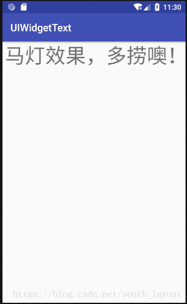
android:text="跑马灯效果,多捞噢!" />
<!--第一行指定Text id标识不多说了,与Button类似,第二、三行指定宽度与高度刚好包含的
了Text即可,第四行指定了字号大小,第五行用于设置当行显示,第六行是重点ellipize设
置为marquee就是跑马灯属性,第七行marqueeReatLimit设置marquee_forever的意思
为一直都是滚动模式,第八行指定了需要跑马灯效果的Text内容。
-->
</RelativeLayout>
其次一定要在Activity里面设置一个属性tv.setSelected(true); 不设置这个属性,字体不会开始滚动,Activity指令如下:
package activitytext.example.com.uiwidgettext;

import android.support.v7.app.AppCompatActivity;
import android.os.Bundle;
import android.widget.TextView;

public class MainActivity extends AppCompatActivity {

    @Override
    protected void onCreate(Bundle savedInstanceState) {
        super.onCreate(savedInstanceState);
        setContentView(R.layout.activity_main);
        TextView tv = (TextView) findViewById(R.id.textView);
        tv.setSelected(true);
    }
}
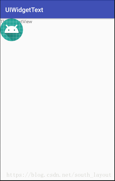
效果如图:会自动滚动

2.Button
Button的可使用的配置与TextView差不多,我们可以在布局文件里这样加入Button:
<LinearLayout xmlns:android="http://schemas.android.com/apk/res/android"
    xmlns:tools="http://schemas.android.com/tools"
    android:layout_width="match_parent"
    android:layout_height="match_parent" >

    <Button
        android:layout_width="match_parent"
        android:layout_height="wrap_content"
        android:id="@+id/button"
        android:text="Button"/>
</LinearLayout>
小插曲:布局里面设置的文件是“Button"但是最终显示的结果是"BUTTON"因为系统会把Button里所有的英文字母自动进行大写转换,要取消这一效果可以在<Button/>中加入一句:
android:textAllCaps="false"/>
Button监听的基本方法的实现:
方式一:匿名类方式。在MainActivity为Button注册一个监听器:
public class MainActivity extends AppCompatActivity {

    @Override
    protected void onCreate(Bundle savedInstanceState) {
        super.onCreate(savedInstanceState);
        setContentView(R.layout.activity_main);
        Button button =(Button) findViewById(R.id.button);
        button.setOnClickListener(new View.OnClickListener(){
                                      @Override
                                      public void onClick(View v) {
                                     //在此添加逻辑(你想要实现的什么)

         }
            }
        );}
        //点击按钮时,会执行监听器中onClick()方法
}
方式二:实现接口的方式。使用实现接口的方式进行注册:
public class MainActivity extends AppCompatActivity  implements View.OnClickListener{

    @Override
    protected void onCreate(Bundle savedInstanceState) {
        super.onCreate(savedInstanceState);
        setContentView(R.layout.activity_main);
        Button button = (Button) findViewById(R.id.button);
        button.setOnClickListener(this);
    }

    @Override
    public void onClick(View v) {
        switch (v.getId()){
            case R.id.button:
                //在此添加逻辑
                break;
                default:
                    break;
        }
    }

}
3.EditText
EditText在前面并没有怎么接触到。EditText是程序用于和用户进行交互的另一个重要控件,它允许用户在控件里输入和编辑内容,并可以在程序中对这些内容进行处理。
首先现在布局文件中加入EditText
<LinearLayout xmlns:android="http://schemas.android.com/apk/res/android"
    xmlns:tools="http://schemas.android.com/tools"
    android:layout_width="match_parent"
    android:layout_height="match_parent" >

    <EditText
        android:layout_width="match_parent"
        android:layout_height="wrap_content"
        android:id="@+id/edit_text"/>
</LinearLayout>
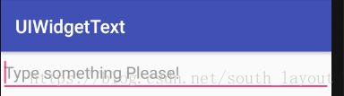
在输入框中加入提示性文字(一旦用户输入任何内容,提示性的文字就会消失):即在EditText中加入一个属性:
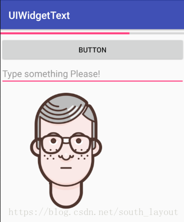
<LinearLayout xmlns:android="http://schemas.android.com/apk/res/android"
    xmlns:tools="http://schemas.android.com/tools"
    android:layout_width="match_parent"
    android:layout_height="match_parent" >

    <EditText
        android:layout_width="match_parent"
        android:layout_height="wrap_content"
        android:id="@+id/edit_text"
        android:hint="Type something Please!"/>
</LinearLayout>
运行效果如图:用户可在长下划线中编辑文字。
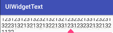
当随着输入的内容不断增多,EditText会不断拉长,因为高度是wrap_content,因此总能包含主里面的内容,当输入内容过多时会非常的丑。我们可以加入android:maxlines这个属性来解决这个问题:
<EditText
    android:layout_width="match_parent"
    android:layout_height="wrap_content"
    android:id="@+id/edit_text"
    android:hint="Type something Please!"
    android:maxLines="2"/>
    <!--这里设置了EditText的最大长度为两行,这样输入的内容超过两行后,
    文本就会自动向上滚动,则不会继续拉伸,用户可以上下滑动EditText
    来浏览全部内容。-->
运行效果如图:
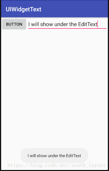
我们还可以结合EditText和Button与Toast来进行一些操作,比如点击按钮来获取EditText中输入的内容:
首先修改ManiActivity中的代码:
public class MainActivity extends AppCompatActivity implements View.OnClickListener{
     private EditText editText;
    @Override
    protected void onCreate(Bundle savedInstanceState) {
        super.onCreate(savedInstanceState);
        setContentView(R.layout.activity_main);
        Button button=(Button) findViewById(R.id.button);
        editText=(EditText)findViewById(R.id.edit_text);
        button.setOnClickListener(this);
    }

    @Override
    public void onClick(View v) {
        switch (v.getId()){
            case R.id.button:
                String inputText=editText.getText().toString();
            Toast.makeText(MainActivity.this,inputText,
                    Toast.LENGTH_SHORT).show();
            break;
            default:
                break;
        }
    }
}
/*
//首先通过findViewById()方法得到EditText的实例,然后在按钮的点击事件里调用EditText的getText()方法
来获取到输入的内容,再调用toString()方法转换成字符串,最后使用Toast将获取的内容显示出来*/
运行效果如图:
4.ImageView
ImageView是用于在界面上展示图片的一个控件、使用时我们首先要再布局文件里定义一个ImageView:
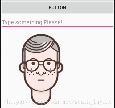
<ImageView
     android:layout_width="wrap_content"
     android:layout_height="wrap_content"
     android:id="@+id/image_view"
     android:src="@drawable/img_1"/>
//可以看到这里通过android:src属性给ImageView指定了一张图片。由于图片宽度高度未知
    ,所以width和height都设定为wrap_content
</LinearLayout>
我们还可以通过代码动态地更改ImageView中的图片,比如点击一个Button使其变成另外一张图片,在MainActivity修改如下:
public class MainActivity extends AppCompatActivity implements View.OnClickListener{
     private EditText editText;
     private ImageView imageView;
    @Override
    protected void onCreate(Bundle savedInstanceState) {
        super.onCreate(savedInstanceState);
        setContentView(R.layout.activity_main);
        Button button=(Button) findViewById(R.id.button);
        editText=(EditText)findViewById(R.id.edit_text);
        imageView=(ImageView)findViewById(R.id.image_view);
        button.setOnClickListener(this);
    }

    @Override
    public void onClick(View v) {
        switch (v.getId()){
            case R.id.button:
                imageView.setImageResource(R.drawable.img_2);
                String inputText=editText.getText().toString();
            Toast.makeText(MainActivity.this,inputText,
                    Toast.LENGTH_SHORT).show();
            break;
            default:
                break;
        }
    }
}
效果如下图:
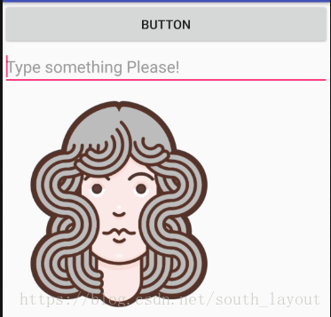
点击按钮以后变为:
小插曲:由于AS一般会自动使用的布局是RelativeLayout,即相对布局. 此时需要把RelativeLayout改为LinearLayout .直接修改它会报错。
Wrong orientation? No orientation specified, and the default is horizontal, yet thislayout has multiple children where at least one haslayout_width="match_parent",并且我们Button充满了整个屏幕,ImageView、EditText都被覆盖了。
解决方法:
通常发生这个错误提示的原因是我们直接在原有的页面上把别的布局标签改成<LinearLayout>,但是使用<LinearLayout>标签要指明方向,水平方向还是垂直方向
android:orientation="horizontal"
有人会问当用了android:orientation="horizontal"运行之后界面只显示一个<Textview>而自己写了4个<Textview>这是因为它的属性是为垂直线性布局的,所以只有一个显示。
解决办法:
改为下面的布局
android:orientation = "vertical"
5.progressBar
ProgressBar是一种进度条组件,通常向用户展示某个耗时操作完成的进度,而不让用户觉得是程序失去了相应,从而更好的提升了用户界面的友好性。
它的用法和以上控件及其相似,首先先修改activity_main.xml中的代码:
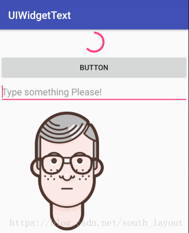
<ProgressBar
    android:layout_width="match_parent"
    android:layout_height="wrap_content"
    android:id="@+id/progress_bar"/>
运行后会发现有一个圆形进度条正在旋转:
旋转的进度条表示我们的程序正在加载数据,数据总是有加载完的时候,这个时候进度条就应该消失,不应该一直旋转下去了,要实现它需要用到android:visibility这个属性进行指定,可选值有三个,分别是:visible、invisible、gone。visible表示这个控件式可见的,这个也是一般控件的默认值,invisible表示控件不可见,但它仍占着原来的位置和大小,gone表示控件不仅不可见,而且不占用任何屏幕空间。我们还可以用代码实现控件的可见性,使用的是setVisibility()可以传入View.VISIBLE、View.INVISIBLE、View.GONE这三种值。为了测试我们来实现点击按钮让进度条出现和消失这种效果,先修改MainActivity中的代码:
public class MainActivity extends AppCompatActivity implements View.OnClickListener{
     private EditText editText;
     private ImageView imageView;
     private ProgressBar progressBar;
    @Override
    protected void onCreate(Bundle savedInstanceState) {
        super.onCreate(savedInstanceState);
        setContentView(R.layout.activity_main);
        Button button=(Button) findViewById(R.id.button);
        editText=(EditText)findViewById(R.id.edit_text);
        imageView=(ImageView)findViewById(R.id.image_view);
        progressBar=(ProgressBar)findViewById(R.id.progress_bar);
        button.setOnClickListener(this);
    }

    @Override
    public void onClick(View v) {
        switch (v.getId()){

             case R.id.button:
                if(progressBar.getVisibility()==View.GONE){
                    progressBar.setVisibility(View.VISIBLE);
                }
                else {
                    progressBar.setVisibility(View.GONE);
                }
            break;
            default:
                break;
        }
    }
}
/*在按钮的点击事件中,我们通过getVisibility()方法来判断
 ProgressBar是否可见,如果可见就将ProgressBar隐藏掉,
 如果不可见就将ProgressBar显示出来*/
我们还可以给ProgressBar指定不同的央视,通过style属性将它换成水平进度条,修改activity_main.xml中的代码:
<ProgressBar
    android:layout_width="match_parent"
    android:layout_height="wrap_content"
    android:id="@+id/progress_bar"
    style="?android:attr/progressBarStyleHorizontal"/>
运行后:发现已经由圆形进度条变为水平进度条了。
换为水平进度条后,可以通过android:max属性给进度条设置一个最大值,然后在代码中动态地更改进度条的进度,修改MainActivity中的代码:
 @Override
    public void onClick(View v) {
        switch (v.getId()){

            case R.id.button:
                int progress=progressBar.getProgress();
                progress=progress+10;
                progressBar.setProgress(progress);

                break;
            default:
                break;
        }
    }
}
每点击一次按钮就会在现有的进度上加10作为更新后的进度。点击数次按钮后的效果如图:
6.AlertDialog
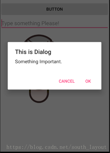
AlertDialog可以在当前的界面弹出一个对话框,且这个对话框是置顶于所有界面元素之上的,能够屏蔽掉其他控件的交互能力,因此AlertDialog一般都是用于提示一些非常重要的内容或者警告信息,下面我们就来练练手,首先先修改ManiActivity中的代码:
 @Override
    public void onClick(View v) {
        switch (v.getId()){
            case R.id.button:
                AlertDialog.Builder dialog=new AlertDialog.Builder(MainActivity.this);
                dialog.setTitle("This is Dialog");
                dialog.setMessage("Something Important.");
                dialog.setCancelable(false);
                dialog.setPositiveButton("OK", new DialogInterface.OnClickListener() {
                    @Override
                    public void onClick(DialogInterface dialog, int which) {

                    }
                });
                dialog.setNegativeButton("Cancel", new DialogInterface.OnClickListener() {
                    @Override
                    public void onClick(DialogInterface dialog, int which) {

                    }
                });
                dialog.show();
                break;
            default:
                break;
        }
    }
}
/*首先通过AlertDialog.Builder创建一个AlertDialog的实例,然后可以为这个对话框
 设置标题、内容、可否用Back键关闭对话框等属性,接下来调用setPositiveButton()
方法来为对话框确定按钮的点击事件,调用setNegativeButton()方法设置取消按钮点击事件
最后调用show()方法将对话框显示出来*/
运行后效果如图:
7.ProgressDialog
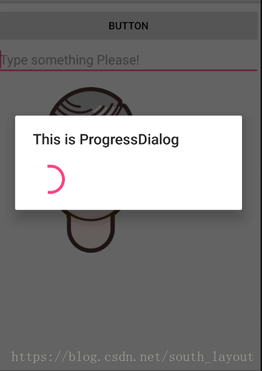
ProgressDialog与AlertDialog类似,都可以在界面上弹出一个对话框,都能够屏蔽掉其他控件的交互能力,不同的是,ProgressDialog会在对话框显示一个进度条,一般用于表示当前操作比较耗时,让用户耐心地等待。它的用法与AlertDialog也比较类似,修改MainActivity中的代码:
 @Override
    public void onClick(View v) {
        switch (v.getId()){
            case R.id.button:
                ProgressDialog progressDialog=new ProgressDialog(MainActivity.this);
                progressDialog.setTitle("This is ProgressDialog");
                ProgressDialog.setMessage("Loading.....");
                progressDialog.setCancelable(true);
                progressDialog.show();
                break;
            default:
                break;
        }
    }
}
/*首先先构建出一个ProgressDialog对象,然后同样可以设置标题、可否取消等属性,
最后也是通过调用show()方法将ProgressDialog显示出来*/
运行效果如图:
注:如果在setCancelable()中传入了false,表示ProgressDialo不能通过Back键取消掉的,这个时候需要在数据完成后调用ProgressDialog的dismiss()方法来关闭对话框,否则ProgressDialog会一直存在
二、四种基本布局(本因有五种基本布局,但是AbsoluteLayout(绝对布局)已经基本上被禁用了,因此就不考虑此了)
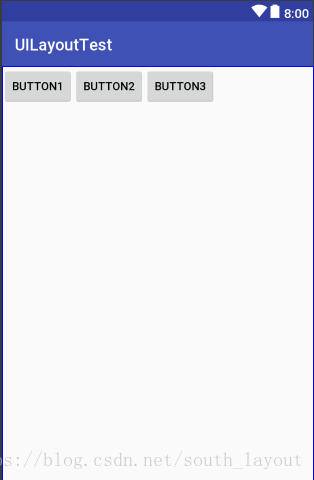
1.线性布局
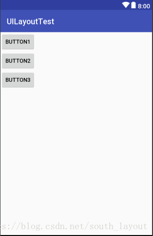
LinearLayout又称作线性布局,是一种非常常用的布局。通过android:orientation属性指定了排列方向是vertical,如果指定的是horizontal,控件就会在水平方向上排列了。首先修改activity_main.xml 这里我们创建了三个Button.并指定orientation即排列方式是垂直的。
<LinearLayout
xmlns:android="http://schemas.android.com/apk/res/android"
android:orientation="vertical"
android:layout_width="match_parent"
android:layout_height="match_parent"
    >
<Button
    android:id="@+id/button1"
    android:layout_width="wrap_content"
    android:layout_height="wrap_content"
    android:text="Button1"/>

<Button
    android:id="@+id/button2"
    android:layout_width="wrap_content"
    android:layout_height="wrap_content"
    android:text="Button2"/>
<Button
    android:id="@+id/button3"
    android:layout_width="wrap_content"
    android:layout_height="wrap_content"
    android:text="Button3"/>
</LinearLayout>
运行后的结果如图:
之后我们修改排列方式为水平(horizontal)后,运行的效果如图:
注:如果LinearLayout的排列方向是horizontal,内部的控件就绝对不能将宽度指定为match_parent,因为这样的话,单独一个控件就会将整个水平方向占满,其他的控件就没有可放置的位置了。同样的道理,如果LinearLayout的排列方向是vertical,内部的控件就不能将高度指定为match_parent。
接下来是了解android:layout_gravity属性,android:gravity用于指定文字在布局中的对齐方式。而layout_gravity用于指定控件在布局中的对齐方式。注意的是,当LinearLayout的排列方向是horizontal时,只有垂直方向上的对齐方式才会生效,因为此时水平向上的长度是不固定的,每添加一个控件,水平方向上的长度都会改变,因而无法指定该方向上的对齐方式。同理,当LinearLayout的排列方向是vertical时,只有水平方向上的对齐方式才会生效。同样修改activity.main.xml中的代码:
<LinearLayout
xmlns:android="http://schemas.android.com/apk/res/android"
android:orientation="horizontal"
android:layout_width="match_parent"
android:layout_height="match_parent"
    >
<Button
    android:id="@+id/button1"
    android:layout_width="wrap_content"
    android:layout_height="wrap_content"
    android:layout_gravity="top"
    android:text="Button1"/>

<Button
    android:id="@+id/button2"
    android:layout_width="wrap_content"
    android:layout_height="wrap_content"
    android:layout_gravity="center_vertical"
    android:text="Button2"/>
<Button
    android:id="@+id/button3"
    android:layout_width="wrap_content"
    android:layout_height="wrap_content"
    android:layout_gravity="bottom"
    android:text="Button3"/>
</LinearLayout>
运行后的结果如图:

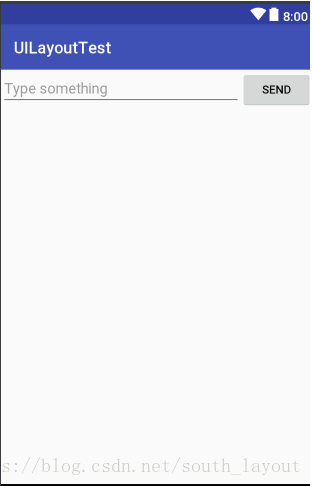
LinearLayout的另外一个重要属性——android:layout_weight.这个属性允许我们使用比例的方式来指定控件的大小,它在手机屏幕的适配性方面可以起到非常重要的作用。
<LinearLayout
xmlns:android="http://schemas.android.com/apk/res/android"
android:orientation="horizontal"
android:layout_width="match_parent"
android:layout_height="match_parent"
    >
<EditText
    android:id="@+id/input_message"
    android:layout_width="0dp"
    android:layout_weight="1"
    android:layout_height="wrap_content"
    android:hint="Type something"
    />
<Button
    android:layout_width="0dp"
    android:layout_weight="1"
    android:id="@+id/send"
    android:layout_height="wrap_content"
    android:text="send"/>
</LinearLayout>
注:这里把EditText和Button的宽度都指定为了0dp,但是我们的文本编辑框和按钮依然还可以显示,因为我们是哟个了android:layout_weight属性,此时控件的宽度就不再由android:layout_width来决定且指定为0dp是比较规范的写法
Layout_weight属性的值指定为1,这表示EditText和Button将在水平方向上平分宽度。系统会把LinearLayout下所有控件指定的layout_weight值相加,得到一个总值,然后每个控件所占大小的比例就是用该控件的layout_weight值除以刚才算出的总值。因此如果想让EditText占据屏幕宽度的3/5,Button占据屏幕宽度的2/5,只需要将EditText的layout_weight改成3,button的layout_weight改成2就可以了。
当然我们还可以通过指定部分控件的layout_weight值来实现更好地效果。修改代码:
<LinearLayout
xmlns:android="http://schemas.android.com/apk/res/android"
android:orientation="horizontal"
android:layout_width="match_parent"
android:layout_height="match_parent"
    >
<EditText
    android:id="@+id/input_message"
    android:layout_width="0dp"
    android:layout_weight="1"
    android:layout_height="wrap_content"
    android:hint="Type something"
    />
<Button
    android:layout_width="wrap_content"
    android:id="@+id/send"
    android:layout_height="wrap_content"
    android:text="send"/>
</LinearLayout>
这里仅指定了EditText的android:layout_weight属性,并将Button的宽度改回wrap_content。这表示Button的宽度仍然按照wrap_content来计算,而EditText则会占满屏幕所有的剩余空间。这种方法对各种屏幕的适配方面会非常好。运行效果如下图:
2.相对布局
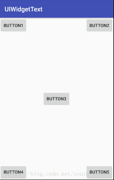
RelativeLayout(相对布局)也是一种常见的布局,和LinearLayout(线性布局)相比显得更加随意一点,它可以通过相对定位的方式让控件出现在布局的任何地方。首先我们依然修改activity_main.xml中的代码:
<?xml version="1.0" encoding="utf-8"?>
<RelativeLayout
    xmlns:android="http://schemas.android.com/apk/res/android"
    android:orientation="horizontal"
    android:layout_width="match_parent"
    android:layout_height="match_parent"
    >
    <Button
        android:layout_width="wrap_content"
        android:id="@+id/button1"
        android:layout_height="wrap_content"
        android:layout_alignParentLeft="true"
        android:layout_alignParentTop="true"
        android:text="button1"/>
    <!--Button1和父布局的左上角对齐-->
    <Button
        android:layout_width="wrap_content"
        android:id="@+id/button2"
        android:layout_height="wrap_content"
        android:layout_alignParentRight="true"
        android:layout_alignParentTop="true"
        android:text="button2"/>
    <!--Button2和父布局的右上角对齐-->
    <Button
        android:layout_width="wrap_content"
        android:id="@+id/button3"
        android:layout_height="wrap_content"
        android:layout_centerInParent="true"
        android:text="button3"/>
    <!--Button3居中显示-->
    <Button
        android:layout_width="wrap_content"
        android:id="@+id/button4"
        android:layout_height="wrap_content"
        android:layout_alignParentBottom="true"
        android:layout_alignParentLeft="true"
        android:text="button4"/>
    <!--Button4和父布局的左下角对齐-->
    <Button
        android:layout_width="wrap_content"
        android:id="@+id/button5"
        android:layout_height="wrap_content"
        android:layout_alignParentRight="true"
        android:layout_alignParentBottom="true"
        android:text="button5"/>
    <!--Button5和父布局的右下角对齐-->
</RelativeLayout>
运行后的效果如图:
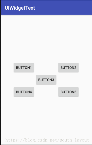
以上是关于父布局定位的,我们还可以关于某个控件定位:
<?xml version="1.0" encoding="utf-8"?>

<RelativeLayout
    xmlns:android="http://schemas.android.com/apk/res/android"
    android:orientation="horizontal"
    android:layout_width="match_parent"
    android:layout_height="match_parent"
    >
    <Button
        android:layout_width="wrap_content"
        android:id="@+id/button1"
        android:layout_height="wrap_content"
        android:layout_above="@id/button3"
        android:layout_toLeftOf="@id/button3"
        android:text="button1"/>

    <Button
        android:layout_width="wrap_content"
        android:id="@+id/button2"
        android:layout_height="wrap_content"
        android:layout_above="@id/button3"
        android:layout_toRightOf="@id/button3"
        android:text="button2"/>
    <Button
        android:layout_width="wrap_content"
        android:id="@+id/button3"
        android:layout_height="wrap_content"
        android:layout_centerInParent="true"
        android:text="button3"/>
    <Button
        android:layout_width="wrap_content"
        android:id="@+id/button4"
        android:layout_height="wrap_content"
        android:layout_below="@id/button3"
        android:layout_toLeftOf="@id/button3"
        android:text="button4"/>
    <Button
        android:layout_width="wrap_content"
        android:id="@+id/button5"
        android:layout_height="wrap_content"
        android:layout_below="@id/button3"
        android:layout_toRightOf="@id/button3"
        android:text="button5"/>
</RelativeLayout>

   <!-- android:layout_above可以让一个控件位于另一个控件的上方,
    但是应用时需要为这个属性指定相对控件id的引用,这里我们
    填入了@id/button3,表示让这个控件位于Button3的上方,其他
    属性与此类似。android:layout_below表示让一个控件位于另一
    控件下方,android:layout_toLeft0f表示让一个控件位于另一个
    控件的左侧,android:layout_toRight0f表示让一个控件位于另
    一个控件的右侧,注意:当一个控件去引用另一个控件的id时,该
    控件一定要定义在引用控件的后面,否则会出现找不到id的情况。-->
运行结果如下:
(注:还有一些相对于控件进行定位的属性如:android:layout_alignLeft表示让一个控件的左边缘和另一个控件的右边缘对齐,android:layout_alignRight表示让一个控件的右边缘和另一个控件的右边缘对齐;android:layout_alignTop和android:layout_alignButtom与此类似。)
3.帧布局
FrameLayout(帧布局),它没有方便的定位方式,所有的控件都会默认摆放在布局的左上角。修改activity_main.xml中的代码:
<FrameLayout
    xmlns:android="http://schemas.android.com/apk/res/android"
    android:orientation="horizontal"
    android:layout_width="match_parent"
    android:layout_height="match_parent"
    >
    <TextView
        android:id="@+id/text_view"
        android:layout_width="wrap_content"
        android:layout_height="wrap_content"
        android:text="This is TextView"/>
    <ImageView
        android:id="@+id/image_view"
        android:layout_width="wrap_content"
        android:layout_height="wrap_content"
        android:src="@mipmap/ic_launcher"/>
</FrameLayout>
运行结果如下图:
我们发现FrameLayout中只是放置了一个TextView和一个ImageView.可以看到,文字和图片都是位于布局的左上角。由于ImageView时在TextView之后添加的所以图片压在了文字上面。
我们还可以用layout_gravity属性来指定控件在布局中的对齐方式,修改后的代码如图所示:
<?xml version="1.0" encoding="utf-8"?>
<FrameLayout
    xmlns:android="http://schemas.android.com/apk/res/android"
    android:orientation="horizontal"
    android:layout_width="match_parent"
    android:layout_height="match_parent"
    >
    <TextView
        android:id="@+id/text_view"
        android:layout_width="wrap_content"
        android:layout_height="wrap_content"
        android:layout_gravity="left"
        android:text="This is TextView"/>
    <ImageView
        android:id="@+id/image_view"
        android:layout_width="wrap_content"
        android:layout_height="wrap_content"
        android:layout_gravity="right"
        android:src="@mipmap/ic_launcher"/>
</FrameLayout>
这里我们指定了TextView在FrameLayout中居左对齐,指定ImageView在FrameLayout居右对齐,运行效果如图:

4.百分比布局
百分比布局,我们可以不再用wrap_content、match_parent等方式来指定控件大小,而是允许直接指定控件在布局中所占的百分比。百分比布局只为FrameLayout和RelativeLayout进行功能扩展,提供了PercentFrameLayout和PercentRelativeLayout这两个全新的布局,百分比布局属于新增布局,为了保证所有的版本都能够使用,我们需要在build.gradle中添加百分比布局库的依赖,这样就能保证安卓所有版本的兼容性问题了。
首先打开app/build.gradle文件,在dependencies闭包中添加如下内容:compile 'com.android.support:percent:26.1.0'
dependencies {
    implementation fileTree(dir: 'libs', include: ['*.jar'])
    implementation 'com.android.support:appcompat-v7:26.0.0-beta1'
    implementation 'com.android.support.constraint:constraint-layout:1.0.2'
    testImplementation 'junit:junit:4.12'
    androidTestImplementation 'com.android.support.test:runner:0.5'
    androidTestImplementation 'com.android.support.test.espresso:espresso-core:2.2.2'
    compile 'com.android.support:percent:26.1.0'
}
切记这时候一定记得Sync(同步),然后修改activity_main.xml中的代码:
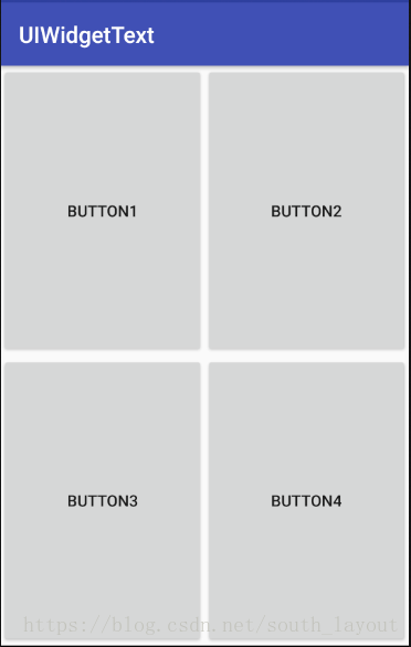
<?xml version="1.0" encoding="utf-8"?>
<android.support.percent.PercentFrameLayout
    xmlns:android="http://schemas.android.com/apk/res/android"
    xmlns:app="http://schemas.android.com/apk/res-auto"
    android:layout_width="match_parent"
    android:layout_height="match_parent">
    <!--这里是最外层,我们是使用了PercentFrameLayout,由于百分比布局并不是内置在系统
    SDK当中的,所以需要把完整的包路径写出来,还必须定义一个app的命名空间,这样才能
    使用百分比布局的自定义属性。-->
    <Button
        android:id="@+id/button1"
        android:text="Button1"
        android:layout_gravity="left|top"
        app:layout_widthPercent="50%"
        app:layout_heightPercent="50%"
        />
    <Button
        android:id="@+id/button2"
        android:text="Button2"
        android:layout_gravity="right|top"
        app:layout_widthPercent="50%"
        app:layout_heightPercent="50%"
        />
    <Button
        android:id="@+id/button3"
        android:text="Button3"
        android:layout_gravity="left|bottom"
        app:layout_widthPercent="50%"
        app:layout_heightPercent="50%"
        />
    <Button
        android:id="@+id/button4"
        android:text="Button4"
        android:layout_gravity="right|bottom"
        app:layout_widthPercent="50%"
        app:layout_heightPercent="50%"
        />
    <!--在PercentFrameLayout中我们定义了4个按钮,使用app:layout_widthPercent属性将各按钮的
    宽度指定为布局的50%,使用app:layout_heightPercent属性将各按钮的高度指定为布局的50%。
    这里能使用app前缀的属性就是因为刚才定义了一个app的命名空间。PercentFrameLayout继承了
    FrameLayout的特性,即所有的控件默认都是摆在布局左上角,为了不重叠与上面一样借助了lay
    out_gravity来分别将这4个按钮放置在布局的左上、右上、左下、右下四个位置-->
</android.support.percent.PercentFrameLayout>
小插曲:运行编译出现报错,错误如下:
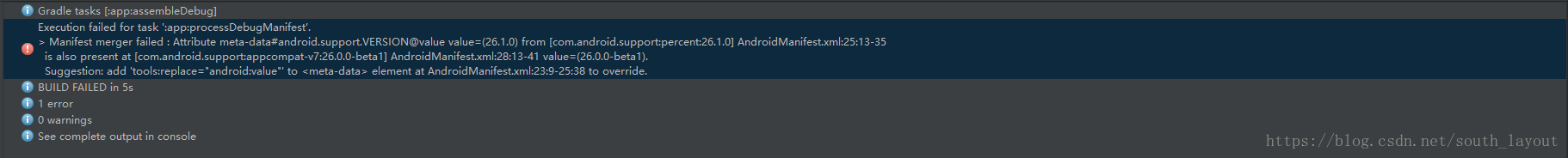
经过查找资料解决方法如下:在app/build.gradle最后加上以下代码:
configurations.all {
    resolutionStrategy.eachDependency { DependencyResolveDetails details ->
        def requested = details.requested
        if (requested.group == 'com.android.support') {
            if (!requested.name.startsWith("multidex")) {
                details.useVersion '25.3.0'
            }
        }
    }
}
编译即可通过,运行结果如下:
另外一个PercentRelativeLayout的用法也是非常相识的,它继承了RelativeLayout中的所有属性,并且可以使用app:layout_widthPercent和app:layout_heightPercent来按百分比指定控件的宽高。