文章目录
文本的新增样式
opacity 和 rgba
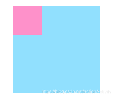
opacity 和 rgba 都是设置透明度,opacity 是一个不可继承的属性,但是它可以被子元素继承。
<!-- opacity 属性 -->
<style>
    .box1 {
        width: 300px;
        height: 300px;
        background: deepskyblue;
        margin: 100px auto;
        opacity: 0.5;
        /* opacity 不是一个可继承的属性,但是它可以被继承 */
    }

    .box2 {
        width: 100px;
        height: 100px;
        background-color: deeppink;
    }
</style>
<div class="box1">
	<div class="box2"></div>
</div>
运行结果
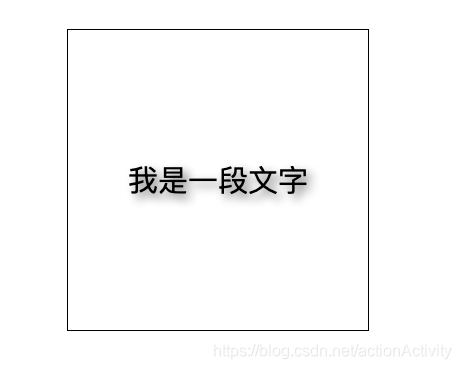
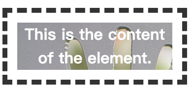
使用 rgba 做一个背景透明文字不透明的效果
<!-- rgba -->
<style>
    * {
        margin: 0;
        padding: 0;
    }

    .box {
        width: 400px;
        height: 400px;
        font: 20px/400px "黑体";
        border: 1px solid;
        text-align: center;
        margin: 100px auto;
        /* 透明度为 .3 */
        background-color: rgba(0, 0, 0, 0.3);
        color: white;
    }
</style>
<body>
    <div class="box">我是 box 中的文字</div>
</body>
运行结果
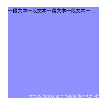
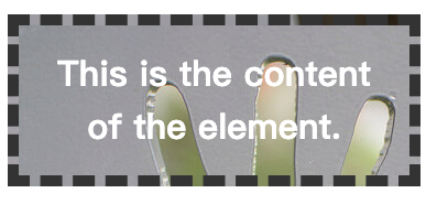
文本溢出显示省略号
<style>
    .box1 {
        width: 300px;
        height: 300px;
        background: rgba(25, 0, 255, 0.5);
        margin: 100px auto;
        white-space: nowrap;  /* 设置文字不换行 */
        overflow: hidden;     /* 设置超出截断 */
        text-overflow: ellipsis;  /* 显示省略号... */
        display: block;  /* 为块级元素,包裹区域必须不能让子元素撑开 */
    }
</style>

<body>
    <div class="box1">
        一段文本一段文本一段文本一段文本一段文本一段文本一段文本一段文本一段文本一段文本一段文本一段文本一段文本一段文本一段文本一段文本一段文本一段文本一段文本一段文本一段文本
    </div>
</body>
运行结果
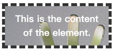
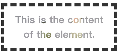
如果包裹区域的宽度是由子元素撑开的,则不能显示省略号。
<style>
    .box1 {
        /* width: 300px; */
        /* height: 300px; */
        background: rgba(25, 0, 255, 0.5);
        margin: 100px auto;
        white-space: nowrap;
        overflow: hidden;
        text-overflow: ellipsis;
        display: inline;
    }
</style>
运行结果,不会显示省略号。

文字阴影
box-shadow 属性可以设置文字的阴影,有四个属性值
- 表示水平方向的偏移量(可以设置负值)
- 表示垂直方向的偏移量(可以设置负值)
- 阴影的模糊程度 (不可以设置负值)
- 阴影的颜色
<style>
    .box{
        width: 300px;
        height: 300px;
        line-height: 300px;
        text-align: center;
        font-size: 30px;
        border: 1px solid;
        margin: 100px auto;

        /* 设置文字阴影 */
        text-shadow: 5px 5px 10px gray;
    }
</style>
<body>
    <div class="box">
        我是一段文字
    </div>
</body>
运行结果
盒模型的新增样式
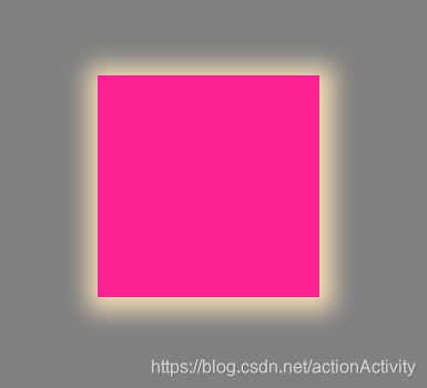
盒模型的阴影
box-shadow 属性来设置盒子的阴影,有6个属性值,可以设置多个阴影,第一个阴影在最上边。
inset表示 内阴影- 控制水平方向的范围(可以为负值)
- 控制垂直方向的范围(可以为负值)
- 控制阴影模糊程度(不能为负值)
- 控制阴影实际大小(可以为负值)
<style>
    * {
        padding: 0;
        margin: 0;
    }

    body {
        background-color: gray;
    }

    .box {
        width: 200px;
        height: 200px;
        position: absolute;
        top: 0;
        left: 0;
        right: 0;
        bottom: 0;
        margin: auto;
        background-color: deeppink;
        box-shadow: 2px 2px 20px 10px wheat;
    }
</style>

<body>
    <div class="box"></div>
</body>
运行结果
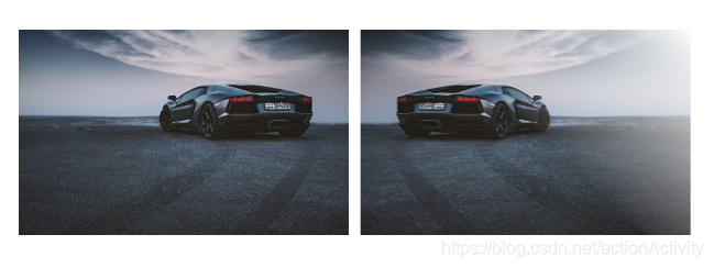
倒影
box-reflect 可以设置倒影,只有 webkit 内核的浏览器(Chrome、Safari)支持该属性,
第一个参数表示倒影的方向
above 上方
below 下方
left 左方
right 右方
第二个参数表示间距
第三个参数可以是一个渐变值
-webkit-box-reflect: right 10px linear-gradient(-90deg,rgba(0, 0, 0, 1) 180px, rgba(0, 0, 0, 0));
<style>
    * {
        padding: 0;
        margin: 0;
    }

    .box {
        border: 1px solid deeppink;
        text-align: center;
        position: absolute;
        top: 0;
        left: 0;
        right: 0;
        bottom: 0;
        margin: auto;
    }

    .box::after {
        content: "";
        display: inline-block;
        height: 100%;
        vertical-align: middle;
    }

    .box img {
        vertical-align: middle;
        /* 设置带渐变的倒影 */
        -webkit-box-reflect: right 10px linear-gradient(-45deg,rgba(0, 0, 0, 1) 180px, rgba(0, 0, 0, 0));
    }
</style>

<body>
    <div class="box">
        <img src="../img/1.jpg" alt="" width="300">
    </div>
</body>
运行结果
box-sizing
box-sizing 属性定义了 user agent 应该如何计算一个元素的总宽度和总高度。
content-box
width = 内容的宽度
height = 内容的高度boder-box
width = border + padding + 内容的宽度
height = border + padding + 内容的高度
<style>
    * {
        padding: 0;
        margin: 0;
    }

    .box {
        width: 200px;
        height: 200px;
        padding: 50px;
        border: 1px solid deeppink;
        text-align: center;
        position: absolute;
        top: 0;
        left: 0;
        right: 0;
        bottom: 0;
        margin: auto;
        background-color: wheat;
    }
</style>

<body>
    <div class="box"></div>
</body>
没有设置box-sizing 的时候 元素应该在红色区域的位置,它是被padding挤下去的
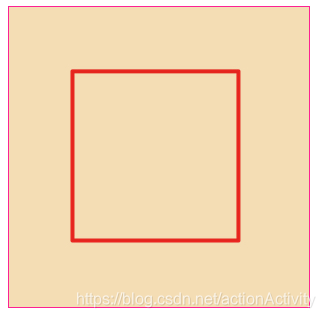
当设置了box-sizing属性为 border-box 以后,元素宽高的计算方式就变成了width = border + padding + 内容的宽度
height = border + padding + 内容的高度
box-sizing:border-box;
运行结果
新增的UI样式
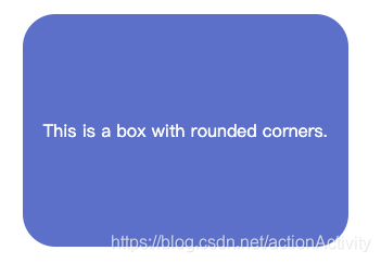
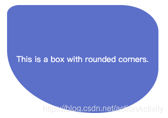
圆角
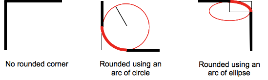
CSS 属性
border-radius允许你设置元素的外边框圆角。当使用一个半径时确定一个圆形,当使用两个半径时确定一个椭圆。这个(椭)圆与边框的交集形成圆角效果。
border-radius: 30px;
/*  */
border-radius: 25% 10%;
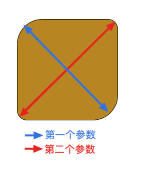
border-radius: 10% 30% 50% 70%;
圆角风车 demo
<style>
    html,
    body {
        height: 100%;
        overflow: hidden;
    }

    .box {
        width: 300px;
        height: 300px;
        position: absolute;
        top: 0;
        left: 0;
        right: 0;
        bottom: 0;
        margin: auto;
        transition: 5s;
    }

    .box:hover {
        transform: rotate(3600deg);
    }

    .box::before {
        content: "";
        display: block;
        position: absolute;
        top: 0;
        left: 0;
        right: 0;
        bottom: 0;
        margin: auto;
        width: 50px;
        height: 50px;
        background: deeppink;
        border: 1px solid;
        border-radius: 50%;
    }


    .box>div {
        width: 130px;
        height: 130px;
        margin: 10px;
        float: left;
        box-sizing: border-box;
    }

    .box>div:nth-child(1),
    .box>div:nth-child(4) {
        border-radius: 0 60%;
    }

    .box>div:nth-child(2),
    .box>div:nth-child(3) {
        border-radius: 60% 0;
    }

    .box>div:nth-child(1) {
        background-color: #be3a30;
    }

    .box>div:nth-child(2) {
        background-color: #f0c330;
    }

    .box>div:nth-child(3) {
        background-color: #2bc4a4;
    }

    .box>div:nth-child(4) {
        background-color: #39ca74;
    }

    .gan {

        width: 50px;
        height: 473px;
        background: darkorange;
        position: fixed;
        top: 300px;
        left: 300px;
        right: 0;
        bottom: 0;
        margin: auto;
        z-index: -1;
        transform: rotate(-45deg);
        border-radius: 50px;
    }
</style>

<body>
    <div class="box">
        <div></div>
        <div></div>
        <div></div>
        <div></div>
    </div>
    <div class="gan"></div>
</body>
运行效果
背景总结
更详细的应用请到MDN 文档查看!
css2
background-color 设置背景颜色
background-img 设置背景图片
background-repeat 设置背景图片的平铺方式
background-position 设置背景图片在背景区域中的位置
- 可以是
px,也可以是百分比,百分比参照与背景区域 - 背景图片的位图像素值
background-attachment
scroll: 默认值,背景图不会随着元素滚动条的滚动而滚动。fixed:背景图铺在视窗中,相当于固定定位
css3
background-size 控制大小,图片是自适应的。
background-origin控制起始剪切位置
- 注意:当使用
background-attachment 为 fixed时,该属性将被忽略不起作用。 - 默认值
padding-box border-box背景图片的摆放以border区域为参考padding-box背景图片的摆放以padding区域为参考content-box背景图片的摆放以content区域为参考
background-clip设置元素的背景(背景图片或颜色)是否延伸到边框下面。
background-clip: border-box;
background-clip: padding-box;
background-clip: content-box;
background-clip: text;
-webkit-background-clip: text;
color: transparent;
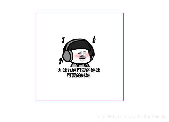
图片的水平垂直居中
.box::after {
        content: "";
        display: inline-block;
        height: 100%;
        vertical-align: middle;
}

img{
        vertical-align: middle;
}
实例代码
<style>
    * {
        margin: 0;
        padding: 0;
    }

    .box {
        width: 300px;
        height: 300px;

        position: absolute;
        top: 0;
        left: 0;
        right: 0;
        bottom: 0;
        margin: auto;
        text-align: center;

        border: 1px solid deeppink;
    }
    .box::after{
        content: "";
        display: inline-block;
        vertical-align: middle;
        height: 100%;
    }
    img{
        width: 150px;
        vertical-align: middle;
    }
</style>

<body>
    <div class="box">
        <img src="img/2.jpg" alt="">
    </div>
</body>
渐变
渐变是一张图片,渐变是一张图片,渐变是一张图片,重要的事情说三遍!
线性渐变
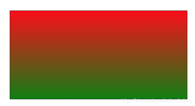
单颜色渐变
<style>
    * {
        margin: 0;
        padding: 0;
    }

    .box {
        width: 600px;
        height: 300px;
        border: 1px solid;
        margin: 100px auto;
        /* 一个渐变,从红色到绿色 */
        background-image: linear-gradient(red, green);
    }
</style>

<body>
    <div class="box"></div>
</body>
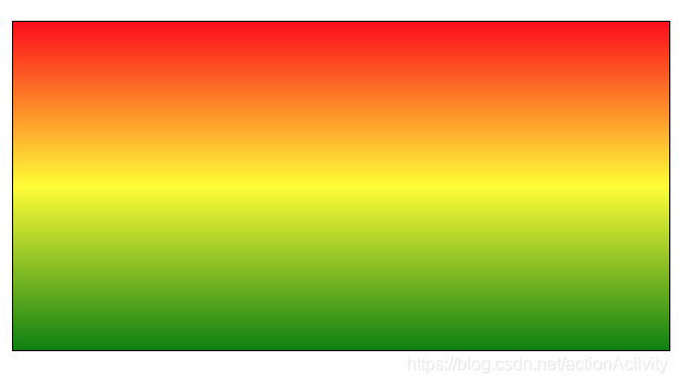
多颜色的线性渐变
/* 两个渐变  一个是从红色到黄色,一个是从黄色到绿色  */
background-image: linear-gradient(red, yellow, green);
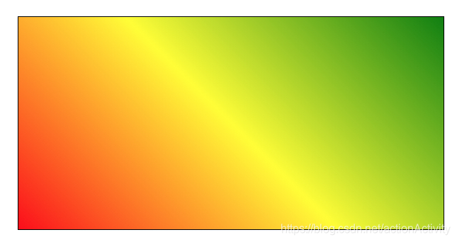
角度
设置角度时,必须是第一个参数
background-image: linear-gradient(45deg, red, yellow, green);
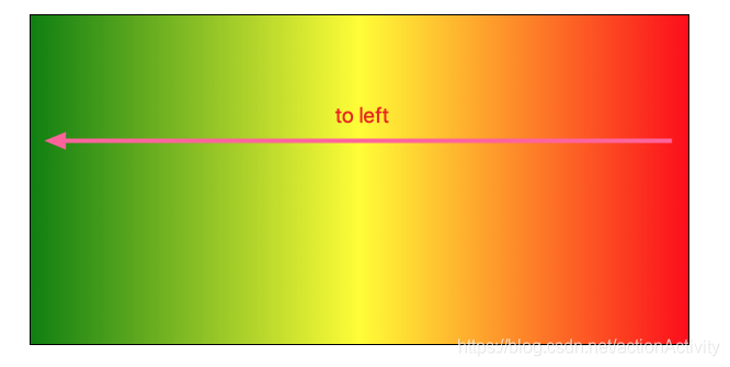
改变渐变的方向
注意:渐变的方向和角度只能设置一个,并且必须要设置到第一参数上。
to right 从右往左
to left从左往右
to top 从下往上
to bottom 从上往下
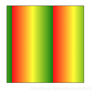
background-image: linear-gradient(to left,red, yellow, green);
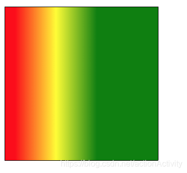
颜色节点
background-image: linear-gradient(to right, red 20px, yellow 100px, green 180px);
从左往右进行渐变,20px 之前是纯红色,20–100px 之间是红色到黄色的渐变色 ,从 100–180px 之间是 黄色到绿色的渐变色,180px 以后是 纯绿色。
渐变的重复
使用 repeating-linear-gradient
background-image: repeating-linear-gradient(to right, red 20px, yellow 100px, green 180px);
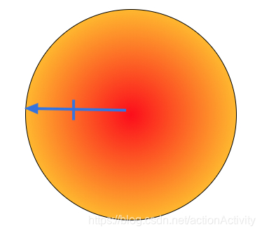
径向渐变
用法和线性渐变相似,具体请查看MDN文档
<style>
    * {
        margin: 0;
        padding: 0;
    }

    .box {
        width: 300px;
        height: 300px;
        border: 1px solid;
        margin: 100px auto;
        border-radius: 50%;   /* 改成一个圆形 */
        background-image: radial-gradient(red, yellow);
    }
</style>

<body>
    <div class="box"></div>
</body>