前言
圣杯布局来源于文章In Search of the Holy Grail,而双飞翼布局来源于淘宝UED。
虽然两者的实现方法略有差异,不过都遵循了以下要点:
- 两侧宽度固定,中间宽度自适应
- 中间部分在DOM结构上优先,以便先行渲染
- 允许三列中的任意一列成为最高列
- 只需要使用一个额外的 div 标签
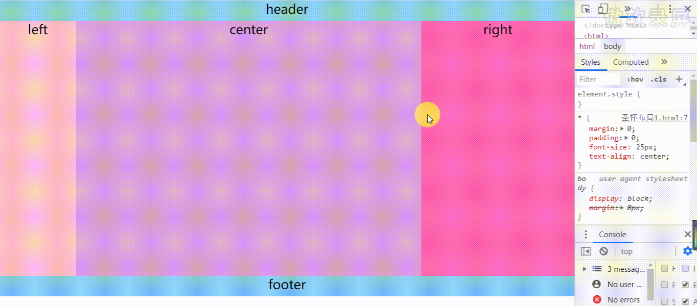
直接上布局效果图。
区别:
1. 圣杯布局:
- 布局结构清晰,一目了然
- 为了让中间div内容不被遮挡,将中间div设置了左右padding-left和padding-right后,将左右两个div用相对布局position: relative并分别配合right和left属性,以便左右两栏div移动后不遮挡中间div。
2. 双飞翼布局:
- 布局结构不太直观
- 为了让中间div内容不被遮挡,直接在中间div内部创建子div用于放置内容,在该div里用margin-left和margin-right为左右两栏div留出位置。
圣杯布局:
用 float 实现圣杯布局
<!DOCTYPE html>
<html>
	<head>
		<meta charset="utf-8" />
		<title>圣杯布局</title>
		<style>
			* {
				margin: 0;
				padding: 0;
				font-size: 25px;
				text-align: center;
			}

			header,
			footer {
				height: 40px;
				width: 100%;
				background: skyblue;
			}

			footer {
				clear: both;
			}

			.wrapper {
				padding: 0 300px 0 150px;
				height: 100px;
			}

			.center {
				float: left;
				width: 100%;
				height: 500px;
				background: plum;

			}

			.left {
				float: left;
				width: 150px;
				height: 500px;
				margin-left: -100%;
				position: relative;
				left: -150px;
				background: pink;
			}

			.right {
				float: left;
				width: 300px;
				height: 500px;
				margin-left: -300px;
				position: relative;
				right: -300px;
				background: hotpink;
			}
		</style>
	</head>
	<body>
		<header>header</header>
		<div class="wrapper">
			<div class="center">center</div>
			<div class="left">left</div>
			<div class="right">right</div>
		</div>
		<footer>footer</footer>
	</body>
</html>
其中:
左右栏通过添加负的margin放到正确的位置了,此段代码是为了摆正中间栏的位置
.wrapper {
	padding: 0 300px 0 150px;
	height: 100px;
}
中间栏的位置摆正之后,左栏的位置也相应右移,通过相对定位的left恢复到正确位置
.left {
	float: left;
	width: 150px;
	margin-left: -100%;
	position: relative;
	left: -150px;
}
中间栏的位置摆正之后,右栏的位置也相应左移,通过相对定位的right恢复到正确位置
.right {
	float: left;
	width: 300px;
	margin-left: -300px;
	position: relative;
	right: -300px;
}
优点:不需要添加dom节点
双飞翼布局
<!DOCTYPE html>
<html>
	<head>
		<meta charset="UTF-8">
		<title>双飞翼布局</title>
		<style>
			* {
				margin: 0;
				padding: 0;
				font-size: 25px;
				text-align: center;
			}

			header,
			footer {
				height: 40px;
				width: 100%;
				background: skyblue;
			}

			footer {
				clear: both;
			}

			.center {
				float: left;
				width: 100%;
				/*左栏上去到第一行*/
				height: 500px;
				background: plum;
			}

			/*给内部 div 添加 margin,把内容放到中间栏,其实整个背景还是 100%*/
			#inside {
				margin: 0 300px 0 150px;
				height: 500px;
			}

			.left {
				float: left;
				width: 150px;
				height: 500px;
				margin-left: -100%;
				background: pink;
			}

			.right {
				float: left;
				width: 300px;
				height: 500px;
				margin-left: -300px;
				background: hotpink;
			}
		</style>
	</head>
	<body>
		<header>header</header>
		<div class="center">
			<div class="inside">center</div>
		</div>
		<div class="left">left</div>
		<div class="right">right</div>
		<footer>footer</footer>
	</body>
</html>
优点:不会像圣杯布局那样变形;
缺点是:多加了一层dom节点
普通三栏布局,其中左右两栏宽度固定,中间自适应。
通过实践,发现flex布局和grid布局真香。传统的借助浮动和定位的方式,跟上述类似,这里不再赘述,另外也可以参考笔者的另一篇笔记面试常考题1-页面布局
利用flex布局
<!DOCTYPE html>
<html>
	<head>
		<meta charset="utf-8" />
		<title>圣杯布局</title>
		<style>
			* {
				margin: 0;
				padding: 0;
				font-size: 25px;
				text-align: center;
			}

			header,
			footer {
				height: 40px;
				width: 100%;
				background: skyblue;
			}

			.wrapper {
				display: flex;
			}

			.left {
				width: 150px;
				height: 500px;
				background: pink;
			}

			.center {
				flex: 1;
				height: 500px;
				background: plum;
			}

			.right {
				width: 300px;
				height: 500px;
				background: hotpink;
			}
		</style>
	</head>
	<body>
		<header>header</header>
		<div class="wrapper">
			<div class="left">left</div>
			<div class="center">center</div>
			<div class="right">right</div>
		</div>
		<footer>footer</footer>
	</body>
</html>
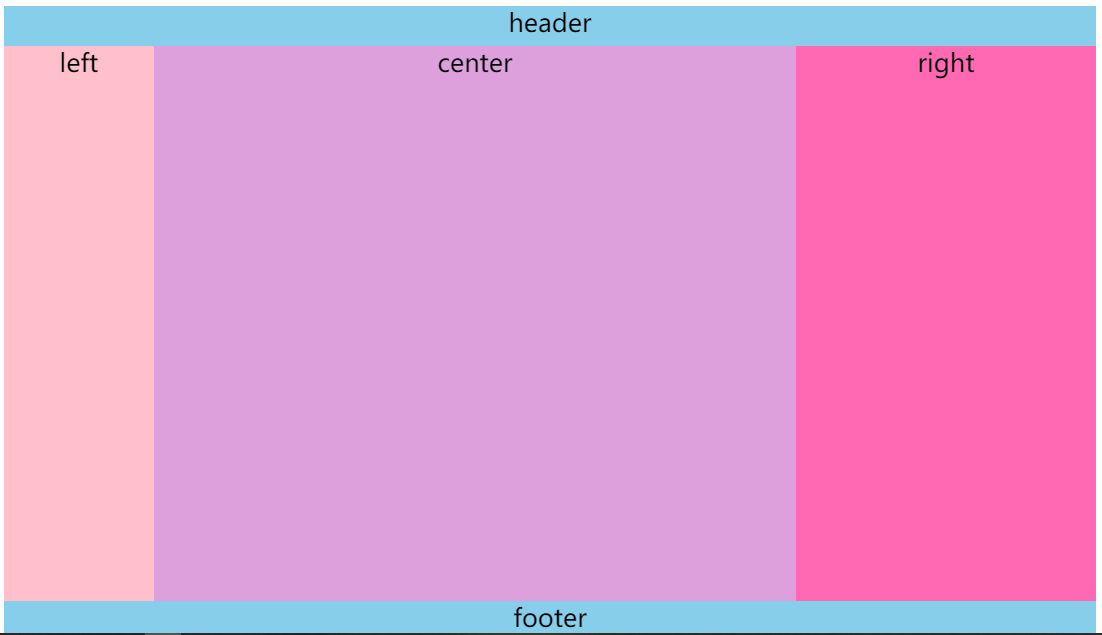
grid布局
相关知识点请参照:阮一峰-CSS Grid 网格布局教程
实现效果图
<!DOCTYPE html>
<html>
	<head>
		<meta charset="utf-8" />
		<title>圣杯布局</title>
		<style>
			body {
				display: grid;
				grid-template-areas:
					'header header header'
					'left center right'
					'footer footer footer';
				min-height: 100vh;
				grid-template-rows: 40px 1fr 40px;
				grid-template-columns: 150px 1fr 300px;
				font-size: 25px;
				text-align: center;
			}

			header {
				grid-area: header;
				background: skyblue;
			}

			footer {
				grid-area: footer;
				background: skyblue;
			}

			.left {
				grid-area: left;
				background: pink;
			}

			.center {
				grid-area: center;
				background: plum;
			}

			.right {
				grid-area: right;
				background: hotpink;
			}
		</style>
	</head>
	<body>
		<header>header</header>
		<div class="left">left</div>
		<div class="center">center</div>
		<div class="right">right</div>
		<footer>footer</footer>
	</body>
</html>
grid布局非常灵活,对于这种布局的实现有很多种方式。笔者这里先给出最直观的一种,足以体现grid的强大。