(本笔记用于参考查找)
flex弹性布局
- display:flex介绍
- 1.flex-direction:row|row-reverse|column|column-reverse|initial|inherit (盒子排列方向)
- 2.flex-wrap: nowrap|wrap|wrap-reverse(拆行或拆列)
- 3.justify-content: flex-start|flex-end|center|space-between|space-around(主轴方向(默认水平方向)项目之间与以及周围的空间)
- 4.align-items: stretch|center|flex-start|flex-end|baseline(如center让里面所有子元素块垂直居中)
- 5.align-content: stretch|center|flex-start|flex-end|space-between|space-around(align-content属性只适用于多行的flex容器)
- 6. align-self: auto|stretch|center|flex-start|flex-end|baseline(内部某个元素在侧轴上的排列方式有所差异)
- 8.order: number|initial|inherit(给容器设定所占位置)
- 9.flex-grow: number(放大属性,默认为0不放大)
- 10.flex-shrink:number|initial|inherit (属性则体现了弹性布局"屈"的一面,可以让项目尺寸收缩)
display:flex介绍
这个是弹性布局必须要的属性,让竖的变横弹性布局之所以功能强大灵活,是因为它打破了很多原有的规则。可以将任意元素设置为弹性布局,弹性布局会对其内部的子元素产生影响:
- 块级元素不再单独占据一行(它是一维布局)。
- 如果块级元素没有显式规定宽度,也不会横向铺满父元素。
- float、clear和vertical-align属性会失效。
- 在父级元素上定义display:flex;那么孩子就属于弹性布局了。
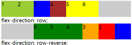
1.flex-direction:row|row-reverse|column|column-reverse|initial|inherit (盒子排列方向)
(1)row:默认值,主轴是水平的,起始位置在左侧,项目从左到右排列。
(2)row-reverse:主轴是水平的,起始位置在右侧,项目从右到左排列。
(3)column:主轴是垂直的,起始位置在顶端,项目垂直显示,从上到下。
(4)column-reverse:主轴是垂直的,起始位置在底部,项目垂直显示,从下到上。
代码:
		/*flex-direction: row;*/
		#main1{
			width:400px;
			display:flex;
			flex-direction: row;
			background: #ccc;
		}
		#main1 div{
			width:50px;
			height:50px;
		}
		/*flex-direction: row-reverse;*/
		#main2{
			width:400px;
			display:flex;
			flex-direction: row-reverse;
			background: #ccc;
		}

		#main2 div{
			width:50px;
			height:50px;
		}
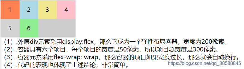
2.flex-wrap: nowrap|wrap|wrap-reverse(拆行或拆列)
就是说,一行铺满之后换行。
(1).nowrap:默认值,规定容器中的项目不会拆行或者拆列显示。
(2).wrap:规定容器中的项目在需要的时候自动进行拆行或者拆列显示。
(3).wrap-reverse:规定容器中的项目在需要的时候自动进行拆行或者拆列显示,但顺序相反。
代码:
        #main2 {
            width: 200px;
            display:flex;
            flex-wrap: wrap;
            background:#ccc;
        }
        #main2 div {
            width: 50px;
            height: 50px;
            text-align:center;
            line-height:50px;
        }
附加:flex-flow(1,2的结合写法)
flex-flow: [flex-direction] [flex-wrap];
这个是上面1,2的结合写法
flex-direction flex-wrap的位置可以直接写成他们1,2的属性值
代码:
		#main {
			width: 200px;
			display:flex;
			flex-flow:row-reverse wrap;
			background:#ccc;
		}
		#main div {
			width: 50px;
			height: 50px;
			text-align:center;
			line-height:50px;
		}
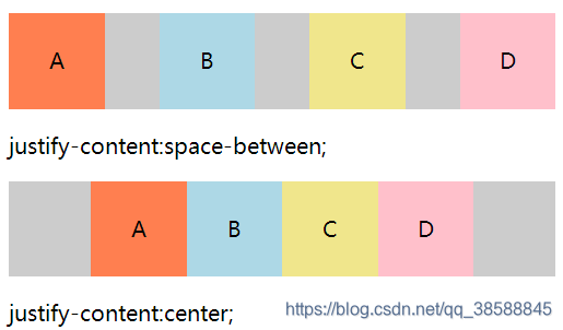
3.justify-content: flex-start|flex-end|center|space-between|space-around(主轴方向(默认水平方向)项目之间与以及周围的空间)
(1).flex-start:默认值,规定项目位于容器主轴的起始位置。
(2).flex-end:规定项目位于容器主轴的结束位置。
(3).center:规定项目位于容器主轴的中间。
(4).space-between:规定项目在主轴的两端对齐。
(5).space-around:规定容器中项目两侧都保留相等的空间。
代码:
		#main1 {
			width: 400px;
			background:#ccc;
			display: flex;
			justify-content:space-between;
		}
		#main1 div {
			width: 70px;
			height: 70px;
			text-align:center;
			line-height:70px;
		}

		#main2 {
			width: 400px;
			background:#ccc;
			display: flex;
			justify-content:center;
		}
		#main2 div {
			width: 70px;
			height: 70px;
			text-align:center;
			line-height:70px;
		}
4.align-items: stretch|center|flex-start|flex-end|baseline(如center让里面所有子元素块垂直居中)
(1).stretch:默认值,弹性布局容器中的项目会在交叉轴方向拉伸以适应容器。
(2).center:规定弹性布局容器中的项目在交叉轴方向上居中对齐。
(3).flex-start:规定弹性布局容器中的项目交叉轴起始位置对齐。
(4).flex-end:规定弹性布局容器中的项目交叉轴结束位置对齐。
(5).baseline:规定弹性布局容器中的项目第一行文字的基线对齐。
代码:
        #main {
            width: 200px;
            height: 100px;
            background:#ccc;
            display: flex;
            align-items: center;
        }
        #main div {
            width: 70px;
	    	height: 20px;
        }
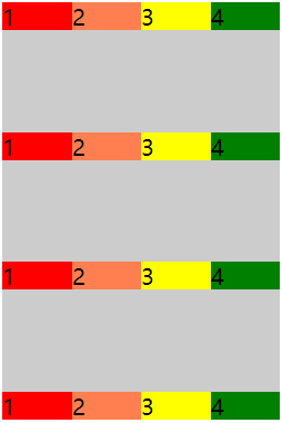
5.align-content: stretch|center|flex-start|flex-end|space-between|space-around(align-content属性只适用于多行的flex容器)
配合flex-wrap使用,效果更佳。
(1).stretch:默认值,规定行被拉伸以适应交叉轴容器的尺寸,其中的项目随之被拉伸。
(2).center:规定容器中的行在容器交叉轴上居中对齐。 (3).flex-start:规定容器中的行在容器交叉轴上起始位置对齐。
(4).flex-end:规定容器中的行在容器交叉轴上结束位置对齐。
(5).space-between:规定容器中的行在容器交叉轴上两端对齐,行之间的间隔都相等。
(6).space-around:每规定容器中的行两侧的间隔相等。所以行之间的间隔比行与容器边缘的间隔大一倍。
代码:
    #main {
        width: 200px;
        height: 300px;
        background:#ccc;
        display: flex;
        flex-wrap: wrap;
        align-content:space-between;
    }
    #main div {
        width: 50px;
        height: 20px;
    }
<div id="main">
    <div style="background-color:red;">1</div>
    <div style="background-color:coral;">2</div>
    <div style="background-color:yellow;">3</div>
    <div style="background-color:green;">4</div>

    <div style="background-color:red;">1</div>
    <div style="background-color:coral;">2</div>
    <div style="background-color:yellow;">3</div>
    <div style="background-color:green;">4</div>

    <div style="background-color:red;">1</div>
    <div style="background-color:coral;">2</div>
    <div style="background-color:yellow;">3</div>
    <div style="background-color:green;">4</div>

    <div style="background-color:red;">1</div>
    <div style="background-color:coral;">2</div>
    <div style="background-color:yellow;">3</div>
    <div style="background-color:green;">4</div>
</div>
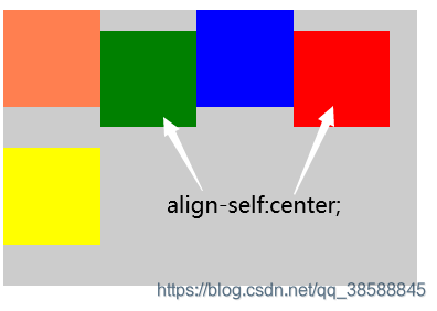
6. align-self: auto|stretch|center|flex-start|flex-end|baseline(内部某个元素在侧轴上的排列方式有所差异)
(1).auto:默认值,继承弹性容器的align-items属性值,如果弹性容器未设置align-items,默认值为stretch。
(2).stretch:规定项目被拉伸以使用容器在交叉轴上的尺寸。
(3).center:规定项目在行中交叉轴方向居中对齐。
(4).flex-start:规定项目在行中交叉轴方向起始位置对齐。
(5).flex-end:规定项目在行中交叉轴方向结束位置对齐。
(6).baseline:规定项目在所在行中基线对齐。
代码:
        #main {
            width: 300px;
            height: 200px;
            background:#ccc;
            display: flex;
            flex-flow: row wrap;
        }
        #main div {
            width: 70px;
            height: 70px;
        }
        #main div:nth-child(2n) {
            align-self: center;
        }

<div id="main">
    <div style="background-color:coral;"></div>
    <div style="background-color:green;"></div>
    <div style="background-color:blue;"></div>
    <div style="background-color:red;"></div>
    <div style="background-color:yellow;"></div>
</div>
在2n的倍数的项目块上做法。
附加1:区别align-items和 align-content
align-items属性可以应用于所有的flex容器,它的作用是设置flex子项在每个flex行的交叉轴上的默认对齐方式。
align-content 只适用多行的flex容器(也就是flex容器中的子项不止一行时该属性才有效果),它的作用是当flex容器在交叉轴上有多余的空间时,将子项作为一个整体(属性值为:flex-start、flex-end、center时)进行对齐。不同取值的效果如下所示
附加2:区别align-items和align-self
align-items 是用作父容器(样式写在有display的样式表里),设置了之后就能让整个孩子具有此样式。而align-self作用于子容器,设置之后,只有设置了此央视的孩子可以有此样式。
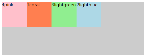
8.order: number|initial|inherit(给容器设定所占位置)
(1).number:默认值是 0。规定flex项目的顺序(就是设置每个色块的位置)。
        #main {
            width:400px;
            height:150px;
            display:flex;
            background:#ccc;
        }
        #main div{
            width:70px;
            height:70px;
        }
        div#coral{order:2;}
        div#lightblue{order:4;}
        div#lightgreen{order:3;}
        div#pink{order:1;}
<div id="main">
    <div style="background-color:coral;" id="coral">1coral</div>
    <div style="background-color:lightblue;" id="lightblue">2lightblue</div>
    <div style="background-color:lightgreen;" id="lightgreen">3lightgreen</div>
    <div style="background-color:pink;" id="pink">4pink</div>
</div>
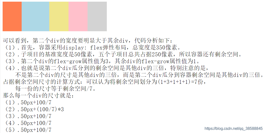
9.flex-grow: number(放大属性,默认为0不放大)
flex-grow属性定义项目的放大比例,默认为0也就是不进行放大。如果容器不存在剩余空间,那么也就无法进行放大操作
(1).number:一个数值,默认为0,用于规定子项目的放大比例,这个比例要和其他项目对比进行确定。
代码:
        #main {
            width: 350px;
            height: 100px;
            background:#ccc;
            display: flex;
        }

        #main div{flex-basis:50px;}

        #main div:nth-of-type(1) {flex-grow: 1;}
        #main div:nth-of-type(2) {flex-grow: 3;}
        #main div:nth-of-type(3) {flex-grow: 1;}
        #main div:nth-of-type(4) {flex-grow: 1;}
        #main div:nth-of-type(5) {flex-grow: 1;}
10.flex-shrink:number|initial|inherit (属性则体现了弹性布局"屈"的一面,可以让项目尺寸收缩)
此属性规定容器中项目在主轴上的缩小比例,默认值为1。
需要特别注意如下几点:
(1)此属性应用于容器中的项目之上。
(2)必须容器主轴上的尺寸小于项目尺寸,才有可能缩小。
(3)属性值为0,表示项目部缩小。
(4)必须应用弹性布局环境中,否则无效。
(5)number:默认值是 1,容器中的项目相对于其他项目的搜索比率。
代码:
        #main {
            width:350px;
            height:100px;
            background:#ccc;
            display:flex;
        }
        #main div {
            flex-shrink:1;
            flex-basis:100px;
        }
        #main div:nth-of-type(2) {flex-shrink:3;}

11 flex-basis: number|auto(为项目设定一个最初的基准尺寸)
当flex-basis和width属性同时存在时,width属性不生效,flex item的宽度为flex-basis设置的宽度
(1)number:长度单位或者百分比,规定flex项目的初始长度。
(2)auto:默认值,长度等于flex项目本身长度,如果项目未指定长度,根据内容决定。
附加1:flex = 1
flex: 【flex-grow】【flex-shrink] 【flex-basis】| auto | 1
此属性是flex-grow、flex-shrink和flex-basis属性的复合写法。默认属性值为0 1 auto。如果元素不是Flex项目,则此属性不起作用。作用于孩子。
(1).auto:与1 1 auto相同。
(2).none:与0 0 auto相同。
(3)1 与 默认值0 1 auto相同。
附加2:flex当前兼容性
我们直接来看一张表
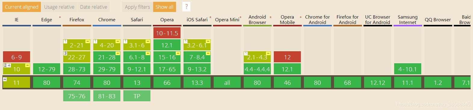
我们看到,flexbox已经兼容所有的浏览器,大家可以用flexbox来展现自己非凡的才能吧!
