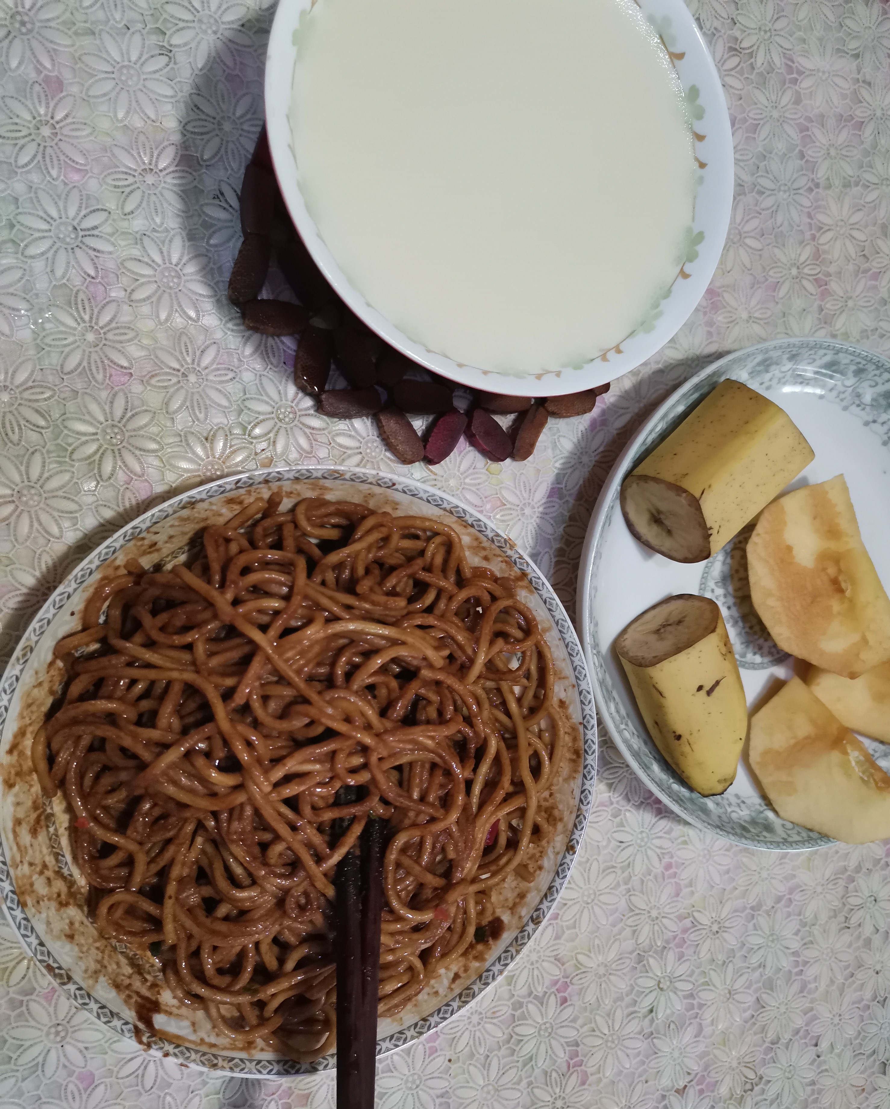
疫情到现在,今天终于吃到了热干面,吃的时候在b站上看到一个前端特效,存下来,我觉得可以当表白利器来玩啦~
实现原理:
将两个文字 我在吃大西瓜呢 完全重叠,后面那个是深灰色,而前面那个是有颜色的,在将前面的文字套用圆形遮套,最后加上CSS Animation就可以啦。原作者还加了渐变色效果,这也让我发现了找图片的新大陆unsplash,来看看代码吧!
<h1 data-spotlight="我在吃大西瓜呢">我在吃大西瓜呢</h1>html {
font-size: 15px;
}
body {
background-color: #222;
display: flex;
justify-content: center;
align-items: center;
min-height: 100vh;
}
h1 {
color: #333;
font-family: Helvetica;
margin: 0;
padding: 0;
font-size: 8rem;
letter-spacing: -0.3rem;
position: relative;
}
h1::after {
content: attr(data-spotlight);
color: transparent;
position: absolute;
top: 0;
left: 0;
-webkit-clip-path: ellipse(100px 100px at 0% 50%);
clip-path: ellipse(100px 100px at 0% 50%);
animation: spotlight 5s infinite;
background-image: url(https://images.unsplash.com/photo-1579547621869-0ddb5f237392?ixlib=rb-1.2.1&ixid=eyJhcHBfaWQiOjEyMDd9&auto=format&fit=crop&w=1500&q=80);
background-size: 150%;
background-position: center center;
-webkit-background-clip: text;
background-clip: text;
}
@keyframes spotlight {
0% {
-webkit-clip-path: ellipse(100px 100px at 0% 50%);
clip-path: ellipse(100px 100px at 0% 50%);
}
50% {
-webkit-clip-path: ellipse(100px 100px at 100% 50%);
clip-path: ellipse(100px 100px at 100% 50%);
}
100% {
-webkit-clip-path: ellipse(100px 100px at 0% 50%);
clip-path: ellipse(100px 100px at 0% 50%);
}
}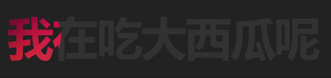
原作者采用的是粤语教学,很好听哟。