What is the knn algorithm?
The KNN algorithm is an instance-based machine learning algorithm, and its full name is K-Nearest Neighbors Algorithm. It is a simple but very effective classification and regression algorithm.
The basic idea of the algorithm is: for a new input sample, by calculating the distance between it and all samples in the training set, find the K training set samples closest to it, and then classify or classify it based on the category information of the K samples. Regression prediction. The "K" in the KNN algorithm represents the number of neighbors used in prediction, which usually needs to be set manually.
The main advantages of the KNN algorithm are simplicity, ease of implementation, and in some cases good classification or regression accuracy can be obtained. However, it also has some disadvantages, such as the need to store all training set samples, the overhead of calculating distance is large, and it is easy to overfit for high-dimensional data.
The KNN algorithm is often used in classification problems, such as text classification, image classification, etc., and regression problems, such as predicting housing prices.
The knn algorithm that we learned machine learning this time trains and visualizes the first two-dimensional data and the first four-dimensional data respectively.
Two goals:
1. Use the knn algorithm to perform model training on the first two dimensions of the iris data set and calculate the error rate, and finally perform a visual display of the data area division.
2. Use the knn algorithm to perform model training on a total of four dimensions of the iris data set and calculate the error rate, and visualize the first four dimensions of data.
The basic idea:
1. First load the iris data set Load Iris data
2. Separate the training set and set the test set split train and test sets
3. Standardize the data Normalize the data 4.
Use the knn model to train Train using KNN
5. Then visualize Processing Visualization
6, and finally through the drawing decision plane plot decision plane
1. Use the knn algorithm to perform model training on the first two dimensions of the iris data set and calculate the error rate, and finally perform a visual display of the data area division:
from sklearn import datasets
import numpy as np
### Load Iris data
iris = datasets.load_iris()
x = iris.data[:,:2]#前2个维度
# x = iris.data
y = iris.target
print("class labels: ", np.unique(y))
x.shape
y.shape
### split train and test sets
from sklearn.model_selection import train_test_split
x_train, x_test, y_train, y_test = train_test_split(x, y, test_size=0.2, stratify=y)
x_train.shape
print("Labels count in y:", np.bincount(y))
print("Labels count in y_train:", np.bincount(y_train))
print("Labels count in y_test:", np.bincount(y_test))
### Normalize the data
from sklearn.preprocessing import StandardScaler
sc = StandardScaler()
sc.fit(x_train)
x_train_std = sc.transform(x_train)
x_test_std = sc.transform(x_test)
print("TrainSets Orig mean:{}, std mean:{}".format(np.mean(x_train,axis=0), np.mean(x_train_std,axis=0)))
print("TrainSets Orig std:{}, std std:{}".format(np.std(x_train,axis=0), np.std(x_train_std,axis=0)))
print("TestSets Orig mean:{}, std mean:{}".format(np.mean(x_test,axis=0), np.mean(x_test_std,axis=0)))
print("TestSets Orig std:{}, std std:{}".format(np.std(x_test,axis=0), np.std(x_test_std,axis=0)))
### Train using KNN
from sklearn.neighbors import KNeighborsClassifier
knn = KNeighborsClassifier(n_neighbors=5, p=2, metric='minkowski')
knn.fit(x_train_std, y_train)
pred_test=knn.predict(x_test_std)
err_num = (pred_test != y_test).sum()
rate = err_num/y_test.size
print("Misclassfication num: {}\nError rate: {}".format(err_num, rate))#计算错误率
### Visualization
x_combined_std = np.vstack((x_train_std, x_test_std))
y_combined = np.hstack((y_train, y_test))
plot_decision_regions(x_combined_std, y_combined,
classifier=knn, test_idx=range(105,150))
plt.xlabel('petal length [standardized]')
plt.ylabel('petal width [standardized]')
plt.legend(loc='upper left')
plt.tight_layout()
plt.show()
#### plot decision plane
x_combined_std = np.vstack((x_train_std, x_test_std))
y_combined = np.hstack((y_train, y_test))
plot_decision_regions(x_combined_std, y_combined,
classifier=knn, test_idx=range(105,150))
plt.xlabel('petal length [standardized]')
plt.ylabel('petal width [standardized]')
plt.legend(loc='upper left')
plt.tight_layout()
plt.show()
Screenshots of the code and its visual effects:

2. Use the knn algorithm to perform model training on a total of four dimensions of the iris data set and calculate the error rate and visualize it:
from sklearn import datasets
import numpy as np
iris = datasets.load_iris()
x = iris.data  #4个维度
# x = iris.data
y = iris.target
print("class labels: ", np.unique(y))
x.shape
y.shape
### split train and test sets
from sklearn.model_selection import train_test_split
x_train, x_test, y_train, y_test = train_test_split(x, y, test_size=0.2, stratify=y)
x_train.shape
print("Labels count in y:", np.bincount(y))
print("Labels count in y_train:", np.bincount(y_train))
print("Labels count in y_test:", np.bincount(y_test))
### Normalize the data
from sklearn.preprocessing import StandardScaler
sc = StandardScaler()
sc.fit(x_train)
x_train_std = sc.transform(x_train)
x_test_std = sc.transform(x_test)
print("TrainSets Orig mean:{}, std mean:{}".format(np.mean(x_train,axis=0), np.mean(x_train_std,axis=0)))
print("TrainSets Orig std:{}, std std:{}".format(np.std(x_train,axis=0), np.std(x_train_std,axis=0)))
print("TestSets Orig mean:{}, std mean:{}".format(np.mean(x_test,axis=0), np.mean(x_test_std,axis=0)))
print("TestSets Orig std:{}, std std:{}".format(np.std(x_test,axis=0), np.std(x_test_std,axis=0)))
### Train using KNN
from sklearn.neighbors import KNeighborsClassifier
knn = KNeighborsClassifier(n_neighbors=5, p=2, metric='minkowski')
knn.fit(x_train_std, y_train)
pred_test=knn.predict(x_test_std)
err_num = (pred_test != y_test).sum()
rate = err_num/y_test.size
print("Misclassfication num: {}\nError rate: {}".format(err_num, rate))#计算错误率
#四维可视化在二维或三维空间中是无法呈现的,但我们可以使用降维技术来可视化数据。在这种情况下,我们可以使用主成分分析(PCA)或线性判别分析(LDA)等技术将数据降到二维或三维空间中,并在此空间中可视化数据。
import matplotlib.pyplot as plt
from mpl_toolkits.mplot3d import Axes3D
from sklearn.decomposition import PCA

# Perform PCA to reduce the dimensionality from 4D to 3D
pca = PCA(n_components=3)
x_train_pca = pca.fit_transform(x_train_std)

# Create a 3D plot of the first three principal components
fig = plt.figure(figsize=(8, 8))
ax = fig.add_subplot(111, projection='3d')

# Plot the three classes in different colors
for label, color in zip(np.unique(y_train), ['blue', 'red', 'green']):
    ax.scatter(x_train_pca[y_train==label, 0],
               x_train_pca[y_train==label, 1],
               x_train_pca[y_train==label, 2],
               c=color, label=label, alpha=0.8)

ax.set_xlabel('PC1')
ax.set_ylabel('PC2')
ax.set_zlabel('PC3')
ax.legend(loc='upper right')
ax.set_title('Iris Dataset - PCA')
plt.show()
4D visualization cannot be represented in 2D or 3D space, but we can use dimensionality reduction techniques to visualize data. In such cases, we can use techniques such as Principal Component Analysis (PCA) or Linear Discriminant Analysis (LDA) to reduce the data into a two-dimensional or three-dimensional space and visualize the data in this space.
The following is a code rendering showing how to use PCA to reduce 4D data to 3D and visualize the iris dataset in 3D space:
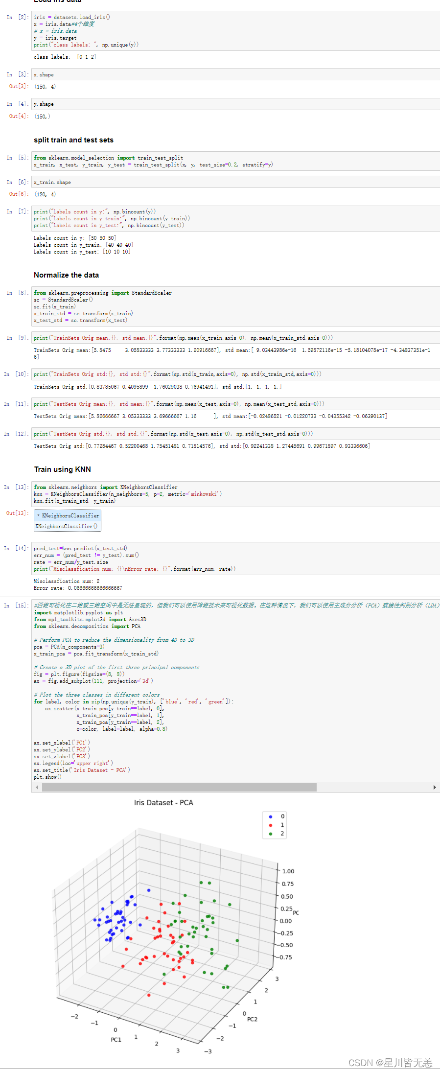
Reduced the 4D data of the iris dataset to 3D and visualized the training set in 3D. Each point represents a data sample, and different colors represent different categories. We can see that in 3D space, there are two categories that can be separated relatively clearly, while the other category is distributed in the middle of the two principal components.
We should pay attention to the fact that using the knn algorithm for high-dimensional data is prone to over-fitting of high-dimensional data, because in high-dimensional space, the distance between data points becomes very large, and the number of training samples is relatively large compared to the feature The number of is very small, which may easily cause the KNN algorithm to fail to predict well.
In order to avoid the situation where high-dimensional data is easy to overfit, the following measures can be taken:
-
Feature selection: Selecting meaningful features for training can reduce the number of features and avoid overfitting. The commonly used feature selection methods are Filter method, Wrapper method and Embedded method.
-
Dimensionality reduction: High-dimensional data can be mapped to a low-dimensional space by methods such as principal component analysis (PCA) to reduce the number of features and avoid overfitting.
-
Adjust the K value: The K value in the KNN algorithm determines the number of neighbors. If the K value is too large, underfitting will easily occur, while if the K value is too small, overfitting will easily occur. Therefore, the best K value can be determined by methods such as cross-validation.
-
Distance measurement: The distance measurement method in the KNN algorithm has a great influence on the results, and different distance measurement methods will lead to different prediction results. Therefore, different distance measurement methods can be tried to choose the optimal method.
-
Data enhancement: In the case of a small amount of data, data enhancement methods can be used to increase training samples to improve the generalization ability of the model.
I hope that through this article, I can further understand the principle and application of the knn algorithm.
Today is May 1st Labor Day, Xiao Ma here wishes everyone a happy May 1st Labor Day!