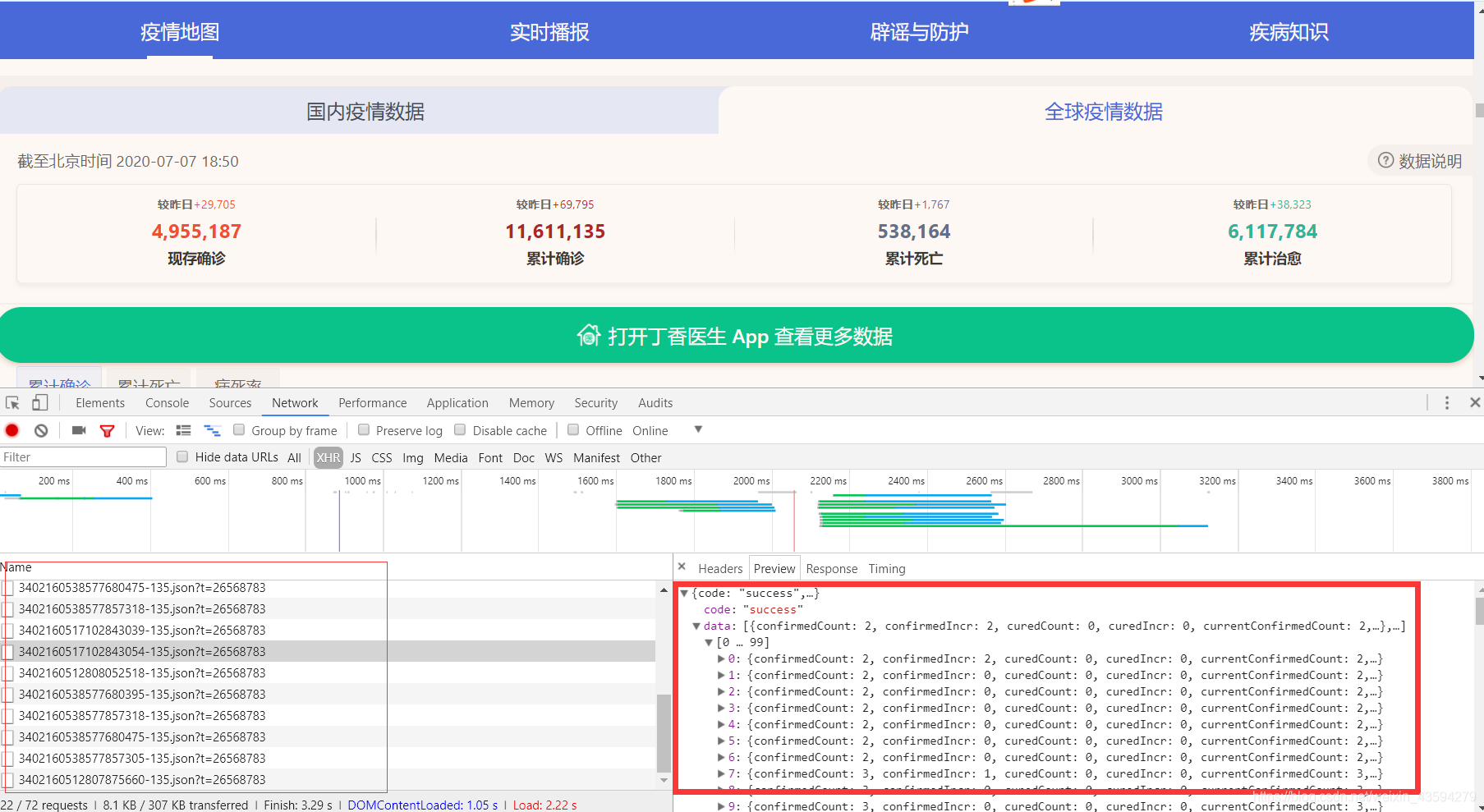
Data crawling and simple analysis of the new crown virus epidemic
In the near future, I have free time, and I am fortunate to be able to crawl a wave of new crown epidemic data and do a simple analysis of the global epidemic situation.
In the process, we have gained a deeper understanding of the severity of the global epidemic and the situation of anti-epidemic.
1. Data sources and website analysis
. There are actually only a few online new crown epidemic data platforms. Here, choose "Doctor Lilac", link: Doctor Lilac Epidemic Data Website.
This website has almost no anti-climbing mechanism, and you can get it quickly if you analyze it normally. The data you want. The data acquisition process of this website is different, you can choose according to your own situation. Let’s talk about two crawling methods:
1. Review the elements, grab the packet to get the data and
press F12, refresh to see a bunch of json data packets, these data are the epidemic data rendered on the web page, but when I analyze it This method is not used because of time, because the json package does not specify which country the data is from.
2. Analyze the source code of the webpage.
In fact, this should be the first step. Generally, the first step of analyzing a website is to look at the source code of the webpage. If the data you want is in it, you don't need to spend a lot of time to capture packets. Right-click on the source code of the web page.
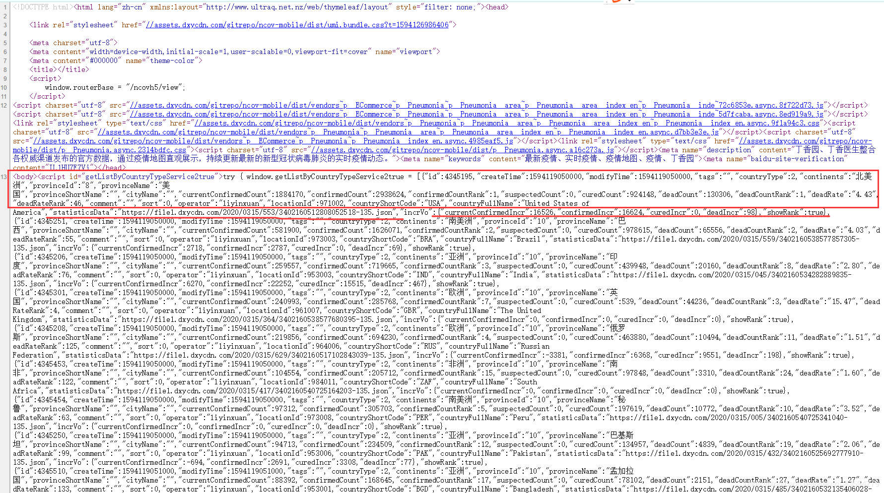
It can be seen that the data of each country is clear at a glance, and everything is available. The data in the upper box of the figure is some of the country's epidemic statistics that day. It is worth noting that the underlined "statisticsData" is followed by a json link, boldly guessing that this link is the country's historical data.
So far our analysis is over, and the next step is to write code.
2. Code preparation
The annotated code can be selectively removed. Of course, whether or not to stay depends on your own situation.
import requests
import json
import os

#requests的请求头
headers = {


    'User-Agent':#自行填写
    }

'''静态网页里有主要国家的json,而其中仅为当天数据,不过其中的statisticsData里
有对应国家的历史疫情数据,数据量有215个国家之多'''

"""这里的start_data.txt特别说明一下,这里偷了个懒,这个txt文件中的数据其实就是网页源代码含各个国家疫情数据的字典的源码,因为我经过试验发现直接从网站提取实在费力,re和xpath都有匹配不到的现象。不想花时间写匹配模式我索性直接复制。"""
#导入本地网页的json数据
with open('start_data.txt','r',encoding='utf-8')as f:
    json_data = json.loads(f.read())

continents=[] #国家所在大洲
provinceName=[] #国家名称
statisticsData=[] #数据链接
for item in json_data:
    continents.append(item['continents'])
    provinceName.append(item['provinceName'])
    statisticsData.append(item['statisticsData'])

#备份链接数据
##index_data = [['大洲','国家','数据网址']]
##
##for i,j,k in zip(continents,provinceName,statisticsData):
##    index_data.append([i,j,k])
##
##print('数据链接生成完毕')
##
##with open('index_data.csv','w',encoding='utf-8')as fn:
##    for index in index_data:
##        fn.write(','.join(index)+'\n')
##
##print('数据链接保存完毕')


#按大洲分别建立对应文件夹
##continents_name = set(continents)
##print(continents_name)
##
##for name in continents_name:
##    print(name,'文件夹建立成功')
##    os.makedirs(name,exist_ok=True)


#遍历每一个链接
for path_name,file_name,url in zip(continents,provinceName,statisticsData):
    res = requests.get(url,headers=headers)
## 	json数据备份,这个步骤其实可以不用,保存一个样例用于后面数据的结构分析就好了
##    with open('{}/{}.json'.format(path_name,file_name),'w',encoding='utf-8')as fa:
##        fa.write(str(res.content))
##    print(path_name,file_name,'json下载成功')
    res.encoding='utf-8'
    every_country_data = json.loads(res.content)
    dateId=[]  #对应one_data的每一项
    confirmedCount=[]
    confirmedIncr=[]
    curedCount=[]
    curedIncr=[]
    deadCount=[]
    deadIncr=[]

    one_data=[['日期','确诊病例','新增确诊','累计治愈','新增治愈','死亡病例','新增死亡']]
    every_country_data=every_country_data['data']
    #这里的操作是为了方便形成csv文件
    for every in every_country_data:
        dateId.append(str(every['dateId']))
        confirmedCount.append(str(every['confirmedCount']))
        confirmedIncr.append(str(every['confirmedIncr']))
        curedCount.append(str(every['curedCount']))
        curedIncr.append(str(every['curedIncr']))
        deadCount.append(str(every['deadCount']))
        deadIncr.append(str(every['deadIncr']))

    #在对应文件夹生成相应的csv文件
    for a,b,c,d,e,f,g in zip(dateId,confirmedCount,confirmedIncr,curedCount,curedIncr,deadCount,deadIncr):
        one_data.append([a,b,c,d,e,f,g])
    with open('{}/{}.csv'.format(path_name,file_name),'w',encoding='utf-8')as fb:
        for one in one_data:
            fb.write(','.join(one)+'\n')
    print(path_name,file_name,'csv数据下载成功')
3. Realize the classification of epidemic countries through K-means clustering.
We have downloaded the data, and we need to use these data to get some rules and useful information.
Based on the fact that these historical epidemic data are time-series data, processing data using feature values as clusters may be too difficult, with poor results, and high time costs.
Since it is a time series, it is natural to think of fitting curve equations. I use the coefficients of the equations as key factors, or pseudo eigenvalues, and then throw these eigenvalues into the K-means clusterer.
The data from February 27th to July 1st are uniformly selected to make the data benchmarks consistent.
1. Code implementation
import csv
import numpy as np
import os
#from pprint import pprint

path = "../选中国家/"  #这里填充需要分类的国家所在的文件夹

files = os.listdir(path) #得到文件夹内文件的名称

title=[] #国家名
feature_X = [] #存拟合函数的斜率
feature_Y = [] #存拟合函数的截距

#读取csv文件数据
for file_name in files:
    title.append(file_name.split('.')[0])
    with open(path+file_name,'r',encoding='utf-8')as f:
        data=list(csv.reader(f))

##    confirmedIncr = [] #获取新增确诊数据对应列
##    for i in range(1,len(data)):
##        confirmedIncr.append(eval(data[i][2]))
##      X = [i for i in range(len(confirmedIncr))]
##      Y = np.array(confirmedIncr)

	column=1 #第一列
    confirmedCount = [] #获取确诊数据对应列
    for i in range(1,len(data)):
        confirmedCount.append(eval(data[i][column])) #1表示确诊病例,3为累计治愈,5为累计死亡

    X = [i for i in range(len(confirmedCount))]
    Y = np.array(confirmedCount)

    f1=np.polyfit(X,Y,1) #一维多项式拟合即线性回归
    f1=list(f1)
    feature_X.append(f1[0])
    feature_Y.append(f1[1])

feature=[]
for i,j,k in zip(title,feature_X,feature_Y):
    feature.append([i,j,k])

pprint(feature)

'''聚类分析'''
from sklearn.cluster import KMeans
import matplotlib.pyplot as plt

k_temp = []
for i,j in zip(feature_X,feature_Y):
    k_temp.append([i,j])
k_data = np.array(k_temp)

##print(k_data)

clf = KMeans(n_clusters = 4)#聚类簇为4
clf = clf.fit(k_data)

##print(clf.cluster_centers_)  #聚类中心
##print(clf.labels_) #数据被标记的标签

#聚类簇为4
data_1_x=[]
data_2_x=[]
data_3_x=[]
data_4_x=[]
data_1_y=[]
data_2_y=[]
data_3_y=[]
data_4_y=[]
data_1_title=[]
data_2_title=[]
data_3_title=[]
data_4_title=[]

for i,j in enumerate(clf.labels_):
    if j==0:
        data_1_x.append(feature_X[i])
        data_1_y.append(feature_Y[i])
        data_1_title.append(title[i])
    elif j==1:
        data_2_x.append(feature_X[i])
        data_2_y.append(feature_Y[i])
        data_2_title.append(title[i])
    elif j==2:
        data_3_x.append(feature_X[i])
        data_3_y.append(feature_Y[i])
        data_3_title.append(title[i])
    elif j==3:
        data_4_x.append(feature_X[i])
        data_4_y.append(feature_Y[i])
        data_4_title.append(title[i])

##print(data_1_x,data_1_y)
##print(data_2_x,data_2_y)
##print(data_3_x,data_3_y)
print('第1类',data_1_title)
print('第2类',data_2_title)
print('第3类',data_3_title)
print('第4类',data_4_title)
plt.scatter(data_1_x,data_1_y,50,color='#0000FE',marker='+',linewidth=2,alpha=0.8) #结果图上的点为蓝色
plt.scatter(data_2_x,data_2_y,50,color='#000000',marker='+',linewidth=2,alpha=0.8) #结果图上的点为黑色
plt.scatter(data_3_x,data_3_y,50,color='#FE0000',marker='+',linewidth=2,alpha=0.8) #结果图上的点为红色
plt.scatter(data_4_x,data_4_y,50,color='#99CC01',marker='+',linewidth=2,alpha=0.8) #结果图上的点为绿色
plt.xlabel('X-parameter')
plt.ylabel('Y-distance')
plt.grid(color='#95a5a6')
plt.show()
2. The final image is
classified by confirmed cases. 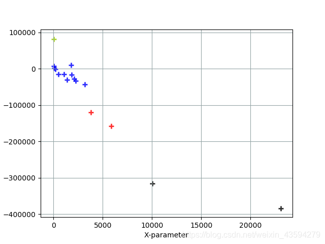
Blue markers: Iran, Canada, Egypt, Germany, Japan, France, Australia, United Kingdom, Spain, South Korea, Italy
Black markers: Brazil, United States
Red markers: Russia, India
Green markers: China
analysis: The larger the value on the horizontal axis, the steeper the growth trend curve of confirmed epidemic cases and the more new cases; the data on the vertical axis can be understood as the number of people who have been diagnosed. Of course, it must be determined in accordance with the actual situation. The weight of the data is relatively small. As can be seen from the figure, the epidemics in the United States and Brazil are still very serious, and more cases will appear in the future, and China is undoubtedly the best in epidemic prevention and control, and there have been few new cases in the near future. The situation in Russia and India is also relatively serious, and we need to work harder to control the epidemic.
Here is also attached a joint drawing of the time series data of these countries:
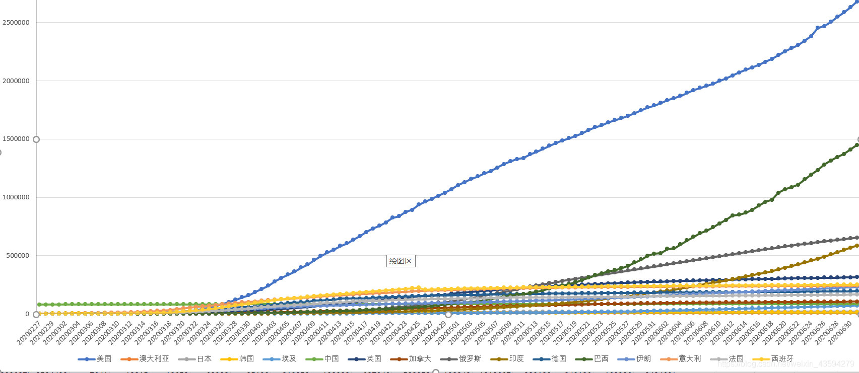
through the trend and ranking of each country, it is once again verified that this classification method is effective.
In the face of the current epidemic situation, we cannot stop taking a break, and we must always be alert to the spread of the epidemic. Recently, an authority has announced that the new crown virus may exist for a long time. This declares a long tug of war between humans and the pneumonia virus. A battle that had to be fought. I sincerely hope that all countries in the world will unite as one, cast aside their past suspicions, and fight the epidemic together.