盒子模型布局稳定性
1、什么时候用内边距 什么时候用外边距
绝大多数情况下可以混用,想用什么就用什么,但是总有一个最好用的,建议
优先使用width 》 padding 》 margin
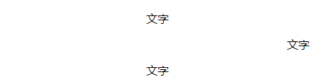
1 <style>
2         .box1{
3             margin-left:200px;
4         }
5         p{
6             padding-left:200px;
7         }
8     </style>
1  <div><p>文字</p></div>
2     <div class="box1"><p>文字</p></div>
3     <div><p>文字</p></div>
浮动(float)
1、标准流 (文档流 普通流)
一个网页的标签元素正常是从上往下,从左到右,块级元素独占一行,行内元素按照顺序依次前后排列
三种布局 标准流 浮动 定位
2、什么是浮动
元素设置了 浮动属性会脱离标准流的控制(脱标)
float:left;
float:right;
float:none 默认值没有浮动
3、浮动特性
*脱离标准流 不占位置 会影响标准流
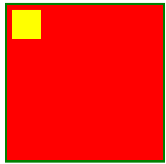
*子盒子浮动 不会压住父盒子的padding和margin
*浮动元素会改变元素的模式,无论行内元素还是块级元素 设置浮动后都具有行内块元素的特性,浮动的元素可以设置宽高,不设置的话靠内容撑开。
4、总结浮动
float
浮 浮动的盒子浮起来,漂浮在标准流盒子上面
漏 浮动的盒子 不占位置 它原来位置漏给了标准流的盒子
特 浮动盒子一般需要和标准流的父级搭配使用,浮动可以改变元素的显示模式
 1 <style>
 2         div{
 3             width: 500px;
 4             height: 500px;
 5             border: 1px solid #ccc;
 6             margin: 0 auto;
 7         }
 8         img{
 9             float:left;/*浮动最初是做文字环绕效果的*/
10             /* float:right; */
11         }
12     </style>
 1 <div>原标题:又一艘?美国载2500人邮轮,21人出现感染“症状”!
 2       该邮轮目前已驶离海岸,抵达时间推迟为美国疾病控制与预防中
 3         心(CDC)、美国海岸警卫队和州卫生官员提供了对该邮轮进行检测的机会。
 4       继日本“钻石公主号”邮轮发生新冠肺炎病毒集体感染事件后,又一艘邮轮
 5         可能也出现疫情。据美国有线电视新闻网(CNN)报道,原定于当地时间4日
 6         晚抵达旧金山的“大公主号”(Grand
 7         Princess)邮轮因为有游客和船员出现感染新型冠状病毒的“症状”,目前该
 8         邮轮已驶离海岸,抵达时间也相应推迟。
 9       报道称,美国加州州长纽森当地时间4日在新闻发布会上表示,原定于当晚抵
10         达旧金山的“大公主号”邮轮已推迟时间,并称该邮轮上有11名乘客和10名船
11         员出现感染新冠病毒的“症状”。
12         <img src="tmg.jpg" height="200px" alt=""/>
13         据纽森表示,该邮轮目前已驶离海岸,抵达时间推迟为美国疾病控制与预防中心
14         (CDC)、美国海岸警卫队和州卫生官员提供了对该邮轮进行检测的机会。他说,
15         上述机构正在向该邮轮运送试剂盒,检测样本随后将被送往位于里士满的州公共
16         卫生实验室进行测试。
17         纽森还说,“大公主号”邮轮上有11名乘客和10名船员出现了感染新冠病毒的“症状”。
18         据报道,该邮轮于2月10日至21日从旧金山驶往墨西哥,随后返回旧金山,并
19         于2月21日启程前往夏威夷。
20         纽森称,该游轮上载有约2500名乘客,其中超过50%是加利福尼亚人。报道称,
21         当地正在与CDC和医疗部门共享乘客名单等信息,以便与所有在邮轮上的人取得联系。
22     </div>
 文字有溢出
文字有溢出
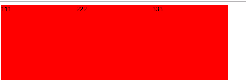
1 <style>
2         div{
3             width: 200px;
4             height: 200px;
5             background-color: red;
6         }
7     </style>
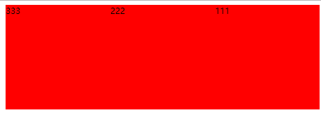
1 <div>111</div>
2     <div>222</div>
3     <div>333</div>
1 <style>
2         div{
3             width: 200px;
4             height: 200px;
5             background-color: red;
6             display:inline-block;
7         }
8     </style>
转化为行内块,并且宽高有效,元素之间有间隙,不方便管理
有间隙原因:回车占用一个空格
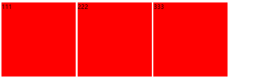
1  <style>
2         div{
3             width: 200px;
4             height: 200px;
5             background-color: red;
6             float:left;/*浮动可以解决元素并排的原因*/
7         }
8     </style>
1 <style>
2         div{
3             width: 200px;
4             height: 200px;
5             background-color: red;
6             float:right;/*浮动可以解决元素并排的原因*/
7         }
8     </style>
 1 <style>
 2         div:first-child{
 3             /*设置第一个div*/
 4             width: 200px;
 5             height: 200px;
 6             background-color: red;
 7             float:left;
 8         }
 9         div:last-child{
10             /*设置最后一个div*/
11             height: 320px;
12             width: 140px;
13             background-color: blue;
14         }
15     </style>
 <div></div>
    <div></div>
浮动的元素飘在标准流的上面压住标准流
 1 <style>
 2         .fa{
 3             width: 500px;
 4             height: 500px;
 5             background-color: red;
 6             border:8px solid green;
 7             padding:16px;
 8             margin:10px;
 9         }
10         .son{
11             width: 100px;
12             height: 100px;
13             float:left;
14             background-color: yellow;
15         }
16     </style>
<div class="fa">
        <div class="son">

        </div>
    </div>
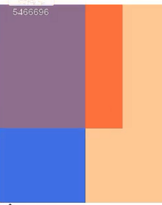
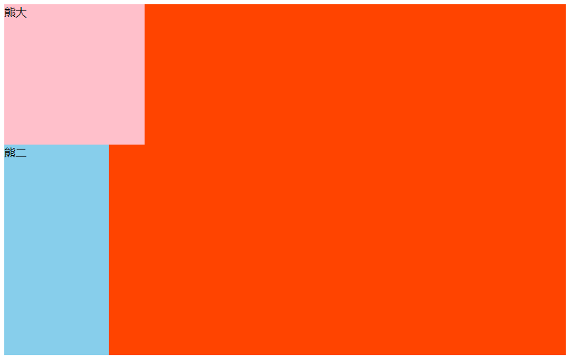
 1 <style>
 2         section{
 3             width: 800px;
 4             height: 500px;
 5             background-color: #f40;
 6         }
 7         section div:first-child{
 8             width: 200px;
 9             height: 200px;
10             background-color: pink;
11         }
12         section div:last-child{
13             width: 149px;
14             height: 300px;
15             background-color: skyblue;
16             float:left;
17         }
18     </style>
<section>
        <!--一个区域-->
        <div>熊大</div>
        <div>熊二</div>
    </section>
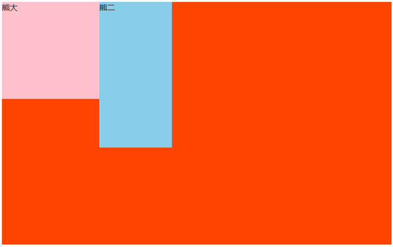
 1 <style>
 2         section{
 3             width: 800px;
 4             height: 500px;
 5             background-color: #f40;
 6         }
 7         section div:first-child{
 8             width: 200px;
 9             height: 200px;
10             background-color: pink;
11             float:left;
12         }
13         section div:last-child{
14             width: 149px;
15             height: 300px;
16             background-color: skyblue;
17             float:left;
18         }
19     </style>
熊大熊二都浮动 会顶对齐
胸大不浮动 熊二浮动 熊二会下一行
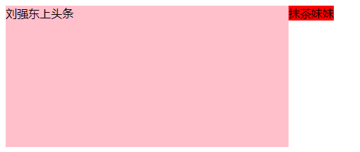
1 <style>
2         div{
3             height: 200px;
4             background-color: pink;
5         }
6     </style>
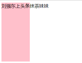
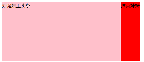
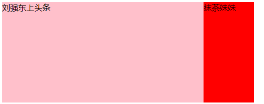
<div>刘强东上头条</div>
    <span>抹茶妹妹</span>
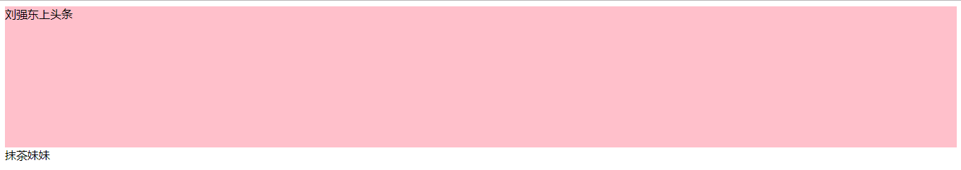
1 <style>
2         div{
3             height: 200px;
4             background-color: pink;
5             float:left;
6         }
7     </style>
宽度靠内容撑开
1  <style>
2         div{
3             height: 200px;
4             width: 400px;
5             background-color: pink;
6             float:left;
7         }
8     </style>
块级元素设置浮动 具有行内块元素的特征

 1     <style>
 2         div{
 3             height: 200px;
 4             width: 400px;
 5             background-color: pink;
 6             float:left;
 7         }
 8         span{
 9             height: 200px;
10             background-color: red;
11         }
12     </style>
 1  <style>
 2         div{
 3             height: 200px;
 4             width: 400px;
 5             background-color: pink;
 6             float:left;
 7         }
 8         span{
 9             height: 200px;
10             float:left;
11             background-color: red;
12         }
13     </style>
 1  <style>
 2         div{
 3             height: 200px;
 4             width: 400px;
 5             background-color: pink;
 6             float:left;
 7         }
 8         span{
 9             height: 200px;
10             width: 100px;
11             float:left;
12             background-color: red;
13         }
14     </style>
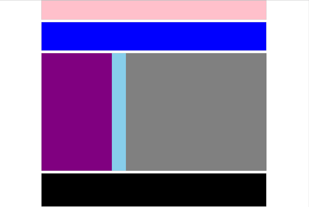
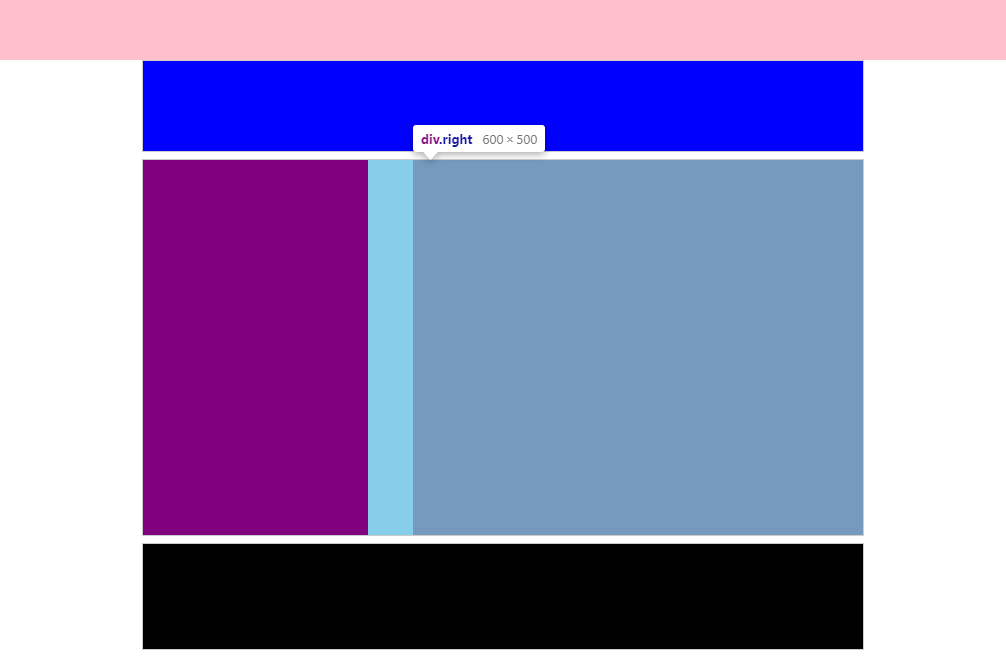
08固定宽度且剧中布局
 1 <style>
 2         *{
 3             padding: 0;
 4             margin: 0;
 5         }
 6         .top,
 7         .banner,
 8         .main,
 9         .footer{
10             width: 960px;
11             text-align: center;
12             margin:0 auto;
13             border:1px solid #ccc;
14             margin-bottom:10px;
15         }
16         .top{
17             height: 80px;
18             background-color: pink;
19         }
20         .banner{
21             height: 120px;
22             background-color: blue;
23         }
24         .main{
25             height: 500px;
26             background-color: skyblue;
27         }
28         .footer{
29             height: 140px;
30             background-color: #000000;
31         }
32         .left{
33             width: 300px;
34             height: 500px;
35             background-color: purple;
36             float:left;
37         }
38         .right{
39             width: 600px;
40             height: 500px;
41             background-color: gray;
42             float:right;
43         }
44     </style>
<div class="top"></div>
    <div class="banner"></div>
    <div class="main">
        <div class="left"></div>
        <div class="right"></div>
    </div>
    <div class="footer"></div>
09通栏分布型
 1  <style>
 2         * {
 3             padding: 0;
 4             margin: 0;
 5         }
 6
 7         .banner,
 8         .main,
 9         .footer {
10             width: 960px;
11             text-align: center;
12             margin: 0 auto;
13             border: 1px solid #ccc;
14             margin-bottom: 10px;
15         }
16
17         .top {
18             height: 80px;
19             background-color: pink;
20             width:100%;/*可以不写*/
21         }
22
23         .banner {
24             height: 120px;
25             background-color: blue;
26         }
27
28         .main {
29             height: 500px;
30             background-color: skyblue;
31         }
32
33         .footer {
34             height: 140px;
35             background-color: #000000;
36         }
37
38         .left {
39             width: 300px;
40             height: 500px;
41             background-color: purple;
42             float: left;
43         }
44
45         .right {
46             width: 600px;
47             height: 500px;
48             background-color: gray;
49             float: right;
50         }
51     </style>
 1 <style>
 2         * {
 3             padding: 0;
 4             margin: 0;
 5         }
 6
 7         .top {
 8             height: 80px;
 9             background-color: pink;
10             width:100%;/*可以不写*/
11         }
12
13         .banner {
14             height: 120px;
15             background-color: blue;
16             width: 960px;
17             border-radius: 15px;/*边框圆角*/
18             margin: 20px auto;
19         }
20
21         .main {
22             height: 500px;
23             background-color: skyblue;
24             width: 960px;
25             margin: 0 auto;
26         }
27
28         .footer {
29             height: 140px;
30             background-color: #000000;
31         }
32
33         ul{
34             list-style: none;/*取消列表的默认样式原点*/
35         }
36
37         .main li{
38             width: 240px;
39             height: 500px;
40             background-color: red;
41             float:left;
42         }
43
44         .main li:nth-child(even){      双数li为绿色
45             background-color: green;
46         }
47
48
49     </style>
<div class="top"></div>
    <div class="banner"></div>
    <div class="main">
       <ul>
           <li></li>
           <li></li>
           <li></li>
           <li></li>
       </ul>
    </div>
    <div class="footer"></div>
