LinearLayout是开发中使用率很高的控件,大部分开发人员感觉应该是很熟悉了,不过LinearLayout还有如下几个需要注意的地方,深刻了解以下几点可以让我们更加全面地认识LinearLayout的真正功能,避免开发中不自觉的踩坑。
一、当父控件orientation为vertical时,只有水平方向的设置才起作用,垂直方向的设置不起作用。即:left、right、center_horizontal 是生效的;top、bottom、center_vertical是无效的。
当父控件的orientation为horizontal时,只有垂直方向的设置才起作用,水平方向的设置不起作用。即:top、bottom、center_vertical是生效的;left、right、center_horizontal是无效的。
原因如下:
我们可以直接看一下LinearLayout的源码布局:
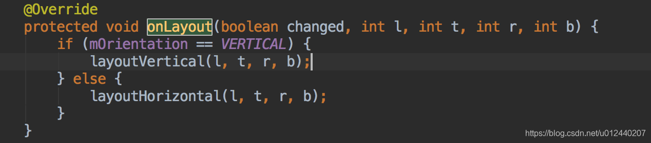
其中layoutVertical(l,t,r,b)方法中关键代码如下:

for循环是绘制子布局,switch语句是根据gravity的值确定水平方向的起始位置,三种值分别为:LEFT,CENTER_HORIZONTAL和RIGHT,由此可以看出只有水平方向的设置起作用。
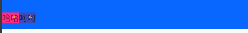
二、当LinearLayout水平布局且设置gravity="bottom"的时候,其多个子控件的底部的其实是在一条水平线上的(欢迎讨论):
先看代码:
<LinearLayout
xmlns:android="http://schemas.android.com/apk/res/android"
android:id="@+id/rootView"
android:layout_width="match_parent"
android:layout_height="50dp"
android:background="@color/color_blue"
android:gravity="bottom"
android:orientation="horizontal">
<TextView
android:id="@+id/tv1"
android:layout_width="wrap_content"
android:layout_height="wrap_content"
android:layout_marginBottom="10dp"
android:background="@color/colorAccent"
android:text="哈哈"/>
<TextView
android:id="@+id/tv2"
android:layout_width="wrap_content"
android:layout_height="wrap_content"
android:background="@color/colorPrimary"
android:text="呵呵"/>
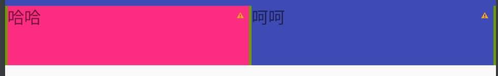
</LinearLayout>本来我以为的布局效果是这样的:
其实的布局效果是这样的:

所以能看出来,当两个子布局的底部还是需要保持在一条水平线上的,如有疑问,欢迎讨论。
三、layout_weight属性:真正意义表示“剩余”空间的占比
1、当LinearLayout的两个子控件的width都是wrap_content时,且layout_weight分别为1和2:
- 那么tv1所占的空间=[总空间-(tv1的字体空间 + tv2的字体空间)] /(1+2)*1 + tv1的字体空间。
- 同理tv2所占的空间=[总空间-(tv1的字体空间 + tv2的字体空间)]/(1+2)*3 + tv2的字体空间。
布局效果:
![]()
代码如下:
<LinearLayout
    xmlns:android="http://schemas.android.com/apk/res/android"
    android:id="@+id/rootView"
    android:layout_width="match_parent"
    android:layout_height="50dp"
    android:background="@color/color_red"
    android:gravity="bottom"
    android:orientation="horizontal">

    <TextView
        android:id="@+id/tv1"
        android:layout_width="wrap_content"
        android:layout_height="wrap_content"
        android:layout_weight="1"
        android:background="@color/color_green"
        android:text="哈哈"/>

    <TextView
        android:id="@+id/tv2"
        android:layout_width="wrap_content"
        android:layout_height="wrap_content"
        android:layout_weight="2"
        android:background="@color/color_blue"
        android:text="呵呵"/>

</LinearLayout>2、上面给人的感觉是当weight越大时所占有空间越大,其实不是这样子的,当我们将两个子控件的width都设置成math_parent时,且layout_weight依然分别为1和2时:
布局效果:
![]()
代码如下:
<LinearLayout
    xmlns:android="http://schemas.android.com/apk/res/android"
    android:id="@+id/rootView"
    android:layout_width="match_parent"
    android:layout_height="50dp"
    android:background="@color/color_white"
    android:gravity="bottom"
    android:orientation="horizontal">

    <TextView
        android:id="@+id/tv1"
        android:layout_width="match_parent"
        android:layout_height="wrap_content"
        android:layout_weight="1"
        android:background="@color/color_green"
        android:text="哈哈"/>

    <TextView
        android:id="@+id/tv2"
        android:layout_width="match_parent"
        android:layout_height="wrap_content"
        android:layout_weight="2"
        android:background="@color/color_blue"
        android:text="呵呵"/>

</LinearLayout>
这表示tv1和tv2开始都占有屏幕的宽度大小,假如屏幕宽度为1080,那么"剩余"空间的占比变为1080-1080*2 = -1080.
所以tv1占有的空间为:1080 +[-1080/(1+2)]*1=720
tv2占有的空间为:1080+[-1080/(1+2)]*2=360
很明显tv1看起来比tv2占有的空间大。
所以weight值的大小跟所占有的空间大小没有必然的联系。
3、假如我们要做一个自适应的布局,左右两个按钮,可以根据屏幕的大小适应,左按钮始终最左边,右按钮始终在最右边。
效果如下:
![]()
当我们使用RelativeLayout的时候很容易实现,即分别设置设置layout_alignParentLeft="true"与layout_alignParentRight="true"就可以了。
但当我们使用LinearLayout如何很快就这种效果呢,这里使用到了Space属性,将此空间放置中间,并只设置其layout_weight 为1,即中间剩余空间都由该Space撑满。
代码如下:
<LinearLayout
    xmlns:android="http://schemas.android.com/apk/res/android"
    android:id="@+id/rootView"
    android:layout_width="match_parent"
    android:layout_height="50dp"
    android:background="@color/color_white"
    android:gravity="bottom"
    android:orientation="horizontal">

    <TextView
        android:id="@+id/tv1"
        android:layout_width="wrap_content"
        android:layout_height="wrap_content"
        android:background="@color/colorAccent"
        android:text="哈哈"/>

    <Space
        android:layout_width="wrap_content"
        android:layout_height="wrap_content"
        android:layout_weight="1"
        android:background="@color/color_black"/>

    <TextView
        android:id="@+id/tv2"
        android:layout_width="wrap_content"
        android:layout_height="wrap_content"
        android:background="@color/colorPrimary"
        android:text="呵呵"/>

</LinearLayout>4、weightSum属性:其与weight属性有很大关系,可通过weightSum控制weight的最大占比(假设字体占有空间宽度为120,屏幕宽度为1080)。
*当weightSum为3,子控件weight分别为1时:
效果如下:
![]()
tv1与tv2本来是一样的weight,可是结果它们都没有撑满屏幕。因为weightSum="3",也就是说tv1、tv2占用的宽度是 120 + 840 / 3 = 400 ,右边还有剩余280。
代码如下:
<LinearLayout
    xmlns:android="http://schemas.android.com/apk/res/android"
    android:id="@+id/rootView"
    android:layout_width="match_parent"
    android:layout_height="50dp"
    android:background="@color/color_white"
    android:gravity="bottom"
    android:orientation="horizontal"
    android:weightSum="3">

    <TextView
        android:id="@+id/tv1"
        android:layout_width="wrap_content"
        android:layout_height="wrap_content"
        android:layout_weight="1"
        android:background="@color/colorAccent"
        android:text="哈哈"/>

    <TextView
        android:id="@+id/tv2"
        android:layout_width="wrap_content"
        android:layout_height="wrap_content"
        android:layout_weight="1"
        android:background="@color/colorPrimary"
        android:text="呵呵"/>

</LinearLayout>
*当weightSum为3时,子控件weight分别为2时:
效果如下:
![]()
tv1与tv2本来是一样的weight且为2。此时weightSum="3",也就是说tv1、tv2占用的宽度是 120 + 840 * 2 / 3 = 680 ,两个都是 680,而屏幕宽度是1080,所以此时tv2被挤到屏幕之外了。
代码如下:
<LinearLayout
    xmlns:android="http://schemas.android.com/apk/res/android"
    android:id="@+id/rootView"
    android:layout_width="match_parent"
    android:layout_height="50dp"
    android:background="@color/color_white"
    android:gravity="bottom"
    android:orientation="horizontal"
    android:weightSum="3">

    <TextView
        android:id="@+id/tv1"
        android:layout_width="wrap_content"
        android:layout_height="wrap_content"
        android:layout_weight="2"
        android:background="@color/colorAccent"
        android:text="哈哈"/>

    <TextView
        android:id="@+id/tv2"
        android:layout_width="wrap_content"
        android:layout_height="wrap_content"
        android:layout_weight="2"
        android:background="@color/colorPrimary"
        android:text="呵呵"/>

</LinearLayout>三、divider showDivider属性
以往我在设置分割线时,都是新增一个View,用来显示分割线,直到我发现在LinearLayout中添加分割线的新方法。LinearLayout显示分割线主要涉及divider 、showDividers 属性 : android:divider用于设置分割线的样式,可以是xml的drawable也可以是图片。android:showDividers = "middle|end|beginning|none" 其每个选项的作用:
- middle 在每一项中间添加分割线
- end 在整体的最后一项添加分割线
- beginning 在整体的最前方添加分割线
- none 不显示分割线
效果如下:
代码如下:
<LinearLayout
    xmlns:android="http://schemas.android.com/apk/res/android"
    android:id="@+id/rootView"
    android:layout_width="match_parent"
    android:layout_height="50dp"
    android:background="@color/color_white"
    android:divider="@drawable/shape"
    android:gravity="bottom"
    android:orientation="horizontal"
    android:showDividers="beginning|middle|end">

    <TextView
        android:id="@+id/tv1"
        android:layout_width="wrap_content"
        android:layout_height="match_parent"
        android:layout_weight="2"
        android:background="@color/colorAccent"
        android:text="哈哈"/>

    <TextView
        android:id="@+id/tv2"
        android:layout_width="wrap_content"
        android:layout_height="match_parent"
        android:layout_weight="2"
        android:background="@color/colorPrimary"
        android:text="呵呵"/>

</LinearLayout>
shape.xml布局:
<?xml version="1.0" encoding="utf-8"?>
<shape xmlns:android="http://schemas.android.com/apk/res/android">
    <solid android:color="@android:color/holo_green_dark"/>
    <size
        android:width="2dp"
        android:height="12dp"/>
</shape>