翻滚吧少年!(自定义css3动画过渡中的贝塞尔曲线)
一、翻滚吧少年
我们先看看本文示例效果:
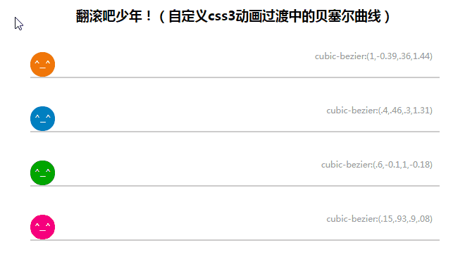
以上效果没有应用js,只用到css3的贝塞尔曲线来实现各种缓动效果,是不是心动呢?那么应该怎么使用呢?
二、背景介绍
随着高级浏览器的普及,css3和html5也开始越来越流行了。现在很多网站都有css3动画效果,交互性进一步增强。
对于css3的Transitions,网上很多介绍,相信大家都比较了解,这里用最简单的方式介绍下:
transition语法:
transition:<transition-property> <transition-duration> <transition-timing-function> <transition-delay>;
例如 transition:all 2.5s linear 0.2s;
表示全部属性变化,持续2.5秒,缓冲效果为linear,延迟0.2s执行;
对于缓冲效果,很多网站只介绍了默认提供的:ease, linear, ease-in, ease-out, ease-in-out
这对于复杂动画效果来说是远远不够的,其实还有一个更强大的属性叫cubic-bezier通过cubic-bezier(x1, y1, x2, y2)来设置动画的贝塞尔曲线。
使用例子:transition:all 2.5s cubic-bezier(1,-0.39,.36,1.44) 0.2s;
二、cubic-bezier 贝塞尔曲线介绍
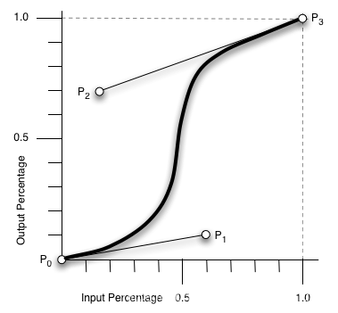
cubic-bezier为通过贝塞尔曲线来计算“转换”过程中的属性值,如下曲线所示,通过改变P1(x1, y1)和P2(x2, y2)的坐标可以改变整个过程的Output Percentage。w3c文档中表述是所有值需在[0, 1]区域内,否则无效。但是在一些浏览器(Chrome,Firefox,Opera,IE11 预览版)下对P1(x1, y1)和P2(x2, y2)的坐标中的y1和y2并没有这个限制,曲线可以是负值,也可以取大于1的值。如果x1和x2是负数,或者大于1的值那么直接应用最终样式没有过渡效果。而一些老版本的浏览器曲线值仍需在[0, 1]区域内,否则直接应用最终样式,比如Opera 12,和老版本的webkit浏览器,其他没测试。
而(x1, y1, x2, y2)的参数怎么获取呢,cubic-bezier.com 提供了详细的演示。
于是,了解过后,我们就可以制作一个文章开头的demo了!
四、在线demo和源码
这里有在线demo。
下一篇《跟我做css3的ppt(Animation介绍&Animate.css应用)》我将介绍css3的Animation和Animate.css的应用。
本例源代码如下:
<!DOCTYPE html>
<html lang="en">
<head>
    <meta charset="UTF-8">
    <meta name="viewport" content="width=device-width, initial-scale=1.0">
    <meta http-equiv="X-UA-Compatible" content="ie=edge">
    <title>翻滚吧少年!(自定义css3动画过渡中的贝塞尔曲线)</title>
</head>
<style>
    h3 {
        text-align:center;
    }
    .demo {
        height:35px;
        border-bottom:2px solid #ccc;
        position:relative;
        margin:40px;
        font-size:12px;
        font-family:"Microsoft YaHei";
    }
    .demo p {
        position:absolute;
        z-index:0;
        right:10px;
        bottom:10px;
        color:#999;
    }
    .demo .box {
        width:35px;
        height:35px;
        line-height:35px;
        position:relative;
        -webkit-border-radius:100%;
        -moz-border-radius:100%;
        border-radius:100%;
        background:#f07709;
        color:#fff;
        text-align:center;
        font-family:Georgia;
        z-index:1;
        left:0;
    }


    .demo:hover .box{
        left:365px;
        -webkit-transform: rotate(2880deg);
        -moz-transform: rotate(2880deg);
        -o-transform: rotate(2880deg);
        -ms-transform: rotate(2880deg);
        transform: rotate(2880deg);
    }

    #demoA .box{
        -webkit-transition:1.5s all cubic-bezier(1,-0.39,.36,1.44) 0.2s;
        -moz-transition:1.5s all cubic-bezier(1,-0.39,.36,1.44) 0.2s;
        -o-transition:1.5s all cubic-bezier(1,-0.39,.36,1.44) 0.2s;
        transition:1.5s all cubic-bezier(1,-0.39,.36,1.44) 0.2s;
    }

    #demoB .box{
        -webkit-transition:1.5s all cubic-bezier(.4,.46,.3,1.31) 0.2s;
        -moz-transition:1.5s all cubic-bezier(.4,.46,.3,1.31) 0.2s;
        -o-transition:1.5s all cubic-bezier(.4,.46,.3,1.31) 0.2s;
        transition:1.5s all cubic-bezier(.4,.46,.3,1.31) 0.2s;
        background:#0080c0;
    }


    #demoC .box{
        -webkit-transition:1.5s all cubic-bezier(.6,-0.1,1,-0.18) 0.2s;
        -moz-transition:1.5s all cubic-bezier(.6,-0.1,1,-0.18) 0.2s;
        -o-transition:1.5s all cubic-bezier(.6,-0.1,1,-0.18) 0.2s;
        transition:1.5s all cubic-bezier(.6,-0.1,1,-0.18) 0.2s;
        background:#00a600;
    }

    #demoD .box{
        -webkit-transition:2.5s all cubic-bezier(.15,.93,.9,.08) 0.2s;
        -moz-transition:2.5s all cubic-bezier(.15,.93,.9,.08) 0.2s;
        -o-transition:2.5s all cubic-bezier(.15,.93,.9,.08) 0.2s;
        transition:2.5s all cubic-bezier(.15,.93,.9,.08) 0.2s;
        background:#f7007b;
    }
</style>
<body>
    <h3>翻滚吧少年!(自定义css3动画过渡中的贝塞尔曲线)</h3>
    <div class="demo" id="demoA">
        <div class="box">^_^</div>
        <p>cubic-bezier:(1,-0.39,.36,1.44)</p>
    </div>
    <div class="demo" id="demoB">
        <div class="box">^_^</div>
        <p>cubic-bezier:(.4,.46,.3,1.31)</p>
    </div>
    <div class="demo" id="demoC">
        <div class="box">^_^</div>
        <p>cubic-bezier:(.6,-0.1,1,-0.18)</p>
    </div>
    <div class="demo" id="demoD">
        <div class="box">^_^</div>
        <p>cubic-bezier:(.15,.93,.9,.08)</p>
    </div>
</body>
</html>
