css3过渡属性:
| 属性 | 描述 |
|---|---|
| transition-property | 检索或设置对象中的参与过渡的属性 |
| transition-duration | 检索或设置对象过渡的持续时间 |
| transition-delay | 检索或设置对象延迟过渡的时间 |
| transition-timing-function | 检索或设置对象中过渡的动画类型 |
简写方法:
    transition: 属性值1  属性值2  属性值3  属性值4;
        属性值1: all(默认值)       需要参与过渡的属性(如:width,height......)
        属性值2: 过渡的时间    (单位:s 秒   ms  毫秒)
        属性值3: 延迟的时间    (单位:s 秒   ms  毫秒)
        属性值4: 动画的类型
    示例:
        transition: all 1s 0.2s linear;
不同属性值的不同变化,可用逗号隔开:
        transition: width 1s, height 2s, background 3s;
| transition-timing-function 属性值 | 说明 |
|---|---|
| ease(默认值) | 慢速开始-变快-慢速结束 |
| linear | 匀速 |
| ease-in | 慢速开始 |
| ease-out | 慢速结束 |
| ease-in-out | 先加速再减速 |
| cubic-bezier(n,n,n,n) | 自定义曲线(n的取值在0~1之间) |
注:**transition** 必须通过鼠标事件触发(例如:鼠标滑过 :hover)
动画效果的实现
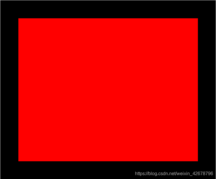
初始状态:
鼠标移上去:
鼠标移上去(黑色区域上面)之后,红色区域逐渐变小的同时其它色块分别从左侧和底部缓缓上来(会有一个过渡的过程)。

鼠标移出:
鼠标移出(黑色区域)后,红色区域逐渐变大的同时,其它色块分别向左侧和底部缓缓退出,直到恢复初始状态。

HTML代码:
 <div class="big_box">
        <div class="box1"></div>
        <div class="box2"></div>
        <div class="box3"></div>
        <div class="box4"></div>
        <div class="box5"></div>
        <div class="box6"></div>
    </div>
css样式:
.big_box{
            width: 600px;
            height: 500px;
            margin: 100px auto;
            background: black;
            /* 添加定位,形成包含块(参照物) */
            position: relative;
             /*隐藏大盒子外面的内容  */
            overflow: hidden;
        }
        .box1{
            width: 500px;
            height: 400px;
            background: red;
            position: absolute;
            top: 50px;
            left: 50px;
            /* 过渡效果 */
            transition: all 1s;
        }
        /* 鼠标移上去,改变大小 */
        .big_box:hover .box1{
            width: 340px;
            height: 280px;
        }


        .box2,.box3,.box4,.box5,.box6{
            width: 160px;
            height: 125px;
        }
        .box2{
            background: green;
            /* 添加定位,初始状态下在大盒子外面 */
            position: absolute;
            top: 50px;
            left: 100%;
            /* 过渡效果 */
            transition: 0.5s 0.2s;
        }
        /* 鼠标移上去改变位置(跑到大盒子里面) */
        .big_box:hover .box2{
            left: 415px;
        }
        .box3{
            background: yellow;
            position: absolute;
            top: 202px;
            left: 100%;
            transition: 0.5s 0.3s;
        }
        .big_box:hover .box3{
            left: 415px;
        }
        .box4{
            background: palevioletred;
            position: absolute;
            top: 100%;
            left: 416px;
            transition: 0.5s 0.2s;
        }
        .big_box:hover .box4{
            top: 352px;
        }
        .box5{
            background: orange;
            position: absolute;
            top: 100%;
            left: 233px;
            transition: 0.5s 0.28s;
        }
        .big_box:hover .box5{
            top: 352px;
        }
        .box6{
            background:plum;
            position: absolute;
            top: 100%;
            left: 50px;
            transition: 0.5s 0.36s;
        }
        .big_box:hover .box6{
            top: 352px;
        }
学习的时候查资料发现很多技术方面的东西都是博客上的文章,前两天注册了一个博客账号,今天尝试着写了一篇,还是第一次写,希望对看到这篇文章的人有帮助,也希望技术大牛们多多指教!!!
