一、问题描述
今天UI小姐姐找到我,说有个界面的问题中的 竖线分隔符 与文本不对齐,有向下偏移的问题,如下所示:
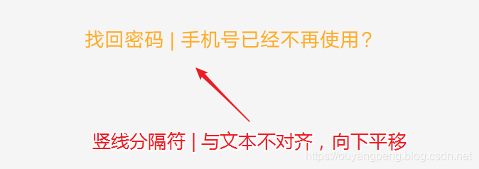
可以明显看到,这个竖线分隔符 | 与文本不对齐,有明显向下偏移的问题。
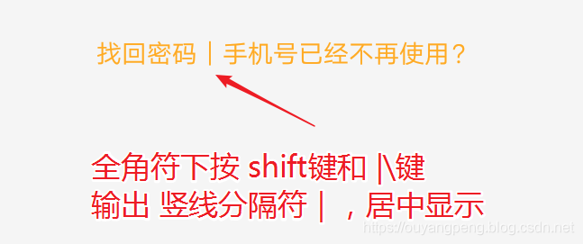
<string name="login_problem_phone_and_password">找回密码   |   手机号已经不再使用?</string>
我是在半角符的情况下,按 shift键 + |\键 即可输出 **|**明显下沉 ,然后在两边加上空格来实现。
UI小姐姐说要我必须想办法使之对齐。好吧,想办法解决吧!
二、解决问题
2.1 使用 ReplacementSpan 尝试解决
首先我查阅到了下面这篇博客,以为有用。
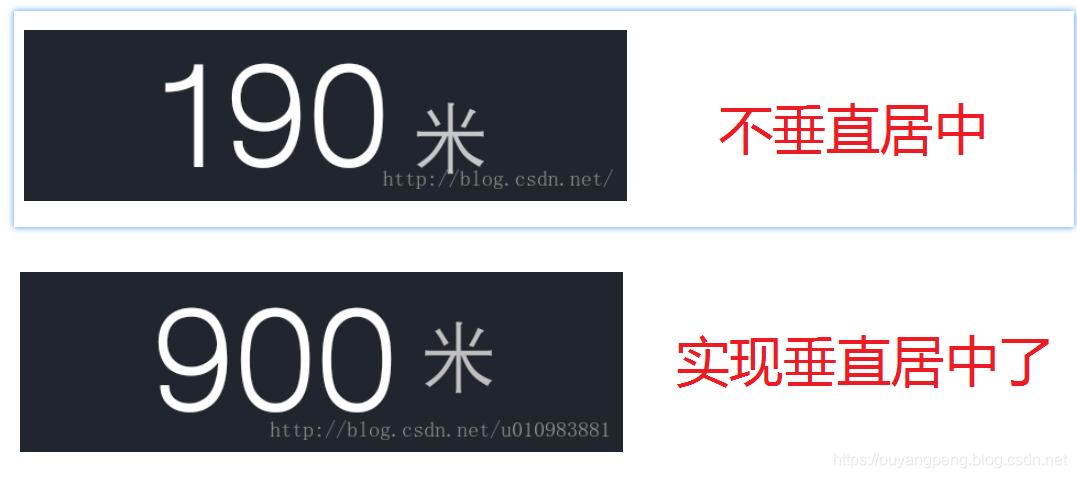
- 【Android】TextView中不同大小字体如何上下垂直居中?
https://blog.csdn.net/u010983881/article/details/53995020
但是实际上,这个问题还是没有解决我这个竖线分隔符 | 与文本不对齐,有明显向下偏移的问题。
这篇文章主要是解决TextView中不同大小字体如何上下垂直居中? 效果图如下
虽然问题没解决,但是也看到了几个日常疏忽掉的知识点。
2.1.1 ParcelableSpan接口的实现类
在客户端开发中,我们往往需要对一个TextView的文字的部分内容进行特殊化处理,比如加粗、改变颜色、加链接、下划线等。iOS为我们提供了AttributedString,而Android则提供了SpannableString。
在Android的android.text.style包下为我们提供了各种各样的span,如下所示:

常用的几个Span的意义如下所示:
-
AbsoluteSizeSpan(int size) —— 设置字体大小,参数是绝对数值,相当于Word中的字体大小
-
RelativeSizeSpan(float proportion) —— 设置字体大小,参数是相对于默认字体大小的倍数,比如默认字体大小是x, 那么设置后的字体大小就是x*proportion,这个用起来比较灵活,proportion>1就是放大(zoom in), proportion<1就是缩小(zoom out)
-
ScaleXSpan(float proportion) —— 缩放字体,与上面的类似,默认为1,设置后就是原来的乘以proportion,大于1时放大(zoon in),小于时缩小(zoom out)
-
BackgroundColorSpan(int color) —— 背景着色,参数是颜色数值,可以直接使用android.graphics.Color里面定义的常量,或是用Color.rgb(int, int, int)
-
ForegroundColorSpan(int color) —— 前景着色,也就是字的着色,参数与背景着色一致
-
TypefaceSpan(String family) —— 字体,参数是字体的名字比如“sans”, “sans-serif”等
-
StyleSpan(Typeface style) —— 字体风格,比如粗体,斜体,参数是android.graphics.Typeface里面定义的常量,如Typeface.BOLD,Typeface.ITALIC等等。StrikethroughSpan—-如果设置了此风格,会有一条线从中间穿过所有的字,就像被划掉一样
2.1.2 什么是 Paint.FontMetrics
Paint.FontMetrics 源代码如下所示:
 /**
     * Class that describes the various metrics for a font at a given text size.
     * Remember, Y values increase going down, so those values will be positive,
     * and values that measure distances going up will be negative. This class
     * is returned by getFontMetrics().
     */
    public static class FontMetrics {
        /**
         * The maximum distance above the baseline for the tallest glyph in
         * the font at a given text size.
         */
        public float   top;
        /**
         * The recommended distance above the baseline for singled spaced text.
         */
        public float   ascent;
        /**
         * The recommended distance below the baseline for singled spaced text.
         */
        public float   descent;
        /**
         * The maximum distance below the baseline for the lowest glyph in
         * the font at a given text size.
         */
        public float   bottom;
        /**
         * The recommended additional space to add between lines of text.
         */
        public float   leading;
    }
该类描述给定文本大小的字体的各种度量。记住,Y值向下增加,所以这些值为正值,测量向上距离的值为负值。此类由GetFontMetrics()返回。
它表示绘制字体时的度量标准。google的官方api文档对它的字段说明如下:
| Type | Fields |
|---|---|
| public float ascent | The recommended distance above the baseline for singled spaced text. |
| public float bottom | The maximum distance below the baseline for the lowest glyph in the font at a given text size. |
| public float descent | The recommended distance below the baseline for singled spaced text. |
| public float leading | The recommended additional space to add between lines of text. |
| public float top | The maximum distance above the baseline for the tallest glyph in the font at a given text size. |
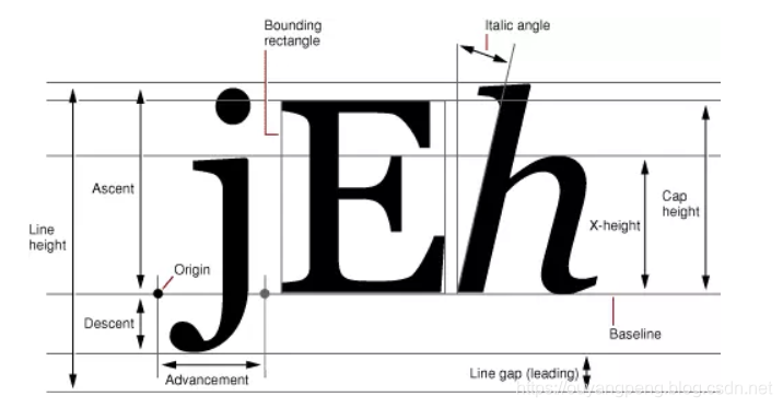
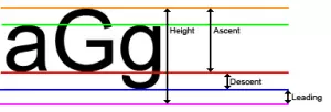
要点如下:
- baseline
基准点 - ascent
baseline之上至字符最高处的距离 - descent
baseline之下至字符最低处的距离 - leading
文档说的很含糊,其实是上一行字符的descent到下一行的ascent之间的距离 - top
指的是指的是最高字符到baseline的值,即ascent的最大值 - bottom
指的是最下字符到baseline的值,即descent的最大值
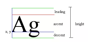
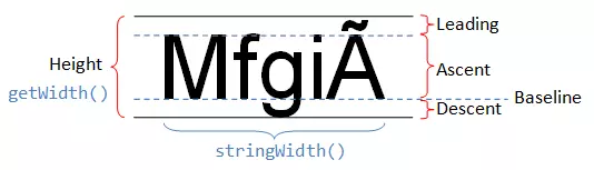
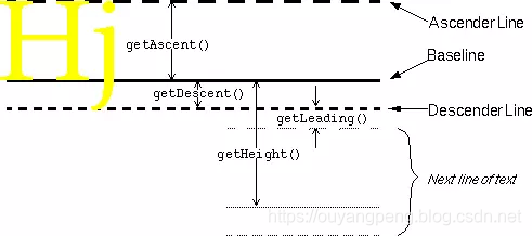
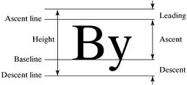
为了帮助理解,我特此搜索了不同的示意图。对照示意图,会很容易理解FontMetrics的参数。
2.2 替换 竖线分隔符
还尝试了几种其他的方法,都是无效的。最后我想是不是 本身的这个 竖线分隔符 就是有问题的呢?
查阅到下面的这篇文章
- 用哪个字符作为标题中的分隔竖线
https://www.jianshu.com/p/f11b5d68b154

发现该作者和我的问题一模一样,似乎有明显的下沉,与两边的文字不在同一水平面上。
好吧,我找到了我的问题所在。 原来一开始我是使用的半角字符 | ,所以才会有这个问题。
2.2.1 半角符情况下的竖线分隔符 |
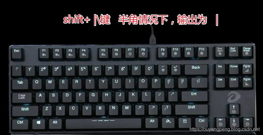
在半角符的情况下,按 shift键 + |\键 即可输出 | ,表现为 a|b。 明显下沉。
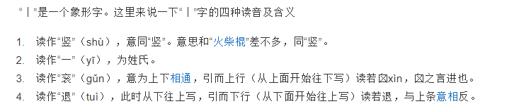
2.2.2 念gǔn也念shù或者yī的汉字 竖线分隔符 丨
.丨,是一个象形文字,是一个多音字,读音主要有shù、gǔn,外文名叫Radical Line,意思是指古姓氏。
读作“竖”(shù),意同“竖”。意思和“火柴棍”差不多,同“竖”。
读作“一”(yī),为姓氏。
读作“衮”(gǔn),意为上下相通,引而上行(从上面开始往下写)读若囟xìn,囟之言进也。
读作“退”(tuì),此时从下往上写,引而下行(从下面开始往上写)读若退,与上条意相反。
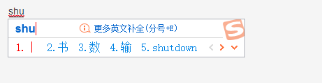
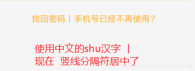
在输入法中 输入 shu 即可展示出来 丨,如下所示
修改后的效果图
<string name="login_problem_phone_and_password">找回密码|手机号已经不再使用?</string>
2.2.3 全角符情况下的竖线分隔符 |
先将输入法切换到全角模式

然后在全角符模式下 输入 shift键 + |键 即可输出 |。
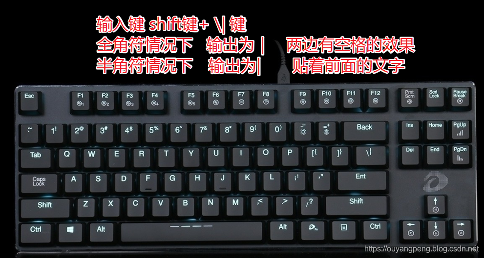
效果如下
<string name="login_problem_phone_and_password">找回密码|手机号已经不再使用?</string>
三、总结
- 全角模式下输入的竖线分隔符 |,两边自带空格效果
<string name="login_problem_phone_and_password">找回密码|手机号已经不再使用?</string>
半角模式下输入的竖线分隔符 |,两边的空格效果需要加空格
<string name="login_problem_phone_and_password">找回密码   |   手机号已经不再使用?</string>
中文的shu汉字实现竖线分隔符 丨,两边自带空格效果
<string name="login_problem_phone_and_password">找回密码|手机号已经不再使用?</string>
后面两个都可以解决此问题,可以自己看着选择,我选择的是全角模式下输入的竖线分隔符 |。
四、参考链接
- https://www.jianshu.com/p/918fec73a24d
- https://blog.csdn.net/u010983881/article/details/53995020
- https://www.jianshu.com/p/f11b5d68b154

作者:欧阳鹏 欢迎转载,与人分享是进步的源泉!
转载请保留原文地址:https://blog.csdn.net/qq446282412/article/details/90410814
☞ 本人QQ: 3024665621
☞ QQ交流群: 123133153
☞ github.com/ouyangpeng
☞ [email protected]