一、RaisedButton 定义一个按钮
Flutter 中通过 RaisedButton 定义一个按钮。RaisedButton 里面有很多的参数,只讲简单的进行使用。
return RaisedButton(
child: Text('女装'),
textColor: Theme.of(context).accentColor,
onPressed: (){
},
);
二、Wrap 组件
Wrap 可以实现流布局,单行的 Wrap 跟 Row 表现几乎一致,单列的 Wrap 则跟 Row 表现几乎一致。但 Row 与 Column 都是单行单列的,Wrap 则突破了这个限制,mainAxis 上空间不足时,则向 crossAxis 上去扩展显示
direction 主轴的方向,默认水平
alignment 主轴的对其方式
spacing 主轴方向上的间距
textDirection 文本方向
verticalDirection 定义了 children 摆放顺序,默认是 down,见Flex 相关属性介绍。
runAlignment run的对齐方式。run 可以理解为新的行或者列,如果是水平方向布局的话,run 可以理解为新的一行
runSpacing run的间距
案例
案例代码一
return Container(
  child: Wrap(
    children: <Widget>[
      Container(margin: EdgeInsets.all(5), width: 100, height: 30, decoration: BoxDecoration(color: Colors.red),),
      Container(margin: EdgeInsets.all(5), width: 100, height: 30, decoration: BoxDecoration(color: Colors.red),),
      Container(margin: EdgeInsets.all(5), width: 100, height: 30, decoration: BoxDecoration(color: Colors.red),),
      Container(margin: EdgeInsets.all(5), width: 100, height: 30, decoration: BoxDecoration(color: Colors.red),),
      Container(margin: EdgeInsets.all(5), width: 100, height: 30, decoration: BoxDecoration(color: Colors.red),),
      Container(margin: EdgeInsets.all(5), width: 100, height: 30, decoration: BoxDecoration(color: Colors.red),)
    ],
  ),
);
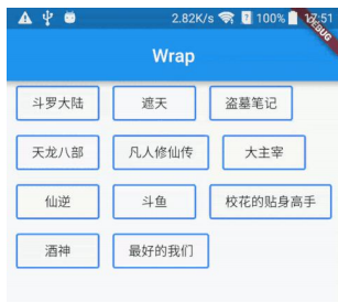
案例代码 二
class HomenCenter extends StatelessWidget {
  Widget build(BuildContext context) {
    // TODO: implement build
    return Wrap(
      spacing: 5,
      children: <Widget>[
        MyButton('按钮1'),
        MyButton('按钮1'),
        MyButton('按钮1'),
        MyButton('按钮1'),
        MyButton('按钮1'),
        MyButton('按钮1'),
        MyButton('按钮1'),
      ],
    );
  }
}

class MyButton extends StatelessWidget {
  final text;
  MyButton(this.text);
  @override
  Widget build(BuildContext context) {
    // TODO: implement build
    return RaisedButton (
      child: Text(this.text),
      color: Colors.red,
      textColor: Colors.white,
      onPressed: () {},
    );
  }
}