关于时间序列你所能做的一切
Siddharth Yadav
翻译自https://www.kaggle.com/thebrownviking20/everything-you-can-do-with-a-time-series
数据文件也在上面链接里。或者上我的github代码库:https://github.com/zwdnet/MyQuant/tree/master/11
目标
从我注册这个平台的第一周,我就被时间序列分析这个主题给迷住了。本文是关于时间序列分析的许多广泛的话题的一个集合体。我写作本文的目的是为时间序列分析初学者和有经验的人提供一个基本的参考。
一些重要的事情
1.本教程还在完成中,所以你每次打开它都有可能会发现有更新的内容。
2.我在写这篇教程时已经学习过很多这个领域的课程,我还在继续学习更多的更高级的课程以获得更多的知识和内容。
3.如果您有任何建议或者有任何主题希望本教材覆盖,请在评论区留言。
4.如果您欣赏本文,请一定点赞(按喜欢按钮)。这样它能对社区有更大的意义和帮助。
首先导入相关的库
'''python
Importing libraries
import os
import warnings
warnings.filterwarnings('ignore')
import numpy as np
import pandas as pd
import matplotlib.pyplot as plt
plt.style.use('fivethirtyeight')
Above is a special style template for matplotlib, highly useful for visualizing time series data
%matplotlib inline
from pylab import rcParams
from plotly import tools
import plotly.plotly as py
from plotly.offline import init_notebook_mode, iplot
init_notebook_mode(connected=True)
import plotly.graph_objs as go
import plotly.figure_factory as ff
import statsmodels.api as sm
from numpy.random import normal, seed
from scipy.stats import norm
from statsmodels.tsa.arima_model import ARMA
from statsmodels.tsa.stattools import adfuller
from statsmodels.graphics.tsaplots import plot_acf, plot_pacf
from statsmodels.tsa.arima_process import ArmaProcess
from statsmodels.tsa.arima_model import ARIMA
import math
from sklearn.metrics import mean_squared_error
print(os.listdir("../input"))
'''
输出
['historical-hourly-weather-data', 'stock-time-series-20050101-to-20171231']
目录
1.介绍日期与时间
1.1 导入时间序列数据
1.2 时间序列数据的清洗与准备
1.3 数据的可视化
1.4 时间戳和周期
1.5 使用date_range
1.6 使用to_datetime
1.7 转换与延迟(shifting and lags)
1.8 重取样
2.金融与统计学
2.1 改变的百分率
2.2 证券收益
2.3 相继列的绝对改变(Absolute change in sucessive rows)
2.4 比较两个或更多的时间序列
2.5 窗口函数
2.6 OHLC图
2.7 蜡烛图
2.8 自相关与部分自相关
3.时间序列分解与随机行走
3.1 趋势、季节性和噪音
3.2 白噪音
3.3 随机行走
3.4 稳定性(Stationarity)
4.使用statsmodels建模
4.1 AR模型
4.2 MA模型
4.3 ARMA模型
4.4 ARIMA模型
4.5 VAR模型
4.6 状态空间模型
4.6.1 SARIMA模型
4.6.2 未观察到的部分(Unobserved omponents)
4.6.3 动态因子模型
1.介绍日期与时间
1.1 导入时间序列数据
如何导入数据?
首先,我们导入本教程需要的所有数据集。所需的时间序列数据的列作为日期时间使用parse_dates参数导入,另外可以使用dateframe的index_col参数来选择索引。
我们将使用的数据包括:
1.谷歌股票数据
2.世界各个城市的温度数据
3.微软股票数据
4.世界各个城市的气压数据
导入数据
'''python
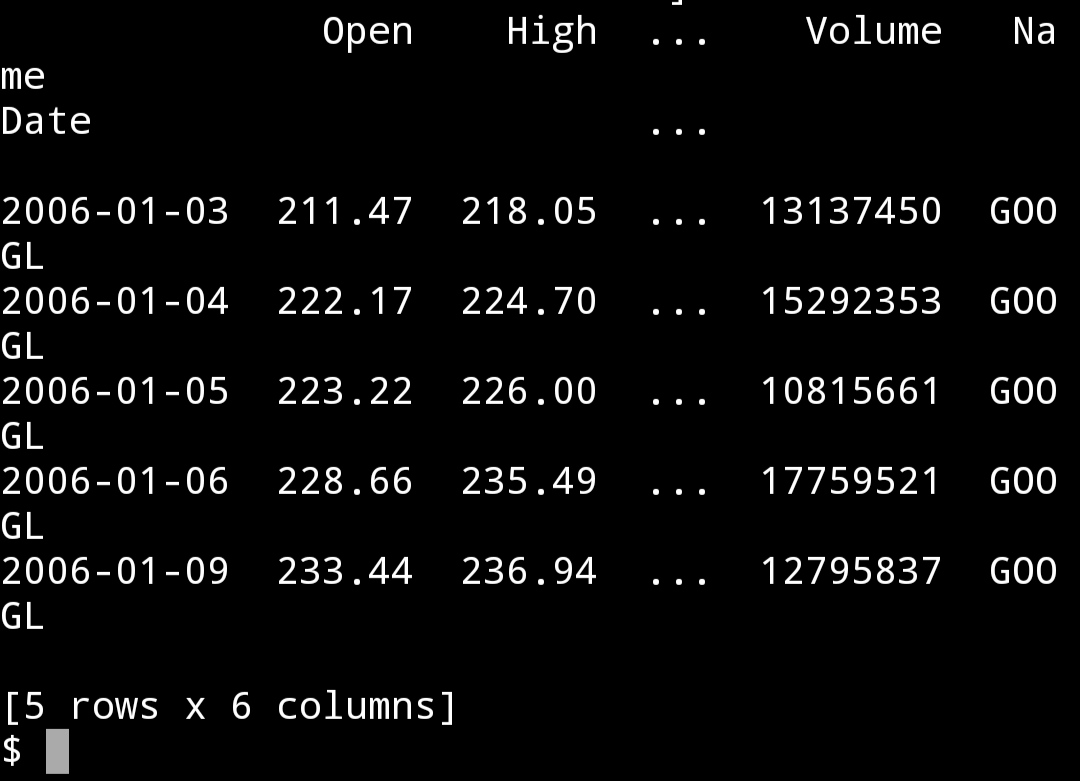
google = pd.read_csv("input/stock-time-series-20050101-to-20171231/GOOGL_2006-01-01_to_2018-01-01.csv", index_col = "Date", parse_dates = ["Date"])
print(google.head())
'''
'''python
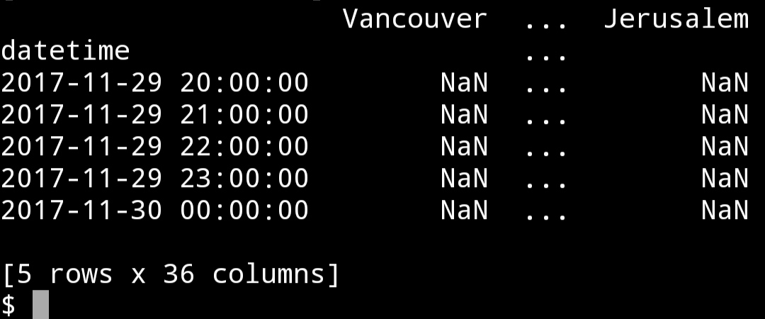
humidity = pd.read_csv("input/historical-hourly-weather-data/humidity.csv", index_col = "datetime", parse_dates = ['datetime'])
print(humidity.tail())
'''
1.2 时间序列数据的清洗与准备
如何准备数据?
谷歌股票数据没有缺失项,而气温数据有缺失数据。使用fillna()方法,其ffill参数采用最近的有效观测值来填充缺失值。
填充缺失值
'''python
humidity = humidity.iloc[1:]
humidity = humidity.fillna(method = "ffill")
print(humidity.head())
'''
1.3 数据集的可视化
数据集的可视化
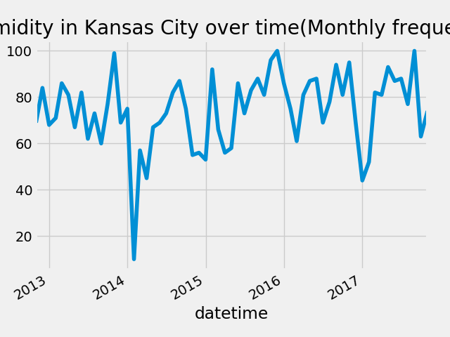
'''python
fig = plt.figure()
humidity["Kansas City"].asfreq("M").plot()
plt.title("Humidity in Kansas City over time(Monthly frequency)")
fig.savefig("Kansas_humidity.png")
'''
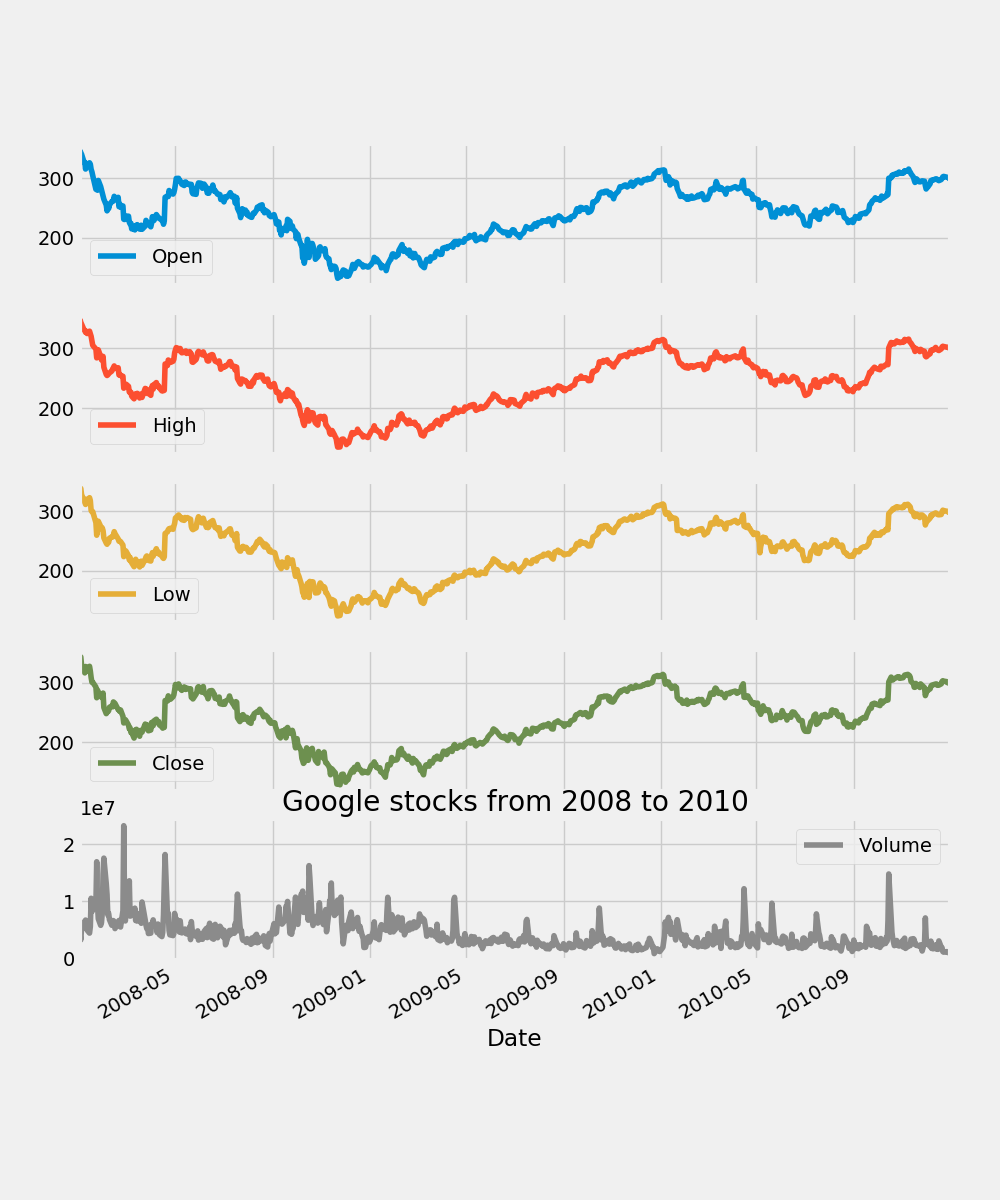
'''python
fig = plt.figure()
google["2008":"2010"].plot(subplots = True, figsize = (10, 12))
plt.title("Google stocks from 2008 to 2010")
plt.savefig("google.png")
'''
1.4 时间戳和周期
什么是时间戳和周期?它们如何有用?
时间戳是用来代表时间中的一个点。周期是时间的一段间隔。周期可以用来检查某一特定事件是否发生在给定的期间内。它们也可以被转化为其它形式。
时间戳
'''python
timestamp = pd.Timestamp(2017, 1, 1, 12)
print(timestamp
'''
2017-01-01 12:00:00
建立一个周期
'''python
period = pd.Period("2017-01-01")
print(period)
'''
2017-01-01
检查一个给定的时间戳是否在一个给定的时间周期中
'''python
print(period.start_time < timestamp < period.end_time)
'''
True
将时间戳转换为周期
'''python
new_period = timestamp.to_period(freq = "H")
print(new_period)
'''
2017-01-01 12:00
将周期转换为时间戳
'''python
new_timestamp = period.to_timestamp(freq = "H", how = "start")
print(new_timestamp)
'''
2017-01-01 00:00:00
1.5 使用date_range
什么是date_range以及其为何那么有用?
date_range是一个返回固定频率的日期时间的方法。在你基于一个已经存在的数据序列建立时间序列数据,或者重新安排整个时间序列数据时它非常有用。
以每天的频率建立一个时间日期索引
'''python
dr1 = pd.date_range(start = "1/1/18", end = "1/9/18")
print(dr1)
'''
DatetimeIndex(['2018-01-01', '2018-01-02', '2018-01-03', '2018-01-04', '2018-01-05', '2018-01-06', '2018-01-07', '2018-01-08', '2018-01-09'], dtype='datetime64[ns]', freq='D')
以每月的频率建立一个时间日期索引
'''python
dr2 = pd.date_range(start = "1/1/18", end = "1/1/19", freq = "M")
print(dr2)
'''
DatetimeIndex(['2018-01-31', '2018-02-28', '2018-03-31', '2018-04-30', '2018-05-31', '2018-06-30', '2018-07-31', '2018-08-31', '2018-09-30', '2018-10-31', '2018-11-30', '2018-12-31'], dtype='datetime64[ns]', freq='M')
不设置日期起点,设定终点和周期
'''python
dr3 = pd.date_range(end = "1/4/2014", periods = 8)
print(dr3)
'''
DatetimeIndex(['2013-12-28', '2013-12-29', '2013-12-30', '2013-12-31', '2014-01-01', '2014-01-02', '2014-01-03', '2014-01-04'], dtype='datetime64[ns]', freq='D')
指定起止日期和周期
'''python
dr4 = pd.date_range(start = "2013-04-24", end = "2014-11-27", periods = 3)
print(dr4)
'''
DatetimeIndex(['2013-04-24', '2014-02-09', '2014-11-27'], dtype='datetime64[ns]', freq=None)
1.6 使用to_datetime
pandas.to_datetime()用来将变量转换为datetime变量。这里,将一个DateFrame转换为datetime序列。
使用to_datetime
'''python
df = pd.DataFrame({
"year" : [2015, 2016],
"month" : [2, 3],
"day" : [4, 5]
})
print(df)
df = pd.to_datetime(df)
print(df)
df = pd.to_datetime("01-01-2017")
print(df)
'''
year month day
0 2015 2 4
1 2016 3 5
0 2015-02-04
1 2016-03-05
dtype: datetime64[ns]
2017-01-01 00:00:00
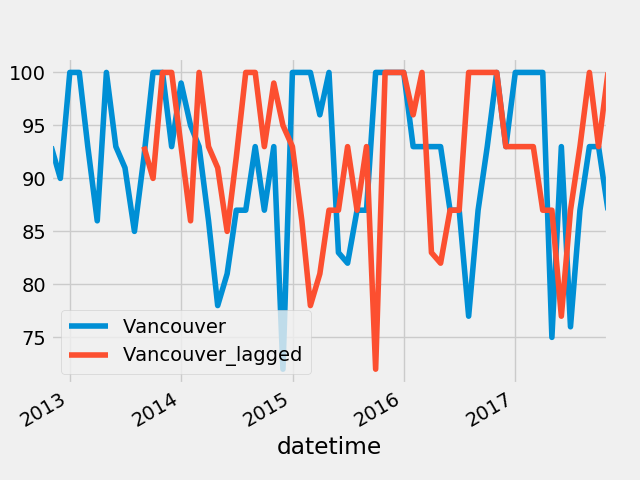
1.7 变换和延迟
我们可以通过提供时间间隔来变换索引。这对于比较一个时间序列与其自身的历史数据很有用。
索引变换
'''python
fig = plt.figure()
humidity["Vancouver"].asfreq('M').plot(legend = True)
shifted = humidity["Vancouver"].asfreq('M').shift(10).plot(legend = True)
shifted.legend(['Vancouver','Vancouver_lagged'])
fig.savefig("shifted.png")
'''
1.8 重取样
上采样(Upsampling):时间序列数据从低时间频率到高时间频率采样(月到天)。这涉及到采用填充或插值的方法处理缺失数据。
下采样(Downsampling):时间序列数据从高时间频率到低时间频率采样(天到月)。这涉及到合并已存在的数据。
采用气压数据演示重采样
'''python
pressure = pd.read_csv("input/historical-hourly-weather-data/pressure.csv", index_col = "datetime", parse_dates = ["datetime"])
print(pressure.tail())
pressure = pressure.iloc[1:]
'''
用前值填充nan
'''python
pressure = pressure.fillna(method = "ffill")
print(pressure.tail())
pressure = pressure.fillna(method = "bfill")
print(pressure.head())
'''
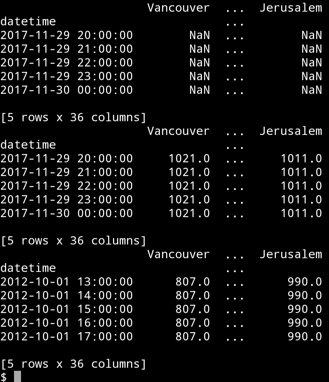
首先我们使用ffill参数用nan之前最后一个可用数据来填充,接着我们使用bfill用nan之后第一个可用的数据来填充。
输出数据规模
'''python
print(pressure.shape)
'''
(45252, 36)
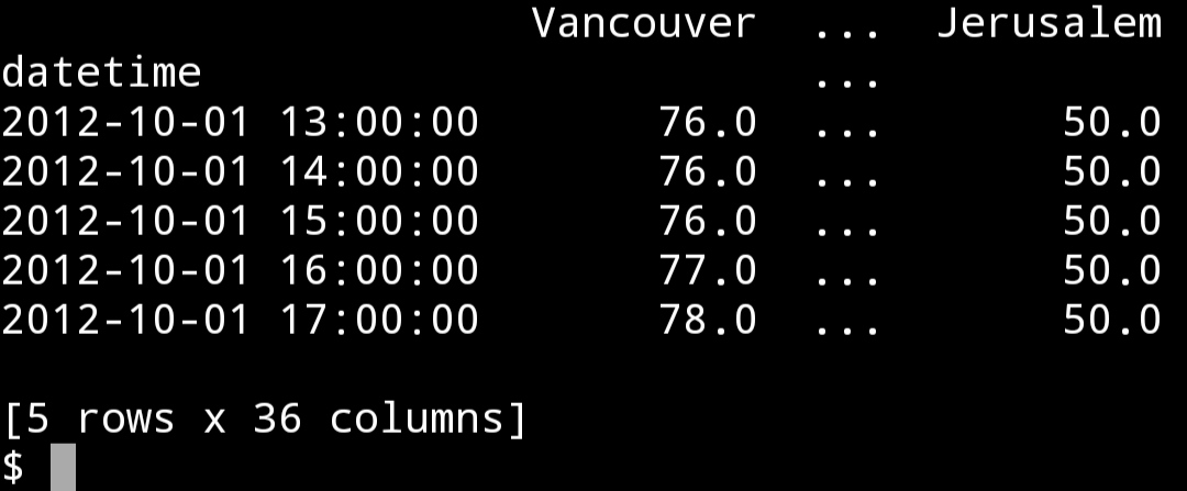
使用平均数从小时数据到3天数据进行向下采样
'''python
pressure = pressure.resample("3D").mean()
print(pressure.head())
print(pressure.shape)
'''
Vancouver ... Jerusalem
datetime ...
2012-10-01 931.627119 ... 990.525424
2012-10-04 1019.083333 ... 990.083333 2012-10-07 1013.930556 ... 989.833333 2012-10-10 1015.000000 ... 987.888889 2012-10-13 1008.152778 ... 990.430556
[5 rows x 36 columns]
(629, 36)
只剩下较少的行数了。现在我们从3天数据向每日数据进行上采样。
从三日数据向每日数据进行上采样
'''python
pressure = pressure.resample('D').pad()
print(pressure.head())
print(pressure.shape)
'''
Vancouver ... Jerusalem datetime ...
2012-10-01 931.627119 ... 990.525424 2012-10-02 931.627119 ... 990.525424 2012-10-03 931.627119 ... 990.525424 2012-10-04 1019.083333 ... 990.083333 2012-10-05 1019.083333 ... 990.083333
[5 rows x 36 columns]
(1885, 36)

2.金融和统计学
2.1 改变的百分率
改变的百分率
'''python
fig = plt.figure()
google["Change"] = google.High.div(google.High.shift())
google["Change"].plot(figsize = (20, 8))
fig.savefig("percent.png")
'''

2.2 证券收益
证券收益
'''python
fig = plt.figure()
google["Return"] = google.Change.sub(1).mul(100)
google["Return"].plot(figsize = (20, 8))
fig.savefig("Return1.png")
'''

另一个计算方法
'''python
fig = plt.figure()
google.High.pct_change().mul(100).plot(figsize = (20, 6))
fig.savefig("Return2.png")
'''
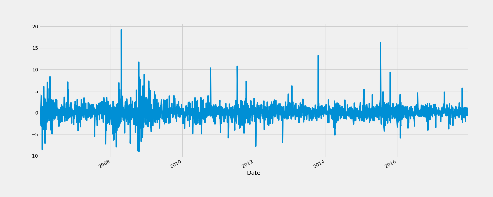
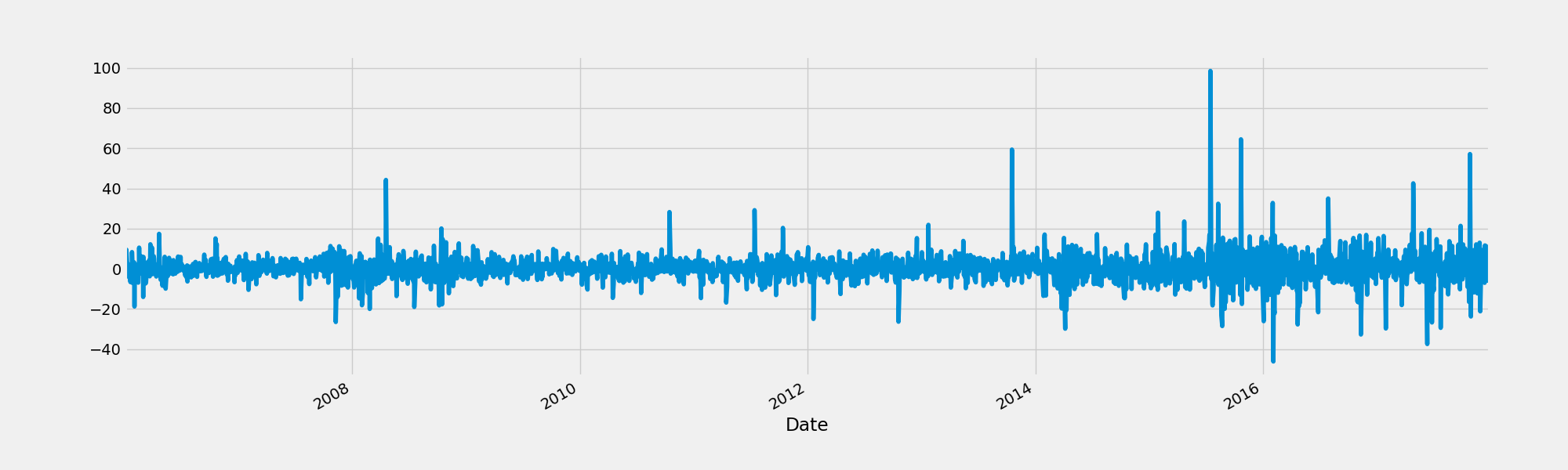
2.3 相继列的绝对改变(Absolute change in sucessive rows)
比较相继序列的绝对改变
'''python
fig = plt.figure()
google.High.diff().plot(figsize = (20, 6))
fig.savefig("AbsoluteChange.png")
'''
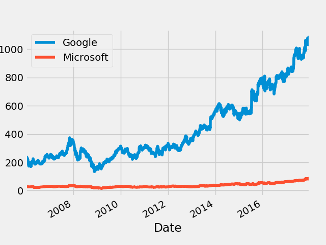
2.4 比较两个或更多时间序列
我们将通过正态化(normalizing)来比较两个时间序列。这是通过将时间序列中的每个元素除以第一个元素来实现的。这样两个时间序列都在同一个起点开始,可以更容易的比较。
比较两个不同的序列,微软和谷歌的股票
'''python
microsoft = pd.read_csv("input/stock-time-series-20050101-to-20171231/MSFT_2006-01-01_to_2018-01-01.csv", index_col = "Date", parse_dates = ["Date"])
'''
在正态化以前绘图
'''python
fig = plt.figure()
google.High.plot()
microsoft.High.plot()
plt.legend(["Google", "Microsoft"])
fig.savefig("Compare.png")
'''
进行正态化并进行比较
'''python
normalized_google = google.High.div(google.High.iloc[0]).mul(100)
normalized_microsoft = microsoft.High.div(microsoft.High.iloc[0]).mul(100)
fig = plt.figure()
normalized_google.plot()
normalized_microsoft.plot()
plt.legend(["Google", "Microsoft"])
fig.savefig("NormalizedCompare.png")
'''
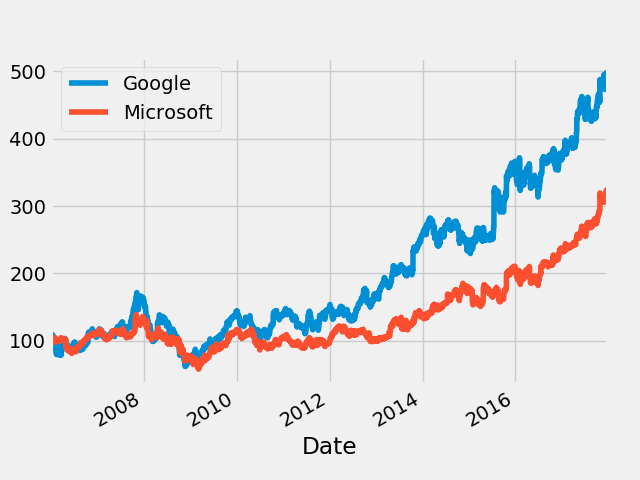
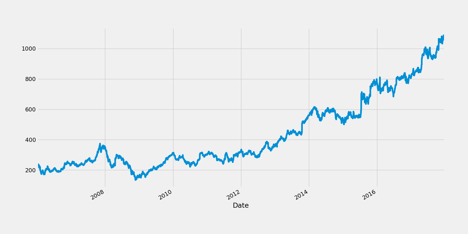
可以看到谷歌的股价表现好于微软数倍。
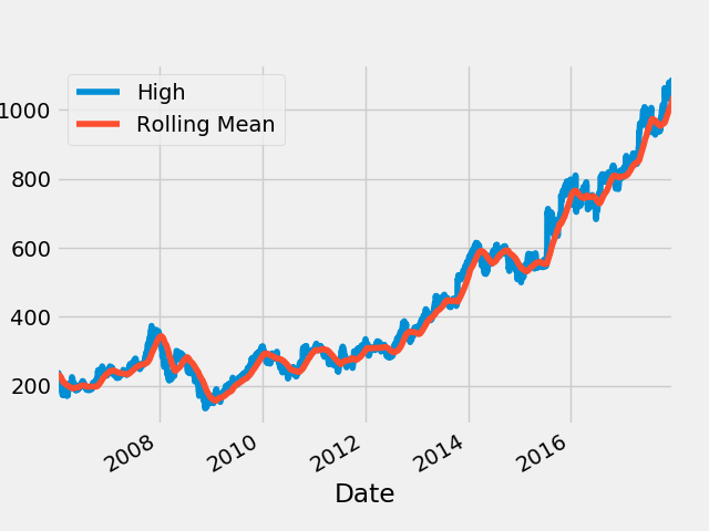
2.5 窗口函数
窗口函数用于定义子序列的周期,计算子周期内的子集。
有两种:
Rolling 相同的大小和切片
Expanding 包含所有之前的数据
Rolling窗口函数
90日均线吧
'''python
rolling_google = google.High.rolling("90D").mean()
fig = plt.figure()
google.High.plot()
rolling_google.plot()
plt.legend(["High", "Rolling Mean"])
fig.savefig("RollongGoogle.png")
'''
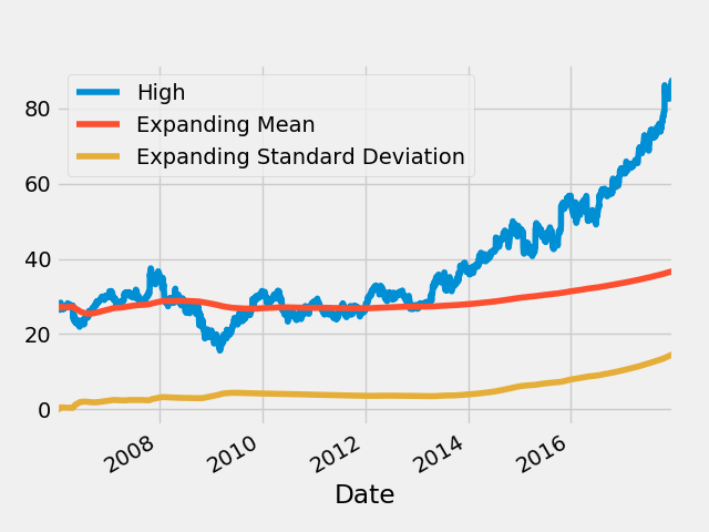
Expanding窗口函数
'''python
microsoft_mean = microsoft.High.expanding().mean()
microsoft_std = microsoft.High.expanding().std()
fig = plt.figure()
microsoft.High.plot()
microsoft_mean.plot()
microsoft_std.plot()
plt.legend(["High", "Expanding Mean", "Expanding Standard Deviation"])
fig.savefig("ExpandingMicrosoft.png")
'''
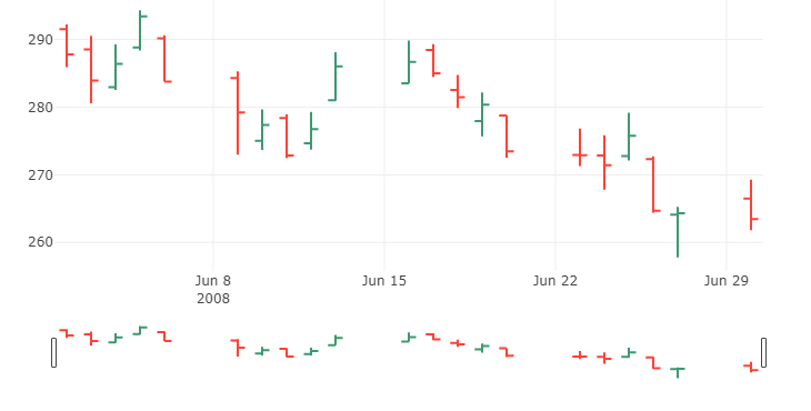
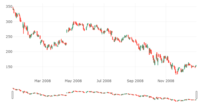
2.6 收市价图(OHLC charts)
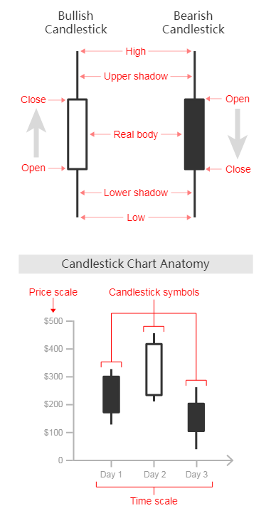
收市价图是表示一定时间周期内任何类型的价格的开盘价、最高价、最低价、以及收盘价的图形。开盘(Open)-最高(High)-最低(Low)-收盘(Close),OHLC图用来作为一种交易工具来可视化和分析证券、外汇、股票、债券、期货等的价格随时间的变化。收市价图对于解释市场价格的每日的变化以及通过模式识别来预测未来的价格改变很有帮助。
收市价图的y轴用来表示价格尺度,而x轴用来表示时间尺度。在每一单独的时间周期内,一个蜡烛图用一个符号来代表两个范围:交易的最高价和最低价,以及那个时间段(例如一天)的开盘价和收盘价。在符号的范围内,最高价和最低价的范围用主要竖线的长度来代表。开盘价和收盘价用位于竖线左边(代表开盘价)和右边(代表收盘价)的刻度线来表示。
每个收市价图符号都有颜色,以区别是“牛市”(bullish)(收盘价比开盘价高)或者“熊市”(bearish)(收盘价比开盘价低)。(文中颜色貌似与我们的习惯是反着的,熊市是红色,牛市是绿色。——译者注)

(作图这部分程序我手机上库用不了,就照搬原文了。)
OHLC chart of June 2008
'''python
trace = go.Ohlc(x=google['06-2008'].index,
open=google['06-2008'].Open,
high=google['06-2008'].High,
low=google['06-2008'].Low,
close=google['06-2008'].Close)
data = [trace]iplot(data, filename='simple_ohlc')
'''
OHLC chart of 2008
'''python
trace = go.Ohlc(x=google['2008'].index,
open=google['2008'].Open,
high=google['2008'].High,
low=google['2008'].Low,
close=google['2008'].Close)
data = [trace]iplot(data, filename='simple_ohlc')
'''

OHLC chart of 2008
'''python
trace = go.Ohlc(x=google.index,
open=google.Open,
high=google.High,
low=google.Low,
close=google.Close)
data = [trace]iplot(data, filename='simple_ohlc')
'''
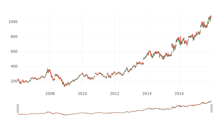
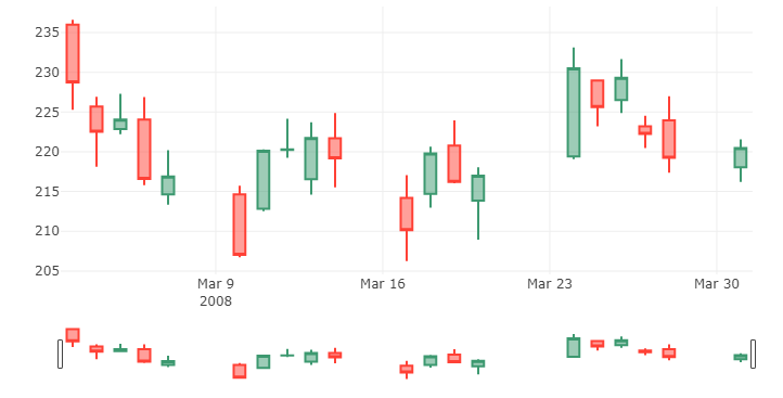
2.7 蜡烛图
这种图用来作为一种交易工具可视化分析证券、衍生品、外汇、股票、债券、期货等的价格随时间的运动。尽管蜡烛图使用的符号像一个箱子的符号,但是它们的功能是不同的,不能彼此混淆。
蜡烛图使用一个蜡烛样的符号来显示多种价格信息,例如开盘价、收盘价、最高价和最低价等。每个符号代表一个单独时间间隔内的压缩的交易活动(一分钟、一小时、一天、一个月等)。每个蜡烛符号画在x轴上一个单独的时间尺度上,以显示那段时间的交易活动。
符号中间的矩形被称为实体,用来显示那段时间的开盘价与收盘价的范围。从其顶部和底部延伸出来的线段代表下影和上影(或者灯芯)。它们代表那段时间里的最低价和最高价。当为牛市时(收盘价高于开盘价),实体常为白色或绿色。当为熊市时(收盘价低于开盘价),实体被涂为黑色或红色。(还是跟我们的习惯相反)
通过其颜色和形状,蜡烛图对于探测和预测市场随时间的趋势以及解释市场的每日的变动是非常好的工具。例如,实体越长,卖压或买压约大。实体越短,意味着该时间短内价格变动非常小。
蜡烛图通过各种指标帮助显示市场心理(交易者的恐惧或贪婪),如形状和颜色,还有一些可以从蜡烛图中识别出来的模式。总的来说,大约有42种已经被识别出来的或简单或复杂的模式。这些从蜡烛图中识别出来的模式对于显示价格关系和预测市场未来可能的变动很有帮助。这里有一些模式。

请注意,蜡烛图并不表示在开盘价格和收盘价格之间发生的事件——只是关于两种价格之间的关系。因此你无法指出这个时间断内的交易的波动性。
来源: https://datavizcatalogue.com/methods/candlestick_chart.html
Candlestick chart of march 2008
'''python
trace = go.Candlestick(x=google['03-2008'].index,
open=google['03-2008'].Open,
high=google['03-2008'].High,
low=google['03-2008'].Low,
close=google['03-2008'].Close)
data = [trace]iplot(data, filename='simple_candlestick')
'''
Candlestick chart of 2008
'''python
trace = go.Candlestick(x=google['2008'].index,
open=google['2008'].Open,
high=google['2008'].High,
low=google['2008'].Low,
close=google['2008'].Close)
data = [trace]iplot(data, filename='simple_candlestick')
'''
Candlestick chart of 2006-2018
'''python
trace = go.Candlestick(x=google.index,
open=google.Open,
high=google.High,
low=google.Low,
close=google.Close)
data = [trace]iplot(data, filename='simple_candlestick')
'''

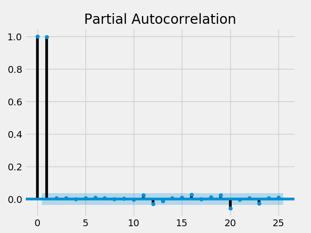
2.8 自相关与部分自相关
自相关(Autocorrelation)——自相关函数(The autocorrelation function, ACF)测量一个序列在不同的片段上与其自身的相关性。
部分自相关(Partial Autocorrelation)——部分自相关函数可以被解释为一个序列的片段是其之前的片段的回归。可以用标准线性回归来解释这个概念,这是部分片段的改变而其它片段保持不变。
来源:https://www.quora.com/What-is-the-difference-among-auto-correlation-partial-auto-correlation-and-inverse-auto-correlation-while-modelling-an-ARIMA-series
自相关性
自相关
'''python
fig = plt.figure()
plot_acf(humidity["San Diego"], lags = 25, title = "San Diego")
plt.savefig("acf.png")
'''
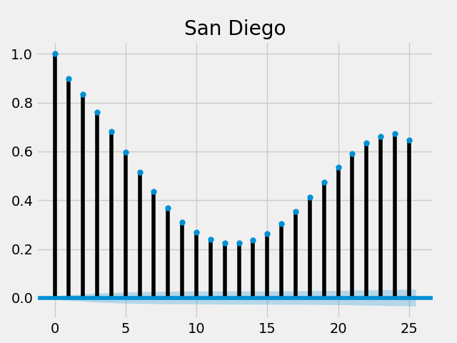
所有的延迟都接近1或者至少大于置信区间,它们有显著的统计学差异的。
部分自相关
部分自相关
'''python
fig = plt.figure()
plot_pacf(humidity["San Diego"], lags = 25, title = "San Diego, pacf")
plt.savefig("pacf.png")
'''

由于差异有统计学意义,在头两个延迟之后的部分自相关性非常低。
'''python
plot_pacf(microsoft["Close"], lags = 25)
plt.savefig("ms_pacf.png")
'''
这里,只有第0,1和20个延迟差异有统计学意义。
3.时间序列分解与随机行走
3.1 趋势,季节性和噪音
这些是一个时间序列的组成部分
趋势:一个时间序列的持续向上或向下的斜率
季节性:一个时间序列的清晰的周期性模式(就像正弦函数)
噪音:异常或缺失数据
趋势,季节性和噪音
'''python
fig = plt.figure()
google["High"].plot(figsize = (16, 8))
fig.savefig("google_trend.png")
'''
分解
'''python
decomposed_google_volume = sm.tsa.seasonal_decompose(google["High"], freq = 360)
fig = decomposed_google_volume.plot()
fig.savefig("decomposed.png")
'''

在上图中有一个清晰的向上的趋势。
你也可以看到规则的周期性改变
不规则的噪音代表着数据异常或缺失。
3.2 白噪音
白噪音是
恒定的平均值
恒定的差异
所有的偏移的零自相关
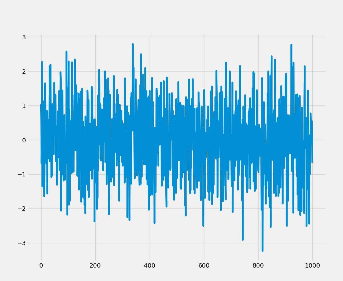
白噪音
'''python
fig = plt.figure()
rcParams["figure.figsize"] = 16, 6
white_noise = np.random.normal(loc = 0, scale = 1, size = 1000)
plt.plot(white_noise)
fig.savefig("whitenoise.png")
'''
绘制白噪音的自相关关系
'''python
fig = plt.figure()
plot_acf(white_noise, lags = 20)
plt.savefig("wn_acf.png")
'''
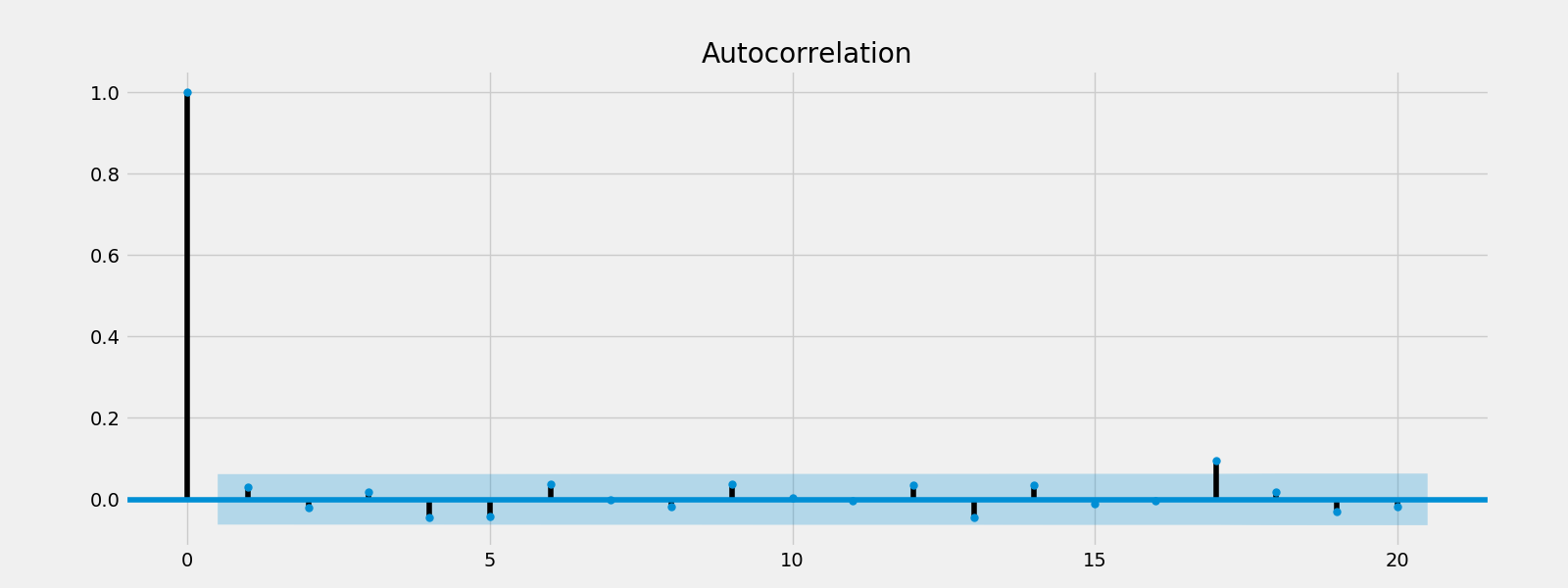
观察所有偏移都在置信区间内(阴影部分),因此是有统计学意义的。
3.3 随机行走
随机行走是一个数学概念,是一个随机的过程,描述一个在一些数学空间(如整数)由持续的随机步数来描述的路径。
一般来说,对于股市,今天的价格 = 昨天的价格+噪音
Pt = Pt-1 + εt
随机行走不能被预测,因为噪音是随机的。
具有Drift(drift(μ) 是 0-平均值)的随机行走
Pt - Pt-1 = μ + εt
对随机行走的回归测试
Pt = α + βPt-1 + εt
化简为
Pt - Pt-1 = α + βPt-1 + εt
检验:
H0:β = 1(这是一个随机行走)
H1:β < 1 (这不是一个随机行走)
Dickey-Fuller(DF)检验
H0:β = 0(这是一个随机行走)
H1:β < 0 (这不是一个随机行走)
单位根检验(Augmented Dickey-Fuller test)
单位根检验的零假设是一个时间序列样本存在单位根,基本上单位根检验在RHS上有更多的延迟改变。
单位根检验谷歌和微软的成交量
'''python
adf = adfuller(microsoft["Volume"])
print("p-value of microsoft: {}".format(float(adf[1])))
adf = adfuller(google["Volume"])
print("p-value of google: {}".format(float(adf[1])))
'''
p-value of microsoft: 0.0003201525277652296
p-value of google: 6.510719605767195e-07
由于微软的p值为0.0003201525小于0.05,零假设被拒绝,这个序列不是一个随机行走序列。
谷歌的p值为0.0000006510小于0.05(此处原文为大于,疑有误),零假设被拒绝,这个序列不是一个随机行走序列。
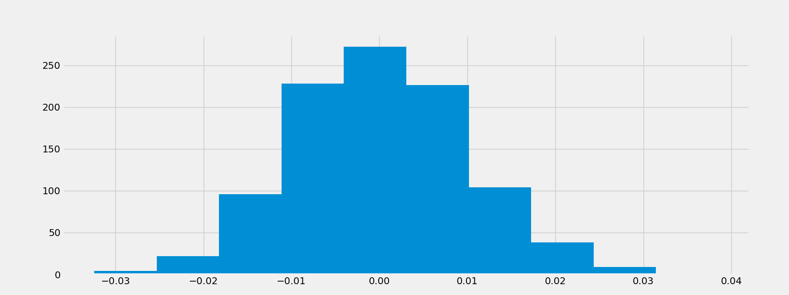
产生一个随机行走序列
'''python
fig = plt.figure()
seed(42)
rcParams["figure.figsize"] = 16, 6
random_walk = normal(loc = 0, scale = 0.01, size = 1000)
plt.plot(random_walk)
fig.savefig("random_walk.png")
'''

'''python
fig = plt.figure()
plt.hist(random_walk)
fig.savefig("random_hist.png")
'''

3.4 稳定性
一个稳定的时间序列是指其统计性质如平均值,方差,自相关性等,都不随时间变化的时间序列。
强稳定性:是指其概率分布绝对的不随时间变化而变化的随机过程。因此,类似平均值、方差等参数也不随时间而变化。
弱稳定性:是指平均值、方差、自相关性都随时间变化保持恒定的过程。
稳定性非常重要,因为非稳定序列有很多影响因素,在建模的时候会很复杂。diff()方法可以容易的将一个非稳定序列转化为稳定序列。
我们将尝试将上面的时间序列的周期性部分分解。(We will try to decompose seasonal component of the above decomposed time series.)
初始的非稳定序列
'''python
fig = plt.figure()
decomposed_google_volume.trend.plot()
fig.savefig("nonstationary.png")
'''
新的稳定的序列,即一阶差分
'''python
fig = plt.figure()
decomposed_google_volume.trend.diff().plot()
fig.savefig("stationary.png")
'''

4.使用statstools建模
4.1 AR模型
一个自回归(autoregressive, AR)模型代表了一类随机过程,这类过程用于描述自然界中特定的时间变化过程,如经济学。该模型认为输出变量线性的依赖于其之前的数据以及一个随机成分(一个有缺陷的预测值);因此模型是以随机差分方程的形式出现。
AR(1)模型
Rt = μ + ΦRt-1 + εt
由于RHS只有一个延迟值(Rt-1),这被称为一阶AR模型,其中μ是平均值, ε是t时刻的噪音。
如果Φ=1,这是随机行走。如果Φ=0,这是噪音。如果-1<Φ<1,它是稳定的。如果Φ为负值,有一个人为因素,如果Φ为正值,有一个动量。( If ϕ is -ve, there is men reversion. If ϕ is +ve, there is momentum.)
AR(2)模型
Rt = μ + Φ1Rt-1 + Φ2Rt-2 + εt
AR(3)模型
Rt = μ + Φ1Rt-1 + Φ2Rt-2 + Φ3Rt-3 + εt
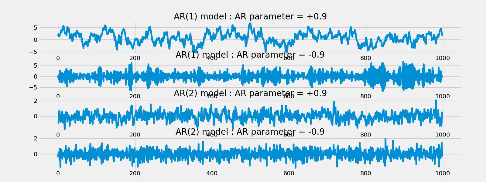
AR(1)模拟模型
AR(1) MA(1)模型: AR参数 = 0.9
'''python
fig = plt.figure()
rcParams['figure.figsize'] = 16, 12
plt.subplot(4,1,1)
ar1 = np.array([1, -0.9])
ma1 = np.array([1])
AR1 = ArmaProcess(ar1, ma1)
sim1 = AR1.generate_sample(nsample = 1000)
plt.title("AR(1) model : AR parameter = +0.9")
plt.plot(sim1)
'''
AR(1) MA(1)模型: AR参数 = -0.9
'''python
plt.subplot(4,1,2)
ar2 = np.array([1, 0.9])
ma2 = np.array([1])
AR2 = ArmaProcess(ar2, ma2)
sim2 = AR2.generate_sample(nsample = 1000)
plt.title("AR(1) model : AR parameter = -0.9")
plt.plot(sim2)
'''
AR(2) MA(1)模型: AR参数 = 0.9
'''python
plt.subplot(4,1,3)
ar3 = np.array([2, -0.9])
ma3 = np.array([1])
AR3 = ArmaProcess(ar3, ma3)
sim3 = AR3.generate_sample(nsample = 1000)
plt.title("AR(2) model : AR parameter = +0.9")
plt.plot(sim3)
'''
AR(2) MA(1)模型: AR参数 = -0.9
'''python
plt.subplot(4,1,4)
ar4 = np.array([2, 0.9])
ma4 = np.array([1])
AR4 = ArmaProcess(ar4, ma4)
sim4 = AR4.generate_sample(nsample = 1000)
plt.title("AR(2) model : AR parameter = -0.9")
plt.plot(sim4)
fig.savefig("AR.png")
'''
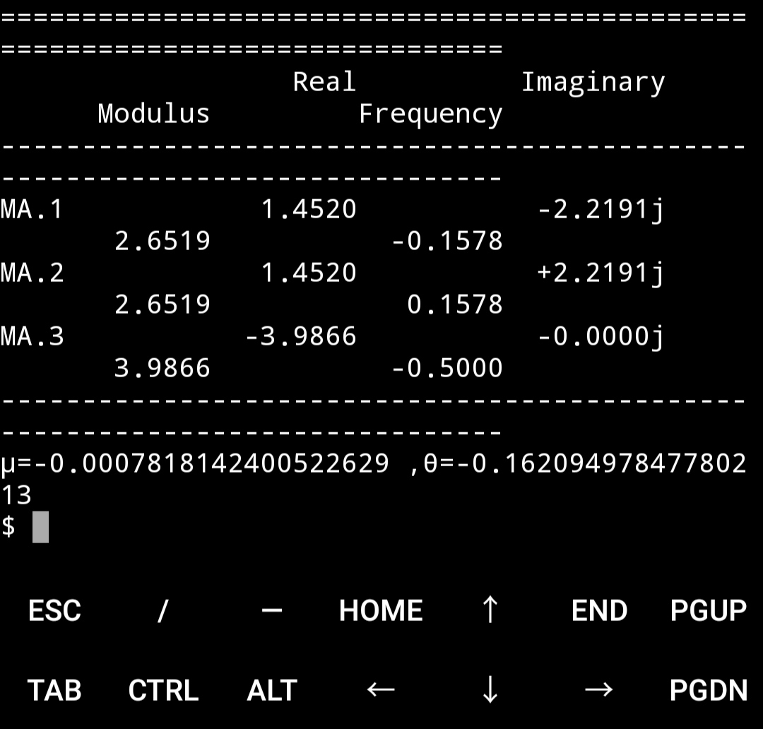
一个模拟模型的预测
'''python
model = ARMA(sim1, order=(1, 0))
result = model.fit()
print(result.summary())
print("μ = {}, φ = {}".format(result.params[0], result.params[1]))
'''
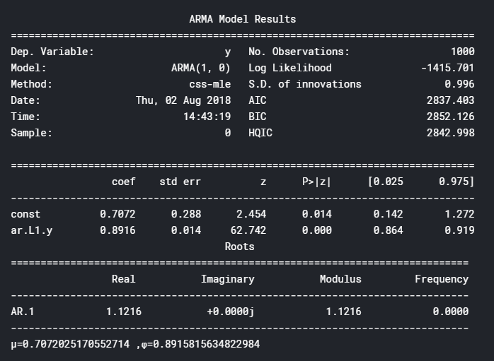
Φ约为0.9,是我们在第一个模拟模型中选择的AR参数。
预测模型
'''python
fig = plt.figure()
fig = result.plot_predict(start = 900, end = 1010)
fig.savefig("AR_predict.png")
'''
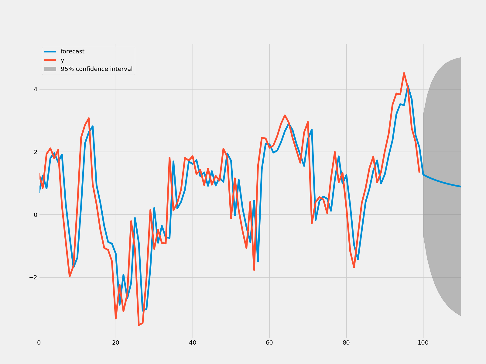
'''python
rmse = math.sqrt(mean_squared_error(sim1[900:1011], result.predict(start = 900, end = 999)))
print("The root mean squared error is {}.".format(rmse))
'''
The root mean squared error is 1.0408054544358292.
y的预测值已经画出,很整洁!
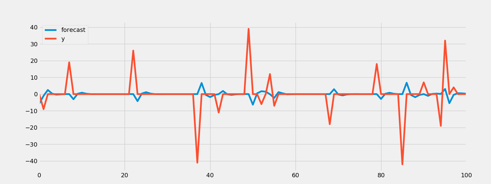
预测蒙特利尔的湿度
'''python
humid = ARMA(humidity["Montreal"].diff().iloc[1:].values, order = (1, 0))
res = humid.fit()
fig = plt.figure()
fig = res.plot_predict(start = 1000, end = 1100)
fig.savefig("humid_arma.png")
'''
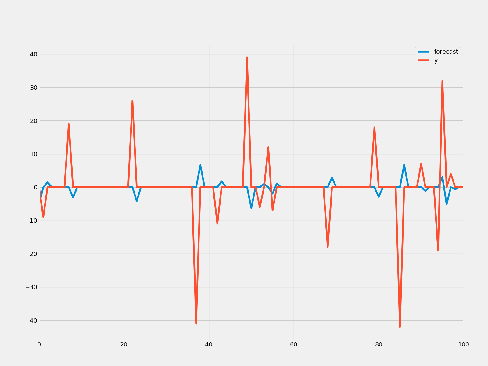
'''python
rmse = math.sqrt(mean_squared_error(humidity["Montreal"].diff().iloc[900:1000].values, result.predict(start=900,end=999)))print("The root mean squared error is {}.".format(rmse))
'''
The root mean squared error is 7.218388589479766.
不是很令人印象深刻,但让我们试试谷歌股票。
预测谷歌的收盘价
'''python
humid = ARMA(google["Close"].diff().iloc[1:].values, order = (1, 0))
res = humid.fit()
fig = plt.figure()
fig = res.plot_predict(start = 900, end = 1100)
fig.savefig("google_arma.png")
'''
总有更好的模型
4.2 MA模型
移动平均模型在单变量时间序列中很有用。模型假设输出变量线性的依赖于当前的各种随后的随机变量(不准确预测值)。
MA(1)模型
Rt = μ + εt1 + θεt-1
即今日的收益= 平均值+今日的噪音+昨日的噪音。
因为RHS中只有一个延迟,这是一阶的MA模型。
MA(1)模拟模型
rcParams["figure.figsize"] = 16, 6
ar1 = np.array([1])
ma1 = np.array([1, -0.5])
MA1 = ArmaProcess(ar1, ma1)
sim1 = MA1.generate_sample(nsample = 1000)
plt.plot(sim1)
plt.savefig("ma1.png")
MA模型的建模
建立MA模型的预测
model = ARMA(sim1, order=(0, 1))
result = model.fit()
print(result.summary())
print("μ={} ,θ={}".format(result.params[0],result.params[1]))
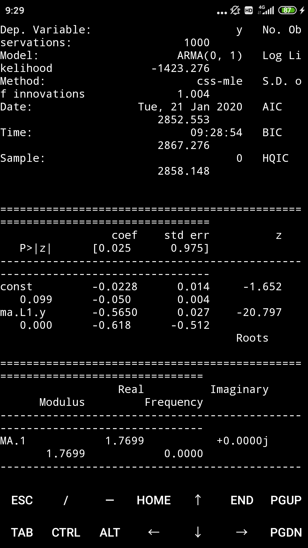
μ=-0.02284716848276931 ,θ=-0.5650012559991154
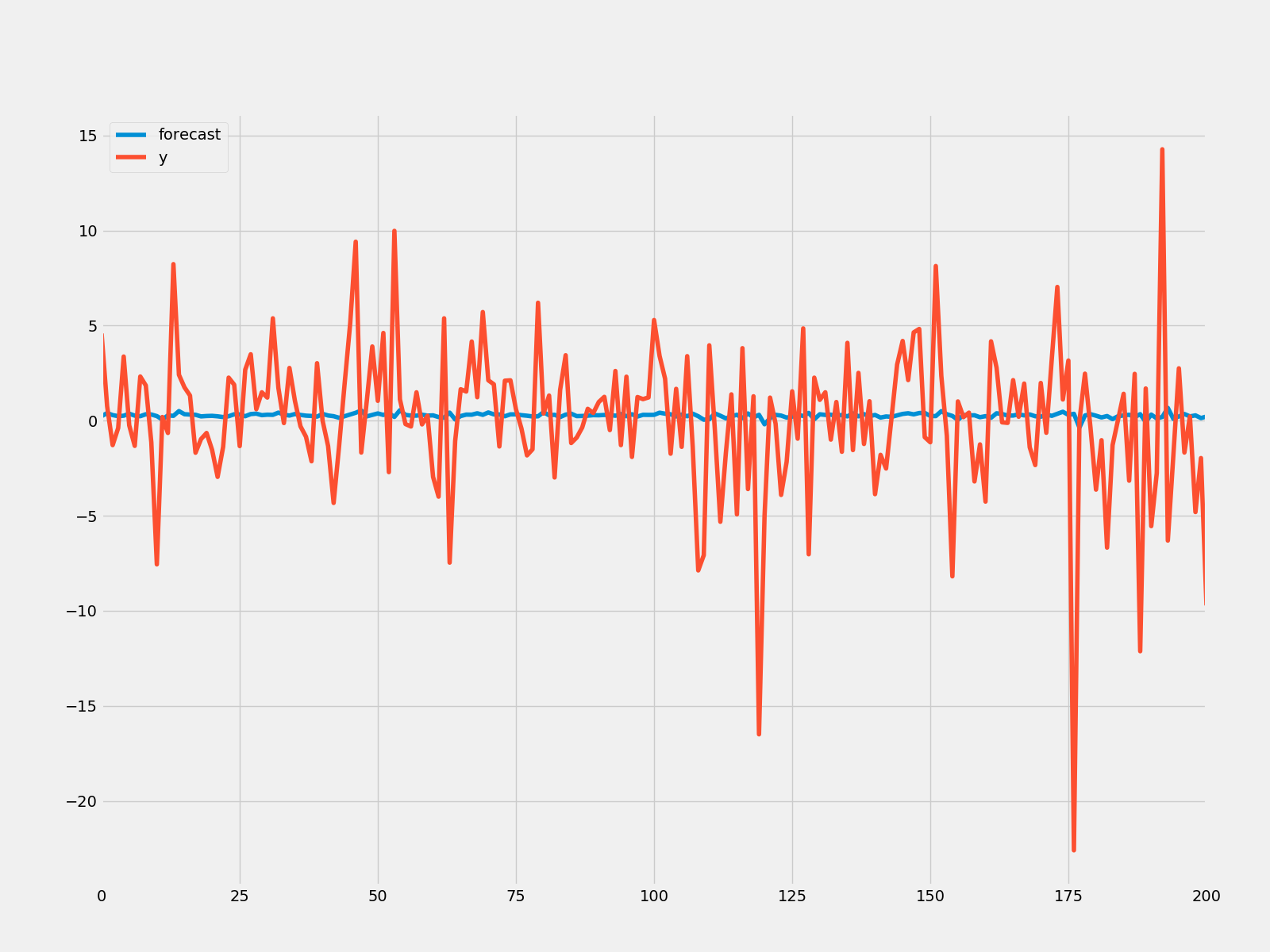
MA模型的预测
使用MA模型进行预测
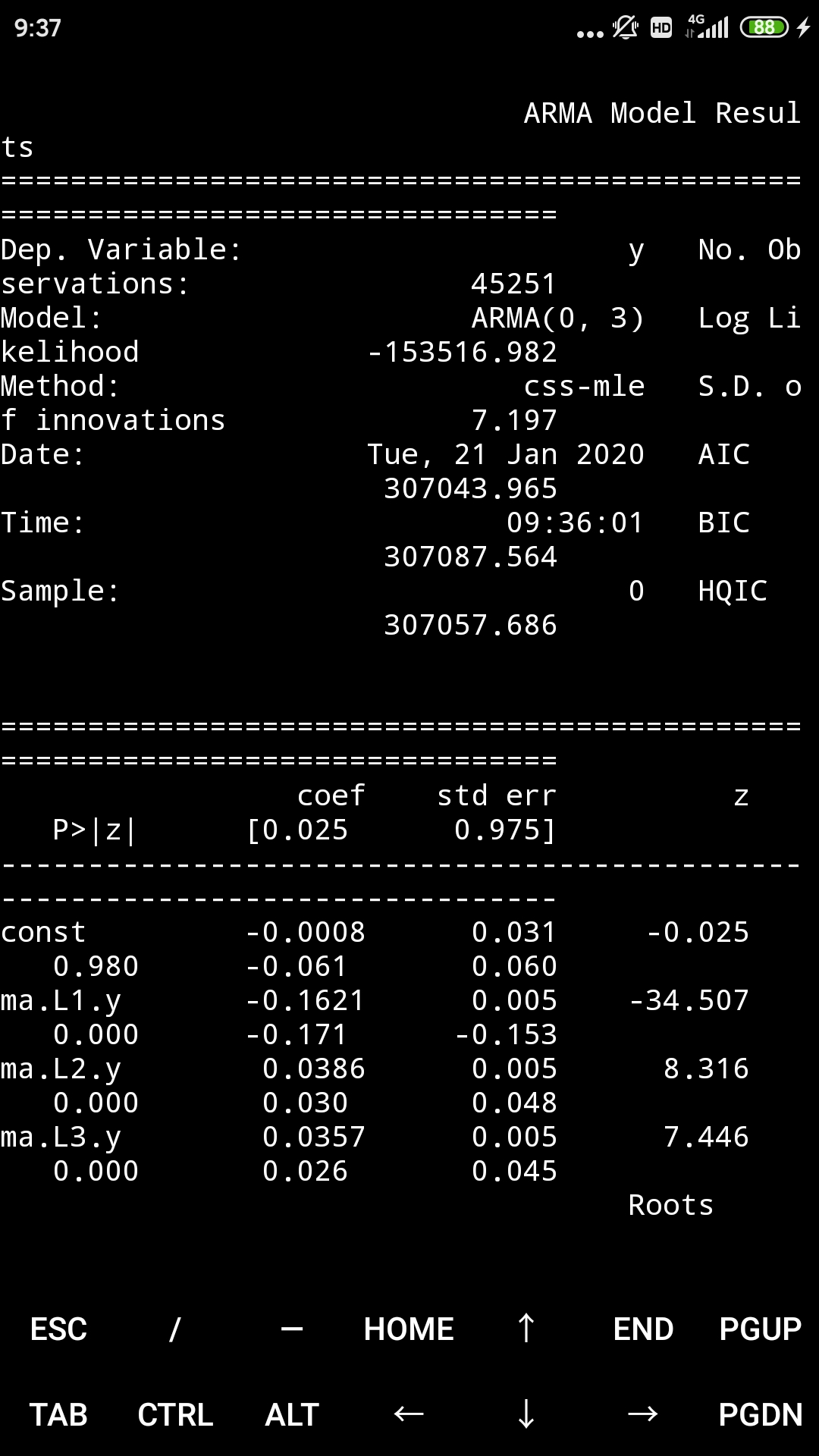
model = ARMA(humidity["Montreal"].diff().iloc[1:].values, order=(0, 3))
result = model.fit()
print(result.summary())
print("μ={} ,θ={}".format(result.params[0],result.params[1]))
result.plot_predict(start = 1000, end = 1100)
plt.savefig("ma_forcast.png")
rmse = math.sqrt(mean_squared_error(humidity["Montreal"].diff().iloc[1000:1101].values, result.predict(start=1000,end=1100)))
print("The root mean squared error is {}.".format(rmse))
The root mean squared error is 11.345129665763626.
接着,是ARMA模型
4.3 ARMA模型
自回归移动平均模型(Autoregressive–moving-average,ARMA)提供一个以二项式形式描述一个(弱的)稳定随机过程的模型。一个是自回归,另一个是移动平均。它是AR和MA模型的综合。
ARMA(1,1)模型
Rt = μ + ΦRt-1 + εt + θεt-1
基本上,它代表着今日收益 = 平均值 + 昨日的收益 + 噪音 + 昨日的噪音。
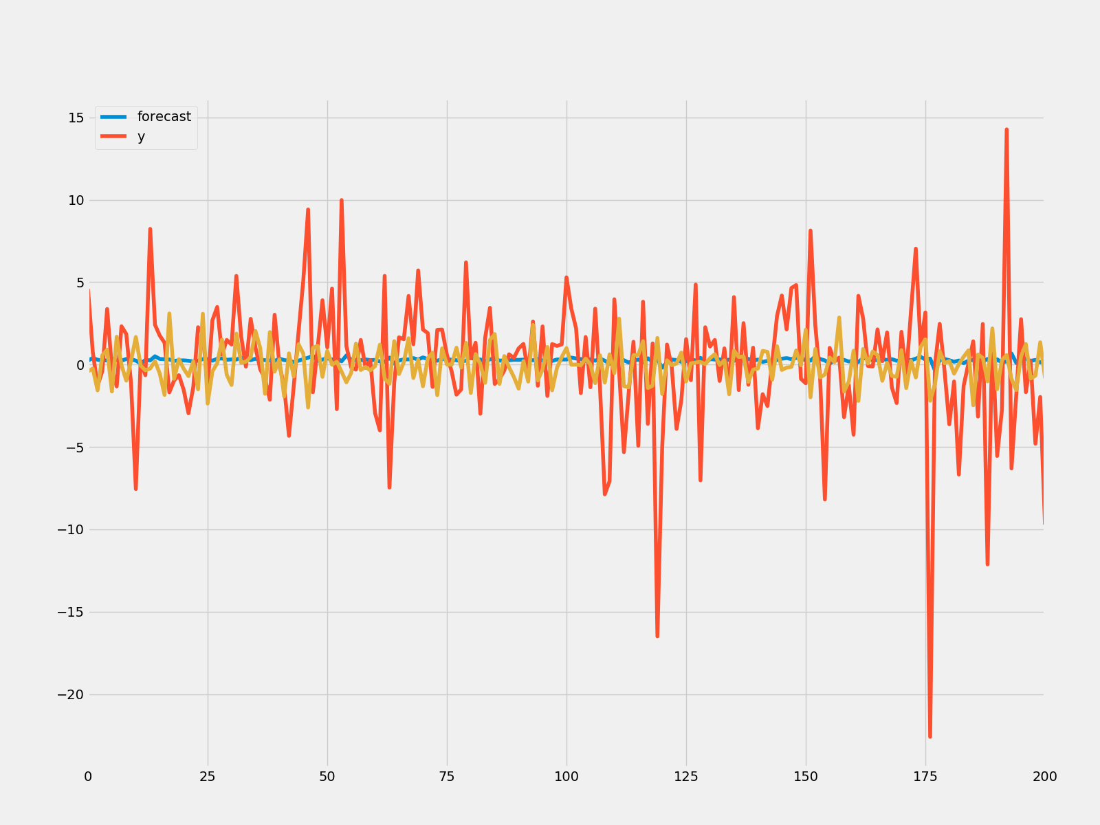
ARMA预测模型的建模
因为与AR和MA模型类似,就不进行模拟了。直接进行预测。
模拟和预测微软股票的市值
model = ARMA(microsoft["Volume"].diff().iloc[1:].values, order = (3, 3))
result = model.fit()
print(result.summary())
print("μ={} ,θ={}".format(result.params[0],result.params[1]))
result.plot_predict(start = 1000, end = 1100)
plt.savefig("arma_forcast.png")
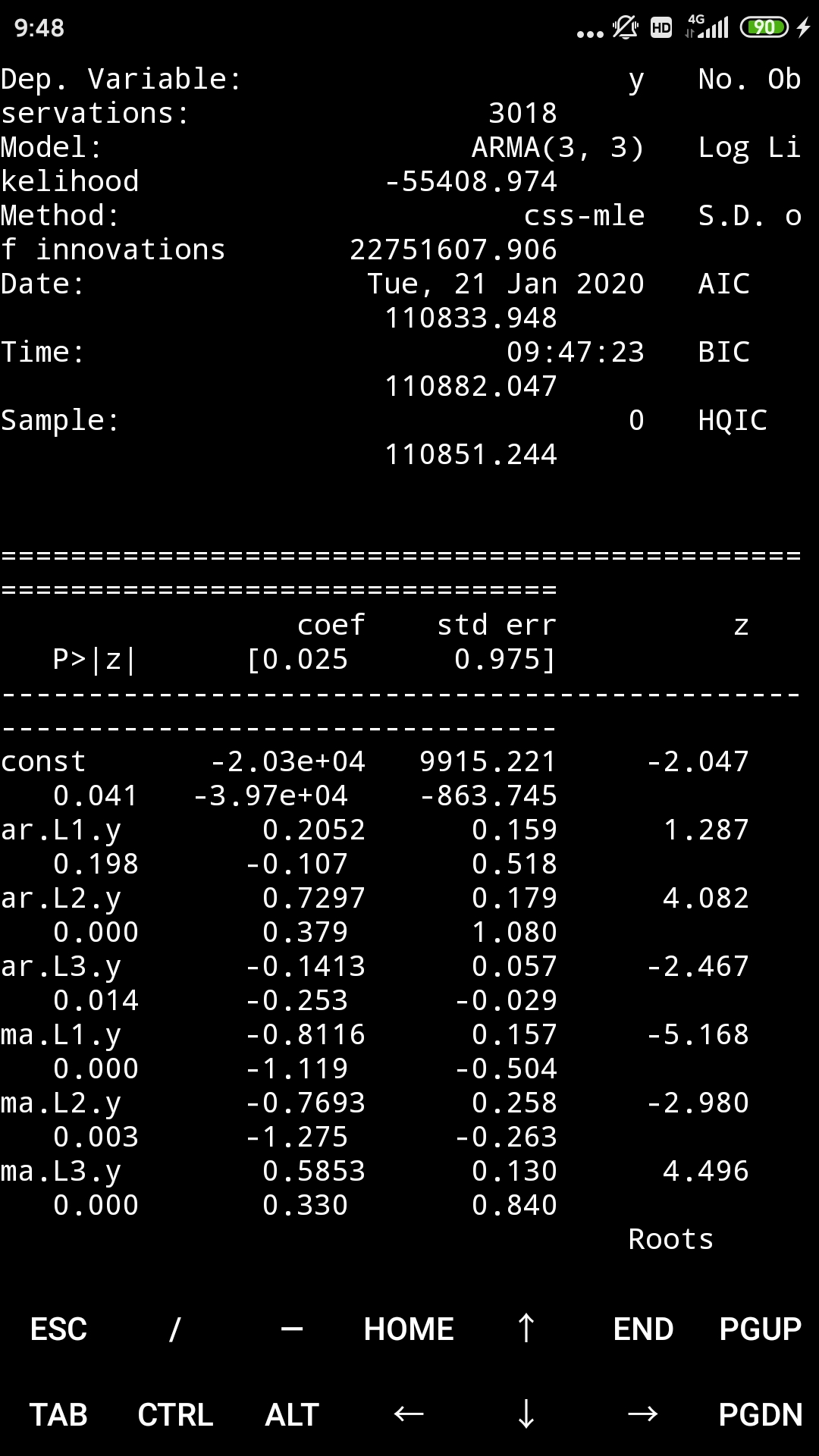
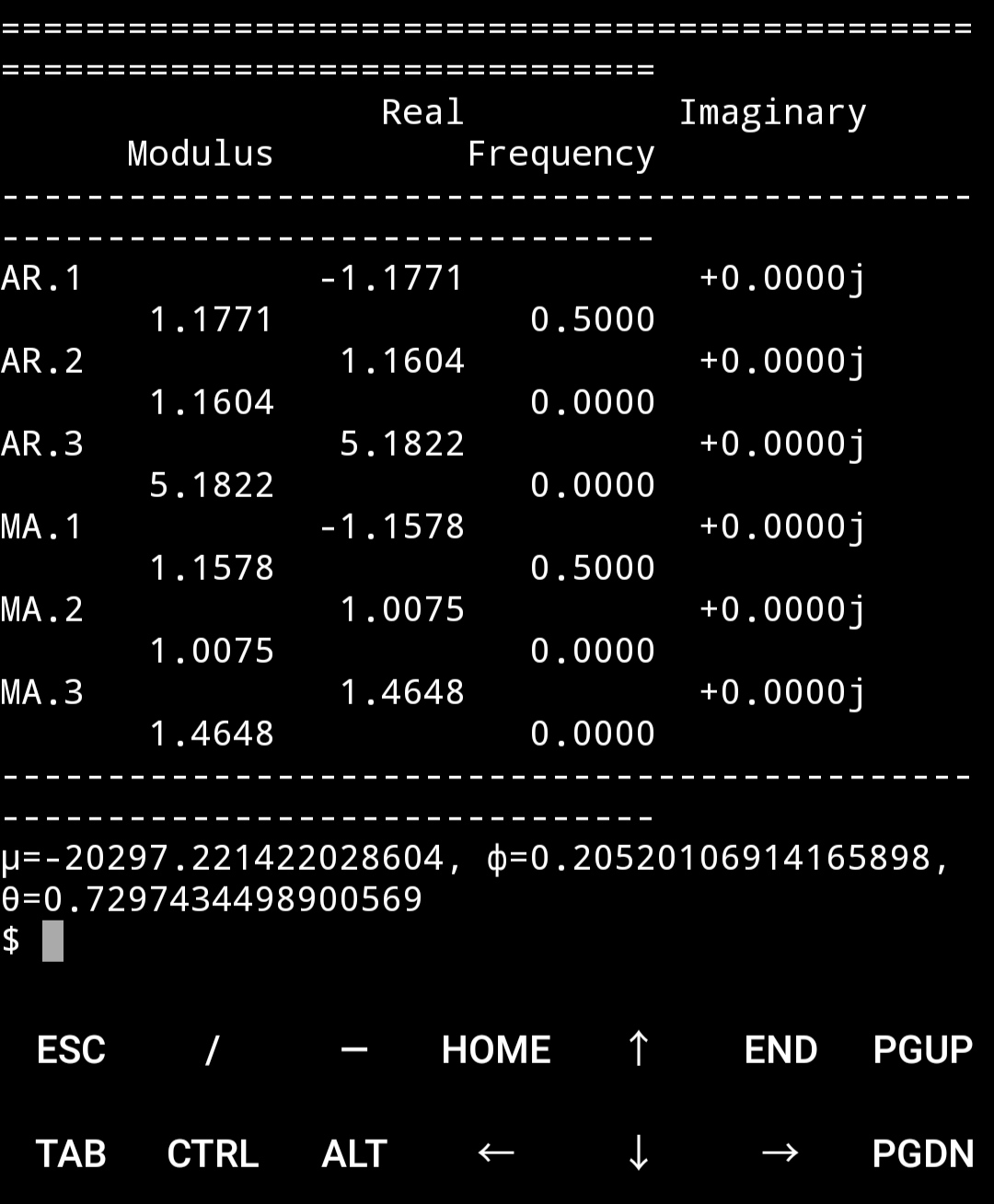
rmse = math.sqrt(mean_squared_error(microsoft["Volume"].diff().iloc[1000:1101].values, result.predict(start=1000,end=1100)))
print("The root mean squared error is {}.".format(rmse))
The root mean squared error is 38038241.66905847.
ARMA模型的预测结果要优于AR和MA模型
4.4 ARIMA模型
求和自回归移动平均模型(autoregressive integrated moving average ,ARIMA)是ARMA模型的一般化。这些模型都是都是拟合时间序列数据,以便更好的理解数据或者预测未来的数据。它应用在不稳定的序列数据,通过一系列的差分步骤(模型相应的“求和”部分)可以消除数据的不稳定。ARIMA模型以ARIMA(p, d, q)形式表示,p是AR的参数,d是差分参数,q是MA的参数
ARIMA(1, 0, 0)
yt = a1yt-1 + εt
ARIMA(1, 0, 1)
yt = a1yt-1 + εt + b1εt-1
ARIMA(1, 1, 1)
Δyt = a1Δyt-1 + εt + b1εt-1, 其中Δyt = yt - yt-1
建立ARIMA的预测模型
使用ARIMA模型进行预测
预测微软股票的市值
rcParams["figure.figsize"] = 16, 6
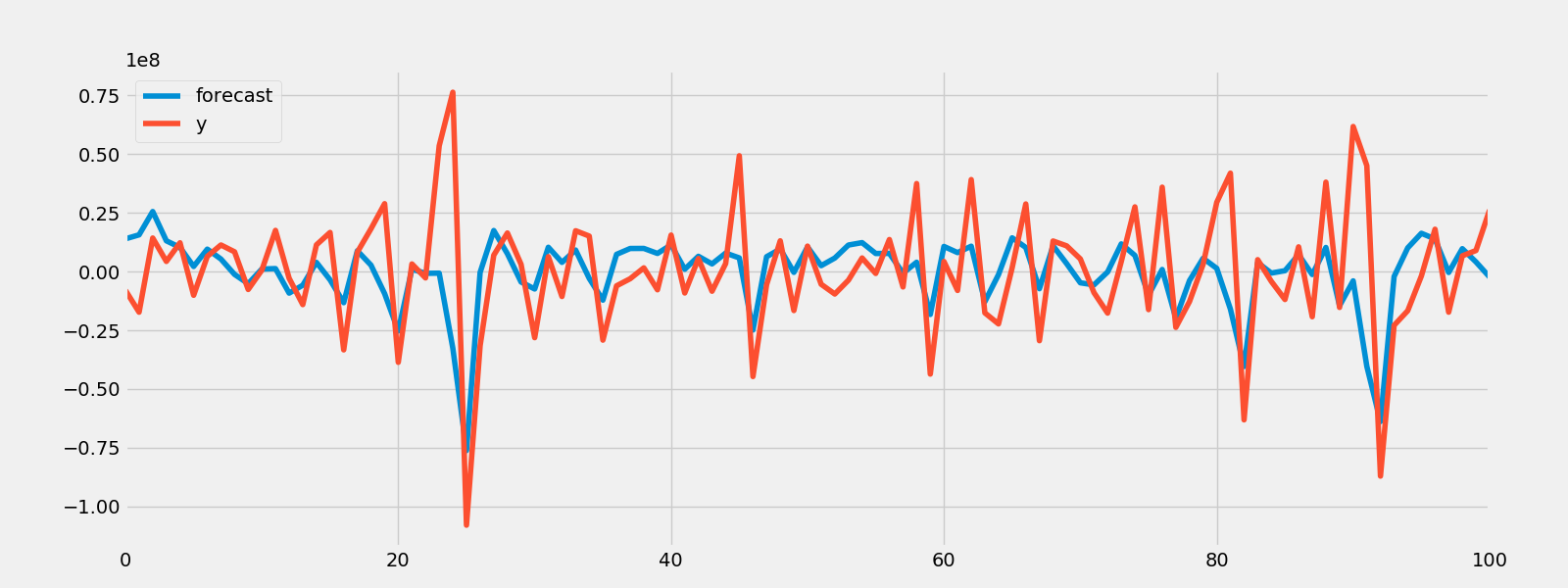
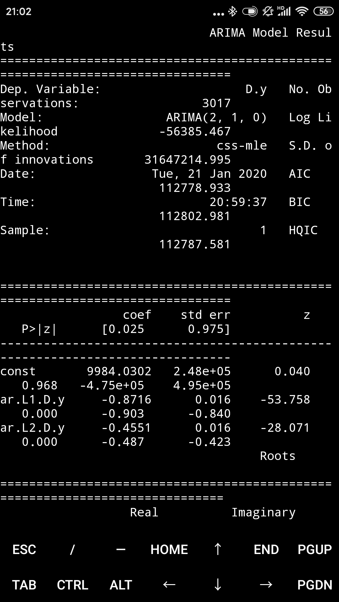
model = ARIMA(microsoft["Volume"].diff().iloc[1:].values, order = (2, 1, 0))
result = model.fit()
print(result.summary())
result.plot_predict(start = 700, end = 1000)
plt.savefig("Arima_predict.png")
rmse = math.sqrt(mean_squared_error(microsoft["Volume"].diff().iloc[700:1001].values, result.predict(start=700,end=1000)))
print("The root mean squared error is {}.".format(rmse))
The root mean squared error is 61937593.98493614.
考虑一个轻微的延迟,这是一个很好的模型。
4.5 VAR模型
向量自回归(Vector autoregression, VAR)是一个随机过程模型,用来捕捉多个时间序列之间的线性相关性。VAR模型是单变量自回归模型(AR模型)推广到多个变量的情况。在VAR模型中所有变量进入模型的途径都一致:每个变量都有一个方程基于其自己的延迟值,其它模型变量的延迟值,以及一个误差因子来解释其演变。VAR模型不需要更多的关于影响一个变量的因素的知识,就像在结构化模型中那样:模型需要的唯一的先导知识是变量列表,其中的变量被暂时地假设会彼此相互影响。
VAR模型
预测谷歌和微软的收盘价
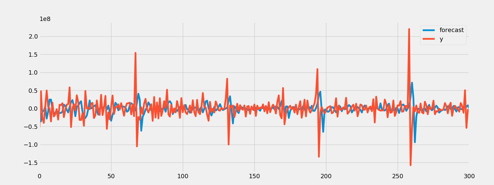
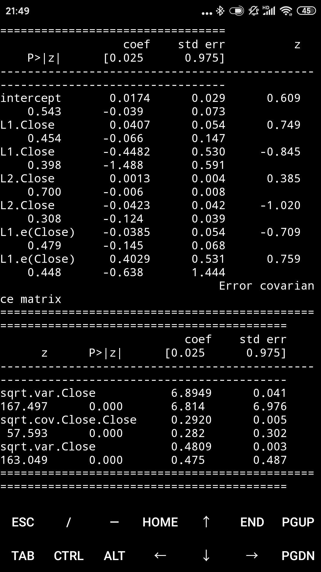
train_sample = pd.concat([google["Close"].diff().iloc[1:], microsoft["Close"].diff().iloc[1:]], axis=1)
model = sm.tsa.VARMAX(train_sample, order = (2, 1), trend = 'c')
result = model.fit(maxiter = 1000, disp = False)
print(result.summary())
predicted_result = result.predict(start = 0, end = 1000)
fig = result.plot_diagnostics()
fig.savefig("Var_predict.png")
计算误差
rmse = math.sqrt(mean_squared_error(train_sample.iloc[1:1002].values, predicted_result.values))
print("The root mean squared error is {}.".format(rmse))

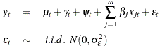
4.6 状态空间模型
一个一般的状态空间模型的形式为:
yt = Ztαt + dt + εt
αt = Ttαt - 1 + ct + Rtηt
其中yt代表了在时间t中的观察向量,αt代表了(未观察的)在时间t的状态向量,不规则的成分定义如下:
εt ~ N(0, Ht)
ηt ~ N(0, Qt)
方程中的其余变量(Zt, dt, Ht, Tt, ct, Rt, Qt)是描述过程的矩阵。它们的名称和维度如下:
(这些就不翻译了)
Z : design (k_endog×k_states×nobs)
d : obs_intercept (k_endog×nobs)
H : obs_cov (k_endog×k_endog×nobs)
T : transition (k_states×k_states×nobs)
c : state_intercept (k_states×nobs)
R : selection (k_states×k_posdef×nobs)
Q : state_cov (k_posdef×k_posdef×nobs)
如果一个矩阵是时间不变的(例如,Zt = Zt + 1 ∀ t),其最后的维度也许大小为1而不是节点的数量。
这个一般形式概括了许多非常流行的线性时间序列模型(如下)并且有很高的扩展性,允许对缺失的观察进行估计,进行预测,推动响应函数,等等。
来源:https://www.statsmodels.org/dev/statespace.html
4.6.1 SARIMA模型
SARIMA模型对于季节性时间序列的建模很有用,其数据的平均值和其它统计指标在某一年度内是不稳定的,SARIMA模型是非季节性自回归移动平均模型(ARMA)和自回归求和移动平均模型(ARIMA)的直接扩展。
SARIMA模型
预测谷歌的收盘价
train_sample = google["Close"].diff().iloc[1:].values
model = sm.tsa.SARIMAX(train_sample, order = (4, 0, 4), trend = 'c')
result = model.fit(maxiter = 1000, disp = True)
print(result.summary())
predicted_result = result.predict(start = 0, end = 500)
fig = result.plot_diagnostics()
fig.savefig("sarimax.png")
计算误差
rmse = math.sqrt(mean_squared_error(train_sample[1:502], predicted_result))
print("The root mean squared error is {}.".format(rmse))


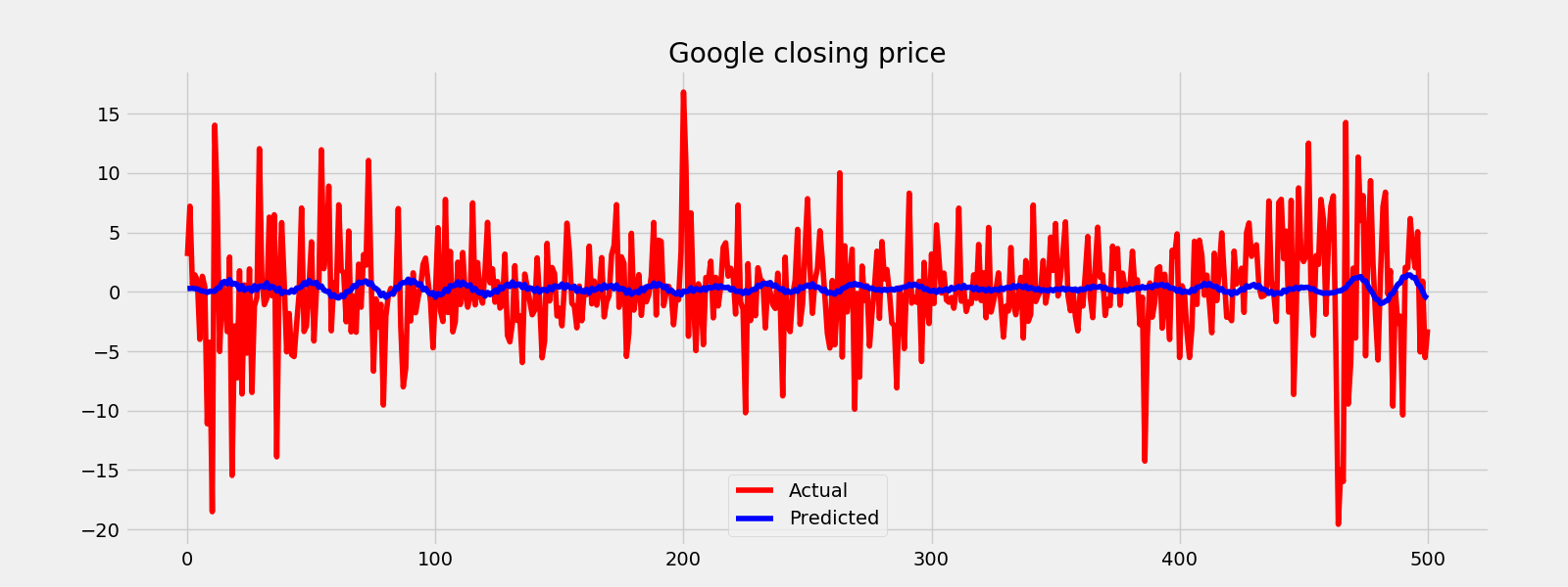
fig = plt.figure()
plt.plot(train_sample[1:502], color = "red")
plt.plot(predicted_result, color = "blue")
plt.legend(["Actual", "Predicted"])
plt.title("Google closing price")
fig.savefig("sarimax_test.png")
4.6.2 未观察成分
UCM将序列拆分为组成成分,例如趋势、季节、周期,以及衰退因素,以预测序列。下面的模型给出了一个可能的方案。
未观察成分模型
预测谷歌的收盘价
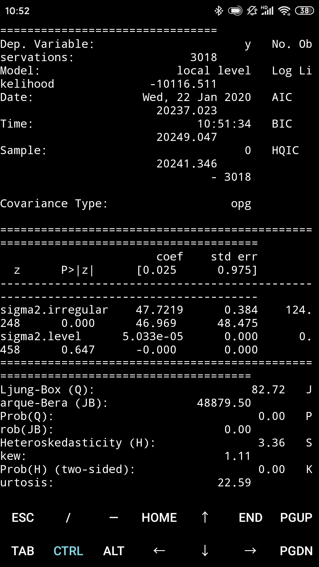
train_sample = google["Close"].diff().iloc[1:].values
model = sm.tsa.UnobservedComponents(train_sample, "local level")
result = model.fit(maxiter = 1000, disp = True)
print(result.summary())
predicted_result = result.predict(start = 0, end = 500)
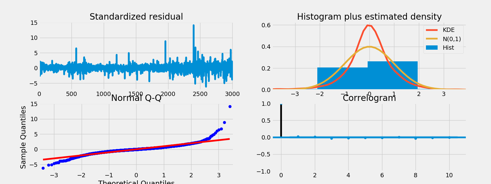
fig = result.plot_diagnostics()
fig.savefig("unobserve.png")
计算误差
rmse = math.sqrt(mean_squared_error(train_sample[1:502], predicted_result))
print("The root mean squared error is {}.".format(rmse))
fig = plt.figure()
plt.plot(train_sample[1:502], color = "red")
plt.plot(predicted_result, color = "blue")
plt.legend(["Actual", "Predicted"])
plt.title("Google closing price")
fig.savefig("unobserve_test.png")

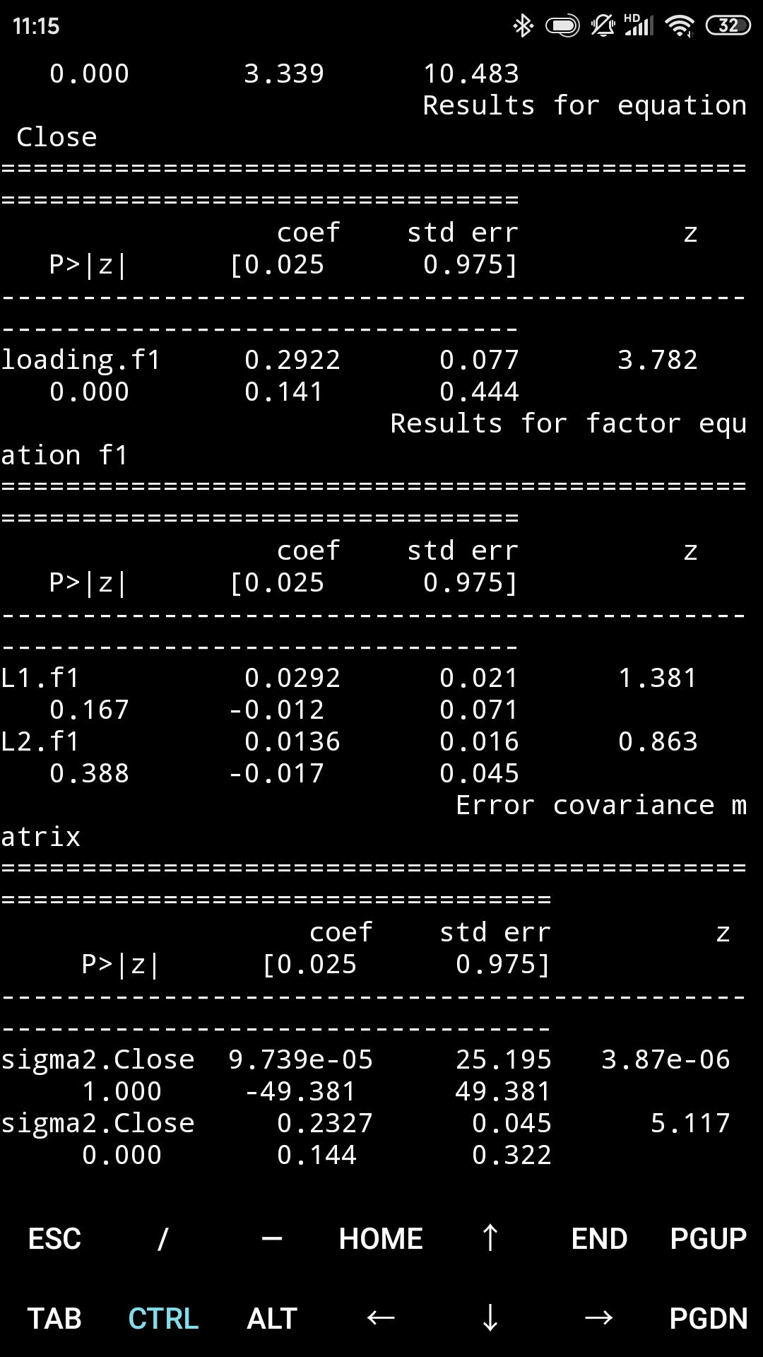
4.6.3 动态因子模型
动态因子模型是一个灵活的模型,用于多变量时间序列,其中观测的内部变量与外部协变量和未观测的因子呈线性关系。因此有一个向量自回归结构。未观测的因子也许是外部协变量的一个函数。依赖变量对方程的干扰也许是自相关的。
动态因子模型
预测谷歌的收盘价
train_sample = pd.concat([google["Close"].diff().iloc[1:], microsoft["Close"].diff().iloc[1:]], axis=1)
model = sm.tsa.DynamicFactor(train_sample, k_factors=1, factor_order=2)
result = model.fit(maxiter = 1000, disp = True)
print(result.summary())
predicted_result = result.predict(start = 0, end = 1000)
fig = result.plot_diagnostics()
fig.savefig("DynamicFactor.png")
计算误差
rmse = math.sqrt(mean_squared_error(train_sample[1:502], predicted_result))
print("The root mean squared error is {}.".format(rmse))

我将尽快增加更多的回归模型,覆盖更多的主题。但根据我的经验,对于时间序列预测的最好模型是LSTM,它是基于循环神经网络( Recurrent Neural Networks)的。我已经为这个主题准备了一个教程,这是链接: https://www.kaggle.com/thebrownviking20/intro-to-recurrent-neural-networks-lstm-gru
参考文献(有更深入的内容和解释):
- Manipulating Time Series Data in Python https://www.datacamp.com/courses/manipulating-time-series-data-in-python
- Introduction to Time Series Analysis in Python https://www.datacamp.com/courses/introduction-to-time-series-analysis-in-python
- Visualizing Time Series Data in Python https://www.datacamp.com/courses/visualizing-time-series-data-in-python
- VAR models and LSTM https://www.youtube.com/watch?v=_vQ0W_qXMxk
- State space models https://www.statsmodels.org/dev/statespace.html
敬请期待更多的内容!并且别忘了点赞和评论。
(原文全文完)
本文写于春节前,本想收假上班就发。由于众所周知的原因,假期一延再延,我至今没有确定准确的上班时间。因此还是发了吧。由于是从手机上发的,格式可能会乱,尤其代码部分。等收假能用电脑再改了。祝疫情早日结束。祝大家身体健康。
我发文章的四个地方,欢迎大家在朋友圈等地方分享,欢迎点“在看”。
我的个人博客地址:https://zwdnet.github.io
我的知乎文章地址: https://www.zhihu.com/people/zhao-you-min/posts
我的博客园博客地址: https://www.cnblogs.com/zwdnet/
我的微信个人订阅号:赵瑜敏的口腔医学学习园地