介绍3个简单的案例:
案例1:

<!DOCTYPE html>
<html lang="en">
<head>
    <meta charset="UTF-8">
    <meta name="viewport" content="width=device-width, initial-scale=1.0">
    <meta http-equiv="X-UA-Compatible" content="ie=edge">
    <title>页面加载动画</title>
    <link rel="stylesheet" href="css/style.css">
    <link rel="stylesheet" href="css/loader1.css">
</head>
<body>
    <div class="loader">
        <div class="circle"></div>
        <div class="circle"></div>
    </div>
</body>
</html>
/* 通用样式 */
*{
padding: 0;
margin: 0;
box-sizing: border-box;
}
body{
font-family: sans-serif;
font-size: 18px;
line-height: 1.6;
background: linear-gradient(135deg,#f5f7fa 0%,#c3cfe2 100%);
display: flex;
flex-direction: column;
align-items: center;
justify-content: center;
min-height: 100vh;
}
.loader{
height: 50px;
transform-origin: bottom center;
animation: rotate 3s linear infinite;
}
.circle{
background: tan;
width: 40px;
height: 40px;
border-radius: 50%;
transform: scale(0);
animation: grow 1.5s linear infinite;
margin: -10px;
}
.circle:nth-child(2){
background: palegreen;
animation-delay: 0.75s;
}
@keyframes rotate {
to{
transform: rotate(360deg);
}
}
@keyframes grow {
50%{
transform: scale(1);
}
}
案例2:
<!DOCTYPE html>
<html lang="en">
<head>
<meta charset="UTF-8">
<meta name="viewport" content="width=device-width, initial-scale=1.0">
<meta http-equiv="X-UA-Compatible" content="ie=edge">
<title>页面加载动画</title>
<link rel="stylesheet" href="css/style.css">
<!-- <link rel="stylesheet" href="css/loader1.css"> -->
<link rel="stylesheet" href="css/loader2.css">
</head>
<body>
<div class="loader">Loading</div>
<!-- <div class="loader">
<div class="circle"></div>
<div class="circle"></div>
</div> -->
</body>
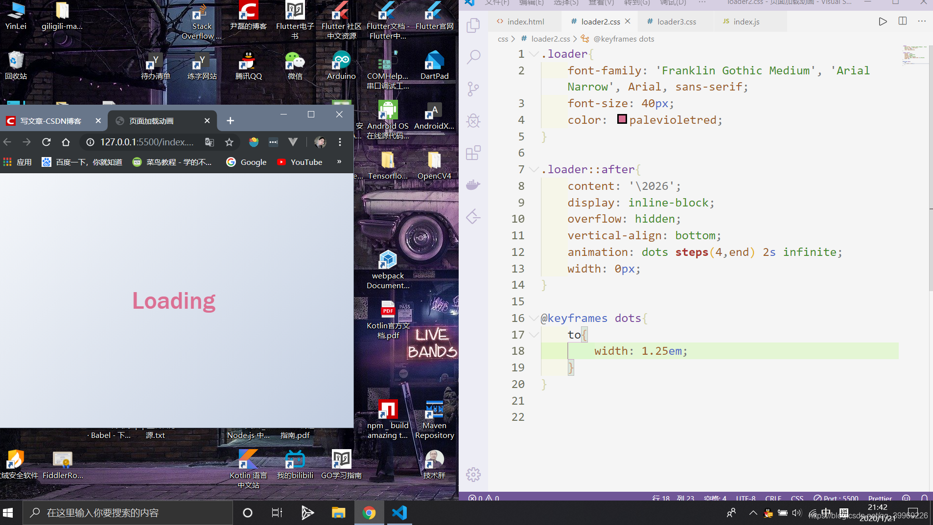
</html>.loader{
font-family: 'Franklin Gothic Medium', 'Arial Narrow', Arial, sans-serif;
font-size: 40px;
color: palevioletred;
}
.loader::after{
content: '\2026';
display: inline-block;
overflow: hidden;
vertical-align: bottom;
animation: dots steps(4,end) 2s infinite;
width: 0px;
}
@keyframes dots{
to{
width: 1.25em;
}
}
案例3:
<!DOCTYPE html>
<html lang="en">
<head>
<meta charset="UTF-8">
<meta name="viewport" content="width=device-width, initial-scale=1.0">
<meta http-equiv="X-UA-Compatible" content="ie=edge">
<title>页面加载动画</title>
<link rel="stylesheet" href="css/style.css">
<!-- <link rel="stylesheet" href="css/loader1.css"> -->
<!-- <link rel="stylesheet" href="css/loader2.css"> -->
<link rel="stylesheet" href="css/loader3.css">
</head>
<body>
<div class="loader">
<span></span>
<span></span>
<span></span>
</div>
<!-- <div class="loader">Loading</div> -->
<!-- <div class="loader">
<div class="circle"></div>
<div class="circle"></div>
</div> -->
</body>
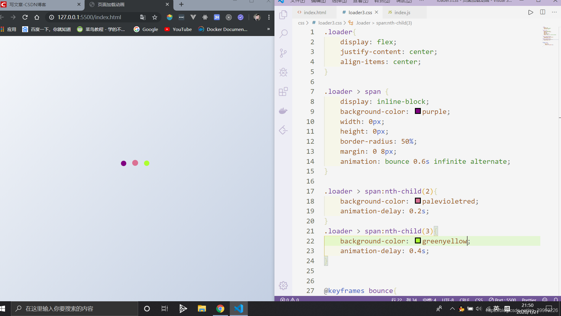
</html>.loader{
display: flex;
justify-content: center;
align-items: center;
}
.loader > span {
display: inline-block;
background-color: purple;
width: 0px;
height: 0px;
border-radius: 50%;
margin: 0 8px;
animation: bounce 0.6s infinite alternate;
}
.loader > span:nth-child(2){
background-color: palevioletred;
animation-delay: 0.2s;
}
.loader > span:nth-child(3){
background-color: greenyellow;
animation-delay: 0.4s;
}
@keyframes bounce{
to{
width: 16px;
height: 16px;
transform: translateY(-16px);
}
}
js的处理:
/* 通用样式 */
*{
    padding: 0;
    margin: 0;
    box-sizing: border-box;
}

body{
    font-family: sans-serif;
    font-size: 18px;
    line-height: 1.6;
    background: linear-gradient(135deg,#f5f7fa 0%,#c3cfe2 100%);
    display: flex;
    flex-direction: column;
    align-items: center;
    justify-content: center;
    min-height: 100vh;
}
.main{
text-align: center;
width: 90%;
display: none;
opacity: 0;
transition: opacity 1s ease-in;
}
.main h1{
font-size: 50px;
margin-bottom: 10px;
}
.main p {
font-size: 25px;
color: #333;
}
.btn {
display: inline-block;
background: purple;
color: #fff;
text-decoration: none;
border: none;
border-radius: 5px;
padding: 10px 20px;
margin-top: 15px;
}
.btn:hover{
opacity: .9;
}<!DOCTYPE html>
<html lang="en">
<head>
<meta charset="UTF-8">
<meta name="viewport" content="width=device-width, initial-scale=1.0">
<meta http-equiv="X-UA-Compatible" content="ie=edge">
<title>页面加载动画</title>
<link rel="stylesheet" href="css/style.css">
<!-- <link rel="stylesheet" href="css/loader1.css"> -->
<link rel="stylesheet" href="css/loader2.css">
<!-- <link rel="stylesheet" href="css/loader3.css"> -->
</head>
<body>
<!-- <div class="loader">
<span></span>
<span></span>
<span></span>
</div> -->
<div class="loader">Loading</div>
<!-- <div class="loader">
<div class="circle"></div>
<div class="circle"></div>
</div> -->
<section class="main">
<h1>Yin Lei.</h1>
<p>佛说,前世500次的回眸才能换来今生的一次相遇。</p>
<a href="#" class="btn">姻缘一线牵</a>
</section>
<script src="index.js"></script>
</body>
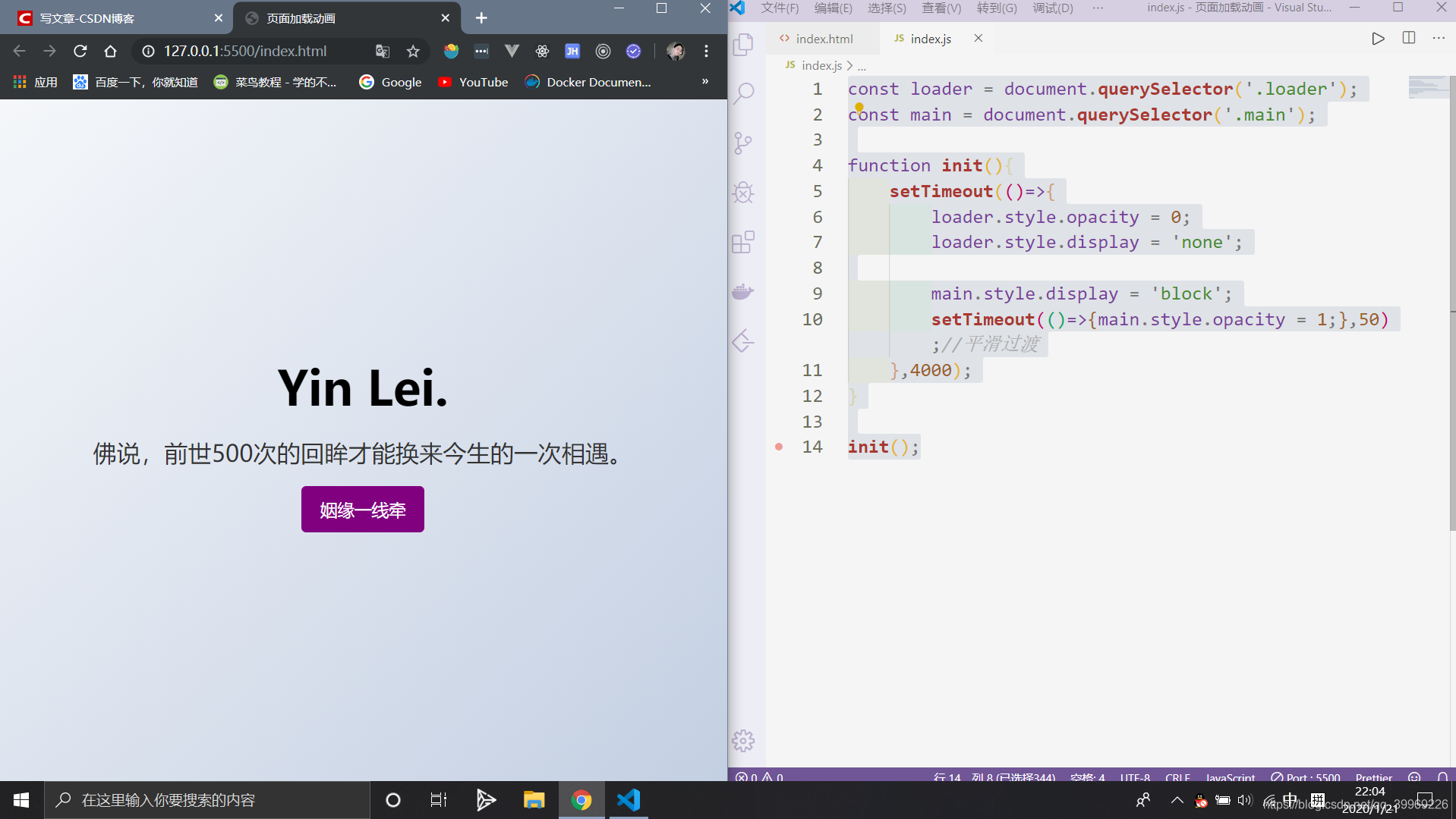
</html>const loader = document.querySelector('.loader');
const main = document.querySelector('.main');
function init(){
setTimeout(()=>{
loader.style.opacity = 0;
loader.style.display = 'none';
main.style.display = 'block';
setTimeout(()=>{main.style.opacity = 1;},50) ;//平滑过渡
},4000);
}
init();