浮动(float)
网页标准文档流
标准文档流是指内容元素排版布局过程中,会自动从左往右,从上往下进行流式排版(即独占一行,在一行,占元素位置)
浮动:
float:left | right;特点:
1.浮动的元素不占位置(脱离标准文档流)
2.块级元素在一行上显示的时候就使用浮动(脱标)
3.浮动可以实现模式转换(脱标)
总结:
1.在网页布局中,块级元素在一行显示就使用浮动。
2.如果只是希望一个行内元素有宽度或者高度(进行模式转换),就使用display。
使用:
1.为了实现图片和文字环绕效果,可以使用浮动该属性。(文字不会受浮动的影响,文字不会被浮动的元素压着)
<!DOCTYPE html>
<html lang="en">
<head>
    <meta charset="UTF-8">
    <title>Document</title>
    <style type="text/css">

        .box {
            width: 300px;
            height: 300px;
            border: 1px solid red;
        }
        p {
            height: 100px;
            background-color: pink;
        }
        img {
            float:left;
        }
    </style>
</head>
<body>


<div class="box">
    <img src="images/favicon.ico" alt="">
    <p>1231文字介绍这是一个图片</p>
</div>
</body>
</html>
2.网页布局块级元素一行显示
<!DOCTYPE html>
<html lang="en">
<head>
    <meta charset="UTF-8">
    <title>Document</title>

    <style type="text/css">
        * {
            margin: 0;
            padding: 0;
        }
        nav {
            height: 50px;
            background-color: #ccc;
        }

        section {
            width: 980px;
            margin: 0 auto;
        }

        .left {
            width: 200px;
            height: 500px;
            background-color: #000;
            float: left;
        }

        .middle {
            width: 580px;
            height: 500px;
            background-color: orange;
            float: left;
        }

        .right {
            float: right;
            height: 500px;
            width: 200px;
            background-color: #000;
        }

        .other {
            width: 1000px;
            height: 50px;
            background-color: blue;
            margin: 0 auto;
        }

        .content {
            width: 980px;
            overflow: hidden;
        }

        /*!*  .other {*/
        /*      clear: both;*/
        /* } *!*/

        /*.clear {*/
        /*    clear: both;*/
        /*}*/

        /*.cleafix:after {*/
        /*    content: "";*/
        /*    height: 0px;*/
        /*    line-height: 0px;*/
        /*    display: block;*/
        /*    clear: both;*/
        /*    !* 隐藏 *!*/
        /*    visibility: hidden;*/
        /*}*/
        /*.cleafix {*/
        /*    !* 兼容IE *!*/
        /*    *zoom: 1;*/
        /*}*/
    </style>
</head>
<body>
<nav class="nav"></nav>
<section class="content">
    <div class="left"></div>
    <div class="middle"></div>
    <div class="right"></div>
</section>

<div class="other"></div>
</body>
</html>
3.在网页布局中制作导航
清除浮动(消除浮动元素对后面元素的影响)
由于浮动标签不再占用原文档流的位置,所以它会对页面中其他标签的排版产生影响。
对子标签设置浮动时,如果不对父标签定义高度,则子标签的浮动会对父标签产生一定的影响。
解决方法如下:
方法一:
使用空标签清除浮动,并用clear属性:left  |  right  |both(对后面受浮动影响的元素使用该属性)
虽然可以清除浮动,但是增加了毫无意义的结构标签,不建议使用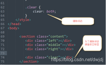
方法二:
给父标签使用overflow属性清除浮动
<!DOCTYPE html>
<html lang="en">
<head>
    <meta charset="UTF-8">
    <title>Document</title>
    <style type="text/css">
        * {
            margin: 0;
            padding: 0;
        }
        nav {
            height: 50px;
            background-color: #ccc;
        }

        section {
            width: 980px;
            margin: 0 auto;
        }

        .left {
            width: 200px;
            height: 500px;
            background-color: #000;
            float: left;
        }

        .middle {
            width: 580px;
            height: 500px;
            background-color: orange;
            float: left;
        }

        .right {
            float: right;
            height: 500px;
            width: 200px;
            background-color: #000;
        }

        .other {
            width: 1000px;
            height: 50px;
            background-color: blue;
            margin: 0 auto;
        }

        .content {
            width: 980px;
            overflow: hidden;
        }

    </style>
</head>
<body>
<nav class="nav"></nav>
<section class="content">
    <div class="left"></div>
    <div class="middle"></div>
    <div class="right"></div>
</section>
<div class="other"></div>
</body>
</html>
注意:如果父标签中有定位的元素,并且该定位的元素超过了父元素,那么不推荐使用该方式清除浮动。
方法三:使用伪元素清除浮动(推荐的方式)
<!DOCTYPE html>
<html lang="en">
<head>
    <meta charset="UTF-8">
    <title>Document</title>
    <style type="text/css">
        * {
            margin: 0;
            padding: 0;
        }
        nav {
            height: 50px;
            background-color: #ccc;
        }

        section {
            width: 980px;
            margin: 0 auto;
        }

        .left {
            width: 200px;
            height: 500px;
            background-color: #000;
            float: left;
        }

        .middle {
            width: 580px;
            height: 500px;
            background-color: orange;
            float: left;
        }

        .right {
            float: right;
            height: 500px;
            width: 200px;
            background-color: #000;
        }

        .other {
            width: 1000px;
            height: 50px;
            background-color: blue;
            margin: 0 auto;
        }

        .content {
            width: 980px;
        }
        .clearfix::after{
            content: "";
            height: 0px;
            line-height: 0px;
            display: block;
            clear: both;
            visibility: hidden;
        }
        .clearfix{
            *zoom=1;
        }
    </style>
</head>
<body>
<nav class="nav"></nav>
<section class="content clearfix">
    <div class="left"></div>
    <div class="middle"></div>
    <div class="right"></div>
</section>
<div class="other"></div>
</body>
</html>
