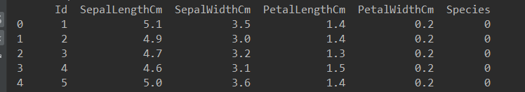
一、对某一列中特定的值进行修改
以 iris.csv 文件为例,对数据进行修改。
把"Species"这一列中三种花的名字分别用0,1,2代替
import pandas as pd

data = pd.read_csv('iris.csv')
print(type(data['Species']))

data.loc[data['Species'] == "Iris-setosa", "Species"] = 0
data.loc[data['Species'] == "Iris-versicolor", "Species"] = 1
data.loc[data['Species'] == "Iris-virginica", "Species"] = 2
上面代码使用了 loc 函数,函数中逗号前是执行条件,逗号后是执行对象。
执行结果是,"Species"中种类一列的字符被数字所代替。
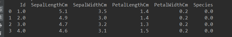
二、选取一行数据存入另一个对象中
还是用上面的例子,新建一个与data列索引相同的DataFrame对象,然后用loc函数加行索引,复制一行到new_data中。这里只示例了四个。
new_data = pd.DataFrame(columns=['Id', 'SepalLengthCm', 'SepalWidthCm', 'PetalLengthCm',
                                 'PetalWidthCm', 'Species'])
for i in range(4):
    new_data.loc[i] = data.loc[i]
print(new_data)
pandas.DataFrame.hist()画数据的柱状图
data : DataFrame
		The pandas object holding the data.

column : string or sequence
		If passed, will be used to limit data to a subset of columns.

by : object, optional
		If passed, then used to form histograms for separate groups.

grid : bool, default True
		Whether to show axis grid lines.

xlabelsize : int, default None
		If specified changes the x-axis label size.

xrot : float, default None
		Rotation of x axis labels. For example, a value of 90 displays the x labels rotated 90 degrees clockwise.

ylabelsize : int, default None
		If specified changes the y-axis label size.

yrot : float, default None
		Rotation of y axis labels. For example, a value of 90 displays the y labels rotated 90 degrees clockwise.

ax : Matplotlib axes object, default None
		The axes to plot the histogram on.

sharex : bool, default True if ax is None else False
		In case subplots=True, share x axis and set some x axis labels to invisible; defaults to True if ax is None otherwise False if an ax is passed in. Note that passing in both an ax and sharex=True will alter all x axis labels for all subplots in a figure.

sharey : bool, default False
		In case subplots=True, share y axis and set some y axis labels to invisible.

figsize : tuple
		The size in inches of the figure to create. Uses the value in matplotlib.rcParams by default.

layout : tuple, optional
		Tuple of (rows, columns) for the layout of the histograms.

bins : integer or sequence, default 10
		Number of histogram bins to be used. If an integer is given, bins + 1 bin edges are calculated and returned. If bins is a sequence, gives bin edges, including left edge of first bin and right edge of last bin. In this case, bins is returned unmodified.

**kwds
		All other plotting keyword arguments to be passed to matplotlib.pyplot.hist().


**Return** :matplotlib.AxesSubplot or numpy.ndarray of them
pandas.DataFrame.plot() 使用matplotlib绘制图
可以查看matplotlib文档
data : DataFrame
x : label or position, default None
y : label, position or list of label, positions, default None

Allows plotting of one column versus another

kind : str

		‘line’ : line plot (default)
		‘bar’ : vertical bar plot
		‘barh’ : horizontal bar plot
		‘hist’ : histogram
		‘box’ : boxplot
		‘kde’ : Kernel Density Estimation plot
		‘density’ : same as ‘kde’
		‘area’ : area plot
		‘pie’ : pie plot
		‘scatter’ : scatter plot
		‘hexbin’ : hexbin plot
		ax : matplotlib axes object, default None
		subplots : boolean, default False

Make separate subplots for each column

sharex : boolean, default True if ax is None else False

		In case subplots=True, share x axis and set some x axis labels to invisible; defaults to True if ax is None otherwise False if an ax is passed in; Be aware, that passing in both an ax and sharex=True will alter all x axis labels for all axis in a figure!

sharey : boolean, default False

		In case subplots=True, share y axis and set some y axis labels to invisible

layout : tuple (optional)

		(rows, columns) for the layout of subplots

figsize : a tuple (width, height) in inches
use_index : boolean, default True

		Use index as ticks for x axis

title : string or list

		Title to use for the plot. If a string is passed, print the string at the top of the figure. If a list is passed and subplots is True, print each item in the list above the corresponding subplot.

grid : boolean, default None (matlab style default)

		Axis grid lines

legend : False/True/’reverse’

		Place legend on axis subplots

style : list or dict

		matplotlib line style per column

logx : boolean, default False

		Use log scaling on x axis

logy : boolean, default False

		Use log scaling on y axis

loglog : boolean, default False

		Use log scaling on both x and y axes

xticks : sequence

		Values to use for the xticks

yticks : sequence

		Values to use for the yticks

xlim : 2-tuple/list
ylim : 2-tuple/list
rot : int, default None

		Rotation for ticks (xticks for vertical, yticks for horizontal plots)

fontsize : int, default None

		Font size for xticks and yticks

colormap : str or matplotlib colormap object, default None

		Colormap to select colors from. If string, load colormap with that name from matplotlib.

colorbar : boolean, optional

		If True, plot colorbar (only relevant for ‘scatter’ and ‘hexbin’ plots)

position : float

		Specify relative alignments for bar plot layout. From 0 (left/bottom-end) to 1 (right/top-end). Default is 0.5 (center)

table : boolean, Series or DataFrame, default False

		If True, draw a table using the data in the DataFrame and the data will be transposed to meet matplotlib’s default layout. If a Series or DataFrame is passed, use passed data to draw a table.

yerr : DataFrame, Series, array-like, dict and str

	See Plotting with Error Bars for detail.

xerr : same types as yerr.
stacked : boolean, default False in line and

		bar plots, and True in area plot. If True, create stacked plot.

sort_columns : boolean, default False

		Sort column names to determine plot ordering

secondary_y : boolean or sequence, default False

		Whether to plot on the secondary y-axis If a list/tuple, which columns to plot on secondary y-axis

mark_right : boolean, default True

		When using a secondary_y axis, automatically mark the column labels with “(right)” in the legend

`**kwds` : keywords

Options to pass to matplotlib plotting method
