其中:
1.python是2.X版本
2.提供两种实现思路,一是基于matplotlib的animation,一是基于matplotlib的ion
1.python是2.X版本
2.提供两种实现思路,一是基于matplotlib的animation,一是基于matplotlib的ion
全篇目录为:
一、一点构思
二、matplotlib animation实现思路
(一)、骨架与实时更新
(二)、animation的优缺点
三、matplotlib ion实现思路
(一)、实时更新
(二)、ion的优缺点
1234567
二、matplotlib animation实现思路
(一)、骨架与实时更新
(二)、animation的优缺点
三、matplotlib ion实现思路
(一)、实时更新
(二)、ion的优缺点
1234567
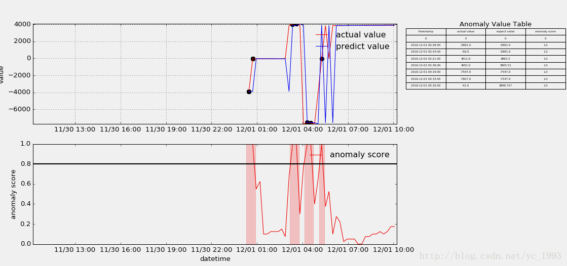
话不多说,先了解大概的效果,如下:
一、一点构思
在做此流数据输出可视化前,一直在捣鼓nupic框架,其内部HTM算法主要是一种智能的异常检测算法,是目前AI框架中垂直领域下的一股清流,但由于其实现的例子对应的流数据展示并非我想要的,故此借鉴后自己重新写了一个,主要是达到三个目的,一是展示真实数据的波动,二是展示各波动的异常得分,三是罗列异常的点。
上述的输出结构并非重点,重点是其实时更新的机制,了解后即可自行定义。另,js对于这种流数据展示应该不难,所以本文主要立足的是算法的呈现角度以及python的实现。
上述的输出结构并非重点,重点是其实时更新的机制,了解后即可自行定义。另,js对于这种流数据展示应该不难,所以本文主要立足的是算法的呈现角度以及python的实现。
二、matplotlib animation实现思路
http://matplotlib.org/api/animation_api.html 链接是matplotlib animation的官方api文档
(一)、骨架与实时更新
animation翻译过来就是动画,其动画展示核心主要有三个:1是动画的骨架先搭好,就是图像的边边框框这些,2是更新的过程,即传入实时数据时图形的变化方法,3是FuncAnimation方法结尾。
下面以一个小例子做进一步说明:
1.对于动画的骨架:
1.对于动画的骨架:
# initial the figure.
x = []
y = []
fig = plt.figure(figsize=(18, 8), facecolor="white")
ax1 = fig.add_subplot(111)
p1, = ax1.plot(x, y, linestyle="dashed", color="red")123456
x = []
y = []
fig = plt.figure(figsize=(18, 8), facecolor="white")
ax1 = fig.add_subplot(111)
p1, = ax1.plot(x, y, linestyle="dashed", color="red")123456
以上分别对应初始化空数据,初始化图形大小和背景颜色,插入子图(三个数字分别表示几行几列第几个位置),初始化图形(数据为空)。
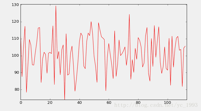
import numpy as np
x = np.arange(0, 1000, 1)
y = np.random.normal(100, 10, 1000)123
x = np.arange(0, 1000, 1)
y = np.random.normal(100, 10, 1000)123
随机生成一些作图数据,下面定义update过程。
2.对于更新过程:
def update(i):
x.append(xs[i])
y.append(ys[i])
ax1.set_xlim(min(x),max(x)+1)
ax1.set_ylim(min(y),max(y)+1)
p1.set_data(x,y)
ax1.figure.canvas.draw()
return p112345678
x.append(xs[i])
y.append(ys[i])
ax1.set_xlim(min(x),max(x)+1)
ax1.set_ylim(min(y),max(y)+1)
p1.set_data(x,y)
ax1.figure.canvas.draw()
return p112345678
上述定义更新函数,参数i为每轮迭代从FuncAnimation方法frames参数传进来的数值,frames参数的指定下文会进一步说,x/y通过相应更新之后,对图形的x/y轴大小做相应的重设,再把数据通过set_data传进图形,注意ax1和p1的区别,最后再把上述的变化通过draw()方法绘制到界面上,返回p1给FuncAnimation方法。
3.对于FuncAnimation方法:
ani = FuncAnimation(fig=fig,func=update,frames=len(xs),interval=1)
plt.show()12
plt.show()12
FuncAnimation方法主要是与update函数做交互,将frames参数对应的数据逐条传进update函数,再由update函数返回的图形覆盖FuncAnimation原先的图形,fig参数即为一开始对应的参数,interval为每次更新的时间间隔,还有其他一些参数如blit=True控制图形精细,当界面较多子图时,为True可以使得看起来不会太卡,关键是frames参数,下面是官方给出的注释:
可为迭代数,可为函数,也可为空,上面我指定为数组的长度,其迭代则从0开始到最后该数值停止。
该例子最终呈现的效果如下:
了解大概的实现,细节就不在这里多说了。
(二)、animation的优缺点
animation的绘制的结果相比于下文的ion会更加的细腻,主要体现在FuncAnimation方法的一些参数的控制上。但是缺点也是明显,就是必须先有指定的数据或者指定的数据大小,显然这样对于预先无法知道数据的情况没法处理。所以换一种思路,在matplotlib ion打开的模式下,每次往模板插入数据都会进行相应的更新,具体看第二部分。
三、matplotlib ion实现思路
(一)、实时更新
matplotlib ion的实现也主要是三个核心,1是打开ion,2是实时更新机制,3是呈现在界面上。
1.对于打开ion:
ion全称是 interactive on(交互打开),其意为打开一个图形的交互接口,之后每次绘图都在之前打开的面板上操作,举个例子:
ion全称是 interactive on(交互打开),其意为打开一个图形的交互接口,之后每次绘图都在之前打开的面板上操作,举个例子:
import matplotlib.pyplot as plt
plt.ion()
fig = plt.figure()
ax1 = fig.add_subplot(111)
line, = ax1.plot(t, v, linestyle="-", color="r")12345
plt.ion()
fig = plt.figure()
ax1 = fig.add_subplot(111)
line, = ax1.plot(t, v, linestyle="-", color="r")12345
打开交互接口,初始化图形。
2.对于实时更新机制:
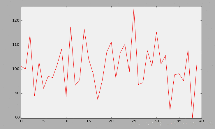
import numpy as np
ys = np.random.normal(100, 10, 1000)
ys = np.random.normal(100, 10, 1000)
def p(a, b):
t.append(a)
v.append(b)
ax1.set_xlim(min(t), max(t) + 1)
ax1.set_ylim(min(v), max(v) + 1)
line.set_data(t, v)
plt.pause(0.001)
ax1.figure.canvas.draw()
t.append(a)
v.append(b)
ax1.set_xlim(min(t), max(t) + 1)
ax1.set_ylim(min(v), max(v) + 1)
line.set_data(t, v)
plt.pause(0.001)
ax1.figure.canvas.draw()
for i in xrange(len(ys)):
p(i, ys[i])1234567891011121314
p(i, ys[i])1234567891011121314
随机生成一组数据,定义作图函数p(包含pause表示暂定时延,最好有,防止界面卡死),传入数据实时更新。
3.对于界面最终呈现
plt.ioff()
plt.show()12
plt.show()12
ioff是关闭交互模式,就像open打开文件产生的句柄,最好也有个close关掉。
最终效果如下:
(二)、ion的优缺点
animation可以在细节上控制比ion更加细腻,这也是ion没有的一点,但是单就无需预先指定数据这一点,ion也无疑是能把流数据做得更加好。
四、最后
贴一下两种方法在最开始那种图的做法,ion我定义成类,这样每次调用只需穿入参数就可以。
animation版本
# _*_ coding:utf-8 _*_
import os
import csv
import datetime
import matplotlib.pyplot as plt
from matplotlib.animation import FuncAnimation
from matplotlib.dates import DateFormatter
import matplotlib.ticker as ticker
import csv
import datetime
import matplotlib.pyplot as plt
from matplotlib.animation import FuncAnimation
from matplotlib.dates import DateFormatter
import matplotlib.ticker as ticker
# read the file
filePath = os.path.join(os.getcwd(), "data/anomalyDetect_output.csv")
file = open(filePath, "r")
allData = csv.reader(file)
# skip the first three columns
allData.next()
allData.next()
allData.next()
# cache the data
data = [line for line in allData]
# for i in data: print i
filePath = os.path.join(os.getcwd(), "data/anomalyDetect_output.csv")
file = open(filePath, "r")
allData = csv.reader(file)
# skip the first three columns
allData.next()
allData.next()
allData.next()
# cache the data
data = [line for line in allData]
# for i in data: print i
# take out the target value
timestamp = [line[0] for line in data]
value = [line[1:] for line in data]
timestamp = [line[0] for line in data]
value = [line[1:] for line in data]
# format the time style 2016-12-01 00:00:00
def timestampFormat(t):
result = datetime.datetime.strptime(t, "%Y-%m-%d %H:%M:%S")
return result
# take out the data
timestamp = map(timestampFormat, timestamp)
value_a = [float(x[0]) for x in value]
predict_a = [float(x[1]) for x in value]
anomalyScore_a = [float(x[2]) for x in value]
# initial the size of the figure
fig = plt.figure(figsize=(18, 8), facecolor="white")
fig.subplots_adjust(left=0.06, right=0.70)
ax1 = fig.add_subplot(2, 1, 1)
ax2 = fig.add_subplot(2, 1, 2)
ax3 = fig.add_axes([0.8, 0.1, 0.2, 0.8], frameon=False)
fig = plt.figure(figsize=(18, 8), facecolor="white")
fig.subplots_adjust(left=0.06, right=0.70)
ax1 = fig.add_subplot(2, 1, 1)
ax2 = fig.add_subplot(2, 1, 2)
ax3 = fig.add_axes([0.8, 0.1, 0.2, 0.8], frameon=False)
# initial plot
p1, = ax1.plot_date([], [], fmt="-", color="red", label="actual")
ax1.legend(loc="upper right", frameon=False)
ax1.grid(True)
p2, = ax2.plot_date([], [], fmt="-", color="red", label="anomaly score")
ax2.legend(loc="upper right", frameon=False)
ax2.axhline(0.8, color='black', lw=2)
# add the x/y label
ax2.set_xlabel("date time")
ax2.set_ylabel("anomaly score")
ax1.set_ylabel("value")
# add the table in ax3
col_labels = ["date time", 'actual value', 'predict value', 'anomaly score']
ax3.text(0.05, 0.99, "anomaly value table", size=12)
ax3.set_xticks([])
ax3.set_yticks([])
# axis format
dateFormat = DateFormatter("%m/%d %H:%M")
ax1.xaxis.set_major_formatter(ticker.FuncFormatter(dateFormat))
ax2.xaxis.set_major_formatter(ticker.FuncFormatter(dateFormat))
dateFormat = DateFormatter("%m/%d %H:%M")
ax1.xaxis.set_major_formatter(ticker.FuncFormatter(dateFormat))
ax2.xaxis.set_major_formatter(ticker.FuncFormatter(dateFormat))
# define the initial function
def init():
p1.set_data([], [])
p2.set_data([], [])
return p1, p2
# initial data for the update function
x1 = []
x2 = []
x1_2 = []
y1_2 = []
x1_3 = []
y1_3 = []
y1 = []
y2 = []
highlightList = []
turnOn = True
tableValue = [[0, 0, 0, 0]]
# update function
def stream(i):
# update the main graph(contains actual value and predicted value)
# add the data
global turnOn, highlightList, ax3
x1.append(timestamp[i])
y1.append(value_a[i])
# update the axis
minAxis = max(x1) - datetime.timedelta(days=1)
ax1.set_xlim(minAxis, max(x1))
ax1.set_ylim(min(y1), max(y1))
ax1.figure.canvas.draw()
p1.set_data(x1, y1)
y1.append(value_a[i])
# update the axis
minAxis = max(x1) - datetime.timedelta(days=1)
ax1.set_xlim(minAxis, max(x1))
ax1.set_ylim(min(y1), max(y1))
ax1.figure.canvas.draw()
p1.set_data(x1, y1)
# update the anomaly graph(contains anomaly score)
x2.append(timestamp[i])
y2.append(anomalyScore_a[i])
ax2.set_xlim(minAxis, max(x2))
ax2.set_ylim(min(y2), max(y2))
x2.append(timestamp[i])
y2.append(anomalyScore_a[i])
ax2.set_xlim(minAxis, max(x2))
ax2.set_ylim(min(y2), max(y2))
# update the scatter
if anomalyScore_a[i] >= 0.8:
x1_3.append(timestamp[i])
y1_3.append(value_a[i])
ax1.scatter(x1_3, y1_3, s=50, color="black")
if anomalyScore_a[i] >= 0.8:
x1_3.append(timestamp[i])
y1_3.append(value_a[i])
ax1.scatter(x1_3, y1_3, s=50, color="black")
# update the high light
if anomalyScore_a[i] >= 0.8:
highlightList.append(i)
turnOn = True
else:
turnOn = False
if len(highlightList) != 0 and turnOn is False:
if anomalyScore_a[i] >= 0.8:
highlightList.append(i)
turnOn = True
else:
turnOn = False
if len(highlightList) != 0 and turnOn is False:
ax2.axvspan(timestamp[min(highlightList)] - datetime.timedelta(minutes=10),
timestamp[max(highlightList)] + datetime.timedelta(minutes=10),
color='r',
edgecolor=None,
alpha=0.2)
highlightList = []
turnOn = True
p2.set_data(x2, y2)
timestamp[max(highlightList)] + datetime.timedelta(minutes=10),
color='r',
edgecolor=None,
alpha=0.2)
highlightList = []
turnOn = True
p2.set_data(x2, y2)
# add the table in ax3
# update the anomaly tabel
if anomalyScore_a[i] >= 0.8:
ax3.remove()
ax3 = fig.add_axes([0.8, 0.1, 0.2, 0.8], frameon=False)
ax3.text(0.05, 0.99, "anomaly value table", size=12)
ax3.set_xticks([])
ax3.set_yticks([])
tableValue.append([timestamp[i].strftime("%Y-%m-%d %H:%M:%S"), value_a[i], predict_a[i], anomalyScore_a[i]])
if len(tableValue) >= 40: tableValue.pop(0)
ax3.table(cellText=tableValue, colWidths=[0.35] * 4, colLabels=col_labels, loc=1, cellLoc="center")
return p1, p2
# main animated function
anim = FuncAnimation(fig, stream, init_func=init, frames=len(timestamp), interval=0)
plt.show()
file.close()123456789101112131415161718192021222324252627282930313233343536373839404142434445464748495051525354555657585960616263646566676869707172737475767778798081828384858687888990919293949596979899100101102103104105106107108109110111112113114115116117118119120121122123124125126127128129130131132133134135136137138139140141142143144145146147148149150151152153154
file.close()123456789101112131415161718192021222324252627282930313233343536373839404142434445464748495051525354555657585960616263646566676869707172737475767778798081828384858687888990919293949596979899100101102103104105106107108109110111112113114115116117118119120121122123124125126127128129130131132133134135136137138139140141142143144145146147148149150151152153154
ion版本
#! /usr/bin/python
import os
import csv
import datetime
import matplotlib.pyplot as plt
from matplotlib.animation import FuncAnimation
from matplotlib.dates import DateFormatter
import matplotlib.ticker as ticker
import csv
import datetime
import matplotlib.pyplot as plt
from matplotlib.animation import FuncAnimation
from matplotlib.dates import DateFormatter
import matplotlib.ticker as ticker
class streamDetectionPlot(object):
"""
Anomaly plot output.
"""
# initial the figure parameters.
def __init__(self):
# Turn matplotlib interactive mode on.
plt.ion()
# initial the plot variable.
self.timestamp = []
self.actualValue = []
self.predictValue = []
self.anomalyScore = []
self.tableValue = [[0, 0, 0, 0]]
self.highlightList = []
self.highlightListTurnOn = True
self.anomalyScoreRange = [0, 1]
self.actualValueRange = [0, 1]
self.predictValueRange = [0, 1]
self.timestampRange = [0, 1]
self.anomalyScatterX = []
self.anomalyScatterY = []
# initial the figure.
global fig
fig = plt.figure(figsize=(18, 8), facecolor="white")
fig.subplots_adjust(left=0.06, right=0.70)
self.actualPredictValueGraph = fig.add_subplot(2, 1, 1)
self.anomalyScoreGraph = fig.add_subplot(2, 1, 2)
self.anomalyValueTable = fig.add_axes([0.8, 0.1, 0.2, 0.8], frameon=False)
global fig
fig = plt.figure(figsize=(18, 8), facecolor="white")
fig.subplots_adjust(left=0.06, right=0.70)
self.actualPredictValueGraph = fig.add_subplot(2, 1, 1)
self.anomalyScoreGraph = fig.add_subplot(2, 1, 2)
self.anomalyValueTable = fig.add_axes([0.8, 0.1, 0.2, 0.8], frameon=False)
# define the initial plot method.
def initPlot(self):
# initial two lines of the actualPredcitValueGraph.
self.actualLine, = self.actualPredictValueGraph.plot_date(self.timestamp, self.actualValue, fmt="-",
color="red", label="actual value")
self.predictLine, = self.actualPredictValueGraph.plot_date(self.timestamp, self.predictValue, fmt="-",
color="blue", label="predict value")
self.actualPredictValueGraph.legend(loc="upper right", frameon=False)
self.actualPredictValueGraph.grid(True)
# initial two lines of the anomalyScoreGraph.
self.anomalyScoreLine, = self.anomalyScoreGraph.plot_date(self.timestamp, self.anomalyScore, fmt="-",
color="red", label="anomaly score")
self.anomalyScoreGraph.legend(loc="upper right", frameon=False)
self.baseline = self.anomalyScoreGraph.axhline(0.8, color='black', lw=2)
self.anomalyScoreLine, = self.anomalyScoreGraph.plot_date(self.timestamp, self.anomalyScore, fmt="-",
color="red", label="anomaly score")
self.anomalyScoreGraph.legend(loc="upper right", frameon=False)
self.baseline = self.anomalyScoreGraph.axhline(0.8, color='black', lw=2)
# set the x/y label of the first two graph.
self.anomalyScoreGraph.set_xlabel("datetime")
self.anomalyScoreGraph.set_ylabel("anomaly score")
self.actualPredictValueGraph.set_ylabel("value")
self.anomalyScoreGraph.set_xlabel("datetime")
self.anomalyScoreGraph.set_ylabel("anomaly score")
self.actualPredictValueGraph.set_ylabel("value")
# configure the anomaly value table.
self.anomalyValueTableColumnsName = ["timestamp", "actual value", "expect value", "anomaly score"]
self.anomalyValueTable.text(0.05, 0.99, "Anomaly Value Table", size=12)
self.anomalyValueTable.set_xticks([])
self.anomalyValueTable.set_yticks([])
self.anomalyValueTableColumnsName = ["timestamp", "actual value", "expect value", "anomaly score"]
self.anomalyValueTable.text(0.05, 0.99, "Anomaly Value Table", size=12)
self.anomalyValueTable.set_xticks([])
self.anomalyValueTable.set_yticks([])
# axis format.
self.dateFormat = DateFormatter("%m/%d %H:%M")
self.actualPredictValueGraph.xaxis.set_major_formatter(ticker.FuncFormatter(self.dateFormat))
self.anomalyScoreGraph.xaxis.set_major_formatter(ticker.FuncFormatter(self.dateFormat))
self.dateFormat = DateFormatter("%m/%d %H:%M")
self.actualPredictValueGraph.xaxis.set_major_formatter(ticker.FuncFormatter(self.dateFormat))
self.anomalyScoreGraph.xaxis.set_major_formatter(ticker.FuncFormatter(self.dateFormat))
# define the output method.
def anomalyDetectionPlot(self, timestamp, actualValue, predictValue, anomalyScore):
# update the plot value of the graph.
self.timestamp.append(timestamp)
self.actualValue.append(actualValue)
self.predictValue.append(predictValue)
self.anomalyScore.append(anomalyScore)
self.timestamp.append(timestamp)
self.actualValue.append(actualValue)
self.predictValue.append(predictValue)
self.anomalyScore.append(anomalyScore)
# update the x/y range.
self.timestampRange = [min(self.timestamp), max(self.timestamp)+datetime.timedelta(minutes=10)]
self.actualValueRange = [min(self.actualValue), max(self.actualValue)+1]
self.predictValueRange = [min(self.predictValue), max(self.predictValue)+1]
self.timestampRange = [min(self.timestamp), max(self.timestamp)+datetime.timedelta(minutes=10)]
self.actualValueRange = [min(self.actualValue), max(self.actualValue)+1]
self.predictValueRange = [min(self.predictValue), max(self.predictValue)+1]
# update the x/y axis limits
self.actualPredictValueGraph.set_ylim(
min(self.actualValueRange[0], self.predictValueRange[0]),
max(self.actualValueRange[1], self.predictValueRange[1])
)
self.actualPredictValueGraph.set_xlim(
self.timestampRange[1] - datetime.timedelta(days=1),
self.timestampRange[1]
)
self.anomalyScoreGraph.set_xlim(
self.timestampRange[1]- datetime.timedelta(days=1),
self.timestampRange[1]
)
self.anomalyScoreGraph.set_ylim(
self.anomalyScoreRange[0],
self.anomalyScoreRange[1]
)
# update the two lines of the actualPredictValueGraph.
self.actualLine.set_xdata(self.timestamp)
self.actualLine.set_ydata(self.actualValue)
self.predictLine.set_xdata(self.timestamp)
self.predictLine.set_ydata(self.predictValue)
self.actualLine.set_xdata(self.timestamp)
self.actualLine.set_ydata(self.actualValue)
self.predictLine.set_xdata(self.timestamp)
self.predictLine.set_ydata(self.predictValue)
# update the line of the anomalyScoreGraph.
self.anomalyScoreLine.set_xdata(self.timestamp)
self.anomalyScoreLine.set_ydata(self.anomalyScore)
self.anomalyScoreLine.set_xdata(self.timestamp)
self.anomalyScoreLine.set_ydata(self.anomalyScore)
# update the scatter.
if anomalyScore >= 0.8:
self.anomalyScatterX.append(timestamp)
self.anomalyScatterY.append(actualValue)
self.actualPredictValueGraph.scatter(
self.anomalyScatterX,
self.anomalyScatterY,
s=50,
color="black"
)
if anomalyScore >= 0.8:
self.anomalyScatterX.append(timestamp)
self.anomalyScatterY.append(actualValue)
self.actualPredictValueGraph.scatter(
self.anomalyScatterX,
self.anomalyScatterY,
s=50,
color="black"
)
# update the highlight of the anomalyScoreGraph.
if anomalyScore >= 0.8:
self.highlightList.append(timestamp)
self.highlightListTurnOn = True
else:
self.highlightListTurnOn = False
if len(self.highlightList) != 0 and self.highlightListTurnOn is False:
self.anomalyScoreGraph.axvspan(
self.highlightList[0] - datetime.timedelta(minutes=10),
self.highlightList[-1] + datetime.timedelta(minutes=10),
color="r",
edgecolor=None,
alpha=0.2
)
self.highlightList = []
self.highlightListTurnOn = True
# update the anomaly value table.
if anomalyScore >= 0.8:
# remove the table and then replot it
self.anomalyValueTable.remove()
self.anomalyValueTable = fig.add_axes([0.8, 0.1, 0.2, 0.8], frameon=False)
self.anomalyValueTableColumnsName = ["timestamp", "actual value", "expect value", "anomaly score"]
self.anomalyValueTable.text(0.05, 0.99, "Anomaly Value Table", size=12)
self.anomalyValueTable.set_xticks([])
self.anomalyValueTable.set_yticks([])
self.tableValue.append([
timestamp.strftime("%Y-%m-%d %H:%M:%S"),
actualValue,
predictValue,
anomalyScore
])
if len(self.tableValue) >= 40: self.tableValue.pop(0)
self.anomalyValueTable.table(cellText=self.tableValue,
colWidths=[0.35] * 4,
colLabels=self.anomalyValueTableColumnsName,
loc=1,
cellLoc="center"
)
# plot pause 0.0001 second and then plot the next one.
plt.pause(0.0001)
plt.draw()
plt.pause(0.0001)
plt.draw()
def close(self):
plt.ioff()
plt.show()
123456789101112131415161718192021222324252627282930313233343536373839404142434445464748495051525354555657585960616263646566676869707172737475767778798081828384858687888990919293949596979899100101102103104105106107108109110111112113114115116117118119120121122123124125126127128129130131132133134135136137138139140141142143144145146147148149150151152153154155156157158159160161162163164165166167168169170171172173174175176177
下面是ion版本的调用:
graph = stream_detection_plot.streamDetectionPlot()
graph.initPlot()
graph.initPlot()
for i in xrange(len(timestamp)):
graph.anomalyDetectionPlot(timestamp[i],value_a[i],predict_a[i],anomalyScore_a[i])
graph.anomalyDetectionPlot(timestamp[i],value_a[i],predict_a[i],anomalyScore_a[i])
graph.close()1234567
具体为实例化类,初始化图形,传入数据作图,关掉。
大概就是这样,有什么不对多指出,谢谢~
原文链接:https://blog.csdn.net/yc_1993/article/details/54933751