文章目录
- 一、开启弹性盒布局(display)——父容器
- 二、伸缩换行 (flex-wrap)——父容器
- 三、排列方式(flex-direction)——父容器
- 四、伸缩流方向与换行(flex-flow)——父容器
- 五、主轴横向对齐 (justify-content)——父容器
- 六、主轴纵向对齐 (align-content)——父容器
- 七、侧轴对齐(align-items/align-self)——父容器/子元素
- 八、排列顺序(order)——子元素
- 九、分配剩余空间(flex-grow)——子元素
- 十、收缩比率(flex-shrink)——子元素
- 十一、伸缩基准值(flex-basis)——子元素
- 十二、伸缩性(flex)——子元素
一、开启弹性盒布局(display)——父容器
-
将对象作为弹性伸缩盒显示
最老版本:box
过渡版本:flexbox
最新版本:flex -
将对象作为内联块级弹性伸缩盒显示
最老版本:inline-box
过渡版本:inline-flexbox
最新版本:inline-flex
【注】该属性设置的元素本身不会发生任何变化,但它的子元素都会被BFC格式化,变为弹性盒元素,进行智能布局,像设置float、vertical-align、多列等属性都会无效,在横向结构下。默认情况下,宽度被内容所撑开,高度和父元素一样高,子元素不换行不溢出,只会按照设置的收缩比例去收缩(当然,到了很极端的情况也会溢出,也就是保证内容的正常显示而能收缩到的极限,这不影响实际开发,只是对这个属性作的一些研究),具体属性见下文
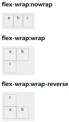
二、伸缩换行 (flex-wrap)——父容器
当子元素溢出时不换行——默认:nowrap
当子元素溢出时换行:wrap
反转wrap排列:wrap-reverse
<style>
    .box{display:flex;width:120px;margin:0;padding:10px;list-style:none;background-color:#eee;}
    .box li{width:50px;height:50px;border:1px solid
    #aaa;text-align:center;}
    #box2{flex-wrap:wrap;}
    #box3{flex-wrap:wrap-reverse;}
</style>
<body>
    <h2>flex-wrap:nowrap</h2>
    <ul id="box" class="box">
        <li>a</li>
        <li>b</li>
        <li>c</li>
    </ul>
    <h2>flex-wrap:wrap</h2>
    <ul id="box2" class="box">
        <li>a</li>
        <li>b</li>
        <li>c</li>
    </ul>
    <h2>flex-wrap:wrap-reverse</h2>
    <ul id="box3" class="box">
        <li>a</li>
        <li>b</li>
        <li>c</li>
    </ul>
</body>
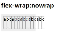
前面提到过,弹性盒布局下的子元素默认情况下打死不换行不溢出,那么打死了呢?那就没办法了,还是会出现溢出。当然,实际开发中基本不会出现这种场景,但是,为了严谨性,还是要了解到一些极端的情况,比如:
<style>
.box{display:flex;width:120px;margin:0;padding:10px;list-style:none;background-color:#eee;}
.box li{width:50px;height:50px;border:1px solid
#aaa;text-align:center;}
</style>
<body>
    <h2>flex-wrap:nowrap</h2>
    <ul id="box" class="box">
        <li>a</li>
        <li>b</li>
        <li>c</li>
        <li>a</li>
        <li>b</li>
        <li>c</li>
        <li>a</li>
        <li>b</li>
        <li>c</li>
        <li>a</li>
        <li>b</li>
        <li>c</li>
        <li>a</li>
        <li>b</li>
        <li>c</li>
    </ul>
</body>
这里,让它的子元素一直增大,增大到一定的程度(为了内容的正常显示),它出现了溢出,但还是没有换行
三、排列方式(flex-direction)——父容器
横向排列(从左到右)——默认:row
横向排列(从右到左):row-reverse
纵向排列(从上到下):column
纵向排列(从下到上):column-reverse
<style>
    .box{display:flex;margin:0;padding:10px;list-style:none;background:#eee;}
    .box li{width:50px;height:50px;border:1px solid
    #aaa;text-align:center;}
    #box{flex-direction:row;}
    #box2{flex-direction:row-reverse;}
    #box3{height:200px;flex-direction:column;}
    #box4{height:200px;flex-direction:column-reverse;}</style>
<body>
    <h2>flex-direction:row</h2>
    <ul id="box" class="box">
        <li>a</li>
        <li>b</li>
        <li>c</li>
    </ul>

    <h2>flex-direction:row-reverse</h2>
    <ul id="box2" class="box">
        <li>a</li>
        <li>b</li>
        <li>c</li>
    </ul>

    <h2>flex-direction:column</h2>
    <ul id="box3" class="box">
        <li>a</li>
        <li>b</li>
        <li>c</li>
    </ul>

    <h2>flex-direction:column-reverse</h2>
    <ul id="box4" class="box">
        <li>a</li>
        <li>b</li>
        <li>c</li>
    </ul>
</body>

四、伸缩流方向与换行(flex-flow)——父容器
flex-direction属性和flex-wrap属性的组合,使用格式:
flex-flow: flex-direction属性值 flex-wrap属性值
【注】因为其属性较少,不建议使用
五、主轴横向对齐 (justify-content)——父容器
左对齐——默认:flex-start
右对齐:flex-end
居中对齐:center
分开对齐:space-between
分开左右边距对齐:space-around
<style>
    .box{display:flex;width:300px;height:50px;margin:0;padding:0;border-radius:5px;list-style:none;background:#eee;}
    .box li{margin:5px;width:50px;padding:10px;border-radius:5px;background:#aaa;text-align:center;}
    #box{justify-content:flex-start;}
    #box2{justify-content:flex-end;}
    #box3{justify-content:center;}
    #box4{justify-content:space-between;}
    #box5{justify-content:space-around;}
</style>
<body>
    <h2>justify-content:flex-start</h2>
    <ul id="box" class="box">
        <li>a</li>
        <li>b</li>
        <li>c</li>
    </ul>
    <h2>justify-content:flex-end</h2>
    <ul id="box2" class="box">
        <li>a</li>
        <li>b</li>
        <li>c</li>
    </ul>
    <h2>justify-content:center</h2>
    <ul id="box3" class="box">
        <li>a</li>
        <li>b</li>
        <li>c</li>
    </ul>
    <h2>justify-content:space-between</h2>
    <ul id="box4" class="box">
        <li>a</li>
        <li>b</li>
        <li>c</li>
    </ul>
    <h2>justify-content:space-around</h2>
    <ul id="box5" class="box">
        <li>a</li>
        <li>b</li>
        <li>c</li>
    </ul>
</body>

六、主轴纵向对齐 (align-content)——父容器
上对齐:flex-start
下对齐:flex-end
居中对齐:center
分开对齐:space-between
分开左右边距对齐:space-around
上下拉升对齐:strecth
【注】该属性不配合换行使用,就会无效,所以不推荐使用
<style>
    .box{display:flex;flex-wrap:wrap;width:100px;height:120px;margin:0;padding:0;border-radius:5px;list-style:none;background-color:#eee;}
    .box li{width:20px;margin:5px;border-radius:5px;background:#aaa;text-align:center;}
    #box{align-content:flex-start;}
    #box2{align-content:flex-end;}
    #box3{align-content:center;}
    #box4{align-content:space-between;}
    #box5{align-content:space-around;}
    #box6{align-content:strecth;}
</style>
<body>
    <h2>align-content:flex-start</h2>
    <ul id="box" class="box">
        <li>a</li>
        <li>b</li>
        <li>c</li>
        <li>d</li>
    </ul>
    <h2>align-content:flex-end</h2>
    <ul id="box2" class="box">
        <li>a</li>
        <li>b</li>
        <li>c</li>
        <li>d</li>
    </ul>
    <h2>align-content:center</h2>
    <ul id="box3" class="box">
        <li>a</li>
        <li>b</li>
        <li>c</li>
        <li>d</li>
    </ul>
    <h2>align-content:space-between</h2>
    <ul id="box4" class="box">
        <li>a</li>
        <li>b</li>
        <li>c</li>
        <li>d</li>
    </ul>
    <h2>align-content:space-around</h2>
    <ul id="box5" class="box">
        <li>a</li>
        <li>b</li>
        <li>c</li>
        <li>d</li>
    </ul>
    <h2>align-content:strecth</h2>
    <ul id="box6" class="box">
        <li>a</li>
        <li>b</li>
        <li>c</li>
        <li>d</li>
    </ul>
</body>

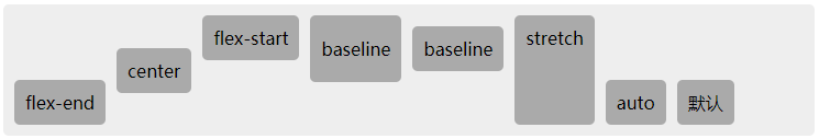
七、侧轴对齐(align-items/align-self)——父容器/子元素
上对齐:flex-start
下对齐:flex-end
居中对齐:center
基线对齐:baseline
上下拉升对齐:stretch
【注】align-items 设置于父容器,作用于该容器的所有子元素,而align-self 设置于子元素,只作用于该元素,align-items的使用参考align-content
<style>
    .box{display:flex;align-items:
    flex-end;height:100px;padding:10px;border-radius:5px;list-style:none;background-color:#eee;}
    .box li{margin-right:10px;padding:10px;border-radius:5px;background:#aaa;text-align:center;}
    .box li:nth-child(1){align-self: flex-end;}
    .box li:nth-child(2){align-self: center;}
    .box li:nth-child(3){align-self: flex-start;}
    .box li:nth-child(4){align-self: baseline;padding:20px
    10px;}
    .box li:nth-child(5){align-self: baseline;}
    .box li:nth-child(6){align-self: stretch;}
    .box li:nth-child(7){align-self: auto;}
</style>
<body>
    <ul id="box" class="box">
        <li>flex-end</li>
        <li>center</li>
        <li>flex-start</li>
        <li>baseline</li>
        <li>baseline</li>
        <li>stretch</li>
        <li>auto</li>
        <li>默认</li>
    </ul>
</body>
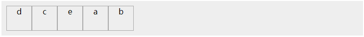
八、排列顺序(order)——子元素
参考数轴的排列规则:初始位置为0,负数靠前,整数靠后
<style>
    .box{display:flex;margin:0;padding:10px;list-style:none;background-color:#eee;}
    .box li{width:50px;height:50px;border:1px solid
    #aaa;text-align:center;}
    /*e没有设置,所以值为默认值0*/
    #box li:nth-child(1){order:1;}
    #box li:nth-child(2){order:9;}
    #box li:nth-child(3){order:-1;}
    #box li:nth-child(4){order:-2;}
</style>
<body>
    <ul id="box" class="box">
        <li>a</li>
        <li>b</li>
        <li>c</li>
        <li>d</li>
        <li>e</li>
    </ul>
</body>
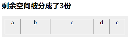
九、分配剩余空间(flex-grow)——子元素
默认值为0,分配提成 数字
<style>    .box{display:flex;width:400px;margin:0;padding:10px;list-style:none;background-color:#eee;}
    .box li{width:50px;height:50px;border:1px solid
    #aaa;text-align:center;}
    /*其他li分配提成默认为0,所以不分配空间*/
    #box li:nth-child(2){flex-grow:1;}
    #box li:nth-child(3){flex-grow:2;}
</style>
<body>
    <h2>剩余空间被分成了3份</h2>
    <ul id="box" class="box">
        <li>a</li>
        <li>b</li>
        <li>c</li>
        <li>d</li>
        <li>e</li>
    </ul>
</body>
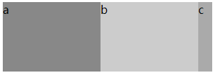
十、收缩比率(flex-shrink)——子元素
默认值为1,溢出时计算比例
<style>
    #flex{display:flex;width:300px;margin:0;padding:0;list-style:none;}
    #flex li{width:200px;height:100px;}
    /*flex-shrink默认为1*/
    #flex li:nth-child(1){background:#888;}
    /*flex-shrink默认为1*/
    #flex li:nth-child(2){background:#ccc;}
    #flex li:nth-child(3){background:#aaa;flex-shrink:3;}
</style>
<body>
    <ul id="flex">
        <li>a</li>
        <li>b</li>
        <li>c</li>
    </ul>
</body>
收缩比率分别为1,1,3,所以三个li各占的百分比为:
a=20% b=20% c=60%
因为超出总宽度为300,每个li宽度为200,所以:
a宽度=200-300*20%=140
b宽度=200-300*20%=140
c宽度=200-300*60%=20
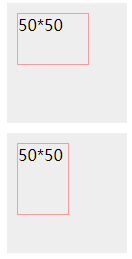
十一、伸缩基准值(flex-basis)——子元素
值为数值,默认:auto
把这个属性当成宽高去设置,是宽还是高跟流向有关,横向就是设置宽度,纵向就是设置高度,权重比宽高大
<style>
    .box{display:flex;width:100px;height:100px;margin:10px;padding:10px;list-style:none;background-color:#eee;}
    .box li{width:50px;height:50px;border:1px solid
    #f99;flex-basis:70px;}
    #box{ flex-direction:row;}#box2{flex-direction:column;}
</style>
<body>
    <ul id="box" class="box">
        <li>50*50</li>
    </ul>
    <ul id="box2" class="box">
        <li>50*50</li>
    </ul>
</body>
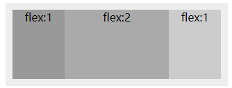
十二、伸缩性(flex)——子元素
该属性为flex-grow、flex-shrink和flex-basis三条属性的简写,但一般使用分配剩余空间即可
<style>
    .box{display:flex;width:300px;height:100px;padding:10px;list-style:none;background:#eee;}
    .box li{background:#aaa;text-align:center;}
    .box li:nth-child(1){background:#999;}
    .box li:nth-child(2){background:#aaa;}
    .box li:nth-child(3){background:#ccc;}
    #box li:nth-child(1){flex:1;}
    #box li:nth-child(2){flex:2;}
    #box li:nth-child(3){flex:1;}
</style>
<body>
    <ul id="box" class="box">
        <li>flex:1</li>
        <li>flex:2</li>
        <li>flex:1</li>
    </ul>
</body>