如图:
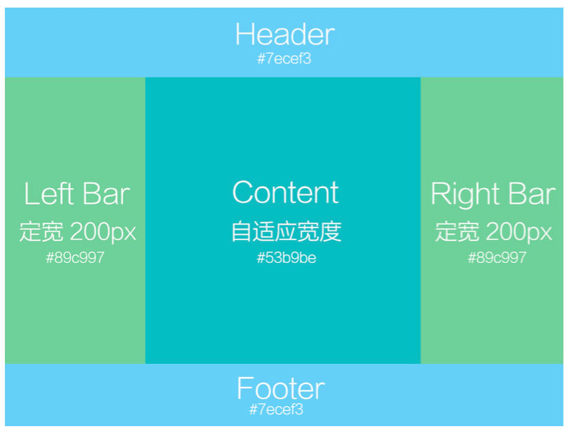
实现left bar 和content 和right bar适应为最高高度的那块高度
1.山下两块就不用说了2个div直接搞定
2.中间的那部分,肯定使是要用一个盒子包起来的,不然,没法实现相同高度
 1 <!DOCTYPE html>
 2 <html lang="en">
 3   <head>
 4     <meta charset="UTF-8" />
 5     <meta name="viewport" content="width=device-width, initial-scale=1.0" />
 6     <meta http-equiv="X-UA-Compatible" content="ie=edge" />
 7     <title>自适应为三者最高高度</title>
 8     <style>
 9       * {
10         padding: 0;
11         margin: 0;
12       }
13       .header {
14         background-color: #7ecef3;
15         width: 100%;
16         height: 100px;
17       }
18
19       .footer {
20         background-color: #7ecef3;
21         width: 100%;
22         height: 100px;
23       }
24       .max {
25         display: flex;
26         min-height: calc(100% - 200px);
27       }
28       .left {
29         width: 200px;
30         background-color: #89c997;
31       }
32       .right {
33         width: 200px;
34         background-color: #89c997;
35         height: 300px;
36       }
37       .content {
38         flex: 1;
39         background-color: #53b9be;
40       }
41     </style>
42   </head>
43   <body>
44     <div class="header"></div>
45     <div class="max">
46       <div class="left"></div>
47       <div class="content"></div>
48       <div class="right"></div>
49     </div>
50     <div class="footer"></div>
51
52     <script></script>
53   </body>
54 </html>