此案例以按钮为demo(由来: elementUI中的按钮点击事件中嵌套messageBox 消息弹框时,点击键盘enter键自动触发弹框,容易误操作 )
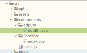
src 目录下创建components 文件夹 components里面创建 install.js和 组件目录
install.js里面
// 组件全局注册
import Vue from 'vue'

import edpBtn from '@/components/edpBtn/edpBtn.vue'//封装共用组件方法一
//import AppToolbar from './AppToolbar'

// 组件库
const Components = [
edpBtn
//AppToolbar,
]

// 注册全局组件
Components.map((com) => {
Vue.component(com.name, com)
})

export default Vue
edpBtn.vue edp 公司简称
<template>
    <div :class="[type,size]" class="default" :style="disabled||loading?'opacity: 0.5; cursor:default':'opacity: 1;cursor:pointer'"
        @click="btnClick">
        <i v-if="loading" class="el-icon-loading"></i>
        <slot></slot>
    </div>
</template>

<script>
    export default {
        name: "edpBtn",
        props: {
            type: {
                type: String,
                default: "Default"
            },
            size: {
                type: String,
                default: "Default"
            },
            disabled: {
                type: Boolean,
                default: false
            },
            loading: {
                type: Boolean,
                default: false
            }
        },
        data() {
            return {};
        },
        computed: {},
        watch: {},
        methods: {
            btnClick() {
                if(!this.disabled && !this.loading){
                    this.$emit('click')
                }
            }
        }
    };
</script>

<style lang="less">
    .default {
        display: inline-block;
        line-height: 1;
        white-space: nowrap;
        cursor: pointer;
        background: #fff;
        border: 1px solid #dcdfe6;
        border-color: #dcdfe6;
        color: #606266;
        -webkit-appearance: none;
        text-align: center;
        box-sizing: border-box;
        outline: none;
        margin: 0;
        transition: .1s;
        font-weight: 500;
        -moz-user-select: none;
        -webkit-user-select: none;
        -ms-user-select: none;
        padding: 12px 20px;
        font-size: 14px;
        border-radius: 4px;
    }

    .primary {
        color: #fff;
        background-color: #409eff;
        border-color: #409eff;
    }

    .success {
        color: #fff;
        background-color: #67c23a;
        border-color: #67c23a;
    }

    .info {
        color: #fff;
        background-color: #909399;
        border-color: #909399;
    }

    .warning {
        color: #fff;
        background-color: #e6a23c;
        border-color: #e6a23c;
    }

    .danger {
        color: #fff;
        background-color: #f56c6c;
        border-color: #f56c6c;
    }

    .text {
        border-color: transparent;
        color: #409eff;
        background: transparent;
        padding-left: 0;
        padding-right: 0;
    }

    .default.medium {
        padding: 10px 20px;
        font-size: 14px;
        border-radius: 4px;
    }

    .default.small {
        padding: 9px 15px;
        font-size: 12px;
        border-radius: 3px;
    }
    .default.mini {
        padding: 7px 15px;
        font-size: 12px;
        border-radius: 3px;
    }
    .default.disabled {
        opacity: 0.5; cursor:default
    }
</style>
main.js 中添加 import './components/install'