| 1.说明 |
自己学习WPF不是很久,现将自己做的一些小项目中用到的自定义控件整理出来,方便以后使用,不尽人意之处,还请多多批评与指导,现在就来实现自定义ScrollViewer仿Win8滚动条
| 2.效果预览 |
1)横纵预览 2)MouseOver
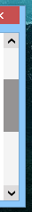 3)拖动中
3)拖动中 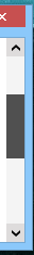
| 3.XAML代码 |

  1    <!--x:Key="ScrollBarThumb" TargetType="{x:Type Thumb}"-->
  2     <SolidColorBrush x:Key="ThumbBorderBackground" Color="#FFCDCDCD"/>
  3     <SolidColorBrush x:Key="ThumbMouseOverBackground" Color="#FF959393"/>
  4     <SolidColorBrush x:Key="ThumbDraggingBackground" Color="#FF505050"/>
  5
  6    <!--x:Key="ScrollBarStyle1" TargetType="{x:Type ScrollBar}"-->
  7     <!--1,垂直与水平值相反-->
  8     <sys:Double x:Key="PepeatButtonPathWidth">8</sys:Double>
  9     <sys:Double x:Key="PepeatButtonPathHeight">6</sys:Double>
 10     <!--2,垂直与水平值一样-->
 11     <SolidColorBrush x:Key="PepeatButtonPathFill" Color="#FF444F4F"/>
 12     <SolidColorBrush x:Key="PepeatButtonPathMouseOverFill" Color="Black"/>
 13     <SolidColorBrush x:Key="PepeatButtonMouseOverBackground" Color="#FFDEDCDC"/>
 14     <SolidColorBrush x:Key="ScrollBarDisabledBackground" Color="#F4F4F4"/>
 15     <SolidColorBrush x:Key="ScrollBarBackground" Color="#F4F4F4"/>
 16
 17     <Style x:Key="ScrollBarButton" TargetType="{x:Type RepeatButton}">
 18         <Setter Property="OverridesDefaultStyle" Value="true"/>
 19         <Setter Property="Focusable" Value="false"/>
 20         <Setter Property="IsTabStop" Value="false"/>
 21         <Setter Property="Template">
 22             <Setter.Value>
 23                 <ControlTemplate TargetType="{x:Type RepeatButton}">
 24                     <Themes:ScrollChrome x:Name="Chrome" RenderMouseOver="{TemplateBinding IsMouseOver}" RenderPressed="{TemplateBinding IsPressed}" SnapsToDevicePixels="true" Themes:ScrollChrome.ScrollGlyph="{TemplateBinding Themes:ScrollChrome.ScrollGlyph}"/>
 25                 </ControlTemplate>
 26             </Setter.Value>
 27         </Setter>
 28     </Style>
 29     <Style x:Key="VerticalScrollBarPageButton" TargetType="{x:Type RepeatButton}">
 30         <Setter Property="OverridesDefaultStyle" Value="true"/>
 31         <Setter Property="Background" Value="Transparent"/>
 32         <Setter Property="Focusable" Value="false"/>
 33         <Setter Property="IsTabStop" Value="false"/>
 34         <Setter Property="Template">
 35             <Setter.Value>
 36                 <ControlTemplate TargetType="{x:Type RepeatButton}">
 37                     <Rectangle Fill="{TemplateBinding Background}" Height="{TemplateBinding Height}" Width="{TemplateBinding Width}"/>
 38                 </ControlTemplate>
 39             </Setter.Value>
 40         </Setter>
 41     </Style>
 42     <Style x:Key="ScrollBarThumb" TargetType="{x:Type Thumb}">
 43         <Setter Property="OverridesDefaultStyle" Value="true"/>
 44         <Setter Property="IsTabStop" Value="false"/>
 45         <Setter Property="Template">
 46             <Setter.Value>
 47                 <ControlTemplate TargetType="{x:Type Thumb}">
 48                     <Border x:Name="border" Background="{StaticResource ThumbBorderBackground}" />
 49                     <ControlTemplate.Triggers>
 50                         <Trigger Property="IsMouseOver" Value="True">
 51                             <Setter Property="Background" TargetName="border" Value="{StaticResource ThumbMouseOverBackground}" />
 52                         </Trigger>
 53                         <Trigger Property="IsDragging" Value="True">
 54                             <Setter Property="Background" TargetName="border" Value="{StaticResource ThumbDraggingBackground}"/>
 55                         </Trigger>
 56                     </ControlTemplate.Triggers>
 57                 </ControlTemplate>
 58             </Setter.Value>
 59         </Setter>
 60     </Style>
 61     <Style x:Key="HorizontalScrollBarPageButton" TargetType="{x:Type RepeatButton}">
 62         <Setter Property="OverridesDefaultStyle" Value="true"/>
 63         <Setter Property="Background" Value="Transparent"/>
 64         <Setter Property="Focusable" Value="false"/>
 65         <Setter Property="IsTabStop" Value="false"/>
 66         <Setter Property="Template">
 67             <Setter.Value>
 68                 <ControlTemplate TargetType="{x:Type RepeatButton}">
 69                     <Rectangle Fill="{TemplateBinding Background}" Height="{TemplateBinding Height}" Width="{TemplateBinding Width}"/>
 70                 </ControlTemplate>
 71             </Setter.Value>
 72         </Setter>
 73     </Style>
 74     <Style x:Key="ScrollBarStyle1" TargetType="{x:Type ScrollBar}">
 75         <Setter Property="Background" Value="{StaticResource ScrollBarBackground}"/>
 76         <Setter Property="Stylus.IsPressAndHoldEnabled" Value="false"/>
 77         <Setter Property="Stylus.IsFlicksEnabled" Value="false"/>
 78         <Setter Property="Foreground" Value="{DynamicResource {x:Static SystemColors.ControlTextBrushKey}}"/>
 79         <Setter Property="Width" Value="{DynamicResource {x:Static SystemParameters.VerticalScrollBarWidthKey}}"/>
 80         <Setter Property="MinWidth" Value="{DynamicResource {x:Static SystemParameters.VerticalScrollBarWidthKey}}"/>
 81         <Setter Property="Template">
 82             <Setter.Value>
 83                 <ControlTemplate TargetType="{x:Type ScrollBar}">
 84                     <Grid x:Name="Bg" Background="{TemplateBinding Background}" SnapsToDevicePixels="true">
 85                         <Grid.RowDefinitions>
 86                             <RowDefinition MaxHeight="{DynamicResource {x:Static SystemParameters.VerticalScrollBarButtonHeightKey}}"/>
 87                             <RowDefinition Height="0.00001*"/>
 88                             <RowDefinition MaxHeight="{DynamicResource {x:Static SystemParameters.VerticalScrollBarButtonHeightKey}}"/>
 89                         </Grid.RowDefinitions>
 90                         <RepeatButton x:Name="upButton" Command="{x:Static ScrollBar.LineUpCommand}" IsEnabled="{TemplateBinding IsMouseOver}" BorderBrush="{x:Null}" Foreground="{x:Null}" BorderThickness="0">
 91                             <Path x:Name="upPath" Height="{StaticResource PepeatButtonPathHeight}" Width="{StaticResource PepeatButtonPathWidth}" Stretch="Fill" Fill="{StaticResource PepeatButtonPathFill}" Data="F1 M 37.8516,35.625L 34.6849,38.7917L 23.6016,50.2708L 23.6016,39.9792L 37.8516,24.9375L 52.1016,39.9792L 52.1016,50.2708L 41.0182,38.7917L 37.8516,35.625 Z "/>
 92                         </RepeatButton>
 93                         <Track x:Name="PART_Track" IsDirectionReversed="true" IsEnabled="{TemplateBinding IsMouseOver}" Grid.Row="1">
 94                             <Track.DecreaseRepeatButton>
 95                                 <RepeatButton Command="{x:Static ScrollBar.PageUpCommand}" Style="{StaticResource VerticalScrollBarPageButton}"/>
 96                             </Track.DecreaseRepeatButton>
 97                             <Track.IncreaseRepeatButton>
 98                                 <RepeatButton Command="{x:Static ScrollBar.PageDownCommand}" Style="{StaticResource VerticalScrollBarPageButton}"/>
 99                             </Track.IncreaseRepeatButton>
100                             <Track.Thumb>
101                                 <Thumb Style="{StaticResource ScrollBarThumb}" Themes:ScrollChrome.ScrollGlyph="VerticalGripper"/>
102                             </Track.Thumb>
103                         </Track>
104                         <RepeatButton x:Name="downButton" Command="{x:Static ScrollBar.LineDownCommand}" IsEnabled="{TemplateBinding IsMouseOver}" Grid.Row="2" Foreground="{x:Null}" BorderBrush="{x:Null}" BorderThickness="0">
105                             <Path x:Name="downPath" Height="{StaticResource PepeatButtonPathHeight}" Width="{StaticResource PepeatButtonPathWidth}" Stretch="Fill" Fill="{StaticResource PepeatButtonPathFill}" Data="F1 M 37.8516,39.5833L 52.1016,24.9375L 52.1016,35.2292L 37.8516,50.2708L 23.6016,35.2292L 23.6016,24.9375L 37.8516,39.5833 Z "/>
106                         </RepeatButton>
107                     </Grid>
108                     <ControlTemplate.Triggers>
109                         <Trigger Property="IsEnabled" Value="True" SourceName="upButton">
110                             <Setter Property="Fill" TargetName="upPath" Value="{StaticResource PepeatButtonPathMouseOverFill}"/>
111                             <Setter Property="Fill" TargetName="downPath" Value="{StaticResource PepeatButtonPathMouseOverFill}"/>
112                             <Setter Property="Background" TargetName="upButton" Value="{StaticResource PepeatButtonMouseOverBackground}"/>
113                             <Setter Property="Background" TargetName="downButton" Value="{StaticResource PepeatButtonMouseOverBackground}"/>
114                         </Trigger>
115                         <Trigger Property="IsEnabled" Value="false">
116                             <Setter Property="Background" TargetName="Bg" Value="{StaticResource ScrollBarDisabledBackground}"/>
117                         </Trigger>
118                     </ControlTemplate.Triggers>
119                 </ControlTemplate>
120             </Setter.Value>
121         </Setter>
122         <Style.Triggers>
123             <Trigger Property="Orientation" Value="Horizontal">
124                 <Setter Property="Background" Value="{StaticResource ScrollBarBackground}"/>
125                 <Setter Property="Width" Value="Auto"/>
126                 <Setter Property="MinWidth" Value="0"/>
127                 <Setter Property="Height" Value="{DynamicResource {x:Static SystemParameters.HorizontalScrollBarHeightKey}}"/>
128                 <Setter Property="MinHeight" Value="{DynamicResource {x:Static SystemParameters.HorizontalScrollBarHeightKey}}"/>
129                 <Setter Property="Template">
130                     <Setter.Value>
131                         <ControlTemplate TargetType="{x:Type ScrollBar}">
132                             <Grid x:Name="Bg" Background="{TemplateBinding Background}" SnapsToDevicePixels="true">
133                                 <Grid.ColumnDefinitions>
134                                     <ColumnDefinition MaxWidth="{DynamicResource {x:Static SystemParameters.HorizontalScrollBarButtonWidthKey}}"/>
135                                     <ColumnDefinition Width="0.00001*"/>
136                                     <ColumnDefinition MaxWidth="{DynamicResource {x:Static SystemParameters.HorizontalScrollBarButtonWidthKey}}"/>
137                                 </Grid.ColumnDefinitions>
138                                 <RepeatButton x:Name="leftButton" Command="{x:Static ScrollBar.LineLeftCommand}" IsEnabled="{TemplateBinding IsMouseOver}" Foreground="{x:Null}" BorderBrush="{x:Null}" BorderThickness="0">
139                                     <Path x:Name="leftPath" Height="{StaticResource PepeatButtonPathWidth}" Width="{StaticResource PepeatButtonPathHeight}" Stretch="Fill" Fill="DarkSlateGray" Data="F1 M 35.8724,37.6042L 39.0391,40.7708L 50.5182,51.8542L 40.2266,51.8542L 25.1849,37.6041L 40.2266,23.3542L 50.5182,23.3542L 39.0391,34.4375L 35.8724,37.6042 Z "/>
140                                 </RepeatButton>
141                                 <Track x:Name="PART_Track" Grid.Column="1" IsEnabled="{TemplateBinding IsMouseOver}">
142                                     <Track.DecreaseRepeatButton>
143                                         <RepeatButton Command="{x:Static ScrollBar.PageLeftCommand}" Style="{StaticResource HorizontalScrollBarPageButton}"/>
144                                     </Track.DecreaseRepeatButton>
145                                     <Track.IncreaseRepeatButton>
146                                         <RepeatButton Command="{x:Static ScrollBar.PageRightCommand}" Style="{StaticResource HorizontalScrollBarPageButton}"/>
147                                     </Track.IncreaseRepeatButton>
148                                     <Track.Thumb>
149                                         <Thumb Style="{StaticResource ScrollBarThumb}" Themes:ScrollChrome.ScrollGlyph="HorizontalGripper"/>
150                                     </Track.Thumb>
151                                 </Track>
152                                 <RepeatButton x:Name="rightButton" Grid.Column="2" Command="{x:Static ScrollBar.LineRightCommand}" IsEnabled="{TemplateBinding IsMouseOver}" Foreground="{x:Null}" BorderBrush="{x:Null}" BorderThickness="0">
153                                     <Path x:Name="rightPath" Height="{StaticResource PepeatButtonPathWidth}" Width="{StaticResource PepeatButtonPathHeight}" Stretch="Fill" Fill="{StaticResource PepeatButtonPathFill}" Data="F1 M 39.8307,37.6042L 36.6641,34.4375L 25.1849,23.3542L 35.4766,23.3542L 50.5182,37.6042L 35.4766,51.8542L 25.1849,51.8542L 36.6641,40.7708L 39.8307,37.6042 Z "/>
154                                 </RepeatButton>
155                             </Grid>
156                             <ControlTemplate.Triggers>
157                                 <Trigger Property="IsEnabled" Value="True" SourceName="leftButton">
158                                     <Setter Property="Fill" TargetName="leftPath" Value="{StaticResource PepeatButtonPathMouseOverFill}"/>
159                                     <Setter Property="Fill" TargetName="rightPath" Value="{StaticResource PepeatButtonPathMouseOverFill}"/>
160                                     <Setter Property="Background" TargetName="leftButton" Value="{StaticResource PepeatButtonMouseOverBackground}"/>
161                                     <Setter Property="Background" TargetName="rightButton" Value="{StaticResource PepeatButtonMouseOverBackground}"/>
162                                 </Trigger>
163                                 <Trigger Property="IsEnabled" Value="false">
164                                     <Setter Property="Background" TargetName="Bg" Value="{StaticResource ScrollBarDisabledBackground}"/>
165                                 </Trigger>
166                             </ControlTemplate.Triggers>
167                         </ControlTemplate>
168                     </Setter.Value>
169                 </Setter>
170             </Trigger>
171         </Style.Triggers>
172     </Style>
173
174    <!--总样式x:Key="ScrollViewerStyle",引用此处Key即可-->
175     <ControlTemplate x:Key="ScrollViewerStyle" TargetType="{x:Type ScrollViewer}">
176         <Grid x:Name="Grid" Background="{TemplateBinding Background}">
177             <Grid.ColumnDefinitions>
178                 <ColumnDefinition Width="*"/>
179                 <ColumnDefinition Width="Auto"/>
180             </Grid.ColumnDefinitions>
181             <Grid.RowDefinitions>
182                 <RowDefinition Height="*"/>
183                 <RowDefinition Height="Auto"/>
184             </Grid.RowDefinitions>
185             <ScrollBar x:Name="PART_VerticalScrollBar" AutomationProperties.AutomationId="VerticalScrollBar" Cursor="Arrow" Grid.Column="1" Maximum="{TemplateBinding ScrollableHeight}" Minimum="0" Grid.Row="0" Visibility="{TemplateBinding ComputedVerticalScrollBarVisibility}" Value="{Binding VerticalOffset, Mode=OneWay, RelativeSource={RelativeSource TemplatedParent}}" ViewportSize="{TemplateBinding ViewportHeight}" Style="{DynamicResource ScrollBarStyle1}"/>
186             <ScrollBar x:Name="PART_HorizontalScrollBar" AutomationProperties.AutomationId="HorizontalScrollBar" Cursor="Arrow" Grid.Column="0" Maximum="{TemplateBinding ScrollableWidth}" Minimum="0" Orientation="Horizontal" Grid.Row="1" Visibility="{TemplateBinding ComputedHorizontalScrollBarVisibility}" Value="{Binding HorizontalOffset, Mode=OneWay, RelativeSource={RelativeSource TemplatedParent}}" ViewportSize="{TemplateBinding ViewportWidth}" Style="{DynamicResource ScrollBarStyle1}"/>
187             <ScrollContentPresenter x:Name="PART_ScrollContentPresenter" CanContentScroll="{TemplateBinding ScrollViewer.CanContentScroll}" CanHorizontallyScroll="False" CanVerticallyScroll="False" ContentTemplate="{TemplateBinding ContentTemplate}" Content="{TemplateBinding Content}" Grid.Column="0" Margin="{TemplateBinding Padding}" Grid.Row="0"/>
188         </Grid>
189     </ControlTemplate>
注:将以上代码放置资源字典或文档资源或App.xaml中都可,如果,您对该样式的颜色搭配有自己的想法,修改以下代码部分颜色值即可,更多修改,此处不再赘述
 1    <!--x:Key="ScrollBarThumb" TargetType="{x:Type Thumb}"-->
 2     <SolidColorBrush x:Key="ThumbBorderBackground" Color="#FFCDCDCD"/>
 3     <SolidColorBrush x:Key="ThumbMouseOverBackground" Color="#FF959393"/>
 4     <SolidColorBrush x:Key="ThumbDraggingBackground" Color="#FF505050"/>
 5
 6    <!--x:Key="ScrollBarStyle1" TargetType="{x:Type ScrollBar}"-->
 7     <!--1,垂直与水平值相反-->
 8     <sys:Double x:Key="PepeatButtonPathWidth">8</sys:Double>
 9     <sys:Double x:Key="PepeatButtonPathHeight">6</sys:Double>
10     <!--2,垂直与水平值一样-->
11     <SolidColorBrush x:Key="PepeatButtonPathFill" Color="#FF444F4F"/>
12     <SolidColorBrush x:Key="PepeatButtonPathMouseOverFill" Color="Black"/>
13     <SolidColorBrush x:Key="PepeatButtonMouseOverBackground" Color="#FFDEDCDC"/>
14     <SolidColorBrush x:Key="ScrollBarDisabledBackground" Color="#F4F4F4"/>
15     <SolidColorBrush x:Key="ScrollBarBackground" Color="#F4F4F4"/>
| 4.应用 |
1 <ScrollViewer Template="{DynamicResource ScrollViewerStyle}" HorizontalScrollBarVisibility="Auto"VerticalScrollBarVisibility="Auto">
2      <!--包含的控件-->
3 </ScrollViewer>
| 5.总结 |
可能对于大神而言这不算什么,但对于初学者还是有一定帮助的,但愿能给与一些还不是很懂的同僚一些启示,共同进步,有更多想法的还望多多批评,不吝赐教。