目录
1. 前言
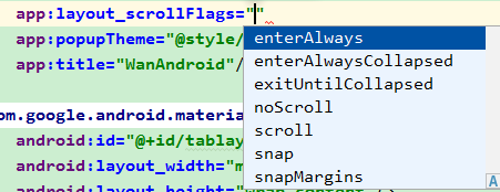
查看Android文档下,com.google.android.material.appbar 包下的 AppBarLayout.LayoutParams 类有一个 AppBarLayout_Layout_layout_scrollFlags 的属性,这个属性可以有七种取值:

这些取值在 xml 里也有对应的值:
下面分别对这些属性的在xml里的使用及效果,进行介绍说明,再简单介绍一下在代码里如何设置这些属性:
2. 正文
2.1 准备工作
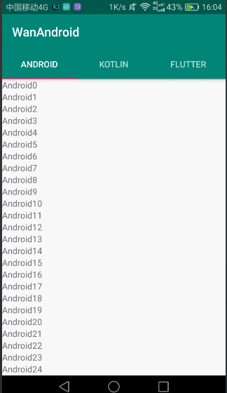
在介绍之前,需要有一个小例子,效果是这样的:

最上边的 WanAndroid字体 部分是一个 Toolbar,Tab 区域是 TabLayout,这两者在 AppBarLayout 布局里面,因为 AppBarLayout 本身是一个 VERTICAL 布局的 LinearLayout,所以 Toolbar 和 TabLayout 是竖向排列的。然后,下边是一个 ViewPager 布局,切换三个 Fragment,每个 Fragment 又是一个 RecyclerView 列表布局。我们打算把 layout_scrollFlags 添加到 Toolbar 节点下,演示 layout_scrollFlags 各种取值的效果。
对应的 xml 布局如下:
<?xml version="1.0" encoding="utf-8"?>
<androidx.coordinatorlayout.widget.CoordinatorLayout
    xmlns:android="http://schemas.android.com/apk/res/android"
    xmlns:app="http://schemas.android.com/apk/res-auto"
    xmlns:tools="http://schemas.android.com/tools"
    android:layout_width="match_parent"
    android:layout_height="match_parent"
    tools:context=".AppBarLayoutActivity">

    <com.google.android.material.appbar.AppBarLayout
        android:id="@+id/appbar"
        android:layout_width="match_parent"
        android:layout_height="wrap_content"
        android:theme="@style/AppTheme.AppBarOverlay">

        <androidx.appcompat.widget.Toolbar
            android:id="@+id/toolbar"
            android:layout_width="match_parent"
            android:layout_height="?attr/actionBarSize"
            android:background="?attr/colorPrimary"
            app:popupTheme="@style/AppTheme.PopupOverlay"
            app:title="WanAndroid"/>

        <com.google.android.material.tabs.TabLayout
            android:id="@+id/tablayout"
            android:layout_width="match_parent"
            android:layout_height="wrap_content"/>
    </com.google.android.material.appbar.AppBarLayout>

    <androidx.viewpager.widget.ViewPager
        android:id="@+id/viewpager"
        android:layout_width="match_parent"
        android:layout_height="match_parent"
        app:layout_behavior="@string/appbar_scrolling_view_behavior"/>
</androidx.coordinatorlayout.widget.CoordinatorLayout>
2.2 noScroll
Disable scrolling on the view. This flag should not be combined with any of the other scroll flags.
关闭在这个View上的滚动。这个 flag 不应该和其他滚动 flag 组合使用。
在没有添加任何 layout_scrollFlags 时,AppBarLayout 的子 View 是没有滚动效果的。这等价于添加了 app:layout_scrollFlags="noScroll",如下:
<androidx.appcompat.widget.Toolbar
            android:id="@+id/toolbar"
            android:layout_width="match_parent"
            android:layout_height="?attr/actionBarSize"
            android:background="?attr/colorPrimary"
            app:layout_scrollFlags="noScroll"
            app:popupTheme="@style/AppTheme.PopupOverlay"
            app:title="WanAndroid"/>
运行效果如下:
2.3 scroll
The view will be scroll in direct relation to scroll events. This flag needs to be set for any of the other flags to take effect. If any sibling views before this one do not have this flag, then this value has no effect.
设置了此 flag 的 View 会直接关联滚动事件而滚动。其他的 flag 要生效,这个 flag 是需要设置的。如果在这个View前面的任何兄弟 View 没有设置这个 flag,那么这个值就没有效果。
这个文档解释的内容比较多。我们一一来演示。首先在 Toolbar 下添加这个 flag
        <androidx.appcompat.widget.Toolbar
            android:id="@+id/toolbar"
            android:layout_width="match_parent"
            android:layout_height="?attr/actionBarSize"
            android:background="?attr/colorPrimary"
            app:layout_scrollFlags="scroll"
            app:popupTheme="@style/AppTheme.PopupOverlay"
            app:title="WanAndroid"/>
运行一下,看效果,可以看到 Toolbar 可以随着滚动事件而滚动:

现在我们把 app:layout_scrollFlags="scroll" 挪到 TabLayout 上,而这时 Toolbar上是没有 scroll 设置的:
        <androidx.appcompat.widget.Toolbar
            android:id="@+id/toolbar"
            android:layout_width="match_parent"
            android:layout_height="?attr/actionBarSize"
            android:background="?attr/colorPrimary"
            app:popupTheme="@style/AppTheme.PopupOverlay"
            app:title="WanAndroid"/>

        <com.google.android.material.tabs.TabLayout
            android:id="@+id/tablayout"
            app:layout_scrollFlags="scroll"
            android:layout_width="match_parent"
            android:layout_height="wrap_content"/>
运行一下,效果是这样的:
可以看到和没有设置任何 layout_scrollFlags 的效果是一模一样的。这是怎么回事呢?看一下上面的文档说明:如果在这个View前面的任何兄弟 View 没有设置这个 flag,那么这个值就没有效果。因为我们在 TabLayout 上面设置了 app:layout_scrollFlags=“scroll”,而位于 TabLayout 之前的 Toolbar 没有设置 app:layout_scrollFlags=“scroll”,所以 TabLayout设置的 app:layout_scrollFlags="scroll" 没有效果。
那么怎么才能有效果呢?在 Toolbar上也设置 app:layout_scrollFlags="scroll"。这时的效果如下:

可以看到 Toolbar 和 TabLayout 一起都随着滚动事件而滚动了。

2.4 enterAlways
When entering (scrolling on screen) the view will scroll on any downwards scroll event, regardless of whether the scrolling view is also scrolling. This is commonly referred to as the ‘quick return’ pattern.
当进入(即在屏幕上的滚动手指由上向下滑动)时,设置了这个 flag 的 View一遇到向下的滚动事件就会滚动,不管滚动的 View是否也在滚动中。这通常被称为“快速返回”模式。
更新 Toolbar 的 layout_scrollFlags 如下:
        <androidx.appcompat.widget.Toolbar
            android:id="@+id/toolbar"
            android:layout_width="match_parent"
            android:layout_height="?attr/actionBarSize"
            android:background="?attr/colorPrimary"
            app:layout_scrollFlags="scroll|enterAlways"
            app:popupTheme="@style/AppTheme.PopupOverlay"
            app:title="WanAndroid"/>
运行效果如下:
和上面单独设置 scroll 的效果相比,在滚出屏幕时的效果是一样的,不同的地方在于滚入屏幕时:scroll 设置,先滚动 Scrolling View,再滚动设置 flag 的 View(即 Toolbar);scroll|enterAlways 设置,先滚动设置 flag 的 View(即 Toolbar),再滚动 Scrolling View。
2.5 enterAlwaysCollapsed
An additional flag for ‘enterAlways’ which modifies the returning view to only initially scroll back to it’s collapsed height. Once the scrolling view has reached the end of it’s scroll range, the remainder of this view will be scrolled into view. The collapsed height is defined by the view’s minimum height.
这是 ‘enterAlways’ 的一个附加的 flag。作用是修改返回的 View的进入效果。首先,返回的View会滚动返回到它的折叠高度。当滚动的 View一达到它的滚动范围的末尾时,返回的View还在视图外的部分就会滚动进入视图。折叠高度是通过返回的View的最小高度来定义的。
可以看到额外添加这个 flag,是把进入过程分开走,首先Toolbar会滚动到折叠的高度,等列表滚动到末尾时,Toolbar的剩余部分才会滚动进入视图。
修改 xml 如下,记得添加 minHeight 属性:
        <androidx.appcompat.widget.Toolbar
            android:id="@+id/toolbar"
            android:layout_width="match_parent"
            android:layout_height="?attr/actionBarSize"
            android:background="?attr/colorPrimary"
            android:minHeight="20dp"
            app:layout_scrollFlags="scroll|enterAlways|enterAlwaysCollapsed"
            app:popupTheme="@style/AppTheme.PopupOverlay"
            app:title="WanAndroid"/>
运行一下,看效果:

2.6 exitUntilCollapsed
When exiting (scrolling off screen) the view will be scrolled until it is ‘collapsed’. The collapsed height is defined by the view’s minimum height.
当退出(即手指在屏幕上由下向上滑动)时,设置这个 flag 的 View 会滚动直至它的折叠高度。折叠高度是由这个View的最小高度来定义的。
这个 flag 关注的是退出过程。
修改 xml 代码如下:
        <androidx.appcompat.widget.Toolbar
            android:id="@+id/toolbar"
            android:layout_width="match_parent"
            android:layout_height="?attr/actionBarSize"
            android:background="?attr/colorPrimary"
            android:minHeight="20dp"
            app:layout_scrollFlags="scroll|exitUntilCollapsed"
            app:popupTheme="@style/AppTheme.PopupOverlay"
            app:title="WanAndroid"/>
运行一下,看效果:

2.7 snap
Upon a scroll ending, if the view is only partially visible then it will be snapped and scrolled to its closest edge. For example, if the view only has its bottom 25% displayed, it will be scrolled off screen completely. Conversely, if its bottom 75% is visible then it will be scrolled fully into view.
滚动一结束,如果这个 View 仅仅部分可见那么它就会被 snapped 并滚动到它最近的边缘。例如,如果这个 View 仅有底部的 25% 部分可见,那么它就会完全地滚出屏幕。相反,如果它有底部的 75% 部分可见,那么它就会全部滚入屏幕。
关于 snap 这个单词的理解,有人翻译成吸附效果。我查了一下词典,觉得这个意思比较贴切:
V-ERG (使)发出吧嗒一声(合上或打开)
If you snap something into a particular position, or if it snaps into that position, it moves quickly into that position, with a sharp sound.
He snapped the notebook shut...

他啪的一声合上了笔记本。

He snapped the cap on his ballpoint...

他吧嗒一声把笔帽扣在了圆珠笔上。
修改 xml,如下:
        <androidx.appcompat.widget.Toolbar
            android:id="@+id/toolbar"
            android:layout_width="match_parent"
            android:layout_height="?attr/actionBarSize"
            android:background="?attr/colorPrimary"
            app:layout_scrollFlags="scroll|snap"
            app:popupTheme="@style/AppTheme.PopupOverlay"
            app:title="WanAndroid"/>
运行一下,看效果:

2.8 snapMargins
An additional flag to be used with ‘snap’. If set, the view will be snapped to its top and bottom margins, as opposed to the edges of the view itself.
这是和 ‘snap’ 一起使用的额外的 flag。如果设置的话,这个 View 将会被 snap 到它的顶部外边距和它的底部外边距的位置,而不是这个 View 自身的上下边缘。
修改xml,如下:
        <androidx.appcompat.widget.Toolbar
            android:id="@+id/toolbar"
            android:layout_width="match_parent"
            android:layout_height="?attr/actionBarSize"
            android:background="?attr/colorPrimary"
            app:layout_scrollFlags="scroll|snap|snapMargins"
            app:popupTheme="@style/AppTheme.PopupOverlay"
            android:layout_marginTop="30dp"
            android:layout_marginBottom="30dp"
            app:title="WanAndroid"/>
效果如下:

2.9 在代码中设置 scrollFlags
        val layoutParams = toolbar.layoutParams as AppBarLayout.LayoutParams
        layoutParams.scrollFlags =AppBarLayout.LayoutParams.SCROLL_FLAG_SCROLL
3. 最后
本文的代码可以去这里下载到。