示例代码:
<!DOCTYPE html>
<html lang="en">
<head>
    <meta charset="UTF-8">
    <title>3dmenu</title>
</head>
<style type="text/css">
    .nav{
        width: 900px;
        margin: 50px auto;
        background-color: #fdfdfd;
        border: 1px #333333 solid;
    }
    .nav:after{
        clear: both;
        display: block;
        content: " ";
        overflow: hidden;
    }
    .nav .item{
        width: 200px;
        height: 100px;
        margin-right: 5px;
        float: left;
        perspective: 400000px;
    }
    .nav .item a{
        display: block;
        height: 100px;
        text-decoration: none;
        transition: all .5s;
        transform-style: preserve-3d;
    }
    .nav .item a p{
        height: 100px;
        margin: 0;
        line-height: 100px;
        color: #ffffff;
        text-align: center;
        font-size: 20px;
        border-radius: 2px;
        transition: all .5s;
    }
    .nav .item a p:first-child{
        background-color: #090;
        -webkit-transform:translateZ(50px);
    }
    .nav .item a p:last-child{
        background-color: #009;
        -webkit-transform: translateZ(50px) rotateX(-90deg);
        margin-top: -50px;
    }
    .nav .item a:hover{
        -webkit-transform: rotateX(90deg);
    }
    .nav .item a p:last-child{
        margin-top: 0;
        -webkit-transform: translateZ(0)rotateX(-90deg);
    }
</style>
<body>
    <div class="nav">
        <div class="item">
            <a href="#">
                <p>首页</p>
                <p>home</p>
            </a>
        </div>
        <div class="item">
            <a href="#">
                <p>问答</p>
                <p>qusition</p>
            </a>
        </div>
        <div class="item">
        <a href="#">
            <p>关于我们</p>
            <p>about</p>
        </a>
    </div>


    </div>
</body>
</html>
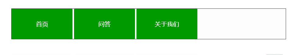
效果图: