SubmitButton

背景
最近在浏览设计网站时看到一个提交/上传的按钮,感觉它的动画效果挺实用的,可以应用于实际开发中,设计的是上传,但是我给改成了下载,其效果图如下:
正常下载如下图(由于是模拟器录制Gif,帧率不够,看起来没有实际上流畅):

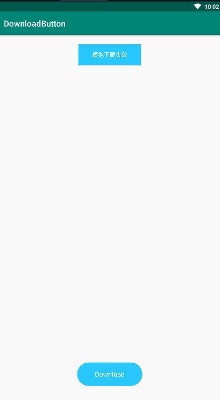
下载失败如图:

长按取消下载如图:
既然可以应用于实际业务中,正好APP页面也有这方面的需求,所以就想动手绘制出来,于是就有了今天这篇文章,这种动画效果其实还是比较简单的,但是今天重点不在于此,主要是想借这篇文章重点叙述下自定义View的流程,也就是如何从零开始自定义一个View,以及涉及到的一些概念和冷门知识点,当然也是面试中经常会被问到的
实现思路
可以看到这个动画虽然来来回回绘制了圆角矩形,圆环,圆弧,动态缩放,透明度变化等功能,但我们要想实现它的话,可以将其拆分成几个阶段:
- 第一个阶段比较简单,我们可以定义为初始状态,就是绘制一个圆角矩形,然后在里面绘制文本
- 第二个阶段是由初始状态过渡到进度刷新的阶段,从gif能看出来圆角矩形随着不断收缩,其透明度值越来越低,里面的文字不断变小,透明度值也不断变低,最后变成了一个圆环
- 第三个阶段就是在这个圆环的12点方向开始绘制圆弧,同时不断刷新里面的进度值
- 第四个阶段是从进度刷新状态过渡到圆角矩形状态,这其实跟第二个阶段是相反的,圆角矩形不断放大,透明度值越来越高,里面的文字不断变大,透明度同理,最后绘制成初始状态的圆角矩形
当我们看到一个复杂的动画效果时,一定要学会拆分实现步骤,因为再复杂的实现,也是由一个一个步骤组成的,我们只需要先将每个小步骤实现出来,再将其组合在一起就行了,这种思路很重要
接下来我们就依次将每个步骤实现出来
继承View
自定义View就先继承View,然后定义一些需要的变量,如下
public class DownloadButton extends View {

    private final int PADDING = 2;

    private final int MSG_DRAW_CIRCLE = 0;
    private final int MSG_DRAW_PROGRESS = 1;
    private final int MSG_DRAW_END = 2;

    /**
     * 按钮的状态
     * 1 初始按钮状态
     * 2 由初始按钮状态过渡到进度刷新状态
     * 3 进度刷新状态
     * 4 由进度刷新结束,还原到按钮状态
     * 5 整个过程结束
     */
    private final int STATUS_INIT = 1;
    private final int STATUS_TO_CIRCLE = 2;
    private final int STATUS_TO_PROGRESS = 3;
    private final int STATUS_TO_REVERT = 4;
    private final int STATUS_TO_END = 5;
    //当前状态
    private int mCurrentStatus = 1;

    private final float MAX_PROGRESS = 100f;
    private final float MAX_ALPHA = 255f;
    private final int MAX_TEXTSIZE = 18;
    /**
     * 动画步骤间隔时间
     */
    private final int ANIM_INTERVAL_TIME = 100;
    /**
     * 恢复动画持续时间
     */
    private final int SHRINK_ANIM_TIME = 600;
    /**
     * 恢复动画持续时间
     */
    private final int REVERT_ANIM_TIME = 800;
    /**
     * 动画当前持续时间
     */
    private long mCurrentAnimTime = 0;
    /**
     * 整个View宽度
     */
    private int mWidth;
    /**
     * 整个View高度
     */
    private int mHeight;
    /**
     * 矩形圆角的x轴,y轴半径长度
     */
    private int mRadius;
    /**
     * 圆角矩形的绘制区域
     */
    private RectF mRoundRect;
    /**
     * 文字的绘制区域
     */
    private Rect mTxtBounds;
    /**
     * 表示进度的圆弧的绘制区域
     */
    private RectF mArcRect;
    //圆角矩形画笔
    private Paint mBorderPaint;
    //文字画笔
    private Paint mTxtPaint;
    //圆画笔
    private Paint mCirclePaint;
    //圆弧画笔
    private Paint mArcPaint;

    private String mInitTxt;
    private String mSuccessTxt;
    private String mCancelTxt;
    private String mFailTxt;
    private String mCurrentTxt;
    /**
     * 当前进度
     */
    private float mProgress = 0f;
    /**
     * true 表示取消下载
     */
    private boolean mCancel;
    /**
     * true 表示下载失败
     */
    private boolean mFail;

    private OnDownloadLister mDownloadLister;

    private StringBuffer mProgressSB;
    /**
     * 自定义属性
     */
    private int initColor;
    private int successColor;
    private int failColor;
    private int cancelColor;

    public DownloadButton(Context context) {
        this(context,null);
    }

    public DownloadButton(Context context, @Nullable AttributeSet attrs) {
        this(context,attrs,0);
    }

    public DownloadButton(Context context, @Nullable AttributeSet attrs, int defStyleAttr) {
        super(context, attrs, defStyleAttr);
        init();
        loadAttribute(context,attrs,defStyleAttr);
    }

    private void init(){

        mInitTxt = "Download";
        mSuccessTxt = "Success";
        mCancelTxt = "Cancel";
        mFailTxt = "Down Failed";

        mBorderPaint = new Paint();
        mBorderPaint.setAntiAlias(true);
        mBorderPaint.setDither(true);
        mBorderPaint.setStyle(Paint.Style.FILL);
        mBorderPaint.setStrokeWidth(dp2PX(2));

        mTxtPaint = new Paint();
        mTxtPaint.setColor(getColor(R.color.white));
        mTxtPaint.setTextSize(dp2PX(MAX_TEXTSIZE));
        mTxtPaint.setTextAlign(Paint.Align.CENTER);
        mTxtPaint.setAntiAlias(true);

        mCirclePaint = new Paint();
        mCirclePaint.setAntiAlias(true);
        mCirclePaint.setStyle(Paint.Style.FILL);
        mCirclePaint.setColor(getColor(R.color.gray_d2));

        mArcPaint = new Paint();
        mArcPaint.setAntiAlias(true);
        mArcPaint.setColor(getColor(R.color.blue_07));
        mArcPaint.setStyle(Paint.Style.STROKE);
        mArcPaint.setStrokeWidth(dp2PX(4));

        mRoundRect = new RectF();
        mTxtBounds = new Rect();
        mArcRect = new RectF();
        /**
         * 初始化默认值
         */
        mWidth = (int) dp2PX(150);
        mHeight = (int) dp2PX(60);
        mRadius = mHeight / 2 - (int)dp2PX(PADDING);

    }

}
这里的工作主要是实例化画笔、每个view的绘制区域,给整个绘制区域的宽高以及圆角矩形的圆角半径一个默认值,同时定义整个View绘制的5个状态
面试题:构造方法如何选择
这里值得注意的一个点就是构造方法如何选择,自定义View会强制要求开发者重写构造方法,至于重写几个由开发者决定,一般情况下,我们将这几个构造方法串联起来,层层调用,让最终的初始化处理逻辑放在最多参数的构造方法中;这也是面试中一个容易跳坑的地方,因为大多数开发者并没有注意它们的区别,只是按照提示重写几个构造方法;而它们的区别如下:
- 只有一个参数的构造方法,在java代码里通过new关键字实例化该控件的时候会调用
- 只有两个参数的构造方法,在xml里使用,系统会调用该构造方法,其中第二个参数表示自定义属性集合,但是不是说必须要你的view有自定义属性才调用这个方法,而是不管有没有自定义属性,默认都会调用这个构造方法
- 只有三个参数的构造方法,需要手动调用,比第二个构造方法多了一个defStyleAttr参数,它有什么作用呢?其实看名字大概能猜出来意思,即默认的style里的属性,但是有点含糊,其实这里的默认的Style是指它在当前Application或Activity所用的Theme中的默认Style,具体使用如下:
假如我在xml里给一个属性赋值
    <com.mango.buttonlib.DownloadButton
        android:id="@+id/down"
        android:layout_width="160dp"
        android:layout_height="60dp"
        android:layout_centerInParent="true"
        mango:init_text="Download"/>
然后在当前application的theme中也给属性赋值(没给activity设置theme)
<?xml version="1.0" encoding="utf-8"?>
<resources>
    <!-- Base application theme. -->
    <style name="AppTheme" parent="Theme.AppCompat.Light.DarkActionBar">
        <!-- Customize your theme here. -->
        <item name="colorPrimary">@color/colorPrimary</item>
        <item name="colorPrimaryDark">@color/colorPrimaryDark</item>
        <item name="colorAccent">@color/colorAccent</item>
        <item name="DownloadButtonStyle">@style/DownloadButton</item>
    </style>
    <style name="DownloadButton">
        <item name="init_text">下载</item>
        <item name="fail_text">下载失败</item>
    </style>
</resources>
接下来需要在attrs中声明一个引用指向这个style
<resources>
    <declare-styleable name="DownloadButton">
        <attr name="init_color" format="color"/>
        <attr name="success_color" format="color"/>
        <attr name="fail_color" format="color"/>
        <attr name="cancel_color" format="color"/>
        <attr name="init_text" format="string"/>
        <attr name="fail_text" format="string"/>
    </declare-styleable>

    <attr name="DownloadButtonStyle" format="reference"></attr>
</resources>
接下来在构造方法中获取
    public DownloadButton(Context context) {
        this(context,null);
    }

    public DownloadButton(Context context, @Nullable AttributeSet attrs) {
        this(context,attrs,R.attr.DownloadButtonStyle);
    }

    public DownloadButton(Context context, @Nullable AttributeSet attrs, int defStyleAttr) {
        super(context, attrs, defStyleAttr);
        init();
        loadAttribute(context,attrs,defStyleAttr);
    }
    private void loadAttribute(Context context,AttributeSet attrs,int defStyleAttr){
        TypedArray typedArray = context.obtainStyledAttributes(attrs, R.styleable.DownloadButton,defStyleAttr,0);
        String initText = typedArray.getString(R.styleable.DownloadButton_init_text);
        String failText = typedArray.getString(R.styleable.DownloadButton_fail_text);
        typedArray.recycle();
        Log.i("loadAttribute","initText="+initText);
        Log.i("loadAttribute","failText="+failText);
    }
最后看看结果
2019-07-21 16:03:14.427 24068-24068/? I/loadAttribute: initText=Download
2019-07-21 16:03:14.427 24068-24068/? I/loadAttribute: failText=下载失败
这里可以得出两个结论:
- init_text这个属性虽然我在xml和theme中都给它赋值了,但是优先取的是xml中的值
- fail_text这个属性只在theme中赋值了,但是在构造方法中是能拿到的
所以第三种构造方法的使用场景是你在attrs中定义的Attribute(也就是你属性)需要引用到应用application或者当前Activity的theme中的值,那就需要使用调用该构造方法,去指定defStyleAttr;那么defStyleAttr就可以理解成View的Attribute默认引用的style里的值
注意:在api21开始,Google提供了第四种构造方法,以本文为例,如下:
    public DownloadButton(Context context, @Nullable AttributeSet attrs, int defStyleAttr, int defStyleRes) {
        super(context, attrs, defStyleAttr,defStyleRes);
        init();
        loadAttribute(context,attrs,defStyleAttr,defStyleRes);
    }
该方法又多了一个参数defStyleRes,它的使用方法如下:
attrs和xml都不变,只在style中新增一个style
    <style name="DownloadStyle">
        <item name="init_text">下载 style</item>
        <item name="fail_text">下载失败 style</item>
        <item name="success_text">下载成功 style</item>
    </style>
记住区别,xml里只给init_text赋值,theme中只给init_text、fail_text赋值,该style中还给success_text赋值了,然后在构造方法获取
    public DownloadButton(Context context) {
        this(context,null);
    }

    public DownloadButton(Context context, @Nullable AttributeSet attrs) {
        this(context,attrs,R.attr.DownloadButtonStyle);
    }

    public DownloadButton(Context context, @Nullable AttributeSet attrs, int defStyleAttr) {
        this(context,attrs,defStyleAttr,R.style.DownloadStyle);
    }

    public DownloadButton(Context context, @Nullable AttributeSet attrs, int defStyleAttr, int defStyleRes) {
        super(context, attrs, defStyleAttr,defStyleRes);
        init();
        loadAttribute(context,attrs,defStyleAttr,defStyleRes);
    }
    private void loadAttribute(Context context,AttributeSet attrs,int defStyleAttr,int defStyleRes){
        TypedArray typedArray = context.obtainStyledAttributes(attrs, R.styleable.DownloadButton,defStyleAttr,defStyleRes);
        String initText = typedArray.getString(R.styleable.DownloadButton_init_text);
        String failText = typedArray.getString(R.styleable.DownloadButton_fail_text);
        String successText = typedArray.getString(R.styleable.DownloadButton_success_text);
        typedArray.recycle();
        Log.i("loadAttribute","initText="+initText);
        Log.i("loadAttribute","failText="+failText);
        Log.i("loadAttribute","successText="+successText);
    }
看看日志
2019-07-21 16:48:03.543 26093-26093/com.mango.button I/loadAttribute: initText=Download
2019-07-21 16:48:03.543 26093-26093/com.mango.button I/loadAttribute: failText=下载失败
2019-07-21 16:48:03.543 26093-26093/com.mango.button I/loadAttribute: successText=null
可以看出只取到了xml和theme中的值,style里给success_text赋的值并没有取出;这是因为defStyleAttr不为0且在当前Theme中可以找到这个attribute的定义时,defStyleRes不起作用,如果把defStyleAttr写成,看看结果
2019-07-21 16:50:07.817 26093-26093/com.mango.button I/loadAttribute: initText=Download
2019-07-21 16:50:07.817 26093-26093/com.mango.button I/loadAttribute: failText=下载失败 style
2019-07-21 16:50:07.817 26093-26093/com.mango.button I/loadAttribute: successText=下载成功 style
所以可以得出如下结论:
- 在attrs中定义的Attribute(也就是你属性)需要引用到应用application或者当前Activity的theme中的值,那就需要使用三个参数的构造方法
- 如果需要直接使用style中的属性值,需要使用四个参数的构造方法
- 三个参数的构造方法有效的情况下(defStyleAttr不为0),四个参数的构造方法的defStyleRes不起作用
- 获取属性值优先从xml获取,其次从theme或者style
还有一个没说的是直接在xml中引用style,style里给属性赋值,也是能获取到的,不过此时defStyleAttr或者defStyleRes都会不起效果
    <com.mango.buttonlib.DownloadButton
        android:id="@+id/down"
        android:layout_width="160dp"
        android:layout_height="60dp"
        android:layout_centerInParent="true"
        style="@style/DownloadStyle"
        mango:init_text="Download"/>
自定义属性
自定义View的时候难免要用到一些属性,因为是直接继承View,所以很多Android提供的View的属性是不能用的,这就需要我们自己定义了,使用步骤如下:
- 新建attrs文件,创建< declare-styleable>标签为自定义View添加属性
- 在xml中添加相应的属性及属性值
- 在java代码中(一般是自定义View类的构造方法)获取自定义属性
- 在测量或者绘制过程中使用这些属性
声明属性
<?xml version="1.0" encoding="utf-8"?>
<resources>
    <declare-styleable name="DownloadButton">
        <attr name="init_color" format="color"/>
        <attr name="success_color" format="color"/>
        <attr name="fail_color" format="color"/>
        <attr name="cancel_color" format="color"/>
    </declare-styleable>
</resources>
其中format类型如下:
- string:字符串类型;
- integer:整数类型;
- float:浮点型;
- dimension:尺寸,后面必须跟dp、dip、px、sp等单位;
- Boolean:布尔值;
- reference:引用类型;
- color:颜色,必须是“#”符号开头;
- fraction:百分比,必须是“%”符号结尾;
- enum:枚举类型
其中format中可以写多种类型,中间使用“|”符号分割开,表示这几种类型都可以传入这个属性;enum类型的定义示例如下代码所示:
<resources>
    <attr name="orientation">
        <enum name="horizontal" value="0" />
        <enum name="vertical" value="1" />
    </attr>

    <declare-styleable name="DownloadButton">
        <attr name="orientation" />
    </declare-styleable>
</resources>
使用时通过getInt()方法获取到value值进行判断,然后进行不同的操作即可
给属性赋值
接下来在xml中使用这些属性

获取属性值
最后在构造方法中加载自定义View属性
    private void loadAttribute(Context context,AttributeSet attrs,int defStyleAttr){
        TypedArray typedArray = context.obtainStyledAttributes(attrs, R.styleable.DownloadButton,defStyleAttr,0);
        initColor = typedArray.getColor(R.styleable.DownloadButton_init_color,getColor(R.color.blue_00));
        successColor = typedArray.getColor(R.styleable.DownloadButton_success_color,getColor(R.color.green_41));
        failColor = typedArray.getColor(R.styleable.DownloadButton_fail_color,getColor(R.color.red_f7));
        cancelColor = typedArray.getColor(R.styleable.DownloadButton_cancel_color,getColor(R.color.blue_07));
        typedArray.recycle();
    }
面试题:styleable、AttributeSet、TypedArray的关系
自定义属性的使用其实还是很简单的,但是有一些概念和区别还是要弄清楚,这些细节在面试中也经常会被问到,比如
- 为啥要定义个declare-styleable,能不能在不写的情况下声明自定义属性
- AttributeSet是干嘛的,与TypedArray有什么关系
第一个问题:declare-styleable有什么用?
首先可以明确的一点是declare-styleable是可以不用写的,直接在attrs文件里定义每个attr就行了,如下声明属性:
<?xml version="1.0" encoding="utf-8"?>
<resources>
    <attr name="init_text" format="string"></attr>
</resources>
系统会在attr文件里生成id值
public static final class attr {
    public static final int init_text=0x7f0100db;
}
接下来使用这个属性
    private static final int[] mAttr = { R.attr.init_text };
    private static final int ATTR_INIT_TEXT = 0;
    private void loadAttribute(Context context,AttributeSet attrs){
        TypedArray typedArray = context.obtainStyledAttributes(attrs, mAttr);
        String initText = typedArray.getString(ATTR_INIT_TEXT);
    }
可以看到这种写法比使用declare-styleable要复杂一点,多写一些代码,起码多定义了一个数组;我这里只是声明了一个属性,如果有多个属性,很多自定义View,那就有更多属性需要在这里面声明了,显然会加大我们的工作量,同时也不利于管理attrs文件里的属性
而使用declare-styleable,系统除了会帮我们在attr文件里生成对应的id值外,还生成这样一个数组,同时定义了下标,如下:
<?xml version="1.0" encoding="utf-8"?>
<resources>
    <declare-styleable name="DownloadButton">
        <attr name="init_color" format="color"/>
        <attr name="success_color" format="color"/>
        <attr name="fail_color" format="color"/>
        <attr name="cancel_color" format="color"/>
    </declare-styleable>


</resources>
	public static final class attr {
	    public static final int init_color=0x7f0100db;
	    public static final int success_color=0x7f0100dc;
	    public static final int fail_color=0x7f0100dd;
	    public static final int cancel_color=0x7f0100de;
	}
    public static final class styleable {
        public static final int SubmitButton_init_color = 0;
        public static final int SubmitButton_success_color = 1;
        public static final int SubmitButton_fail_color = 2;
        public static final int SubmitButton_cancel_color = 3;
        public static final int[] DownloadButton = {
            0x7f0100db, 0x7f0100dc, 0x7f0100dd, 0x7f0100de
        };
    }
然后对照着使用代码看看就知道为啥获取自定义属性的时候名字老长了
    private void loadAttribute(Context context,AttributeSet attrs,int defStyleAttr){
        TypedArray typedArray = context.obtainStyledAttributes(attrs, R.styleable.DownloadButton,defStyleAttr,0);
        initColor = typedArray.getColor(R.styleable.DownloadButton_init_color,getColor(R.color.blue_00));
        successColor = typedArray.getColor(R.styleable.DownloadButton_success_color,getColor(R.color.green_41));
        failColor = typedArray.getColor(R.styleable.DownloadButton_fail_color,getColor(R.color.red_f7));
        cancelColor = typedArray.getColor(R.styleable.DownloadButton_cancel_color,getColor(R.color.blue_07));
        typedArray.recycle();
    }
现在你应该知道declare-styleable的作用了吧,是Android为了简化我们的工作,帮我们完成很多常量的编写,比如数组,下标;同时它还有一个name属性,一般定义为自定义VIew的名称,方便管理这些属性
第二个问题:AttributeSet是干嘛的,与TypedArray有什么关系?
AttributeSet这个单词看中文意思就能知道它的含义,属性的集合,它保存了当前View声明的所有属性,我们可以通过它直接拿到这些属性及在xml中设置的值,如下:
现在xml中进行如下设置
    <com.mango.downloadview.view.DownloadButton
        android:id="@+id/down"
        android:layout_width="160dp"
        android:layout_height="60dp"
        android:layout_centerHorizontal="true"
        android:layout_alignParentBottom="true"
        android:layout_marginBottom="40dp"
        mango:init_color="@color/blue_00"
        mango:success_color="#41e197"/>
接下来获取这些值
    private void loadAttribute(Context context,AttributeSet attrs){

        for (int i=0; i<attrs.getAttributeCount(); i++) {
            String key = attrs.getAttributeName(i);
            String value = attrs.getAttributeValue(i);
            Log.i("loadAttribute","key="+key+",value="+value);
        }
    }
打印出来的结果如下
07-19 11:15:47.477 6003-6003/? I/loadAttribute: key=id,value=@2131427413
07-19 11:15:47.477 6003-6003/? I/loadAttribute: key=layout_width,value=160.0dip
07-19 11:15:47.477 6003-6003/? I/loadAttribute: key=layout_height,value=60.0dip
07-19 11:15:47.478 6003-6003/? I/loadAttribute: key=layout_marginBottom,value=40.0dip
07-19 11:15:47.478 6003-6003/? I/loadAttribute: key=layout_alignParentBottom,value=true
07-19 11:15:47.478 6003-6003/? I/loadAttribute: key=layout_centerHorizontal,value=true
07-19 11:15:47.478 6003-6003/? I/loadAttribute: key=init_color,value=@2131361802
07-19 11:15:47.478 6003-6003/? I/loadAttribute: key=success_color,value=#ff41e197
有没有看出来点区别,如果xml中设置的是具体值,那取出来的就是实际值;如果设置的是引用,那获取出来的就是id值,这样你就得根据id值去解析获取实际值,那这样开发岂不是要累死;但是从上面的代码可以看出,如果使用TypedArray,不管你在xml中设置的是实际值还是引用,最终获取到的都是实际值
所以可以得出TypedArray是帮我们降低开发复杂度,从AttributeSet中解析出真正的资源值
测量宽高
第二步就是重写onMeasure方法测量整个绘制区域的宽高以及确定圆角矩形的圆角半径,在这个方法里我们需要了解MeasureSpec这个类,它也是面试中经常被问到的一个问题,其实在博主之前关于View相关的文章中就有介绍过,为了大家更好理解,这里就再阐述一遍
MeasureSpec描述了一个View的尺寸与测量模式,一个View的MeasureSpec的创建过程并不仅仅由自己的Layoutparams决定(也就是设置layout_width和layout_height),还跟父控件的MeasureSpec相关,也就是父控件的MeasureSpec和子View的Layoutparams共同决定子view的MeasureSpec,其中在确定子View能使用的宽高时还要考虑父控件的padding、子View的margin;不过一旦MeasureSpec确定后,在子View的onMeasure方法中就可以获取子view的宽高和测量规格了,开发者也可以在该方法中重新设置子view的宽高
MeasureSpec的值由specSize和specMode共同组成的,SPEC_MODE(32,31)-SPEC_SIZE(30,…,1),也就是高两位表示模式,低30位表示大小;其中specSize记录的是大小,specMode记录的是模式;specMode一共有三种类型,如下所示:
- EXACTLY:父View已经确定子View的大小,这个时候View的大小就是specSize所指定的值或者子View自己设置的值,通常对应于LayoutParams中的match_parent和具体的数值这两种情况
- AT_MOST:父View也不知道子View要多大尺寸,但是不能超过父View指定的specSize的值,如果子View没有在onMeasure方法中设置大小,那默认是填充父View,通常对应于LayoutParams中的wrap_content
- UNSPECIFIED:父View不对子View有任何限制,未指定大小,子View想要多大给多大;这种情况在实际开发中很少见,一般用于系统内部的测量过程,但是有些面试官会问这些偏冷门的知识点
所以可以总结出View的测量规格的生成规则:

注意:parentSize是父容器中当前能使用的大小,一般是父容器大小-父容器padding-子View的margin
- 当子View指定宽高值时,不管父View的MeasureSpec是啥,子View的MeasureSpec都是EXACTLY,其大小遵循LayoutParams中的大小,即childSize
- 当子View是match_parent,父View的MeasureSpec是EXACTLY,那子View也是EXACTLY;如果父View是AT_MOST,那子View也是AT_MOST,其子View能获取到的大小都是parentSize
- 当子View是wrap_content,无论父View是EXACTLY还是AT_MOST,子View都是AT_MOST,其子View能获取到的大小都是parentSize
接下来我们就重写onMeasure方法给View一个合适的大小
    @Override
    protected void onMeasure(int widthMeasureSpec, int heightMeasureSpec) {
        super.onMeasure(widthMeasureSpec, heightMeasureSpec);
        /**
         * 从提供的测量规格中获取测量模式和宽高值
         */
        int widthMode = MeasureSpec.getMode(widthMeasureSpec);
        int widthSize = MeasureSpec.getSize(widthMeasureSpec);
        int heightMode = MeasureSpec.getMode(heightMeasureSpec);
        int heightSize = MeasureSpec.getSize(heightMeasureSpec);

        if (widthMode == MeasureSpec.EXACTLY) {
            //测量模式是EXACTLY,说明view的宽度值是确定的
            mWidth = widthSize;
        } else if (widthMode == MeasureSpec.AT_MOST) {
            /**
             * 测量模式是AT_MOST,说明view的宽度值最大是父View能提供的大小
             * 比如开发者设置wrap_content,那可能是希望填充父View
             */
            mWidth = Math.max(mWidth,widthSize);
        }

        if (heightMode == MeasureSpec.EXACTLY) {
            mHeight = heightSize;
        } else if (heightMode == MeasureSpec.AT_MOST) {
            mHeight = Math.min(mHeight,heightSize);
        }

        /**
         * 为了View能更好的展示,需要设置下宽高比
         */
        float times = mWidth / (float)mHeight;
        if (times < 2.5 ) {
            if (mHeight < dp2PX(60)) {
                mHeight = (int) dp2PX(60);
            }
            mWidth = (int) (mHeight * 2.5);
        }
        mRadius = mHeight / 2 - (int)dp2PX(PADDING);
        //保存计算后的宽高
        setMeasuredDimension(mWidth,mHeight);
    }
面试题:UNSPECIFIED出现的场景,怎么应对
UNSPECIFIED虽然我们平时开发不会碰到,但是在RecyclerView中是会遇到的,比如item进行滚动时,且item的高设置了wrap_content(垂直方向),那么item的height测量模式就是UNSPECIFIED
Google的解释是因为Item是可以滚动的,所以它的内容总是能够展示出来的,不需要限制它的高度,这时候如果你把它的模式设置成AT_MOST(虽然通常情况下是设置成这个),那么item的高度最大不能超过父View的尺寸,这样在一些情况下item的内容是展示不全的
如果我们真的在自定义View的测量过程中遇到了 UNSPECIFIED,应该怎么处理呢?不要慌,既然父View对子View尺寸不做限制,那我们就可以根据实际需求来定义,比如ImageView,设置了图片资源就由图片宽高定义该View的宽高,没有就是0
布局
接下来可能有同学说是不是要到onLayout方法了,通常情况下自定义View不需要重写它,而在自定义ViewGroup时要重写它以确定子View的摆放规则;但是你也可以重写它,因为它有个changed参数,表示这个控件是否有了新的尺寸或位置,可能会对你的业务需求有帮助
绘制View
接下来就是到自定义View的绘制阶段了,你想要什么样的View,就重写onDraw方法,利用Canvas绘制;接下来就是按照上面列出来的四个阶段来绘制
绘制圆角矩形(第一阶段)
这个阶段是静态绘制,重写onDraw方法,绘制圆角矩形及文本,使用Canvas的drawRoundRect方法和drawText方法
    @Override
    protected void onDraw(Canvas canvas) {
        super.onDraw(canvas);
        switch (mCurrentStatus) {
            case STATUS_INIT :
                mBorderPaint.setColor(initColor);
                drawRoundRect(canvas,mInitTxt);
                break;
            default:
        }

    }

    private void drawRoundRect(Canvas canvas,String txt){
        /**
         * 让圆角矩形在绘制区域居中显示
         */
        mRoundRect.left = (int)dp2PX(PADDING);
        mRoundRect.top = (int)dp2PX(PADDING);
        mRoundRect.right = mWidth - (int)dp2PX(PADDING);
        mRoundRect.bottom = mHeight - (int)dp2PX(PADDING);
        /**
         * 绘制圆角矩形
         * 第一个参数:RectF,定义绘制区域,指定left,top,right,bottom
         * 第二个参数:rx,生成圆角的椭圆的X轴半径
         * 第三个参数:ry,生成圆角的椭圆的Y轴半径
         * 第四个参数:画笔
         */
        canvas.drawRoundRect(mRoundRect,mRadius,mRadius,mBorderPaint);

        mTxtPaint.getTextBounds(txt,0,txt.length(),mTxtBounds);
        canvas.drawText(txt,mWidth/2,mHeight/2 + mTxtBounds.height()/2 ,mTxtPaint);
    }
DownloadButton这个View在屏幕上占有一个矩形区域,有多大呢?在重写onMeasure方法时计算出了其宽高,也就是mWidth和mHeight的值;确定了整个View的大小,然后就是画圆角矩形,这里使用drawRoundRect(RectF rect, float rx, float ry, Paint paint) 方法,接收四个参数:
第一个RectF好理解,圆角矩形的绘制区域,也是一个矩形区域;第二个和第三个参数rx,ry怎么理解呢?先看下面这一幅图

最外面是一个圆角矩形,如果rx=ry,那圆角是以它为1/4圆的一部分,那么rx/ry就是圆角的半径;甚至rx=ry=矩形宽一半=矩形高一半,那整个矩形就成了一个圆;当然了rx和ry是可以不相等的,只是画出来有点诡异效果,所以通常情况下rx是个ry相等的,也就是圆角所在圆的半径,严谨一点就是圆角的x轴长度和y轴长度;第四个参数就没啥好说了,绘制圆角矩形的画笔
接下来就是绘制矩形里的文本了,主要是让文字居中显示,getTextBounds方法是将文本放到一个矩形区域得到其宽高,然后另x=mWidth/2,结合mTxtPaint.setTextAlign(Paint.Align.CENTER)方法,可以让文本从矩形中间往两边平分画出文本;而y=mHeight/2 + mTxtBounds.height()/2得到的是文本基线的位置,具体可以参考博主的Android自定义View-在Tab上添加红点消息提示数字 动态刷新切换显示椭圆和圆
收缩动画(第二阶段)
这个阶段有一个动画时间的限制,随着时间越来越少,圆角矩形和文字的透明度越来越低,它们的大小也越来越小,直到出现圆环,代码实现如下:
            case STATUS_TO_CIRCLE :
                mBorderPaint.setColor(initColor);
                float moveTime = System.currentTimeMillis() - mCurrentAnimTime;
                if (mCurrentAnimTime == 0 || moveTime <= SHRINK_ANIM_TIME) {

                    float distance = mWidth/2 - (mRadius - dp2PX(PADDING));
                    float speed = distance / SHRINK_ANIM_TIME;
                    float moveD = moveTime * speed;

                    mRoundRect.left = (int)dp2PX(PADDING) + moveD;
                    mRoundRect.right = mWidth - (int)dp2PX(PADDING) - moveD;

                    float alphaSpeed = MAX_ALPHA / SHRINK_ANIM_TIME;
                    mBorderPaint.setAlpha((int)(MAX_ALPHA-alphaSpeed*moveTime) + 10);
                    canvas.drawRoundRect(mRoundRect,mRadius,mRadius,mBorderPaint);

                    float sizeSpeed = dp2PX(MAX_TEXTSIZE) / SHRINK_ANIM_TIME;
                    mTxtPaint.setTextSize(dp2PX(MAX_TEXTSIZE) - sizeSpeed * moveTime);
                    mTxtPaint.setAlpha((int)(MAX_ALPHA-alphaSpeed*moveTime));
                    mTxtPaint.getTextBounds(mInitTxt,0,mInitTxt.length(),mTxtBounds);
                    canvas.drawText(mInitTxt,mWidth/2,mHeight/2 + mTxtBounds.height()/2 ,mTxtPaint);
                    if (mCurrentAnimTime == 0) {
                        mCurrentAnimTime = System.currentTimeMillis();
                    }
                    invalidate();
                } else {
                    mCurrentAnimTime = 0;
                    drawCircle(canvas);
                    mHandle.sendEmptyMessageDelayed(MSG_DRAW_PROGRESS,ANIM_INTERVAL_TIME);
                }
                break;


          private void drawCircle(Canvas canvas){
              mCirclePaint.setColor(getColor(R.color.gray_d2));
              canvas.drawCircle(mWidth/2,mHeight/2,mRadius - dp2PX(PADDING),mCirclePaint);
              mCirclePaint.setColor(getColor(R.color.white));
              canvas.drawCircle(mWidth/2,mHeight/2,mRadius - 3 * dp2PX(PADDING),mCirclePaint);
          }
这里的逻辑并不复杂,如下:
- 计算出圆角矩形的最左边到圆环最左边的距离,这就是收缩距离
- 结合收缩距离和收缩时间,算出收缩速度,速度乘以实际收缩时间就是当前收缩的距离
- 根据当前收缩距离算出圆角矩形所在的绘制区域的宽度,同理算出当前矩形的透明度值
- 用上面同样的方法算出当前文字的大小和透明度,然后就是不断绘制了
- 当达到了提前设定好的动画时间,就绘制一个圆环,圆环是根据两个圆的背景色不同、半径不同绘制成的
进度刷新(第三阶段)
这个阶段就是在圆环的基础上绘制圆弧,并随着圆弧划过的角度不断变大,形成一种进度不断增长的感觉,代码如下:
    private void drawProgress(Canvas canvas){
        mArcRect.top = 3*dp2PX(PADDING);
        mArcRect.left = mWidth/2 - (mHeight/2 - 3*dp2PX(PADDING));
        mArcRect.right = mWidth/2 + (mHeight/2 - 3*dp2PX(PADDING));
        mArcRect.bottom = 3*dp2PX(PADDING) + 2*(mHeight/2 - 3*dp2PX(PADDING));
        canvas.drawArc(mArcRect,-90,(360/MAX_PROGRESS) * mProgress,false,mArcPaint);
        mProgressSB.setLength(0);
        String txt = mProgressSB.
                append(mProgress)
                .append("%").toString();
        mTxtPaint.setTextSize(dp2PX(12));
        mTxtPaint.setColor(getColor(R.color.blue_07));
        mTxtPaint.setAlpha((int) MAX_ALPHA);
        mTxtPaint.getTextBounds(txt,0,txt.length(),mTxtBounds);
        canvas.drawText(txt,mWidth/2,mHeight/2 + mTxtBounds.height()/2 ,mTxtPaint);
    }
我们重点关注drawArc(RectF oval, float startAngle, float sweepAngle, boolean useCenter,Paint paint)这个方法,参数说明如下:
第一个参数RectF,大家应该也能猜到什么意思了,即这个圆弧所在的矩形区域,由top、left、right、bottom四个变量决定,为了让圆弧的宽度能把圆环填充满,就需要计算这四个变量,主要原则是让矩形的四条边穿过圆环的中线,然后设置画笔的宽度等于圆环的宽度就行了,如图:

第二个参数是startAngle,也就是开始角度,也就是从哪个角度开始顺时针或者逆时针转动圆弧;在Android中,以时钟上的三点钟方向为0°,顺时针为正,逆时针为负,而进度一般是从12点钟方向开始,所以就这里就设置为-90度
第三个参数sweepAngle,即圆弧扫过的角度,也就是从圆弧的起点与圆心形成的直线,到终点与圆心形成的直线的两线夹角
第四个参数useCenter,意思是是否连接圆心,最终效果分为以下几种情况:
-
当画笔风格设置为STROKE,useCenter为true时,圆弧起点与圆心会连接显示一条直线,圆弧终点与圆心连接也显示有一条直线,如下图
-
当画笔风格设置为FILL,useCenter为true时,上面说的两条直线之间的区域会被填充,如下图

3. 当画笔风格设置为FILL,useCenter为false时,圆弧终点与圆弧起点之间连成一条直线,且直线与圆弧之间的区域被填充

这里只需要描边,所以就设置画笔风格设置为STROKE,useCenter为false就行了
第五个参数就没啥好讲了
最后当mProgress不断更新,调用invalidate()重绘就能看到进度在刷新了
还原(第四阶段)
这一个阶段要处理的是当进度条刷新完,也就是下载结束需要从圆环还原到圆角矩形的状态,这其实跟第二阶段类似,只不过这里不是收缩,而是放大,代码如下:
            case STATUS_TO_REVERT:

                if (mCancel) {
                    mCurrentTxt = mCancelTxt;
                    mBorderPaint.setColor(cancelColor);
                } else if (mFail){
                    mCurrentTxt = mFailTxt;
                    mBorderPaint.setColor(failColor);
                }else {
                    mBorderPaint.setColor(successColor);
                    mCurrentTxt = mSuccessTxt;
                }

                float backTime = System.currentTimeMillis() - mCurrentAnimTime;
                if (mCurrentAnimTime == 0 || backTime <= REVERT_ANIM_TIME) {

                    float distance = mWidth / 2 - (mRadius - dp2PX(PADDING));
                    float speed = distance / REVERT_ANIM_TIME;
                    float moveD = backTime * speed;

                    mRoundRect.left = Math.abs(distance - moveD);
                    mRoundRect.right = mWidth / 2 + (mRadius - dp2PX(PADDING)) + moveD;

                    float alphaSpeed = MAX_ALPHA / REVERT_ANIM_TIME;
                    mBorderPaint.setAlpha((int) (alphaSpeed * backTime));
                    canvas.drawRoundRect(mRoundRect, mRadius, mRadius, mBorderPaint);

                    float sizeSpeed = dp2PX(MAX_TEXTSIZE) / REVERT_ANIM_TIME;
                    mTxtPaint.setTextSize(sizeSpeed * backTime);
                    mTxtPaint.setColor(getColor(R.color.white));
                    mTxtPaint.setAlpha((int) (alphaSpeed * backTime));
                    mTxtPaint.getTextBounds(mCurrentTxt, 0, mCurrentTxt.length(), mTxtBounds);
                    canvas.drawText(mCurrentTxt, mWidth / 2, mHeight / 2 + mTxtBounds.height() / 2, mTxtPaint);
                    if (mCurrentAnimTime == 0) {
                        mCurrentAnimTime = System.currentTimeMillis();
                    }
                    invalidate();
                } else {
                    drawRoundRect(canvas,mCurrentTxt);
                    mCurrentAnimTime = 0;
                    mCurrentStatus = STATUS_TO_END;
                    mDownloadLister.onResult();
                }
                break;
这里原理跟第二阶段类似,随着放大动画的持续时间越来越长,圆角矩形的区域越来越大,即left值变小,right值变大;文本和透明度的变化类似
到这里一个下载Button的绘制就完成了,其它在下载过程中出现下载失败,取消下载的视图变换情况的处理也很简单,只需要更改当前下载状态,修改画笔的颜色就行了,具体代码可见MangoButton
面试题:View刷新的方法及区别
我们在开发中想要刷新View,通常是调用它的invalidate方法,但是还有其它方法比如postInvalidate(),requestLayout(),它们的作用及区别如下:
- invalidate:该方法作用是请求重绘View树,即回调onDraw方法;如果View的大小发生了变化,还会回调layout方法;该方法需要在主线程调用;触发invalidate的途径有如下几种:
- 直接调用invalidate方法
- layout过程中调用invalidate方法
- 调用setSelection()方法,会间接调用invalidate()方法
- 调用setVisibility()方法,会间接调用invalidate()方法
- postInvalidate:该方法与invalidate方法作用一样,只不过它是在子线程里用来刷新View的
- requestLayout:该方法只是对View树进行重新布局,包括measure()过程和layout()过程,通常情况下是不会调用draw过程,但是如果在layout过程中发现View区域的l,t,r,b和以前不一样,那就会触发一次invalidate,所以触发了onDraw
总结
自定义View并没有想象中那么触不可及,复杂动画效果也是由简单api组装而成,差别在于你对于这些api是否熟练使用以及你的思路是否正确,这些都需要平时多动手才能掌握;至于一些冷门知识点就真的需要自己留心了,虽然你平时开发中碰不到,但是你总避免不了遇到较真的面试官,所以还是得主动出击去掌握这些坑爹的知识点;至于自定义View的流程,相信你看完本篇文章应该知道它的流程步骤了
完整代码就不在这贴了,太长了,感兴趣的可以去我的Github下载
看到这里说明你狠认真的看了,点个赞再走吧,哈哈