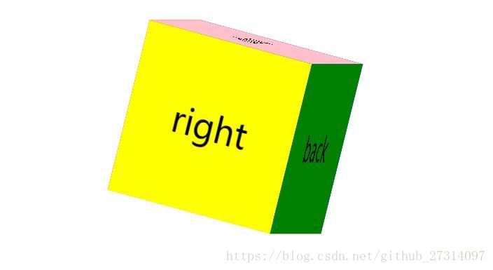
效果
代码
<!DOCTYPE html>
<html lang="en">
<head>
	<meta charset="UTF-8">
	<title>Document</title>
	<style>
		.container{
			width: 200px;
			height: 200px;
			position: relative;
			margin:50px auto;
			transform: rotateY(15deg) rotateX(-15deg);
			transform-style: preserve-3d;
			animation:xuanzhuan 8s linear infinite;
		}
		@keyframes xuanzhuan{
			0%{
				transform: rotateY(15deg) rotateX(45deg);
			}
			50%{
				transform: rotateY(375deg) rotateX(-45deg);
			}
			100%{
				transform: rotateY(735deg) rotateX(45deg);
			}
		}
		.container:hover{
			animation-play-state: paused;
		}
		.container div.front{
			background: red;
			transform: translateZ(100px);
		}
		.container div.back{
			background: green;
			transform: translateZ(-100px) rotateY(180deg);
		}
		.container div.left{
			background: blue;
			transform:translateX(-100px) rotateY(-90deg);
		}
		.container div.right{
			background: yellow;
			transform:translateX(100px) rotateY(90deg);
		}
		.container div.top{
			background: pink;
			transform:translateY(-100px) rotateX(90deg);
		}
		.container div.bottom{
			background: orange;
			transform:translateY(100px) rotateX(-90deg);
		}
		.container div{
			position: absolute;
			left:0;
			top:0;
			width: 200px;
			height: 200px;
			line-height: 200px;
			text-align: center;
			font-size: 40px;
		}
	</style>
</head>
<body>
	<div class="container">
		<div class="front">front</div>
		<div class="back">back</div>
		<div class="left">left</div>
		<div class="right">right</div>
		<div class="top">top</div>
		<div class="bottom">bottom</div>
	</div>
</body>
</html>