Android系统应用程序一般是由多个Activity组成,这些Activity以视图的形式展现在我们面前,视图是由一个个组件构成。组件即前面的那些Button等等。这些布局的显示需要用到布局管理器。
在每个Android项目的目录下都有个res/layout目录,这个目录就是用来存放布局文件的。
1. 线性布局
LinearLayout又称线性布局,这个布局会将它所包含的控件在线性方向上向上一次排列。
- 通过android:orientation属性指定了排列方向。如果不指定,默认的排列方向是horizontal,即水平布局
- 如果排列方向是horizontal,内部的控件就不能将宽度指定为match_parent。同理,如果排列方向是vertical,内部控件就不能将高度指定为match_parent。
- android:layout_gravity用于指定控件在布局中的对齐方式。排列方向是horizontal时,只有垂直方向上的对齐方式才会生效,排列方向为vertical时同理。
- android:layout_weight该属性允许我们使用比例的方式来指定控件的大小
<EditText
        android:id="@+id/input_message"
        android:layout_width="0dp"
        android:layout_height="wrap_content"
        android:layout_weight="1"
        android:hint="type something" />


    <Button
        android:id="@+id/send"
        android:layout_height="wrap_content"
        android:layout_width="0dp"
        android:layout_weight="1"
        android:text="send" />
由于使用了android:layout_weight,控件的宽度不再由android:layout_width决定,指定为0dp只是一种规范的写法。dp是Android中用于指定控件大小,间距等属性的单位。
这里属性指定为1,表示平分屏幕宽度。系统会将所有控件的该值相加,然后每个控件所占的比例就是该控件的值除以总值。
-
如果没有指定android:layout_weight,则控件大小仍按规定计算,剩余的空间给指定了该属性的控件分配。
-
weightSum属性
weightSum属性与上面的weight属性有很大的关系,通过weightSum控制weight的最大占比:
<LinearLayout xmlns:android="http://schemas.android.com/apk/res/android"
    android:layout_width="match_parent"
    android:layout_height="match_parent"
    android:weightSum="3"
    android:orientation="horizontal">
    <TextView
        android:layout_width="wrap_content"
        android:layout_height="wrap_content"
        android:gravity="center"
        android:layout_weight="1"
        android:background="#FF0000"
        android:text="text1" />

    <TextView
        android:layout_width="wrap_content"
        android:layout_height="wrap_content"
        android:gravity="center"
        android:layout_weight="1"
        android:background="#00FF00"
        android:text="text2" />
</LinearLayout>
可以看到text1 与text2 没有撑满屏幕,因为weightSum=3
如果将weightSum仍定为3,但是text1 与 text2 的weight改为2,效果如下:
可以看到text2溢出屏幕。
-
divider、showDividers属性
在LinearLayout显示分割线时,除了新增一个View的方法,还可以通过divider、showDividers属性android:divider用于设置分割线的样式,可以是xml或者图片android:showDividers用于设置显示分割线的位置,有middle、end、beginning、non等选项,可以自己实验
示例:
先创建一个xml的drawable,设置分割线的样式
<?xml version="1.0" encoding="utf-8"?>
<shape xmlns:android="http://schemas.android.com/apk/res/android"
    android:shape="rectangle">
    <solid android:color="@color/colorAccent"/>
    <size android:height="2dp"
        android:width="460dp"/>
</shape>
<LinearLayout xmlns:android="http://schemas.android.com/apk/res/android"
    xmlns:tools="http://schemas.android.com/tools"
    android:layout_width="match_parent"
    android:layout_height="match_parent"
    android:showDividers="middle"
    android:divider="@drawable/divider_line"
    android:orientation="vertical"
    tools:context=".MainActivity">

    <TextView
        android:layout_width="match_parent"
        android:layout_height="0dp"
        android:layout_weight="1"
        android:text="Hello World!" />
    <TextView
        android:layout_width="match_parent"
        android:layout_height="0dp"
        android:layout_weight="1"
        android:text="Hello World!"/>

</LinearLayout>
android:baselineAligned基线属性,只对有文字内容的组件有效,没怎么用过,待补充
简单示例:
<LinearLayout xmlns:android="http://schemas.android.com/apk/res/android"
    xmlns:tools="http://schemas.android.com/tools"
    android:layout_width="match_parent"
    android:layout_height="match_parent"
    android:orientation="vertical"
    tools:context=".MainActivity">

    <TextView
        android:layout_width="match_parent"
        android:layout_height="0dp"
        android:layout_weight="1"
        android:text="Hello World!" />
    <TextView
        android:layout_width="match_parent"
        android:layout_height="0dp"
        android:layout_weight="1"
        android:text="Hello World!"/>

</LinearLayout>
2. 相对布局
RelativeLayout又称相对布局,可以通过相对定位的方式让控件出现在布局的任何位置。
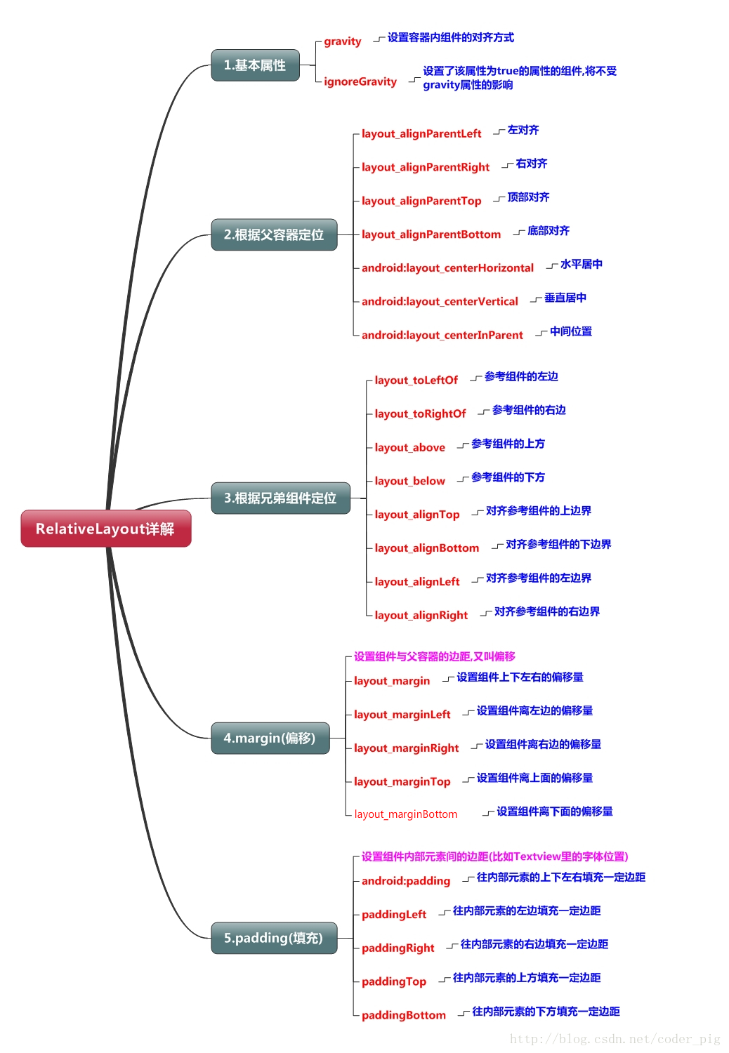


 <Button
        android:id="@+id/button_1"
        android:layout_height="wrap_content"
        android:layout_width="wrap_content"
        android:layout_alignParentLeft="true"
        android:layout_alignParentTop="true"
        android:text="button 1" />

    <Button
        android:id="@+id/button_2"
        android:layout_height="wrap_content"
        android:layout_width="wrap_content"
        android:layout_centerInParent="true"
        android:text="button 2" />
上述例子是相对于父布局进行定位的,控件也可以相对于控件进行定位的:
<Button
        android:id="@+id/button_1"
        android:layout_height="wrap_content"
        android:layout_width="wrap_content"
        android:layout_centerInParent="true"
        android:text="button 1" />

    <Button
        android:id="@+id/button_2"
        android:layout_height="wrap_content"
        android:layout_width="wrap_content"
        android:layout_above="@id/button_1"
        android:layout_toLeftOf="@id/button_1"
        android:text="button 2" />
注意:
margin代表的是偏移,比如marginleft = "5dp"表示组件离容器左边缘偏移5dp; 而padding代表的则是填充,而填充的对象针对的是组件中的元素,比如TextView中的文字 比如为TextView设置paddingleft = “5dp”,则是在组件里的元素的左边填充5dp的空间! margin针对的是容器中的组件,而padding针对的是组件中的元素>
3. 帧布局
FrameLayout又称作帧布局。所有的控件都会默认摆放在布局的左上角。
帧布局只有两个属性:
- android:foreground:设置帧布局容器的前景图像
- android:foregroundGravity:设置帧布局容器前景图像的显示位置
(前景图像即永远处于帧布局最上面,不会被覆盖的图像)
除了默认的效果之外,还可以使用android:layout_gravity属性指定控件在布局的对齐方向。
4. 表格布局
TableLayout又称表格布局,继承了LinearLayout, 它的本质还是线性布局管理器。以行和列的形式对控件进行管理,每一行为一个TableRow对象,或一个View控件
- 当为TableRow对象时,可在TableRow下添加子控件,默认情况下,每个子控件占据一列。
- 当为View时,该View将独占一行。
行数由开发人员直接确定,有多少个TableRow对象(或View控件),就有多少行。
TableLayout的列数等于含有最多子控件的TableRow的列数。
三个常用的属性:
- android:collapseColumns:设置需要被隐藏的列的序号
- android:shrinkColumns:设置允许被收缩的列的列序号
- android:stretchColumns:设置运行被拉伸的列的列序号
三个属性的列号都是从0开始算。
android:stretchColumns="0"           第0列可伸展
android:shrinkColumns="1,2"         第1,2列皆可收缩
android:collapseColumns="*"         隐藏所有行
单元格属性:
- android:layout_column 指定该单元格在第几列显示
- android:layout_span 指定该单元格占据的列数
示例:
android:layout_column="1"    该控件显示在第1列

android:layout_span="2"        该控件占据2列

说明:一个控件也可以同时具备这两个特性。
简单示例:
<?xml version="1.0" encoding="utf-8"?>
<LinearLayout xmlns:android="http://schemas.android.com/apk/res/android"
    android:orientation="vertical"
    android:layout_width="fill_parent"
    android:layout_height="fill_parent"
    android:padding="3dip"
    >

    <!-- 第1个TableLayout,用于描述表中的列属性。第0列可伸展,第1列可收缩 ,第2列被隐藏-->
    <TextView
		android:text="表1:全局设置:列属性设置"
		android:layout_height="wrap_content"
		android:layout_width="wrap_content"
		android:textSize="15sp"
		android:background="#7f00ffff"/>
	<TableLayout
		android:id="@+id/table1"
		android:layout_width="fill_parent"
		android:layout_height="wrap_content"
		android:stretchColumns="0"
		android:shrinkColumns="1"
		android:collapseColumns="2"
		android:padding="3dip">
		<TableRow>
			<Button android:text="该列可伸展"/>
			<Button android:text="该列可收缩"/>
			<Button android:text="我被隐藏了"/>
		</TableRow>

		<TableRow>
			<TextView android:text="我向行方向伸展,我可以很长    "/>
			<TextView android:text="我向列方向收缩,我可以很深"/>
		</TableRow>

	</TableLayout>

	<!-- 第2个TableLayout,用于描述表中单元格的属性,包括:android:layout_column 及android:layout_span-->
	<TextView
		android:text="表2:单元格设置:指定单元格属性设置"
		android:layout_height="wrap_content"
		android:layout_width="wrap_content"
		android:textSize="15sp"
		android:background="#7f00ffff"/>
	<TableLayout
		android:id="@+id/table2"
		android:layout_width="fill_parent"
		android:layout_height="wrap_content"
		android:padding="3dip">
		<TableRow>
			<Button android:text="第0列"/>
			<Button android:text="第1列"/>
			<Button android:text="第2列"/>
		</TableRow>

		<TableRow>
			<TextView android:text="我被指定在第1列" android:layout_column="1"/>
		</TableRow>

		<TableRow>
			<TextView
				android:text="我跨1到2列,不信你看!"
				android:layout_column="1"
				android:layout_span="2"
				/>
		</TableRow>

	</TableLayout>

	<!-- 第3个TableLayout,使用可伸展特性布局-->
	<TextView
		android:text="表3:应用一,非均匀布局"
		android:layout_height="wrap_content"
		android:layout_width="wrap_content"
		android:textSize="15sp"
		android:background="#7f00ffff"/>
	<TableLayout
		android:id="@+id/table3"
		android:layout_width="fill_parent"
		android:layout_height="wrap_content"
		android:stretchColumns="*"
		android:padding="3dip"
		>
		<TableRow>
			<Button android:text="一" ></Button>
			<Button android:text="两字"></Button>
			<Button android:text="三个字" ></Button>
		</TableRow>
	</TableLayout>

	<!-- 第4个TableLayout,使用可伸展特性,并指定每个控件宽度一致,如1dip-->
	<TextView
		android:text="表4:应用二,均匀布局"
		android:layout_height="wrap_content"
		android:layout_width="wrap_content"
		android:textSize="15sp"
		android:background="#7f00ffff"/>
	<TableLayout
		android:id="@+id/table4"
		android:layout_width="fill_parent"
		android:layout_height="wrap_content"
		android:stretchColumns="*"
		android:padding="3dip"
		>
		<TableRow>
			<Button android:text="一" android:layout_width="1dip"></Button>
			<Button android:text="两字" android:layout_width="1dip"></Button>
			<Button android:text="三个字" android:layout_width="1dip"></Button>
		</TableRow>
	</TableLayout>
</LinearLayout>