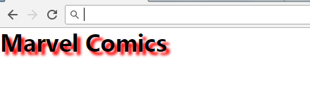
text-shadow
<!DOCTYPE html>
<html>
<head>
<meta charset="utf-8">
<title>css3文本</title>
<style type="text/css">
  * {
      margin: 0;
      padding: 0;
  }

  h1 {
      text-shadow: 5px 5px 5px red; /*x轴,y轴,模糊程度,颜色*/
  }
</style>
</head>
<body>
  <h1>Marvel Comics</h1>
</body>
</html>
效果如下:
CSS3文本溢出属性指定应向用户如何显示溢出内容
<!DOCTYPE html>
<html>
<head>
<meta charset="utf-8">
<title>css3文本效果</title>
<style type="text/css">
  * {
      margin: 0;
      padding: 0;
  }

  div.test {
      width: 12em;
      white-space: nowrap; /*文本显示在一行*/
      overflow: hidden;    /*超出文本的区域隐藏掉*/
      border: 1px solid #000;
  }
</style>
</head>
<body>
  <div class="test" style="text-overflow: ellipsis;">
    This is some long text that will not fit in the box
  </div>

  <div class="test">
    This is some long text that will fit in the box
  </div>

  <div class="test" style="text-overflow: '>>'">
    This is some long text that will fit in the box
  </div>
</body>
</html>
效果如下:
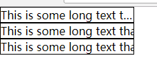
clip:默认
ellipsis:文本溢出显示省略号
text-overflow: '>>':只在火狐浏览器下有效