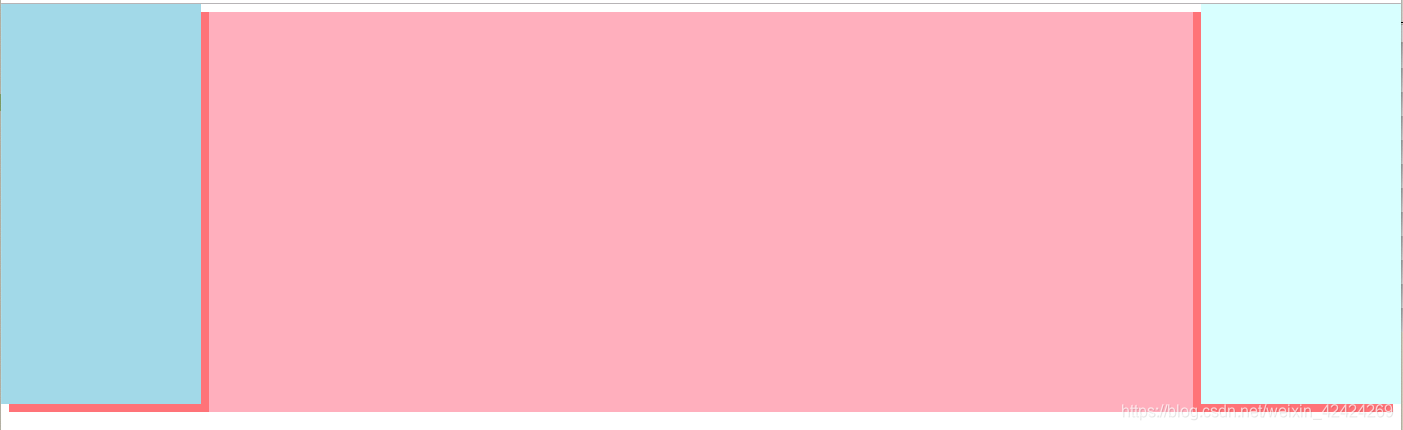
1.绝对定位
<div class="containt">
			<div class="left"></div>
			<div class="center"></div>
			<div class="right"></div>
		</div>
			.containt{
				background: lightcoral;
			}
			.left{
				position: absolute;
				width: 200px;
				height: 400px;
				top: 0;
				left: 0;
				background: lightblue;

			}
			.right{
				position: absolute;
				width: 200px;
				height: 400px;
				right: 0;
				top: 0;
				background: lightcyan;
			}
			.center{
				height: 400px;
				margin: 0 200px 0 200px;
				background:lightpink;
			}
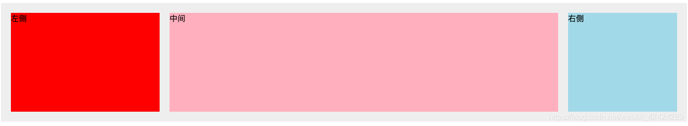
2.float
x需要注意的是,因为浮动会使元素脱离文档流,所以我们需要将中间的元素放在html结构的最后,以免右侧的内容沉在中间内容的下面
<div class="wrap">
			<div class="left">左侧</div>
			<div class="right">右侧</div>
			<!--必须将中间内容写在html结构的最后,否则右侧会沉在中间内容的下侧-->
			<div class="middle">中间</div>
		</div>
.wrap {
				background: #eee;
				overflow: hidden;
				padding: 20px;
			}

			.left {
				width: 300px;
				height: 200px;
				float: left;
				background: red;
			}

			.right {
				width: 220px;
				height: 200px;
				float: right;
				background: lightblue;
			}

			.middle {
				margin-left: 320px;
				background: lightpink;
				margin-right: 240px;
				height: 200px;
			}
3.flex布局
<div class="contain">
			<div class="left">左侧</div>
			<div class="center">中间</div>
			<div class="right">右侧</div>
		</div>
.contain{
				display: flex;
				justify-content: space-between;
			}
			.left,.right,.center{
				height: 100px;
			}
			.left{
				width: 200px;
				background:lightblue;
			}
			.right{
				width: 200px;
				background: lightcoral;
			}
			.center{
				width: 100%;
				margin: 0 20px;
				background: lightgrey;
			}
