Drawable (可绘制图像)
本文由 Luzhuo 编写,转发请保留该信息.
原文: https://blog.csdn.net/Rozol/article/details/87100169
Drawable是可绘制图像, 它并不是某一具体类型的图像.
从图像资源创建
图片资源是指放在res/drawable下的图片, 现在一般都把图片放在res/mipmap下了.
文件的类型支持PNG、JPG、GIF,一般只使用PNG格式的图片, 其他图片格式不推荐.
1.使用代码的方式
AppCompatImageView i = new AppCompatImageView(this);
i.setImageResource(R.mipmap.my_image);
i.setAdjustViewBounds(true);
i.setLayoutParams(new Gallery.LayoutParams(ViewGroup.LayoutParams.WRAP_CONTENT, LinearLayout.LayoutParams.WRAP_CONTENT));

LinearLayoutCompat mLinearLayout = new LinearLayoutCompat(this);
mLinearLayout.addView(i);
setContentView(mLinearLayout);
2.使用xml的方式
setContentView(R.layout.activity_png);
<?xml version="1.0" encoding="utf-8"?>
<android.support.v7.widget.LinearLayoutCompat xmlns:android="http://schemas.android.com/apk/res/android"
    android:layout_width="match_parent"
    android:layout_height="match_parent"
    android:orientation="vertical">

    <android.support.v7.widget.AppCompatImageView
        android:layout_width="wrap_content"
        android:layout_height="wrap_content"
        android:src="@mipmap/my_image"/>

</android.support.v7.widget.LinearLayoutCompat>
BitmapDrawable 图片
就是对图片进行描述, 从而进行一些简单的处理, 如平铺。
案例代码
<?xml version="1.0" encoding="utf-8"?>
<bitmap xmlns:android="http://schemas.android.com/apk/res/android"
    android:src="@drawable/v0"
    android:tileModeX="repeat"
    android:tileModeY="repeat"
    android:antialias="true"
    android:dither="true" >

</bitmap>
使用:设置背景即可
<ImageView
    android:layout_width="match_parent"
    android:layout_height="match_parent"
    android:background="@drawable/my_bitmap" />
其效果

详细参数
<bitmap
    xmlns:android="http://schemas.android.com/apk/res/android"
    android:src="@[package:]drawable/drawable_resource"
    // 抗锯齿
    android:antialias=["true" | "false"]
    // 位图抖动 (当位图的像素配置与屏幕不同时(如ARGB8888位图和RGB565屏幕), 启动抖动)
    android:dither=["true" | "false"]
    // 位图过滤 (当位图收缩或拉伸使其平滑)
    android:filter=["true" | "false"]
    // 放置位置
    android:gravity=["top" | "bottom" | "left" | "right" | "center" | "center_vertical" | "center_horizontal"
    "fill_vertical" | "fill_horizontal" |
    "fill" | "clip_vertical" | "clip_horizontal"]
    // mipmap 提示
    android:mipMap=["true" | "false"]
    // 平铺模式: disabled:不平铺(默认) / clamp:复制边缘颜色 / repeat:水平和垂直重复 / mirror:水平和垂直, 交替处以使相邻图像相接
    android:tileMode=["disabled" | "clamp" | "repeat" | "mirror"] />
TransitionDrawable
TransitionDrawable 是可转换的绘制对象, 支持两个item进行向前或向后转换, 实现两个Drawable之间过渡切换效果.
创建的xml文件放在res/drawable下.
transition.startTransition(1000); // 向后转换
transition.resetTransition(); // 向前转换
从xml创建
<transition xmlns:android="http://schemas.android.com/apk/res/android">
    <item android:drawable="@mipmap/image_expand">
    <item android:drawable="@mipmap/image_collapse">
</transition>
标签支持的属性有
<?xml version="1.0" encoding="utf-8"?>
<transition xmlns:android="http://schemas.android.com/apk/res/android" >
    <item
        <!-- 可绘制对象资源 -->
        android:drawable="@drawable/drawable_resource"
        <!-- 唯一资源ID -->
        android:id="@+id/resource_name"

        <!-- 上下左右 偏移 -->
        android:top="dimension"
		android:bottom="dimension"
		android:left="dimension"
        android:right="dimension" />
</transition>
案例代码
Resources res = this.getResources();
TransitionDrawable transition = (TransitionDrawable) ResourcesCompat.getDrawable(res, R.drawable.my_transition, null);

ImageView image = findViewById(R.id.iv_stransition);
image.setImageDrawable(transition);

transition.startTransition(1000);
<ImageView
    android:id="@+id/iv_stransition"
    android:layout_width="match_parent"
    android:layout_height="match_parent"/>
效果

ShapeDrawable
ShapeDrawable主要用来绘制一些简单的形状、背景. 这个也是平时比较常用的.
创建的xml文件放在res/drawable下.
可以定义的形状有: rectangle:矩形(默认) oval:椭圆 line:水平线(<stroke>定义线宽) ring:环形
rectangle:矩形(默认)特有属性:
<?xml version="1.0" encoding="utf-8"?>
<shape xmlns:android="http://schemas.android.com/apk/res/android"
    android:shape="rectangle">

    <!-- 为形状(rectangle)产生圆角 -->
    <corners
        android:radius="5dp"
        android:topLeftRadius="5dp"
        android:topRightRadius="5dp"
        android:bottomLeftRadius="5dp"
        android:bottomRightRadius="5dp" />

</shape>
ring:环形特有属性:
<?xml version="1.0" encoding="utf-8"?>
<shape xmlns:android="http://schemas.android.com/apk/res/android"
    android:shape="ring"

    <!-- 环内部(中间的孔)的半径 -->
    android:innerRadius = "5dp"
    <!-- 环内部的半径比率, 环内半径=环宽÷9(半径比率, 默认9) (被android:innerRadius覆盖) -->
    android:innerRadiusRatio = "9.0"
    <!-- 环的厚度-->
    android:thickness = "5dp"
    <!-- 环的宽度比率, 环的厚度=环宽度÷9(厚度比率, 默认9) (被android:thickness覆盖) -->
    android:thicknessRatio = "9.0" >

</shape>
颜色渐变
与<solid>标签互斥
<shape xmlns:android="http://schemas.android.com/apk/res/android"
    android:shape="rectangle">

    <gradient
		// 渐变的角度: 0°(默认):从左到右, 90°:从上到下 (必须是45°的倍数)
	    android:angle="integer"
	    // x轴渐变中心 [0 - 1.0]
	    android:centerX="float"
	    // y轴渐变中心 [0 - 1.0]
	    android:centerY="float"
	    // 起始颜色
	    android:startColor="color"
	    // 起始颜色与结束颜色之间的可选颜色
	    android:centerColor="integer"
	    // 结束颜色
	    android:endColor="color"

	    // 渐变类型: linear:线性渐变(默认), radial:径向渐变, sweep:流线型渐变
	    android:type=["linear" | "radial" | "sweep"]
	    // 渐变的半径。(android:type="radial"时可用)
	    android:gradientRadius="integer" />
</shape>
颜色填充
<?xml version="1.0" encoding="utf-8"?>
<shape xmlns:android="http://schemas.android.com/apk/res/android"
    android:shape="rectangle">

    <solid
        android:color="#5677fc" />

</shape>
描边
<?xml version="1.0" encoding="utf-8"?>
<shape xmlns:android="http://schemas.android.com/apk/res/android"
    android:shape="rectangle">

	<stroke
	    // 线宽
	    android:width="integer"
	    // 线的颜色
	    android:color="color"

	    // 短划线的大小(虚线与线段之间的空白间隔) (设置android:dashGap时有效)
	    android:dashWidth="integer"
	    // 短划线的间距(线段的宽度) (设置android:dashWidth时有效)
	    android:dashGap="integer" />
</shape>
内边距
内边距为展示内容的内边距, 对形状不会造成影响
<?xml version="1.0" encoding="utf-8"?>
<shape xmlns:android="http://schemas.android.com/apk/res/android"
    android:shape="rectangle">

    <!-- 内边距为展示内容的内边距, 对形状不会造成影响 -->
    <padding
        android:left="5dp"
        android:top="5dp"
        android:right="5dp"
        android:bottom="5dp" />

</shape>
大小
<shape xmlns:android="http://schemas.android.com/apk/res/android"
    android:shape="rectangle">

    <size
        android:width="100dp"
        android:height="50dp" />

</shape>
其他补充属性:
<?xml version="1.0" encoding="utf-8"?>
<shape
    xmlns:android="http://schemas.android.com/apk/res/android"
    android:shape=["rectangle" | "oval" | "line" | "ring"]

    <!-- 当该shape使用在LevelListDrawable的时候, 该值为true, 否则false -->
    android:useLevel = "boolean"
    <!-- 图像抖动处理(true) -->
    android:dither = "boolean"
    <!-- 着色效果(改为其他颜色) -->
    android:tint = "integer"
    <!-- 显示与隐藏 -->
    android:visible = "integer">

</shape>
使用
对编写好的xml文件进行使用
方式一: 直接在xml里为控件设置背景
<TextView
    android:layout_width="match_parent"
    android:layout_height="match_parent"
    android:text="虚线"
    android:background="@drawable/my_shape_stroke"/>
.9图
在创建.9图需要注意的是, 目前版本.9图并不需要在四周预留1像素的空位, 工具会自动帮你扩展;
你应尽可能用AndroidStudio自带的工具进行创建, 如果用其他软件进行处理的话, AS编译时会给警告, 甚至直接报错;
你只需把直接图标拷贝mipmap下(不需要重命名为.9.png后缀), 然后点击右键菜单中的Create 9-Path file..., 点击ok后会帮你创建一个新的以.9.png为后缀的文件, 然后双击它, 接着就可以进行绘制了.
绘制规则主要是:
左上为拉伸范围, 右下为内容填充范围
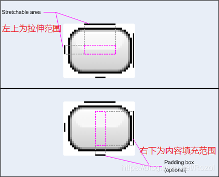
在代码中添加
<Button
    android:layout_width="wrap_content"
    android:layout_height="wrap_content"
    android:text="我是一个小按钮"
    android:background="@mipmap/ninepath"/>
其大小会随文字的大小而改变, 只拉伸标记的范围, 所以不会导致位图失真.
StateListDrawable 状态选择器
状态选择器主要终于按钮等具有状态(如按下, 松开)功能的控件.
xml创建在res/drawable下, 使用的时候要注意, 一定要把默认的item放最后.
案例代码:
<?xml version="1.0" encoding="utf-8"?>
<selector xmlns:android="http://schemas.android.com/apk/res/android">

    <item
        android:state_pressed="true"
        android:drawable="@drawable/statelist_pressed">
    </item>

    <!-- 默认放最后 -->
    <item
        android:drawable="@drawable/statelist_normal">
    </item>

</selector>
把它用在按钮上:
<Button
    android:layout_width="wrap_content"
    android:layout_height="wrap_content"
    android:background="@drawable/statelist"
    android:text="我是个有态度的大按钮" />
状态选择器的其他详细属性还有:
<selector xmlns:android="http://schemas.android.com/apk/res/android"
    // 内部大小在状态变更时保持不变(ture) (若变化则false)
    android:constantSize=["true" | "false"]
    // 位图的像素配置与屏幕不同时(如ARGB8888位图和 RGB565屏幕), 启用位图抖动(true), (若不启动则false)
    android:dither=["true" | "false"]
    // 内边距随状态的变化而变化(true) (若保持不变则false)
    android:variablePadding=["true" | "false"] >

    <item
        android:drawable="@[package:]drawable/drawable_resource"
        // 什么都不加, 就是默认
        // 按下时
        android:state_pressed=["true" | "false"]
        // 获取焦点时
        android:state_focused=["true" | "false"]
        // 光标悬停时 (主要用于电视上)
        android:state_hovered=["true" | "false"]

        // 选中时
        android:state_selected=["true" | "false"]
        // 可选中时
        android:state_checkable=["true" | "false"]
        // 已选中时
        android:state_checked=["true" | "false"]

        // 该对象启用时
        android:state_enabled=["true" | "false"]
        // 该对象激活时作为持续选择
        android:state_activated=["true" | "false"]
        // 该应用窗口焦点时
        android:state_window_focused=["true" | "false"] />
</selector>
LayerDrawable 图层列表
所谓图层列表就是将多张Drawable按顺序叠加在一起, 形成一张新的Drawable.
案例代码:
<?xml version="1.0" encoding="utf-8"?>
<layer-list xmlns:android="http://schemas.android.com/apk/res/android">

    <!-- 图片 -->
    <item android:drawable="@mipmap/image_collapse"/>

    <!-- 形状 -->
    <item
        android:top="100dp"
        android:bottom="100dp"
        android:left="100dp"
        android:right="100dp">

        <shape
            android:shape="rectangle"
            android:dither="true">

            <corners android:radius="2dp"/>

            <stroke
                android:width="2dp"
                android:color="#33121212" />
        </shape>
    </item>

</layer-list>
详细的可选属性还有:
<layer-list
    xmlns:android="http://schemas.android.com/apk/res/android" >
    <item
        android:drawable="@[package:]drawable/drawable_resource"
        // 该对象的唯一id
        android:id="@[+][package:]id/resource_name"
        // 上下左右 偏移量
        android:top="dimension"
        android:bottom="dimension"
        android:left="dimension"
        android:right="dimension"
        />
</layer-list>
在代码中使用也是直接设置背景即可:
<TextView
    android:layout_width="300dp"
    android:layout_height="300dp"
    android:background="@drawable/my_layer"/>
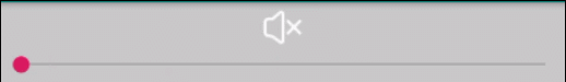
LevelListDrawable 级别列表
手机的信号强弱、音量的高低等都有等级之分, 可以根据不同的等级显示不同的Drawable, 这时候LevelListDrawable就派上用场了.
xml文件放在res/drawable下.
案例代码:
<?xml version="1.0" encoding="utf-8"?>
<level-list xmlns:android="http://schemas.android.com/apk/res/android">
    <item android:drawable="@drawable/v0"
        android:minLevel="0"
        android:maxLevel="9"/>

    <item android:drawable="@drawable/v1"
        android:minLevel="10"
        android:maxLevel="19"/>

    <item android:drawable="@drawable/v2"
        android:minLevel="20"
        android:maxLevel="29"/>

    <item android:drawable="@drawable/v3"
        android:minLevel="30"
        android:maxLevel="39"/>
</level-list>
使用
<ImageView
    android:id="@+id/iv_level"
    android:layout_width="wrap_content"
    android:layout_height="wrap_content"
    android:layout_gravity="center"
    android:src="@drawable/my_levellist"/>
在代码中设置级别即可
ivLevel = findViewById(R.id.iv_level);
ivLevel.setImageLevel(progress);
其效果如图:
详细的属性有:
<level-list
    xmlns:android="http://schemas.android.com/apk/res/android" >

    <item
        android:drawable="@drawable/drawable_resource"
        android:maxLevel="integer"
        android:minLevel="integer" />
</level-list>
InsetDrawable 增加边距
主要功能是给Drawable增加一个padding的效果
案例代码(增加上下10dp的内边距):
<?xml version="1.0" encoding="utf-8"?>
<inset xmlns:android="http://schemas.android.com/apk/res/android"
    android:drawable="@mipmap/image_collapse"
    android:insetTop="10dp"
    android:insetBottom="10dp">

</inset>
使用
<ImageView
    android:layout_width="wrap_content"
    android:layout_height="wrap_content"
    android:background="@mipmap/image_collapse"
    android:src="@drawable/my_inset" />
其效果如图所示:

详细的属性有:
<inset
    xmlns:android="http://schemas.android.com/apk/res/android"

    android:drawable="@drawable/drawable_resource"
    // Drawable距离View的 顶部/底部/左部/右部 边缘的距离
    android:insetTop="dimension"
    android:insetRight="dimension"
    android:insetBottom="dimension"
    android:insetLeft="dimension" />
ClipDrawable 剪裁
就是对Drawable进行剪裁.
根据Drawable的**level等级[0,10000]**进行按百分比剪裁.
xml文件放在res/drawable下.
案例代码:
<?xml version="1.0" encoding="utf-8"?>
<clip xmlns:android="http://schemas.android.com/apk/res/android"
    android:drawable="@mipmap/image_collapse"
    android:clipOrientation="vertical|horizontal"
    android:gravity="center">

</clip>
使用
<ImageView
    android:id="@+id/iv_clip"
    android:layout_width="wrap_content"
    android:layout_height="wrap_content"
    android:layout_gravity="center_horizontal"
    android:src="@drawable/my_clip"/>
代码中设置
ivClip = findViewById(R.id.iv_clip);
ivClip.setImageLevel(progress);
其效果图:
详细的属性有
<clip
    xmlns:android="http://schemas.android.com/apk/res/android"
    android:drawable="@drawable/drawable_resource"
    // 裁剪方向 (设置多个用|隔开)
    android:clipOrientation=["horizontal" | "vertical"]
    // 放置位置
    android:gravity=["top" | "bottom" | "left" | "right" | "center_vertical" |
    "fill_vertical" | "center_horizontal" | "fill_horizontal" |
    "center" | "fill" | "clip_vertical" | "clip_horizontal"] />
ScaleDrawable 缩放
按照Drawable的**level等级[0,10000]**进行缩放.
xml文件放在res/drawable下.
这里需要注意的是: level为0时不显示
案例代码
<?xml version="1.0" encoding="utf-8"?>
<scale xmlns:android="http://schemas.android.com/apk/res/android"
    android:drawable="@mipmap/image_collapse"
    android:scaleGravity="center"
    android:scaleHeight="50%"
    android:scaleWidth="50%">

</scale>
使用
<ImageView
    android:id="@+id/iv_scale"
    android:layout_width="wrap_content"
    android:layout_height="wrap_content"
    android:layout_gravity="center_horizontal"
    android:src="@drawable/my_scale" />
代码使用
ivScale = findViewById(R.id.iv_scale);
// 注意: level为0时, 不显示
ivScale.setImageLevel(progress);
显示的效果
详细的属性有
<scale
    xmlns:android="http://schemas.android.com/apk/res/android"
    android:drawable="@drawable/drawable_resource"
    // 放置位置
    android:scaleGravity=["top" | "bottom" | "left" | "right" | "center" | "center_vertical" | "center_horizontal"
    "fill" | "fill_vertical" | "fill_horizontal" |
    "clip_vertical" | "clip_horizontal"]
    // 最小缩放百分比 (10%, 可隐藏10%, 可显示90%)
    android:scaleHeight="percentage"
    android:scaleWidth="percentage" />
Vector Drawable
drawable文件夹
系统会根据设备的dpi去匹配相应文件夹, 如果低dpi显示在高密度设备上, 图片会变放大而失真
dpi密度范围 | 密度 | 放大倍数 | icon尺寸
-----------|------|---------
0dpi ~ 120dpi | ldpi | 0.75 | -
120dpi ~ 160dpi | mdpi(基准) | 1.0 | 4848
160dpi ~ 240dpi | hdpi | 1.5 | 7272
240dpi ~ 320dpi | xhdpi | 2.0 | 9696
320dpi ~ 480dpi | xxhdpi | 3.0 | 144144
480dpi ~ 640dpi | xxxhdpi | 4.0 | 192*192
drawable-nodpi文件夹里的图片将不进行任何缩放处理(原图多大就显示多大).
目前的手机基本是1080p的, 其dpi处于320~480dpi之间, 所以建议放在xxhdpi文件夹
Palette 调色板
Palette能让你从位图中分析出颜色, 动态的改变应用的色彩体系.
使用该库需要导包:
implementation 'com.android.support:palette-v7:28.0.0'
创建Palette有两种方式:
// --- ↓ 生成 Palette 对象
// 方式一: 同步生成 Palette 对象
public Palette createPaletteSync(Bitmap bitmap) {
    Palette p = Palette.from(bitmap).generate();
    return p;
}

// 方式二: 异步生成 Palette 对象
public void createPaletteAsync(Bitmap bitmap) {
    Palette.from(bitmap).generate(new Palette.PaletteAsyncListener() {
        public void onGenerated(Palette p) {
            // Use generated instance
        }
    });
}
// --- ↑ 生成 Palette 对象
当然你也可以自定义Palette
// --- ↓ 自定义Palette ---
private void myPalette(Bitmap bitmap){
    Palette.Builder builder = Palette.from(bitmap);

    // 添加过滤器
    builder.addFilter(new Palette.Filter() {
        @Override
        public boolean isAllowed(int i, @NonNull float[] floats) {
            return false;
        }
    });
    // 清空过滤器
    builder.clearFilters();

    // 调色板大小, 值越大越慢, 得到的颜色信息越多, 调色板的大小最好根据图片的类型而定(头像:24~32 风景:8~16 默认:16)
    builder.maximumColorCount(16);
    // Build使用Bitmap的什么区域 (不影响原图)
    builder.setRegion(100, 100, 100, 100);
    // 创建自己的色彩配置文件
    builder.addTarget(new Target.Builder().build());
}
Palette提供了6个色彩配置:
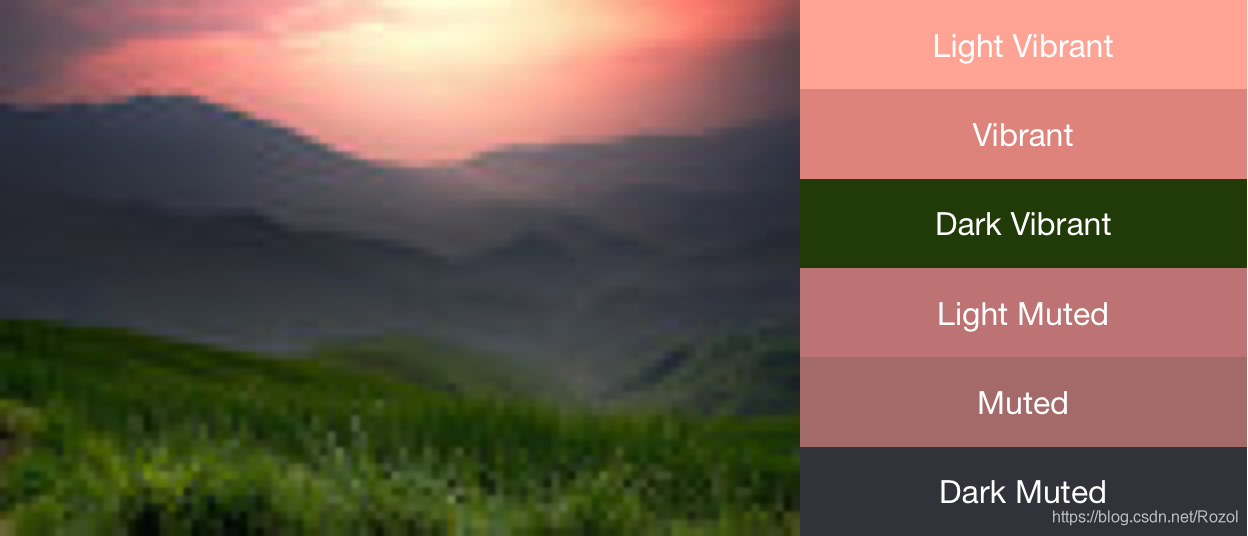
Vibrant (有活力的)
Vibrant dark(有活力的 暗色)
Vibrant light(有活力的 亮色)
Muted (柔和的)
Muted dark(柔和的 暗色)
Muted light(柔和的 亮色)
使用色彩配置文件创建色彩体系, 通过Palette.getSwatch()返回关联的Swatch, 如果图片中不存在特定的色彩配置, 则返回null.
Palette.Swatch vibrant = myPalette.getVibrantSwatch();
if(vibrant != null){
    int titleColor = vibrant.getTitleTextColor();
    // ...
}
获取颜色共有几下几种方法:
int p = vibrantSwatch.getPopulation(); // 此样本的像素量
rgb = vibrantSwatch.getRgb(); // 获得RGB色彩, 用于文本背景(主色调)
float[] hsl = vibrantSwatch.getHsl(); // 获得HSL色彩
bodyColor = vibrantSwatch.getBodyTextColor(); // 文本RGB值, 用于文本主体
titleColor = vibrantSwatch.getTitleTextColor(); // 文本RGB值, 用于文本标题
案例代码:
private void initView() {
    tvRgb = findViewById(R.id.tv_rgb);
    tvBody = findViewById(R.id.tv_body);
    tvTitle = findViewById(R.id.tv_title);
    ivPalette = findViewById(R.id.iv_palette);
}

private void initData() {
    // 加载默认颜色, 如果图片解析失败, 就使用该颜色
    int rgb = ContextCompat.getColor(this, R.color.colorPrimary);
    int bodyColor = ContextCompat.getColor(this, R.color.colorPrimary);
    int titleColor = ContextCompat.getColor(this, R.color.colorPrimary);

    Bitmap bitmap = BitmapFactory.decodeResource(getResources(), R.mipmap.image_palette);
    ivPalette.setImageBitmap(bitmap);

    Palette palette = createPaletteSync(bitmap);
    Palette.Swatch vibrantSwatch = palette.getVibrantSwatch();
    if(vibrantSwatch != null){
        int p = vibrantSwatch.getPopulation(); // 此样本的像素量
        rgb = vibrantSwatch.getRgb(); // 获得RGB色彩, 用于文本背景(主色调)
        float[] hsl = vibrantSwatch.getHsl(); // 获得HSL色彩
        bodyColor = vibrantSwatch.getBodyTextColor(); // 文本RGB值, 用于文本主体
        titleColor = vibrantSwatch.getTitleTextColor(); // 文本RGB值, 用于文本标题
    }

    tvRgb.setBackgroundColor(rgb);
    tvBody.setBackgroundColor(bodyColor);
    tvTitle.setBackgroundColor(titleColor);
}
效果图:
