关于BFC的那些事
BFC的简介
BFC的全称是Block Formatting Context ,即块格式化上下文。是Web页面的可视化CSS渲染的一部分,是布局过程中生成块级盒子的区域,也是浮动元素与其他元素的交互限定区域。
BFC的应用方式
1.防止margin重叠
<style>
    p {
        color: red;
        background: green;
        width: 100px;
        line-height: 50px;
        text-align:center;
        margin: 5px;
    }
</style>
<body>
    <p>program one</p>
    <p>program one</p>
</body>

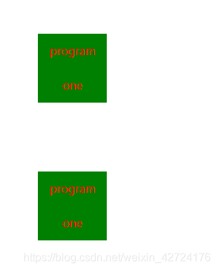
当两个 p 标签的margin距离都为50px的时候,在垂直方向上会发生外边距合并的问题,具体以margin最大的那个决定,比如说 第一个p的margin是100px而第二个是90px,则发生重叠合并的距离就是100px。 解决这个问题的可以对其中一个 p 进行包裹,两个元素置于不同的BFC中进行隔离。比如下面:
<style>
	.wraper{
		overflow : hidden;
	}
    p {
        color: red;
        background: green;
        width: 100px;
        line-height: 50px;
        text-align:center;
        margin: 5px;
    }
</style>
<body>
    <p>program one</p>
    <div class = "wraper">
    	<p>program one</p>
    </div>
</body>
2.相邻Box水平方向margin重叠
<html>
<head>
<style type="text/css">

    #green {
        margin:10px 10px 10px 10px
    }
    #blue {
        margin:10px 10px 10px 10px
    }
    #red {
        margin:10px 10px 10px 10px
    }
    body {
        writing-mode:tb-rl;
    }

</style>
</head>
<body>

<div id="green" style="background:lightgreen;height:100px;width:100px;"></div>
<div id="blue" style="background:lightblue;height:100px;width:100px;"></div>
<div id="red" style="background:pink;height:100px;width:100px;"></div>

</body>
</html>
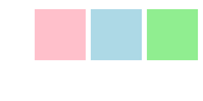
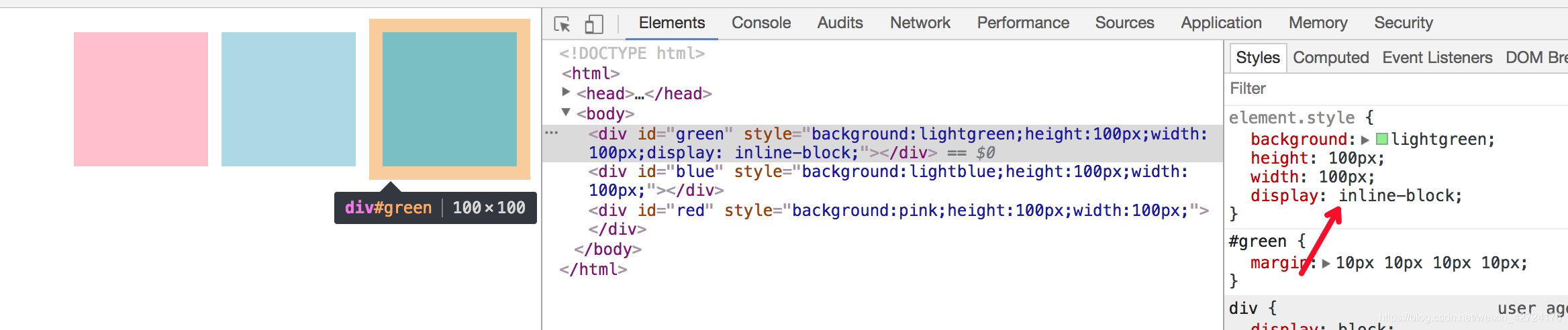
可以看到水平方向上的margin产生了合并,我们可以给div加个display:inline-block,触每个div容器生成一个BFC。那么三个DIV便不属于同一个BFC(这个只body根元素形成的BFC),就不会发生margin重叠了。
3.嵌套元素的margin重叠
<html>
<head>
<meta http-equiv="Content-Type" content="text/html; charset=utf-8">
<!--The viewport meta tag is used to improve the presentation and behavior of the samples
on iOS devices-->
<meta name="viewport" content="initial-scale=1, maximum-scale=1,user-scalable=no"/>
<title></title>
<style>
html, body { height: 100%; width: 100%; margin: 0; padding: 0; }
#map{
padding:0;
}
.first{
margin:20px;
background:lightgreen;
width:100px;
height:100px;
}
ul{
/*display:inline-block;*/
margin:10px;
background:lightblue;
}
li{
margin:25px;
}
</style>
</head>
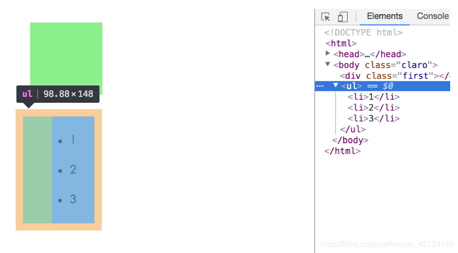
<body class="claro">
<div class="first"></div>
<ul>
<li>1</li>
<li>2</li>
<li>3</li>
</ul>
</body>
</html>
此时div与ul之间的垂直距离,取div、ul、li三者之间的最大外边距。
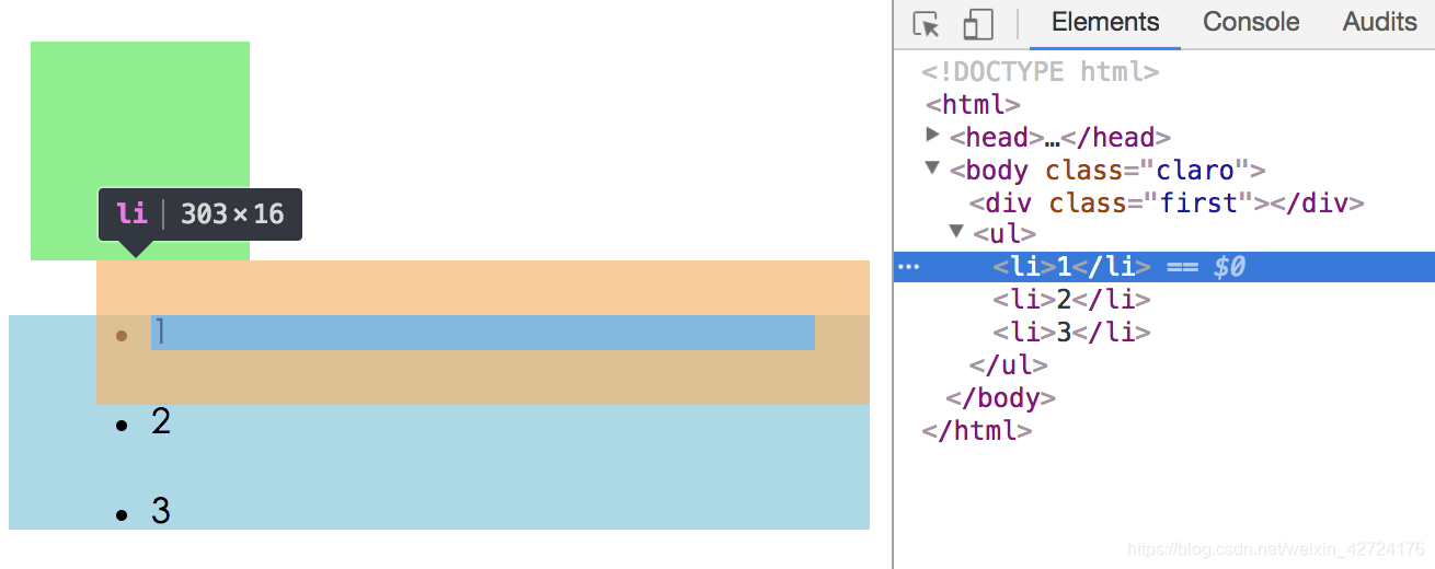
要阻止嵌套元素的margin重叠,只需让ul生成BFC即可(将上例中的注释去掉),这样div、ul、li之间便不会发生重叠现象。
但是li仍然会产生重叠,这时可以给li标签添加上display : inline-block即可
4.清除内部浮动
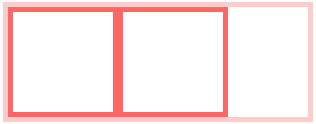
<style>
    .par {
        border: 5px solid #fcc;
        width: 300px;
    }

    .child {
        border: 5px solid #f66;
        width:100px;
        height: 100px;
        float: left;
    }
</style>
<body>
    <div class="par">
        <div class="child"></div>
        <div class="child"></div>
    </div>
</body>
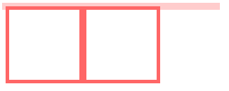
计算BFC的高度时,浮动元素也参与计算
为达到清除内部浮动,我们可以触发par生成BFC,那么par在计算高度时,par内部的浮动元素child也会参与计算。
.par {
overflow: hidden;
}
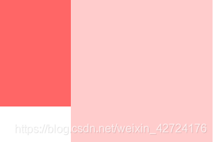
5. 自适应两栏布局
    body {
        width: 300px;
        position: relative;
    }

    .aside {
        width: 100px;
        height: 150px;
        float: left;
        background: #f66;
    }

    .main {
        height: 200px;
        background: #fcc;
    }
</style>
<body>
    <div class="aside"></div>
    <div class="main"></div>
</body>
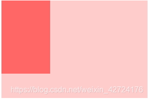
BFC的区域不会与float box重叠。
我们可以通过通过触发main生成BFC, 来实现自适应两栏布局。
.main {
overflow: hidden;
}
当触发main生成BFC后,这个新的BFC不会与浮动的aside重叠。因此会根据包含块的宽度,和aside的宽度,自动变窄。效果如下:
BFC就是页面上的一个隔离的独立容器,容器里面的子元素不会影响到外面的元素。反之也如此。
因为BFC内部的元素和外部的元素绝对不会互相影响,因此,
当BFC外部存在浮动时,它不应该影响BFC内部Box的布局,BFC会通过变窄,而不与浮动有重叠。 同样的,当BFC内部有浮动时,为了不影响外部元素的布局,BFC计算高度时会包括浮动的高度。 避免margin重叠也是这样的一个道理。
总结创建BFC的方式
- 根元素或包含根元素的元素
- 浮动元素(元素的 float 不是 none)
- 绝对定位元素(元素的 position 为 absolute 或 fixed)
- 行内块元素(元素的 display 为 inline-block)
- 表格单元格(元素的 display为 table-cell,HTML表格单元格默认为该值)
- 表格标题(元素的 display 为 table-caption,HTML表格标题默认为该值)
- 匿名表格单元格元素(元素的 display为 table、table-row、 table-row-group、table-header-group、table-footer-group(分别是HTML table、row、tbody、thead、tfoot的默认属性)或 inline-table)
- overflow 值不为 visible 的块元素
- display 值为 flow-root 的元素
- contain 值为 layout、content或 strict 的元素
- 弹性元素(display为 flex 或 inline-flex元素的直接子元素)
- 网格元素(display为 grid 或 inline-grid 元素的直接子元素)
- 多列容器(元素的 column-count 或 column-width 不为 auto,包括 column-count 为 1)
- column-span 为 all 的元素始终会创建一个新的BFC,即使该元素没有包裹在一个多列容器中(标准变更,Chrome bug)。