- css:cascading style sheet
- 样式表-规则-选择器+声明-css属性+css属性值组成的键值对
- div ul li #test{} 浏览器读取选择性的顺序从右往左
选择器:
规范地址:http://www.w3.org/TR/2011/REC-css3-selectors-20110929/
最新规范:http://www.w3.org/TR/selectors
选择器:基本选择器及其扩展
通配符,Id,类,元素,后代 空格,分组,(结合符)
基本选择器:Css声明优先级
子元素选择器(直接后代选择器)#wrap >div

全变成粉色因为选择器的颜色属性是可继承的,属性查阅可登录 MDN Web文档

边框颜色是不可继承的(一定要拿非继承属性来测试)
后代选择器:#wrap #first
相邻兄弟选择器: #wrap > #first +.inner{}

通用选择器:相邻兄弟选择器: #wrap > #first ~.inner{}
(区别于兄弟相邻选择器,通用选择器适用于向下的所有兄弟,相邻兄弟选择器只适用于紧挨着的兄弟)

但可以看出兄弟的孩子是选择不到的
属性选择器
1.存在选择器
[attr] 包含attr属性的所有元素

2.值选择器
[attr| =””]
[attr~=val]选择attr属性的值val或val+空格+..的元素

3.子串值选择器
[attr|=val]选择attr属性的值val或以val-开头的元素
[attr^=val]选择attr属性的值以val开头的元素

[attr$=val]选择attr属性的值是以val结尾(包括val)的元素
[attr*=val]选择attr属性的值中包含字符串val的元素

4.伪类和伪类选择器(为了拿到元素的一些状态)
link ,visited 只能用在链接上
Visited 内只有color,background-color,border-color起作用
<!DOCTYPE html>
<html>
	<head>
		<meta charset="utf-8" />
		<title></title>
		<style>
			*{
				margin:0;
				padding:0;
			}
			a{
				text-decoration: none;
				color:deepink;
			}
			div{
				width:200px;
				height:200px;
				background: pink;
				display: none;
				text-align: center;
				font:50px/200px "微软雅黑";
			}
			:target{
				display: block;
			}
		</style>
	</head>
	<body>
		<a href="#div1">div1</a>
		<a href="#div2">div2</a>
		<a href="#div3">div3</a>
		<div id="div1">
			div1
		</div>
		<div id="div2">
			div2
		</div>
		<div id="div3">
			div3
		</div>
	</body>
</html>
Target只能代表id为uri片段的元素
 URI即为#后面的内容
动态伪类 (排序 lvha)
Hover ,active
<!DOCTYPE html>
<html>
	<head>
		<meta charset="utf-8" />
		<title></title>
		<style>
			*{
				margin:0;
				padding:0;
			}
			a{
				text-decoration: none;
				color:black;
				display:block;
			}
			a:hover{
				font-size: 24px;
			}

		</style>
	</head>
	<body>
		<a href="javascript:;">css3真棒!</a>
		<a href="javascript:;">css3真棒!</a>
		<a href="javascript:;">css3真棒!</a>
		<a href="javascript:;">css3真棒!</a>
		<a href="javascript:;">css3真棒!</a>
		<a href="javascript:;">css3真棒!</a>
		<a href="javascript:;">css3真棒!</a>
	</body>
</html>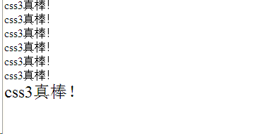
表单伪类
Enabled 匹配可编辑的表单,disabled 匹配被禁用的表单,checked匹配被选中的表单
focus匹配获焦的表单
结构性伪类
#wrap p :nth-child(1){} //找到wrap下的第一个子标签,并且标签名为p
#wrap p :nth-child(1){} //找到wrap下的所有子元素,并且选择此顺序下的第一个p子标签
*:first child{} //只要是html文档的第一个儿子 ...<head>标签,<body>里面的第一个子标签
P:only chid{} 只要p标签作为一个独生子 p:first-child:last-child{}
P:first-of-child p作为第一个孩子
p:first-of-type p作为孩子中的第一个
自定义字体
@font-face{
Font-family:”name”;//所指定字体名字
Src:url(font/.....);
}
- 准备一张矢量图
- 和不同的字符绑定 Font Lab
- 通过站点生成一个字体 http://www.fontquirrel.com
盒模型
<!DOCTYPE html>
<html>
	<head>
		<meta charset="utf-8" />
		<title></title>
		<style>
			*{
				margin:0;
				padding:0;
			}
			#test{
				position:absolute;
				left:0;
				right: 0;
				top:0;
				bottom: 0;
				margin:auto;
				width: 100px;
				height: 100px;
				background: pink;
				text-align: center;
				line-height: 100px;
				box-shadow: 类型 10px 10px 10px 0px black, 20px 20px 20px -10px yellow ;//宽 高 模糊程度 阴影放大 颜色
			}
		</style>
	</head>
	<body>
		<div id="test">
			test
		</div>
	</body>
</html>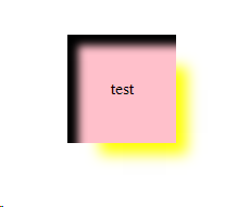
图片居中的办法
1.给body增加一个子元素  宽度不限制,高度100%(img,after为兄弟元素)


<!DOCTYPE html>
<html>
	<head>
		<meta charset="utf-8" />
		<title></title>
		<style>
			*{
				margin:0;
				padding:0;
			}
			html,body{
				height: 100%;
			}
			body{
				text-align: center;
			}
			body:after{
				content:"";
				display: inline-block;
				height: 100%;
				vertical-align: middle;
			}
			img{
				vertical-align:middle;
			}

		</style>
	</head>
	<body>
		<img src="img/1.jpeg"width="200",height="200">
	</body>
</html>
2.设置图片位置
 img{
				position:absolute;
				left:0;
				right: 0;
				top:0;
				bottom: 0;
				margin:auto;
			}
缩放页面
<!DOCTYPE html>
<html>
	<head>
		<meta charset="utf-8" />
		<title></title>
		<style>
			*{
				margin:0;
				padding:0;
			}
			html,body{
				height: 100%;
			}
			body{
				text-align: center;
			}
			body:after{
				content:"";
				display: inline-block;
				height: 100%;
				vertical-align: middle;
			}

			div{
				display: inline-block;
				width: 200px;
				height: 200px;
				background: pink;
				vertical-align: middle;
				resize:both;//长宽都可缩放
				overflow: auto;
			}
		</style>
	</head>
	<body>
		<div></div>
	</body>
</html>
拖动右下角可以进行缩放