版权声明:欢迎转载,可Chat交流,写博不易请标明出处: https://blog.csdn.net/JackJia2015/article/details/86541089
wx.showToast(Object object)
显示消息提示框
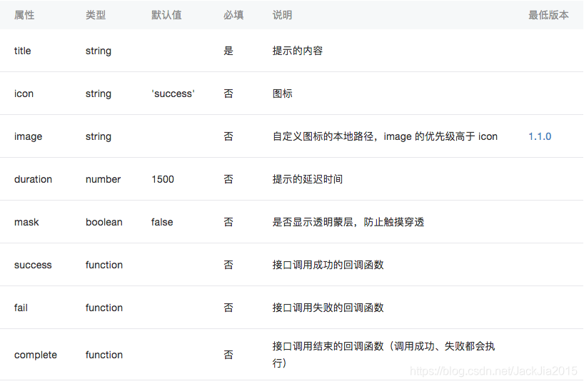
wx.showToast参数
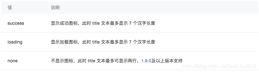
object.icon 的合法值
注:wx.showToast 应与 wx.hideToast 配对使用
wx.hideToast(Object object)
隐藏消息提示框
wx.hideToast参数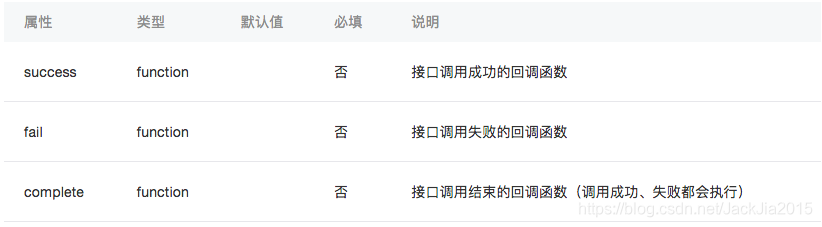
例如:
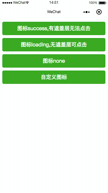
效果展示
首先找一张图片,命名CSDN.png

工程中在最外层创建image,拖入CSDN.png图片
代码
index.wxml
  <button bindtap="btnClick1" type="primary">图标success,有遮盖层无法点击</button>
  <button bindtap="btnClick2" type="primary">图标loading,无遮盖层可点击</button>
  <button bindtap="btnClick3" type="primary">图标none</button>
  <button bindtap="btnClick4" type="primary">自定义图标</button>
index.wxss
button{
  margin: 20rpx;
}
index.js
/*
  title    提示的内容
  icon     图标
  image    自定义图标的本地路径,image 的优先级高于 icon
  duration 示的延迟时间
  mask     是否显示透明蒙层,防止触摸穿透
  success  接口调用成功的回调函数
  fail     接口调用失败的回调函数
  complete 接口调用结束的回调函数(调用成功、失败都会执行)
*/
/* object.icon 的合法值
  success   显示成功图标,此时 title 文本最多显示 7 个汉字长度
  loading   显示加载图标,此时 title 文本最多显示 7 个汉字长度
  none  不显示图标,此时 title 文本最多可显示两行
*/

Page({
  data: {},
  btnClick1() {
    wx.showToast({
      title: '成功',
      icon: 'success',
      duration: 5000,
      mask: true
    })
  },
  btnClick2() {
    wx.showToast({
      title: '加载',
      icon: 'loading',
      duration: 2000,
      mask: false
    })
  },
  btnClick3() {
    wx.showToast({
      title: '不显示图标',
      icon: 'none',
      duration: 2000
    })
  },
  btnClick4() {
    wx.showToast({
      title: '自定义图标',
      image: '../../image/CSDN.png',
      icon: 'success',
      duration: 2000
    })
  },
})
wx.showLoading()
显示 loading 提示框。需主动调用 wx.hideLoading 才能关闭提示框
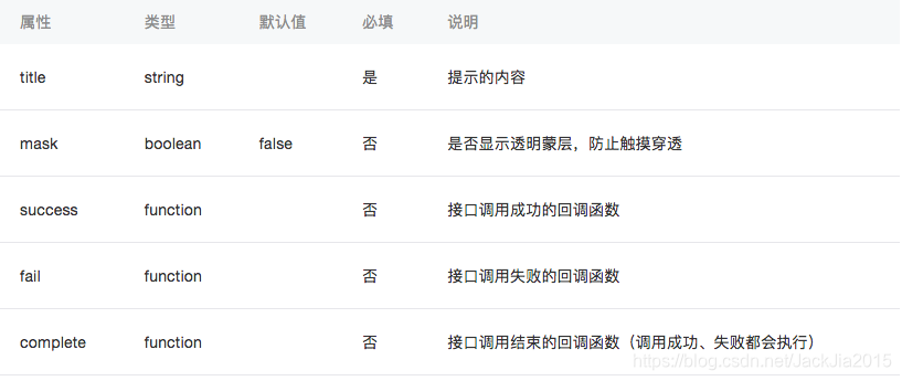
wx.showLoading参数
注:wx.showLoading 应与 wx.hideLoading 配对使用
wx.hideLoading(Object object)
隐藏 loading 提示框
例如:
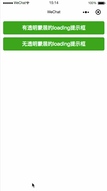
效果展示
代码
index.wxml
  <button bindtap="btnClick1" type="primary">有透明蒙层的loading提示框</button>

  <button bindtap="btnClick2" type="primary">无透明蒙层的loading提示框</button>
index.wxss
button{
  margin: 20rpx;
}
index.js
/*
  title    提示的内容
  mask     是否显示透明蒙层,防止触摸穿透
  success  接口调用成功的回调函数
  fail     接口调用失败的回调函数
  complete 接口调用结束的回调函数(调用成功、失败都会执行)
*/


Page({
  data: {},
  btnClick1() {
    wx.showLoading({
      title: '加载中1',
      mask:true
    })

    setTimeout(function () {
      wx.hideLoading()
    }, 5000)
  },
  btnClick2() {
    wx.showLoading({
      title: '加载中2',
      mask: false
    })

    setTimeout(function () {
      wx.hideLoading()
    }, 5000)
  },

})
wx.showModal(Object object)
显示模态对话框
wx.showModal参数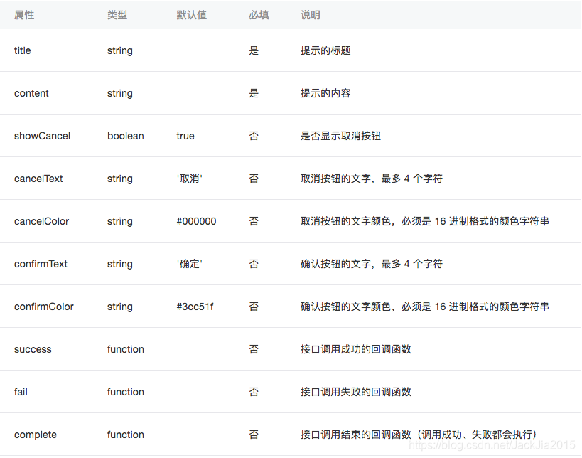
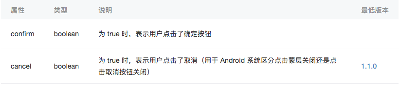
参数 Object res
例如:
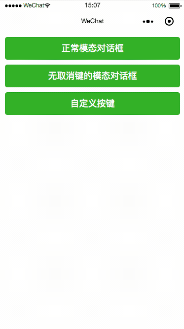
效果展示
代码
index.wxml
  <button bindtap="btnClick1" type="primary">正常模态对话框</button>
  <button bindtap="btnClick2" type="primary">无取消键的模态对话框</button>
  <button bindtap="btnClick3" type="primary">自定义按键</button>
index.wxss
button{
  margin: 20rpx;
}
index.js
/*
  title    提示的标题
  content  提示的内容
  showCancel:true 是否显示取消按钮
  cancelText             取消按钮的文字,最多 4 个字符
  cancelColor:#000000    取消按钮的文字颜色,必须是 16 进制格式的颜色字符串
  confirmText   确认按钮的文字,最多 4 个字符
  confirmColor  确认按钮的文字颜色,必须是 16 进制格式的颜色字符串
  success    接口调用成功的回调函数
  fail       接口调用失败的回调函数
  complete   接口调用结束的回调函数(调用成功、失败都会执行)
*/
/*
  confirm  为 true 时,表示用户点击了确定按钮
  cancel   为 true 时,表示用户点击了取消(用于 Android 系统区分点击蒙层关闭还是点击取消按钮关闭)
*/

Page({
  data: {},
  btnClick1() {
    wx.showModal({
      title: '提示',
      content: '这是一个模态对话框',
      success(res) {
        if (res.confirm) {
          console.log('用户点击确定')
        } else if (res.cancel) {
          console.log('用户点击取消')
        }
      }
    })
  },
  btnClick2() {
    wx.showModal({
      title: '提示',
      content: '这是一个无取消键的模态对话框',
      showCancel:false,
      success(res) {
        if (res.confirm) {
          console.log('用户点击确定')
        }
      }
    })
  },
  btnClick3() {
    wx.showModal({
      title: '提示',
      content: '这是一个自定义按键的模态对话框',
      cancelText: '算了吧',
      cancelColor: 'green',
      confirmText: '嗨!世界',
      confirmColor: 'red',
      success(res) {
        if (res.confirm) {
          console.log('嗨!世界')
        } else if (res.cancel) {
          console.log('算了吧')
        }
      }
    })
  },

})
wx.showActionSheet(Object object)
显示操作菜单
wx.showActionSheet参数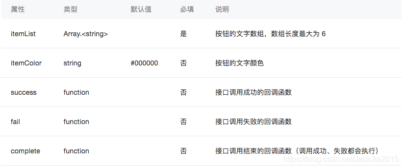
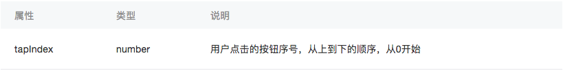
object.success 回调函数
例如:
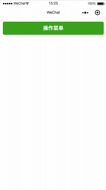
效果展示
代码
index.wxml
<button bindtap="btnClick1" type="primary">操作菜单</button>
index.wxss
button{
  margin: 20rpx;
}
index.js
/*
  itemList  Array 按钮的文字数组,数组长度最大为 6
  itemColor:#000000  钮的文字颜色
  success    接口调用成功的回调函数
  fail       接口调用失败的回调函数
  complete   接口调用结束的回调函数(调用成功、失败都会执行)
*/
Page({
  data: {},
  btnClick1() {
    wx.showActionSheet({
      itemList: ['A', 'B', 'C'],
      itemColor: 'red',
      success(res) {
        console.log(res.tapIndex)
      },
      fail(res) {
        console.log(res.errMsg)
      }
    })
  },
})
注:
wx.showLoading 和 wx.showToast 同时只能显示一个wx.showLoading 应与 wx.hideLoading 配对使用wx.showToast 应与 wx.hideToast 配对使用Android 6.7.2 以下版本,点击取消或蒙层时,回调 fail, errMsg 为 "fail cancel";Android 6.7.2 及以上版本 和 iOS 点击蒙层不会关闭模态弹窗,所以尽量避免使用「取消」分支中实现业务逻辑