Blink Coordinate Spaces
Blink Coordinate Spaces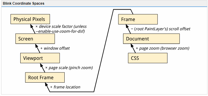
Types of ZoomThere are two types of zoom in Chromium: Browser Zoom and Pinch-Zoom.
Browser zoom is what you get by using Ctrl+/- or the zoom buttons in the
 menu. It changes the size of a CSS pixel relative to a device independent pixel and so it will cause page layout to change. Throughout Blink, Browser-zoom is referred to as “Page Zoom” or “Zoom” more generally. menu. It changes the size of a CSS pixel relative to a device independent pixel and so it will cause page layout to change. Throughout Blink, Browser-zoom is referred to as “Page Zoom” or “Zoom” more generally.
Pinch-zoom is activated by using a pinch gesture on a touchscreen. It scales the surface the web page is rendered onto and so it does not cause a relayout of the page. Throughout Blink, Pinch-zoom is referred to as “Page Scale”.
Device Independent Pixels (DIPs): Modern devices sport high density displays (e.g. Apple’s Retina). In order to keep the UI at a comfortably readable size we scale it up based on the density of the display. This scaling factor is called the
device pixel ratio in web APIs and
device scale factor in Chromium code. A UI will always be the same size in DIPs regardless of how many pixels are actually used to display it. To go from physical pixels to DIPs we divide the physical pixel dimensions by the device scale factor.
CSS pixels: CSS defines its own pixel type that is also independent of physical pixels. When there is no Browser-Zoom or Pinch-Zoom applied, CSS pixels and DIPs are equivalent. However, browser zoom can make CSS pixels bigger or smaller relative to DIPs. You may come across the term
un-zoomed CSS pixel below and in code. This refers to the fact that these pixels do not have
browser zoom applied (but they do have
pinch-zoom applied). I.e. Converting from frame-space (which is in un-zoomed CSS pixels) to Viewport using something like FrameView::frameToViewport will not apply the browser zoom.
A note about --use-zoom-for-dsf
The --use-zoom-for-dsf flag is used to have Blink use CSS based browser-zoom (the same kind as applied by Ctrl+/-) for screen-density based UI scaling. When this flag is passed, Blink doesn't scale anything using the device scale factor (and ensures it's set to 1) and instead boosts the page zoom factor by the requested amount.
This flag is currently shipped on all Aura platforms (ChromeOS, Linux, Windows), work is ongoing to bring it to Android, and remains unshipped on Mac.
Coordinate Spaces
Note that the conversion methods between these spaces do not apply browser zoom. To go from CSS pixels to Document Content, FrameView Content, or Frame space you must first multiply by the browser-zoom scale factor.
Document
The coordinate space of the current FrameView's document content, in un-zoomed CSS pixels. The origin is the top left corner of the Frame’s document content. In Web/Javascript APIs this is referred to as "page coordinates" (e.g. MouseEvent.pageX) though there it is in CSS pixels (i.e. browser zoom applied). Because coordinates in this space are relative to the document origin, scrolling the frame will not affect coordinates in this space.
Frame
The coordinate space of the current FrameView in un-zoomed CSS pixels. The origin is the top left corner of the frame. Therefore, scrolling the frame will change the "frame-coordinates" of elements on the page. This is the same as document coordinates except that Frame coordinates take the Frame’s scroll offset into account. In Web/Javascript APIs this is referred to as "client coordinates" (e.g. MouseEvent.clientX) though there it is in CSS pixels (i.e. browser zoom applied).
Root Frame
The Frame coordinates of the top level (i.e. main) frame. This frame contains all the other child frames (e.g. elements create frames on a page).
(Visual) Viewport
The coordinate space of the visual viewport as seen by the user, in DIPs. The origin is at the top left corner of the browser view (Window or Screen). The difference between Viewport and RootFrame is the transformation applied by pinch-zoom. This is generally what you'd use to display something relative to the user's Window or Screen.
Screen
The final screen space on the user's device, relative to the top left corner of the screen (i.e. if we're in a Window, this will include the window's offset from the top left of the screen). Note that this is in DIPs rather than physical pixels.
Web-exposed input co-ordinate spaces
To see exactly how some of the above co-ordinate spaces are exposed to JavaScript in input events see
https://rbyers.github.io/inputCoords.html.
|