第一步:先写好重置的样式。直接复制粘贴即可
    @media all and (max-width: 320px){
        html{
            font-size: 12px;
        }
    }
    @media all and (min-width: 321px) and (max-width: 375px){
        html{
            font-size: 14px;
        }
    }
    @media all and (min-width:376px){
        html{
            font-size: 16px;
        }
    }
@charset "utf-8";
html,body,ul,li,ol,dl,dd,dt,p,h1,h2,h3,h4,h5,h6,form,fieldset,legend,img,input,figure,figcaption{margin:0;padding:0;}
section,article,aside,header,footer,main,nav,hgroup{display:block;}
a,u{text-decoration:none;}
em,i{font-style:normal;}
b,strong{font-weight:normal;}
ul,ol,li{list-style:none;}
h1,h2,h3,h4,h5,h6{font-size:16px;font-weight:normal;}
body{font-family: "微软雅黑"}
input{outline:none;}
img{border:0;display:block;}写移动端另外加上的
*{box-sizing:border-box;}
body,html{height:100%;}
body{display: flex;flex-direction: column;}
在head里,style外需加上下面一句。
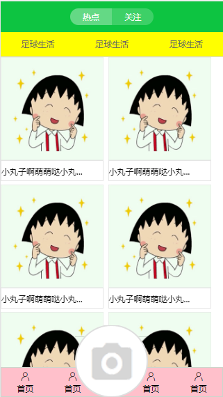
<meta name="viewport" content="width=device-width,initial-scale=1.0,minimum-scale=1.0,maximum-scale=1.0,user-scalable=no"/>第二步:写头部
头部html
    <header>
            <span>热点</span>
            <span>关注</span>
    </header>
头部style
    header{
        height:3.67rem;
        background: #0dc441;
        display: flex;
        justify-content: center;
        align-items: center;
    }
    header span{
        width: 5.04rem;
        height: 2.04rem;
        background: gray;
        color:#fff;
        text-align: center;
        line-height: 2.04rem;
    }
两个span的共同点写完了,接着分别微调不一样的地方
    header span:nth-child(1){
        border-radius: 1rem 0 0 1rem;
        background: #64d985;
    }
    header span:nth-child(2){
        border-radius: 0 1rem 1rem 0;
        background: #3dd067;
    }
第三部,写导航nav
导航html。这里的class类名是点击效果。因为还没涉及js,暂时就先写成这样
    <nav>
            <li class="active">足球生活</li>
            <li>足球生活</li>
            <li>足球生活</li>
    </nav>
导航style。因为每个li宽度一样,所以可以给nav定义成弹性盒,然后在主轴分散对齐,侧轴居中对齐。随后做了个点击后变化的效果
    nav{
        height: 2.96rem;
        display: flex;
        background: yellow;
        border-bottom: 1px solid #d9d9d9;
    }
    nav li{
        flex: 1;
        line-height: 2.96rem;
        text-align: center;
        color:#666666;
    }
    nav li:active{
        color: #0dc441;
        border-bottom: 2px solid #0dc441;
    }
第四部:写底部。因为中间板块的高度不可以固定,所以先写好底部。之后再给中间板块加上flex:1,将剩余空间全分配给它。
底部html
    <footer>
            <div>
                <span class="iconfont icon-wode"></span>
                <i>首页</i>
            </div>
            <div>
                <span class="iconfont icon-wode"></span>
                <i>首页</i>
            </div>
            <div>
                <img src="images/xiangji_03.png" alt="">
            </div>
            <div>
                <span class="iconfont icon-wode"></span>
                <i>首页</i>
            </div>
            <div>
                <span class="iconfont icon-wode"></span>
                <i>首页</i>
            </div>
    </footer>
##底部style footer{
height: 3.625rem;
background: pink;
}
footer{
display: flex;
justify-content: space-around;
border: 1px solid #cbd7cc;
}
footer div{
height: 3.625rem;
display: flex;
flex-direction: column;
align-items: center;
justify-content: center;
}
footer div:nth-child(3){
position: relative;
}
footer div:nth-child(3) img{
position: absolute;
bottom: 0;
}第五步:写主要内容板块。光给main分配剩余空间还不够,中间板块的内容还是会把头和底挤掉。需得给article也加弹性盒。当写好之后,发现中间板块没法滑动,需得在main那加上overflow:auto
    <main>
        <article>
                <figure>
                    <img src="images/03index_0_02.jpg" alt="">
                    <figcaption>小丸子啊萌萌哒小丸...</figcaption>
                </figure>

        </article>
    </main>
main{
flex: 1;
overflow: auto;
}
main article{
display: flex;
flex-wrap: wrap;
justify-content: space-between;
}
main figure{
width: 49%;
display: flex;
flex-direction: column;
margin-bottom: 0.4rem;
}
main figure img{
width: 100%;
}
main figure figcaption{
height: 2.5rem;
border:1px solid #e5e5e5;
line-height: 2.5rem;
}
完!