10 种css 水平垂直居中方法
参考地址:https://mp.weixin.qq.com/s/uTnMr4lv_Hrlt2TH9A01gA
(直接网上搜索到的地址,人家整理的比较好)
编写该博文仅仅作为梳理,巩固学习,加强记忆。
场景一:居中元素宽高已知
- absolute + 负 margin
- absolute + margin auto
- absolute + calc
场景二:居中元素宽高未知
- absolute + transform
- line-height
- writing-mode
- table
- css-table
- flex
- grid
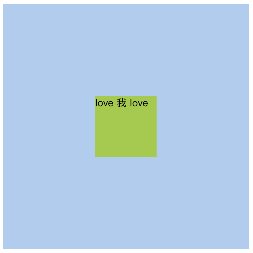
html 代码
<div class='wrapper'>
  <div class='box'>love 我 love</div>
</div>
场景一:居中元素宽高已知
大小&颜色
div.wrapper {
  width: 400px;
  height: 400px;
  background: #abcdef;
}
div.box {
  width: 100px;
  height: 100px;
  background: yellowgreen;
}
效果
1. absolute + 负margin
.wrapper {
  position: relative;
}
.box {
  margin-top: -50px;
  margin-left: -50px;
  position: absolute;
  top: 50%;
  left: 50%;
}
2. absolute + margin auto
.wrapper {
  position: relative;
}
.box {
  position: absolute;
  top: 0;
  left: 0;
  right: 0;
  bottom: 0;
  margin: auto;
}
3. absolute + calc
.wrapper {
  position: relative;
}
.box {
  position: absolute;
  top: calc(200px - 50px); // 或 calc(50% - 50px);
  left: calc(200px - 50px); // 或 calc(50% - 50px);
}
场景二:居中元素宽高未知
大小&颜色
div.wrapper {
  width: 400px;
  height: 400px;
  background: #abcdef;
}
div.box {
  background: yellowgreen;
}
效果

1. absolute + transform
.wrapper {
  position: relative;
}
.box {
  position: absolute;
  top: 50%;
  left: 50%;
  transform: translate(-50%, -50%);
}
2. line-height
.wrapper {
  line-height: 400px;
  text-align: center;
  font-size: 0;
}
.box {
  font-size: 16px;
  display: inline-block;
  line-height: initial;
}
3. writing-mode
稍有些复杂,可以参看参考网址中的demo:
http://yanhaijing.com/vertical-center/writing-mode.html
4. table标签
<table>
	<tbody>
		<tr>
			<td class="wrapper">
				<div class="box">love 我 love</div>
			</td>
		</tr>
	</tbody>
</table>
.wrapper {
   width: 400px;
   height: 400px;
   background: #abcdef;
   text-align: center;
 }

 .box {
   display: inline-block;
   background: yellowgreen;
 }
5. css-table
<div class='wrapper'>
	<div class='box'>love 我 love</div>
</div>
.wrapper {
	width: 400px;
	height: 400px;
	background: #abcdef;
	display: table-cell;
	text-align: center;
	vertical-align: middle;
}

.box {
	display: inline-block;
	background: yellowgreen;
}
6. flex
.wrapper {
	display: flex;
	align-items: center;
	justify-content: center;
}
兼容性说明:移动端均基本都可以使用flex;pc端需考虑兼容性
flex 兼容性写法:
display: -webkit-box;
display: -webkit-flex;
display: flex;
-webkit-box-pack: center;
-webkit-justify-content: center;
justify-content: center;
-webkit-box-align: center;
-webkit-align-items: center;
align-items: center;
7. grid
.wrapper {
	width: 400px;
	height: 400px;
	background: #abcdef;
	display: grid;
}

.box {
	background: yellowgreen;
	align-self: center;
	justify-self: center;
}
总结
- PC 端有兼容性要求,宽高固定,推荐 absolute + 负 margin
- PC 端有兼容要求,宽高不固定,推荐 css-table
- PC 端无兼容性要求,推荐 flex
- 移动端推荐使用 flex
flex 兼容性方案:https://yanhaijing.com/css/2016/08/21/flex-practice-on-mobile/
参考地址:https://mp.weixin.qq.com/s/uTnMr4lv_Hrlt2TH9A01gA
(感谢原作者分享)