Scaffold
实现基本的材料设计视觉布局结构。
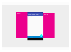
此课程提供了用于显示抽屉,短文本和底部表的API。
要显示snackbar或持久底部表,请通过Scaffold.of获取当前BuildContext的ScaffoldState,然后使用ScaffoldState.showSnackBar和ScaffoldState.showBottomSheet函数。
也可以看看:
- AppBar, 这是一个水平条,通常使用appBar属性显示在应用程序的顶部.
- BottomAppBar,这是一个水平条,通常使用bottomNavigationBar属性显示在应用程序的底部 .
- FloatingActionButton, 这是一个圆形按钮,通常使用floatingActionButton属性显示在应用程序的右下角.
- Drawer, 这是一个垂直面板,通常使用drawer属性显示在身体的左侧(通常隐藏在手机上).
- BottomNavigationBar, 这是一个水平按钮阵列,通常使用bottomNavigationBar属性在应用程序的底部显示.
- SnackBar, 这是使用ScaffoldState.showSnackBar方法通常显示在应用程序底部附近的临时通知.
- BottomSheet, 这是通常显示在应用底部附近的叠加层。 底部表单可以是持久性的,在这种情况下,它使用ScaffoldState.showBottomSheet方法或模态显示,在这种情况下,它使用showModalBottomSheet函数显示.
- ScaffoldState, 这是与这个小部件相关的状态.
- material.google.com/layout/structure.html
继承结构
Object>Diagnosticable>DiagnosticableTree>Widget>StatefulWidget>Scaffold
构造函数
Scaffold({Key key, PreferredSizeWidget appBar, Widget body, Widget floatingActionButton, List<Widget> persistentFooterButtons, Widget drawer, Widget endDrawer, Widget bottomNavigationBar, Color backgroundColor, bool resizeToAvoidBottomPadding: true, bool primary: true })
为材料设计部件创建视觉展台.
const
属性
应用程序栏显示在展台的顶部.
final
作为整个展示台基础的Material小部件的颜色. [...]
final
展示台的主要内容. [...]
final
底部导航栏显示在展示台的底部. [...]
final
面板显示在主体的侧面,通常隐藏在移动设备上。 从左到右(TextDirection.ltr)或从右到左(TextDirection.rtl)滑入 [...]
final
面板显示在主体的侧面,通常隐藏在移动设备上。 从左到右(TextDirection.ltr)或从右到左(TextDirection.rtl)滑入 [...]
final
一个按钮显示在主体上方,位于右下角. [...]
final
persistentFooterButtons → List<Widget>
显示在展示台底部的一组按钮. [...]
final
这个展示台是否显示在屏幕的顶部. [...]
final
resizeToAvoidBottomPadding → bool
主体(和其它浮动部件)是否应该自己调整大小以避免窗口的底部填充. [...]
final
hashCode → int read-only, inherited
runtimeType → Type read-only, inherited
方法
在树中的给定位置为此部件创建可变状态. [...]
createElement() → StatefulElement inherited
debugDescribeChildren() → List<DiagnosticsNode> @protected, inherited
debugFillProperties(DiagnosticPropertiesBuilder description) → void inherited
noSuchMethod(Invocation invocation) → dynamic inherited
toDiagnosticsNode({String name, DiagnosticsTreeStyle style }) → DiagnosticsNode inherited
toString({DiagnosticLevel minLevel: DiagnosticLevel.debug }) → String inherited
toStringDeep({String prefixLineOne: '', String prefixOtherLines, DiagnosticLevel minLevel: DiagnosticLevel.debug }) → String inherited
toStringShallow({String joiner: ', ', DiagnosticLevel minLevel: DiagnosticLevel.debug }) → String inherited
toStringShort() → String inherited
操作符
operator ==(other) → bool inherited
静态方法
geometryOf(BuildContext context) → ValueListenable<ScaffoldGeometry>
返回给定上下文的最近展示台祖先的ScaffoldGeometry的ValueListenable. [...]
hasDrawer(BuildContext context, { bool registerForUpdates: true }) → bool
最接近的上下文中的展示台是否有抽屉. [...]
of(BuildContext context, { bool nullOk: false }) → ScaffoldState
来自该类的最接近实例的状态,它包含给定的上下文. [...]
setFloatingActionButtonNotchFor(BuildContext context, ComputeNotch computeNotch) → VoidCallback
为给定上下文中最近的Scaffold祖先设置ScaffoldGeometry.floatingActionButtonNotch,如果存在的话. [...]
Appbar
一个Material Design应用程序栏。

应用程序栏由工具栏和其它可能的部件(如TabBar和FlexibleSpaceBar)组成。
应用栏通常会将一个或多个常见actions用IconButton显示出来,可选择使用PopupMenuButton作为不太常见的操作(有时称为“溢出菜单”)。
应用程序栏通常用在Scaffold.appBar属性中,该属性将应用程序栏作为固定高度的小部件放置在屏幕的顶部。对于可滚动的应用程序栏,请参阅SliverAppBar,该应用程序将AppBar嵌入长条中以用于CustomScrollView。
AppBar在底部(如果有)上方显示工具栏部件,leading,标题和操作。底部通常用于TabBar。 如果指定了一个flexibleSpace部件,那么它将堆叠在工具栏和底部部件的后面。下图显示了当书写语言是从左到右(例如英语)时,每个插槽出现在工具栏中的位置:
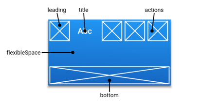
如果省略了leading小部件,但AppBar位于带有抽屉的展示台中,则会插入一个按钮以打开抽屉。否则,如果最近的Navigator有所有以前的路线,则插入BackButton替代。这种行为可以通过设置automatedImplyLeading为false来关闭。在这种情况下,一个空的leading部件将导致在middle/title部件中开始展开。
示例代码
new AppBar(
  title: new Text('My Fancy Dress'),
  actions: <Widget>[
    new IconButton(
      icon: new Icon(Icons.playlist_play),
      tooltip: 'Air it',
      onPressed: _airDress,
    ),
    new IconButton(
      icon: new Icon(Icons.playlist_add),
      tooltip: 'Restitch it',
      onPressed: _restitchDress,
    ),
    new IconButton(
      icon: new Icon(Icons.playlist_add_check),
      tooltip: 'Repair it',
      onPressed: _repairDress,
    ),
  ],
)
也可以看看:
- Scaffold, 它在其Scaffold.appBar插槽中显示AppBar.
- SliverAppBar, 它使用AppBar提供一个灵活的应用程序栏,可以在CustomScrollView中使用.
- TabBar, 如果屏幕有多个页面排列在选项卡中,它通常放置在AppBar的bottom插槽中.
- IconButton,它用于在应用栏上显示按钮的actions.
- PopupMenuButton, 通过actions在应用栏上显示一个弹出式菜单.
- FlexibleSpaceBar, 当应用栏可以展开和折叠时,它与flexibleSpace一起使用.
- material.google.com/layout/structure.html#structure-toolbars
继承结构
Object>Diagnosticable>DiagnosticableTree>Widget>StatefulWidget>AppBar
实现
构造函数
AppBar({Key key, Widget leading, bool automaticallyImplyLeading: true, Widget title, List<Widget> actions, Widget flexibleSpace, PreferredSizeWidget bottom, double elevation: 4.0, Color backgroundColor, Brightness brightness, IconThemeData iconTheme, TextTheme textTheme, bool primary: true, bool centerTitle, double titleSpacing: NavigationToolbar.kMiddleSpacing, double toolbarOpacity: 1.0, double bottomOpacity: 1.0 })
创建材质设计应用栏. [...]
属性
部件在标题部件后显示. [...]
final
automaticallyImplyLeading → bool
控制我们是否应该尝试暗示leading部件为空. [...]
final
用于应用栏材质的颜色。 通常这应该与brightness,iconTheme,textTheme一起设置. [...]
final
此部件显示在应用程序栏的底部. [...]
final
应用栏底部的不透明度如何. [...]
final
应用栏材质的亮度。 通常这是与backgroundColor,iconTheme,textTheme一起设置. [...]
final
标题是否应该居中. [...]
final
放置此应用栏的z坐标。 这将控制应用程序栏下方阴影的大小. [...]
final
此部件堆叠在工具栏和TabBar后面。 它的高度将与应用栏的整体高度相同. [...]
final
用于应用程序栏图标的颜色,不透明度和大小。 通常这是与backgroundColor,亮度,textTheme一起设置的. [...]
final
标题前显示的部件. [...]
final
高度为kToolbarHeight和bottom部件首选高度之和的大小. [...]
final
是否在屏幕顶部显示此应用栏. [...]
final
用于应用栏中文字的印刷风格。 通常这与亮度backgroundColor,iconTheme一起设置. [...]
final
Appbar中显示的主要部件. [...]
final
标题内容在横轴上的间距。即使没有主要内容或操作,也会应用此间距。如果您希望标题占用所有可用空间,请将此值设置为0.0. [...]
final
应用栏的工具栏部分的透明度如何. [...]
final
hashCode → int read-only, inherited
runtimeType → Type read-only, inherited
方法
createState() → _AppBarState
在树中的给定位置为此小部件创建可变状态. [...]
createElement() → StatefulElement inherited
debugDescribeChildren() → List<DiagnosticsNode> @protected, inherited
debugFillProperties(DiagnosticPropertiesBuilder description) → void inherited
noSuchMethod(Invocation invocation) → dynamic inherited
toDiagnosticsNode({String name, DiagnosticsTreeStyle style }) → DiagnosticsNode inherited
toString({DiagnosticLevel minLevel: DiagnosticLevel.debug }) → String inherited
toStringDeep({String prefixLineOne: '', String prefixOtherLines, DiagnosticLevel minLevel: DiagnosticLevel.debug }) → String inherited
toStringShallow({String joiner: ', ', DiagnosticLevel minLevel: DiagnosticLevel.debug }) → String inherited
toStringShort() → String inherited
操作符
operator ==(other) → bool inherited
FlutterLogo
Flutter标志,以窗口小部件的形式。 这个小部件遵守IconTheme。

也可以看看:
- IconTheme, 为图标提供环境配置.
- Icon, 用于显示图标材质设计图标库.
- ImageIcon,用于显示来自AssetImages或其他ImageProviders的图标.
继承结构
Object>Diagnosticable>DiagnosticableTree>Widget>StatelessWidget>FlutterLogo
FlutterLogo({Key key, double size, MaterialColor colors, Color textColor: const Color(0xFF616161), FlutterLogoStyle style: FlutterLogoStyle.markOnly, Duration duration: const Duration(milliseconds: 750), Curve curve: Curves.fastOutSlowIn })
创建一个绘制Flutter标志的小部件. [...]
const
属性
默认情况下用于绘制徽标的色样,Colors.blue. [...]
final
标志动画的曲线如果样式,颜色,文字颜色发生变化.
final
动画的时间长度,如果样式,颜色或textColor属性发生更改.
final
标志的大小以逻辑像素表示. [...]
final
是否以及在何处绘制“Flutter”文本。 默认情况下,只绘制徽标本身.
final
如果样式为FlutterLogoStyle.horizontal或FlutterLogoStyle.stacked,则用于在徽标上绘制“Flutter”文本的颜色。 适当的颜色是常量颜色(0xFF616161)(中等灰度),在白色背景下.
final
hashCode → int read-only, inherited
runtimeType → Type read-only, inherited
方法
build(BuildContext context) → Widget
介绍由此小部件代表的用户界面的一部分. [...]
createElement() → StatelessElement inherited
debugDescribeChildren() → List<DiagnosticsNode> @protected, inherited
debugFillProperties(DiagnosticPropertiesBuilder description) → void inherited
noSuchMethod(Invocation invocation) → dynamic inherited
toDiagnosticsNode({String name, DiagnosticsTreeStyle style }) → DiagnosticsNode inherited
toString({DiagnosticLevel minLevel: DiagnosticLevel.debug }) → String inherited
toStringDeep({String prefixLineOne: '', String prefixOtherLines, DiagnosticLevel minLevel: DiagnosticLevel.debug }) → String inherited
toStringShallow({String joiner: ', ', DiagnosticLevel minLevel: DiagnosticLevel.debug }) → String inherited
toStringShort() → String inherited
操作符
operator ==(other) → bool inherited
Placeholder
一个部件绘制一个框,表示有一天将添加其它部件的位置。
个部件在开发过程中非常有用,用于指示接口尚未完成。
默认情况下,占位符的大小适合其容器。 如果占位符处于无界空间,它将根据给定的fallbackWidth和fallbackHeight自行调整大小。
继承结构
Object>Diagnosticable>DiagnosticableTree>Widget>StatelessWidget>Placeholder
构造函数
Placeholder({Key key, Color color: const Color(0xFF455A64), double strokeWidth: 2.0 , double fallbackWidth: 400.0, double fallbackHeight: 400.0 })
创建一个绘制框的部件.
const
Properties
The color to draw the placeholder box.
final
占位符处于高度无限的情况下要使用的高度. [...]
final
The width to use when the placeholder is in a situation with an unbounded width. [...]
final
占位符框中行的宽度.
final
hashCode → int read-only, inherited
runtimeType → Type read-only, inherited
方法
build(BuildContext context) → Widget
介绍由此小部件代表的用户界面的一部分. [...]
createElement() → StatelessElement inherited
debugDescribeChildren() → List<DiagnosticsNode> @protected, inherited
debugFillProperties(DiagnosticPropertiesBuilder description) → void inherited
noSuchMethod(Invocation invocation) → dynamic inherited
toDiagnosticsNode({String name, DiagnosticsTreeStyle style }) → DiagnosticsNode inherited
toString({DiagnosticLevel minLevel: DiagnosticLevel.debug }) → String inherited
toStringDeep({String prefixLineOne: '', String prefixOtherLines, DiagnosticLevel minLevel: DiagnosticLevel.debug }) → String inherited
toStringShallow({String joiner: ', ', DiagnosticLevel minLevel: DiagnosticLevel.debug }) → String
inherited
toStringShort() → String inherited
操作符
operator ==(other) → bool inherited