由于图片的加载是在dom加载完成之后进行的,于是,在手机端浏览网页时,经常会看到页面刚打开时很多内容叠在一起,当图片加载完成后,页面会由于图片加载完成出现明显的抖动
针对这个问题,有以下几种解决方案
- 媒体查询+px
- rem
- vm
- padding
媒体查询+px
@media screen and(max - width: 320 px) {
    img {
        height: 50px;
    }
}
移动端设备种类繁多,媒体查询固然精准,但相应的是工作量的增加
rem
rem这个低调的单位随着webapp的兴起,俨然成为了手机端屏幕适配的最佳方案
img {
    height: 0.5rem;
}
但由于rem的小数像素问题,可能会导致1px偏差的产生,就看你是不是处女座了
vm
相对于视口的宽度或高度中较小的那个,其中最小的那个被均分为100单位的vm 算是比较完美的一个解决方案了,不过ios8以下及android4.4以下不支持padding
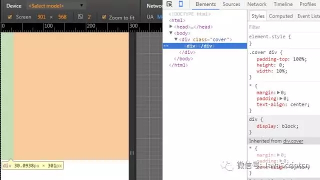
padding是可以百分比取值的,详见padding-properties(https://www.w3.org/TR/CSS2/box.html#padding-properties)The percentage is calculated with respect to the width of the generated box's containing block, even for 'padding-top' and 'padding-bottom'. If the containing block's width depends on this element, then the resulting layout is undefined in CSS 2.1.
即取值为百分比时,计算出来的padding边距是相对于其父元素的宽度计算的(margin类同),如下图:
那么,解决图片占位的问题就很简单了。
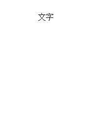
页面布局如下:
<style>
    * {
        margin: 0;
        padding: 0;
    }
    ul {
        overflow: hidden;
    }
    li {
        width: 50%;
        float: left;
        text-align: center;
    }
    img {
        width: 100%
    }
</style>
<ul>
    <li>
        <div class="cover">
            <img src="2222.png" alt="">
        </div>
        <div>
            文字
        </div>
    </li>
</ul>
这里使用伪元素替代div充当子元素,由于padding-top使图片距离cover顶部100%,用相对定位到顶端。
.cover {
    position: relative;
    font-size: 0;
    display: inline-block;
    width: 100%
}
.cover img {
    width: 100%;
    height: 100%;
    position: absolute;
    left: 0;
    top: 0;
}
.cover:after {
    content: '\20';
    padding-top: 100%;
    display: block;
}
页面最终效果如下:
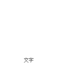
上述例子只适用于图片宽高1:1的情况,对于其他比例的图片需要修改padding-top值,例如宽高2:1的图片,padding-top改为50%即可