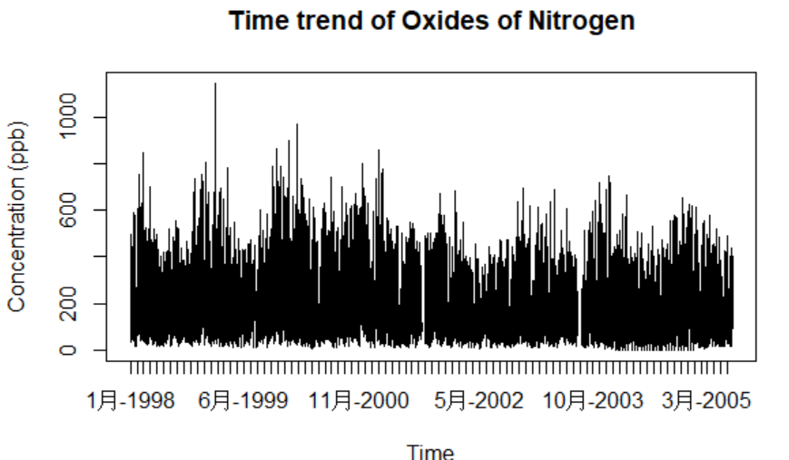
1.时间序列图
plot()函数
> air<-read.csv("openair.csv")
> plot(air$nox~as.Date(air$date,"%d/%m/%Y %H:%M"),  #把年月日时分秒转换成日期格式
+ type="l",
+ xlab="Time", ylab="Concentration (ppb)",
+ main="Time trend of Oxides of Nitrogen")

zoo()包
> library(zoo)
> plot(zoo(air$nox,as.Date(air$date,"%d/%m/%Y %H:%M")),   #zoo简化plot函数的参数设置
+ xlab="Time", ylab="Concentration (ppb)",
+ main="Time trend of Oxides of Nitrogen")

2.时间刻度可读化
> plot(air$nox~as.Date(air$date,"%d/%m/%Y %H:%M"),type="l",
+ xaxt="n",                                #不画X轴
+ xlab="Time", ylab="Concentration (ppb)",
+ main="Time trend of Oxides of Nitrogen")
> xlabels<-strptime(air$date, format = "%d/%m/%Y %H:%M")
> axis.Date(1,                            #设置X轴刻度显示位置
+ at=xlabels[xlabels$mday==1],            #设置刻度为每天一个刻度
+ format="%b-%Y")                         #设置标记格式
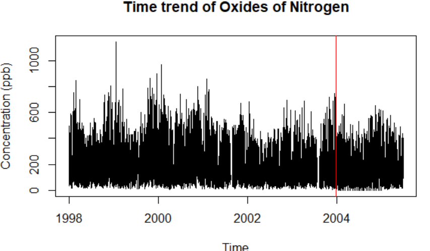
3.标记特定的时间事件
> plot(air$nox~as.Date(air$date,"%d/%m/%Y %H:%M"),type="l",
+ xlab="Time", ylab="Concentration (ppb)",
+ main="Time trend of Oxides of Nitrogen")
> abline(v=as.Date("25/12/2003","%d/%m/%Y"),col="red")    #在特定时间画垂直线
示例:股票数据图
> library(quantmod)
> library(tseries)
> aapl<-get.hist.quote(instrument = "aapl", quote = c("Cl", "Vol"))        #抓取苹果股票数据
> goog <- get.hist.quote(instrument = "goog", quote = c("Cl", "Vol"))      #抓取谷歌股票数据
> msft <- get.hist.quote(instrument = "msft", quote = c("Cl", "Vol"))      #抓取微软股票数据
> plot(msft$Close,main = "Stock Price Comparison",
+ ylim=c(0,800), col="red", type="l", lwd=0.5,
+ pch=19,cex=0.6, xlab="Date" ,ylab="Stock Price (USD)")
> lines(goog$Close,col="blue",lwd=0.5)
> lines(aapl$Close,col="gray",lwd=0.5)
> legend("top",horiz=T,legend=c("Microsoft","Google","Apple"),             #horiz=T图例水平摆开
+ col=c("red","blue","gray"),lty=1,bty="n")

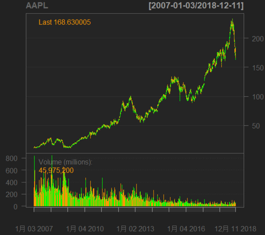
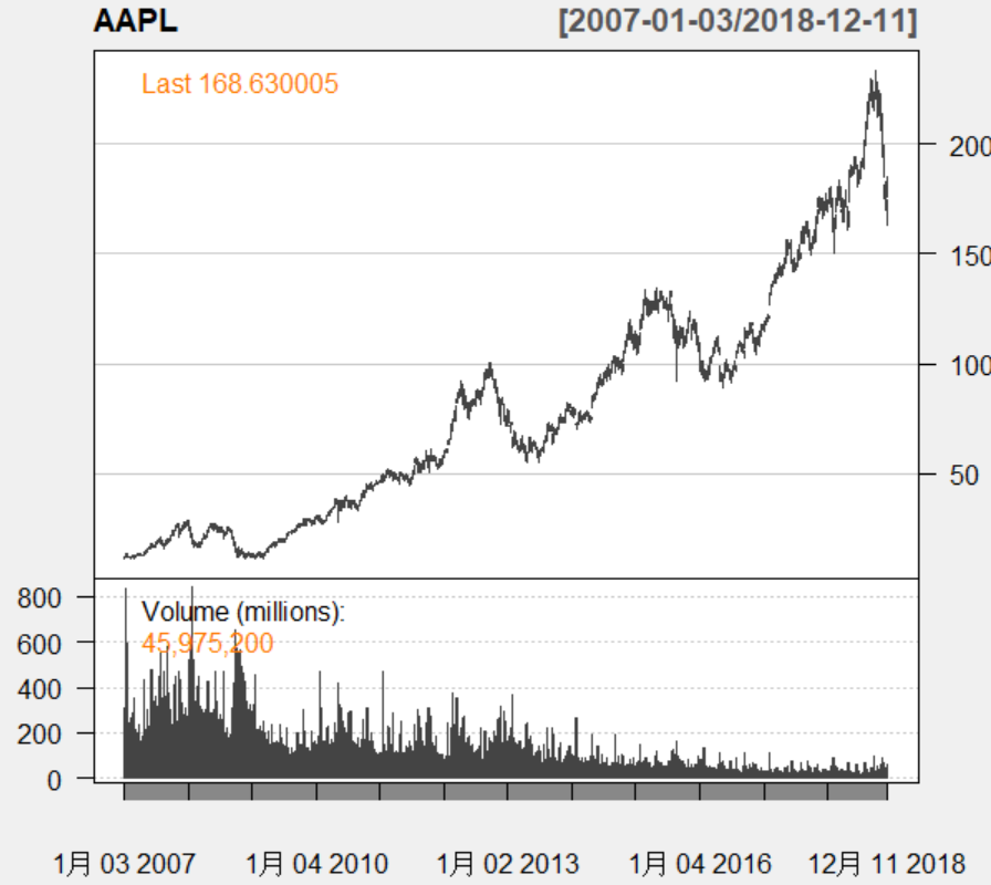
> getSymbols("AAPL",src="yahoo")
> barChart(AAPL)                       #画成交量与股价图
> candleChart(AAPL,theme="white")      #画蜡烛图