版权声明:本文为博主原创文章,未经博主允许不得转载 https://blog.csdn.net/qq_34578833/article/details/84563305
在
android studio中打开之前创建的
Hello World项目
一、布局控件
布局控件,顾名思义就是对你的页面提供布局方式,让你的app页面中的其他控件(例如文本控件,按钮控件)可以合理有序的安排位置。
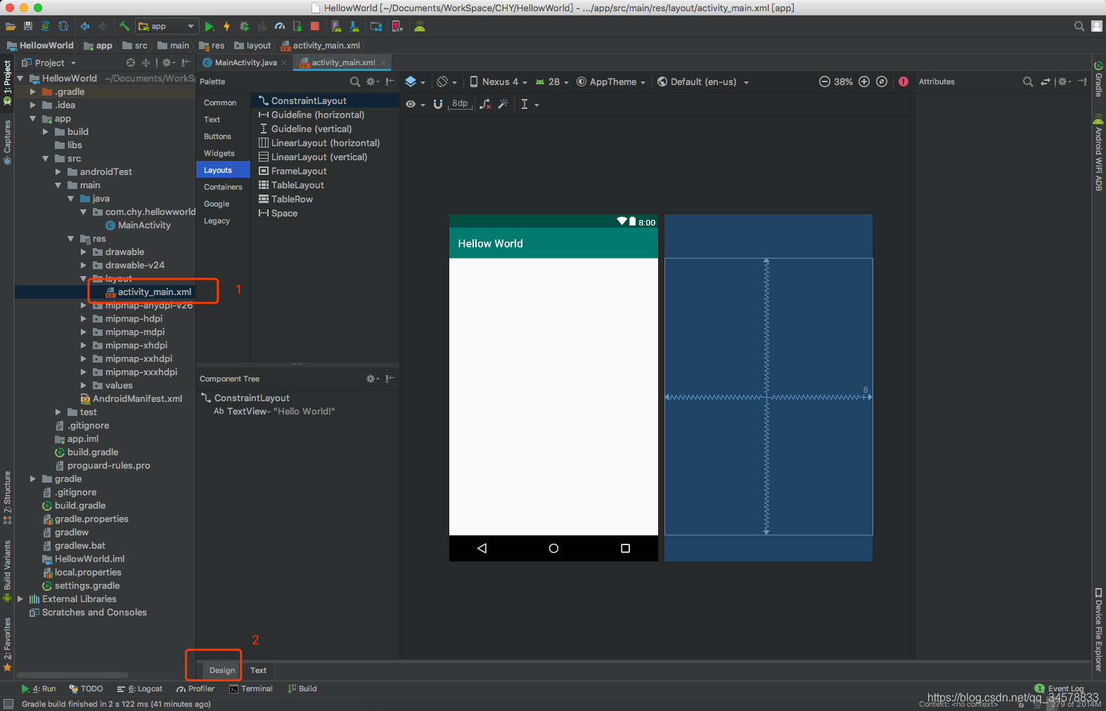
- 找到如下图所示的
activity_main.xml文件,并切换为Design的设计页面
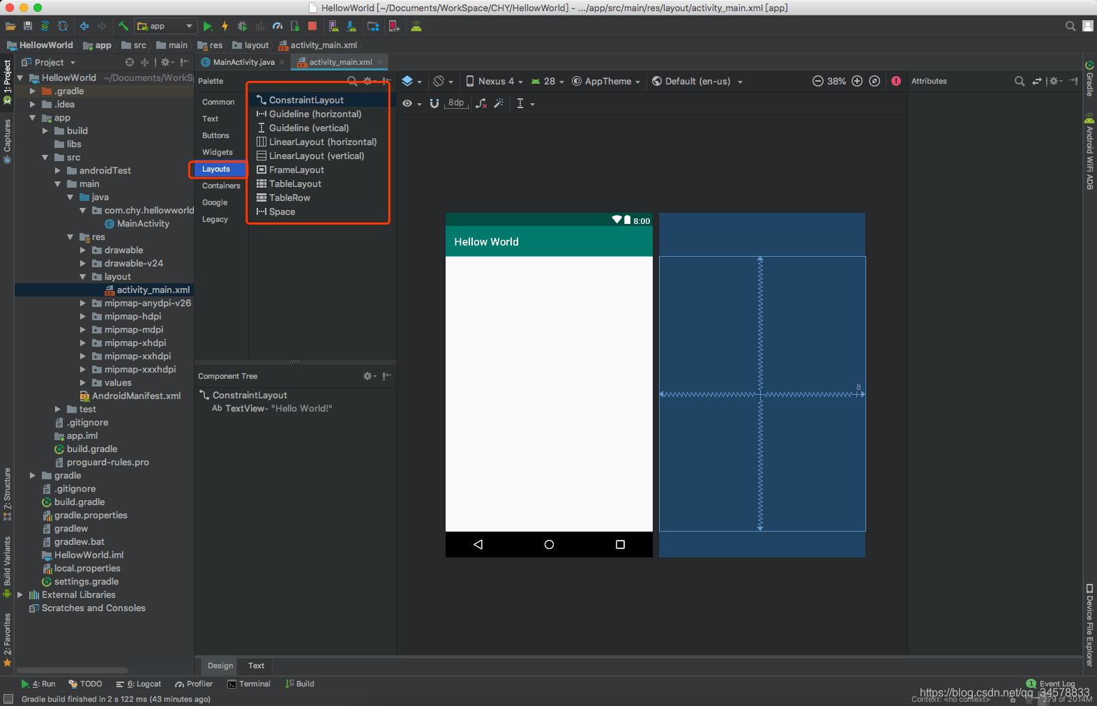
- 你会发现如下图所示有很多布局控件,但是我们常用的布局控件就是
FrameLayout,LinearLayout,ConstraintLayout,还有一个里面没有列出的RelativeLayout布局,但是ConstraintLayout完全可以替代RelativeLayout布局,所以这里就不介绍RelativeLayout布局了
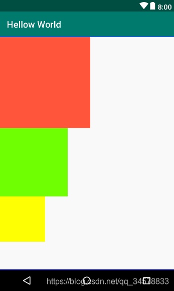
FrameLayout(帧布局)可以说是最为简单的一个布局,这个布局直接在屏幕上开辟出一块空白的区域,当我们往里面添加控件的时候,会默认把他们放到这块区域的左上角,而这种布局方式却没有任何的定位方式,所以它应用的场景并不多;帧布局的大小由控件中最大的子控件决定,如果控件的大小一样大的话,那么同一时刻就只能看到最上面的那个组件!后续添加的控件会覆盖前一个!虽然默认会将控件放置在左上角,但是我们也可以通过layout_gravity属性,指定到其他的位置!
FrameLayout的属性很少就两个,但是在说之前我们先介绍一个东西:
前景图像:永远处于帧布局最上面,直接面对用户的图像,就是不会被覆盖的图片。
两个属性:
android:foreground:设置改帧布局容器的前景图像
android:foregroundGravity:设置前景图像显示的位置
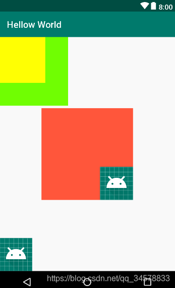
效果图如下图所示<?xml version="1.0" encoding="utf-8"?> <FrameLayout xmlns:android="http://schemas.android.com/apk/res/android" android:layout_width="match_parent" android:layout_height="match_parent" android:foreground="@mipmap/ic_launcher_round" android:foregroundGravity="left|bottom"> <TextView android:layout_width="200dp" android:layout_height="200dp" android:layout_gravity="center" android:foreground="@mipmap/ic_launcher_round" android:foregroundGravity="right|bottom" android:background="#FF6143" /> <TextView android:layout_width="150dp" android:layout_height="150dp" android:background="#7BFE00" /> <TextView android:layout_width="100dp" android:layout_height="100dp" android:background="#FFFF00" /> </FrameLayout>
LinearLayout(线性布局)是使用比较多的一个布局控件,通常用于控件垂直或者水平排序的页面,android:orientation=""这个属性就是控制垂直(android:orientation="vertical")或者水平(android:orientation="horizontal")排序,用的比较多的自身属性为android:gravity="",这个是控制子控件所在的位置,当然它还有很多通用属性,这里就不一一介绍了,有兴趣的可以向度娘提问。它的子控件用得最多的属性为android:layout_gravity="",这个是控制子控件自身相对父布局LinearLayout(线性布局)的位置。
水平排序:
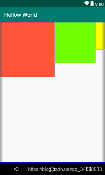
效果图<?xml version="1.0" encoding="utf-8"?> <LinearLayout xmlns:android="http://schemas.android.com/apk/res/android" android:layout_width="match_parent" android:orientation="horizontal" android:layout_height="match_parent"> <TextView android:layout_width="200dp" android:layout_height="200dp" android:background="#FF6143" /> <TextView android:layout_width="150dp" android:layout_height="150dp" android:background="#7BFE00" /> <TextView android:layout_width="100dp" android:layout_height="100dp" android:background="#FFFF00" /> </LinearLayout>
垂直排序:
效果图<?xml version="1.0" encoding="utf-8"?> <LinearLayout xmlns:android="http://schemas.android.com/apk/res/android" android:layout_width="match_parent" android:orientation="vertical" android:layout_height="match_parent"> <TextView android:layout_width="200dp" android:layout_height="200dp" android:background="#FF6143" /> <TextView android:layout_width="150dp" android:layout_height="150dp" android:background="#7BFE00" /> <TextView android:layout_width="100dp" android:layout_height="100dp" android:background="#FFFF00" /> </LinearLayout>
ConstraintLayout,扣心自问,这个布局我真的很少使用,为了避免误导大众,这里引用前辈的帖子Android新特性介绍,ConstraintLayout完全解析——
guolin,请见谅
二、文本控件
文本控件最常用的也就两个,TextView,EditText
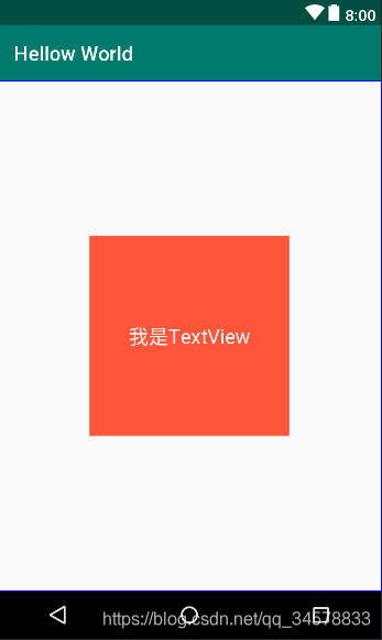
TextView,顾名思义就是文本视图,实际上它就是承载字符串的一个视图控件,使用方法如下所示,android:layout_width和android:layout_height一般使用wrap_content来进行自适应宽高,例如android:layout_width="wrap_content"和android:layout_height="wrap_content":
效果图<?xml version="1.0" encoding="utf-8"?> <LinearLayout xmlns:android="http://schemas.android.com/apk/res/android" android:layout_width="match_parent" android:layout_height="match_parent" android:gravity="center" android:orientation="horizontal"> <TextView android:layout_width="200dp"<!--设置文本控件所占宽度--> android:layout_height="200dp"<!--设置文本控件所占高度--> android:layout_gravity="center"<!--设置文本控件居于父控件的什么位置--> android:background="#FF6143"<!--设置文本控件的背景--> android:gravity="center"<!--设置文本居于文本控件的什么位置--> android:textColor="@android:color/white"<!--设置文本文字颜色--> android:textSize="20sp"<!--设置文本字号大小--> android:text="我是TextView" /><!--设置文本文字--> </LinearLayout>
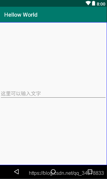
EditText,顾名思义就是编辑文本,实际上他就是一个编辑文本框视图控件,它是基于TextView衍生出来的一个控件,就是说TextView有的属性,它也有,TextView没有的属性,它都有。它的使用方法如下:
效果图如下<?xml version="1.0" encoding="utf-8"?> <LinearLayout xmlns:android="http://schemas.android.com/apk/res/android" android:layout_width="match_parent" android:layout_height="match_parent" android:gravity="center" android:orientation="horizontal"> <EditText android:layout_width="match_parent" android:layout_height="wrap_content" android:hint="这里可以输入文字"<!--提示文本--> android:textColorHint="@android:color/darker_gray"<!--提示文本的颜色--> android:inputType="text"/><!--文本输入类型,常用的就是textPassword、number、phone--> </LinearLayout>
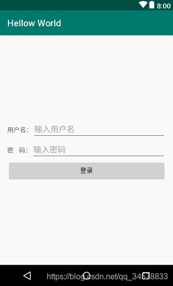
以下是TextView,EditText结合的一个简单的登录页面的例子
效果图如下:<?xml version="1.0" encoding="utf-8"?> <LinearLayout xmlns:android="http://schemas.android.com/apk/res/android" android:layout_width="match_parent" android:layout_height="match_parent" android:gravity="center" android:orientation="vertical" android:padding="16dp"> <LinearLayout android:layout_width="match_parent" android:layout_height="wrap_content" android:orientation="horizontal"> <TextView android:layout_width="wrap_content" android:layout_height="wrap_content" android:text="用户名:" android:textColorHint="@android:color/darker_gray" /> <EditText android:layout_width="match_parent" android:layout_height="wrap_content" android:hint="输入用户名" android:inputType="text" android:textColorHint="@android:color/darker_gray" /> </LinearLayout> <LinearLayout android:layout_width="match_parent" android:layout_height="wrap_content" android:orientation="horizontal"> <TextView android:layout_width="wrap_content" android:layout_height="wrap_content" android:text="密 码:" android:textColorHint="@android:color/darker_gray" /> <EditText android:layout_width="match_parent" android:layout_height="wrap_content" android:hint="输入密码" android:inputType="textPassword" android:textColorHint="@android:color/darker_gray" /> </LinearLayout> <Button android:layout_width="match_parent" android:layout_height="wrap_content" android:text="登录" /> </LinearLayout>
三、按钮控件
文本控件最常用的也就五个,Button,ImageButton,RadioButton,CheckBox,Switch
-
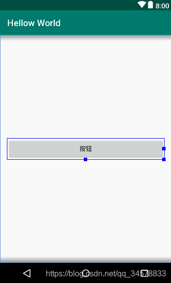
Button,顾名思义就是一个按钮,它也是基于TextView控件衍生出来的一个视图控件,但是它具备触感反馈能力,它的使用方法如下<?xml version="1.0" encoding="utf-8"?> <LinearLayout xmlns:android="http://schemas.android.com/apk/res/android" android:layout_width="match_parent" android:layout_height="match_parent" android:gravity="center" android:orientation="vertical" android:padding="16dp"> <Button android:layout_width="match_parent" android:layout_height="wrap_content" android:text="按钮"/> </LinearLayout>效果图
-
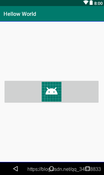
ImageButton,顾名思义就是一个图片按钮,但是它是ImageView衍生出来的一个视图控件的,所以他就没有文本属性了,它是用src属性来显示按钮内容的,就是用图片存放到按钮处,大概使用方法如下
<?xml version="1.0" encoding="utf-8"?>
<LinearLayout xmlns:android="http://schemas.android.com/apk/res/android"
    android:layout_width="match_parent"
    android:layout_height="match_parent"
    android:gravity="center"
    android:orientation="vertical"
    android:padding="16dp">

    <ImageButton
        android:layout_width="match_parent"
        android:layout_height="wrap_content"
        android:src="@mipmap/ic_launcher_round"/>

</LinearLayout>
效果图
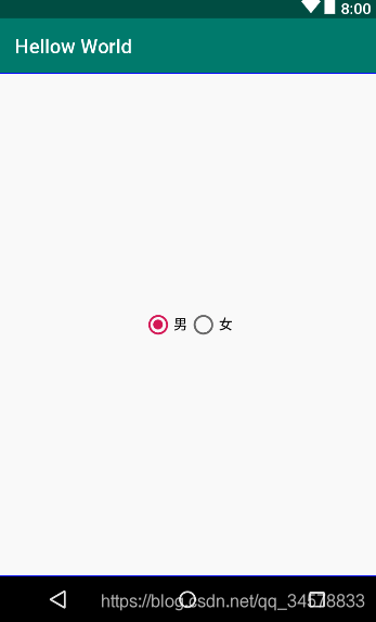
RadioButton,顾名思义就是单选按钮,但是它是基于Button二次开发的,它通常需要配合单选组RadioGroup一起使用,因为RadioGroup就是用来约束RadioButton实现单选的,具体使用方法如下:
<?xml version="1.0" encoding="utf-8"?>
<LinearLayout xmlns:android="http://schemas.android.com/apk/res/android"
    android:layout_width="match_parent"
    android:layout_height="match_parent"
    android:gravity="center"
    android:orientation="vertical"
    android:padding="16dp">

    <RadioGroup
        android:layout_width="match_parent"
        android:orientation="horizontal"
        android:gravity="center"
        android:layout_height="wrap_content">

        <RadioButton
            android:layout_width="wrap_content"
            android:text="男"
            android:checked="true"
            android:layout_height="wrap_content" />
        <RadioButton
            android:layout_width="wrap_content"
            android:text="女"
            android:layout_height="wrap_content" />
    </RadioGroup>

</LinearLayout>
效果图如下
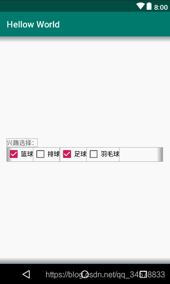
CheckBox,顾名思义就是一个选择盒子,它实际上就是一个多选按钮,它也是基于Button二次开发的,它的具体用法如下:
<?xml version="1.0" encoding="utf-8"?>
<LinearLayout xmlns:android="http://schemas.android.com/apk/res/android"
    android:layout_width="match_parent"
    android:layout_height="match_parent"
    android:gravity="center_vertical"
    android:orientation="vertical"
    android:padding="16dp">

    <TextView
        android:layout_width="wrap_content"
        android:layout_height="wrap_content"
        android:text="兴趣选择:" />

    <LinearLayout
        android:layout_width="match_parent"
        android:layout_height="wrap_content"
        android:orientation="horizontal">

        <CheckBox
            android:layout_width="wrap_content"
            android:layout_height="wrap_content"
            android:checked="true"
            android:text="篮球" />

        <CheckBox
            android:layout_width="wrap_content"
            android:layout_height="wrap_content"
            android:text="排球" />

        <CheckBox
            android:layout_width="wrap_content"
            android:layout_height="wrap_content"
            android:checked="true"
            android:text="足球" />

        <CheckBox
            android:layout_width="wrap_content"
            android:layout_height="wrap_content"
            android:text="羽毛球" />
    </LinearLayout>

</LinearLayout>
效果图
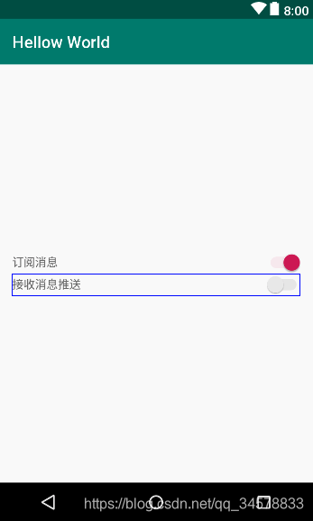
Switch,顾名思义开关,实际上他就是一个开关控件,它也是基于Button二次开发的,具体使用方法如下
<?xml version="1.0" encoding="utf-8"?>
<LinearLayout xmlns:android="http://schemas.android.com/apk/res/android"
    android:layout_width="match_parent"
    android:layout_height="match_parent"
    android:gravity="center_vertical"
    android:orientation="vertical"
    android:padding="16dp">

    <LinearLayout
        android:layout_width="match_parent"
        android:layout_height="wrap_content"
        android:gravity="center_vertical"
        android:orientation="horizontal">

        <TextView
            android:layout_width="0dp"
            android:layout_height="wrap_content"
            android:layout_weight="1"
            android:text="接收消息推送" />

        <Switch
            android:layout_width="wrap_content"
            android:layout_height="wrap_content" />
    </LinearLayout>


</LinearLayout>
效果图如下
- 综合使用例子
<?xml version="1.0" encoding="utf-8"?>
<LinearLayout xmlns:android="http://schemas.android.com/apk/res/android"
    android:layout_width="match_parent"
    android:layout_height="match_parent"
    android:gravity="center_vertical"
    android:orientation="vertical"
    android:padding="16dp">
    <!--性别-->
    <LinearLayout
        android:layout_width="match_parent"
        android:layout_height="wrap_content"
        android:gravity="center_vertical"
        android:orientation="horizontal">

        <TextView
            android:layout_width="0dp"
            android:layout_height="wrap_content"
            android:layout_weight="1"
            android:text="性别:" />

        <RadioGroup
            android:layout_width="wrap_content"
            android:layout_height="wrap_content"
            android:orientation="horizontal">

            <RadioButton
                android:layout_width="wrap_content"
                android:layout_height="wrap_content"
                android:checked="true"
                android:text="男" />

            <RadioButton
                android:layout_width="wrap_content"
                android:layout_height="wrap_content"
                android:text="女" />
        </RadioGroup>
    </LinearLayout>
    <!--兴趣选择-->
    <LinearLayout
        android:layout_width="match_parent"
        android:layout_height="wrap_content"
        android:gravity="center_vertical"
        android:orientation="horizontal">

        <TextView
            android:layout_width="0dp"
            android:layout_height="wrap_content"
            android:layout_weight="1"
            android:text="兴趣选择:" />

        <LinearLayout
            android:layout_width="wrap_content"
            android:layout_height="wrap_content"
            android:orientation="horizontal">

            <CheckBox
                android:layout_width="wrap_content"
                android:layout_height="wrap_content"
                android:checked="true"
                android:text="篮球" />

            <CheckBox
                android:layout_width="wrap_content"
                android:layout_height="wrap_content"
                android:text="排球" />

            <CheckBox
                android:layout_width="wrap_content"
                android:layout_height="wrap_content"
                android:checked="true"
                android:text="足球" />

            <CheckBox
                android:layout_width="wrap_content"
                android:layout_height="wrap_content"
                android:text="羽毛球" />
        </LinearLayout>
    </LinearLayout>
    <!--订阅消息-->
    <LinearLayout
        android:layout_width="match_parent"
        android:layout_height="wrap_content"
        android:gravity="center_vertical"
        android:orientation="horizontal">

        <TextView
            android:layout_width="0dp"
            android:layout_height="wrap_content"
            android:layout_weight="1"
            android:text="订阅消息:" />

        <Switch
            android:layout_width="wrap_content"
            android:layout_height="wrap_content"
            android:checked="true" />
    </LinearLayout>

    <Button
        android:layout_width="match_parent"
        android:layout_height="wrap_content"
        android:text="提交修改" />

    <ImageButton
        android:layout_width="match_parent"
        android:layout_height="wrap_content"
        android:background="@null"
        android:src="@mipmap/ic_update" />
</LinearLayout>
效果图
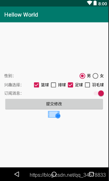
上述所有的android:check="true"都是我模拟手动点击的,实际开发可能用不到的,android:src=""这个属性就是保持原图片的尺寸放到对应的图片视图控件里面
四、其他控件
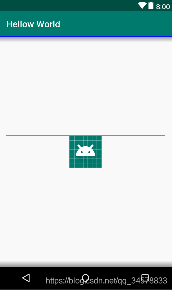
ImageView,顾名思义就是一个图片视图控件,它的具体用法如下:
<?xml version="1.0" encoding="utf-8"?>
<LinearLayout xmlns:android="http://schemas.android.com/apk/res/android"
    android:layout_width="match_parent"
    android:layout_height="match_parent"
    android:gravity="center_vertical"
    android:orientation="vertical"
    android:padding="16dp">

    <ImageView
        android:layout_width="match_parent"
        android:layout_height="wrap_content"
        android:src="@mipmap/ic_launcher_round" />
</LinearLayout>
效果图
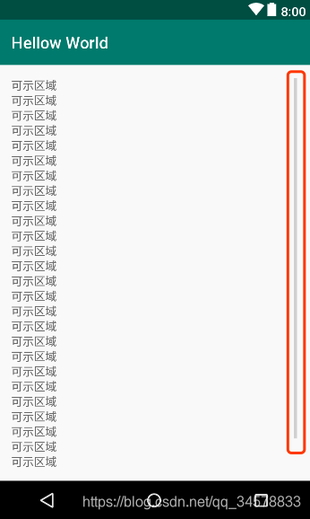
ScrollView,顾名思义就是一个滑动视图,它的存在就是为了解决控件数量超出了页面可示的数量却又无法滑动显示的窘境,但是它的子视图只能是一个视图,具体用法如下
<?xml version="1.0" encoding="utf-8"?>
<LinearLayout xmlns:android="http://schemas.android.com/apk/res/android"
    android:layout_width="match_parent"
    android:layout_height="match_parent"
    android:gravity="center_vertical"
    android:orientation="vertical"
    android:padding="16dp">

    <ScrollView
        android:layout_width="match_parent"
        android:layout_height="match_parent">

        <LinearLayout
            android:layout_width="match_parent"
            android:layout_height="wrap_content"
            android:orientation="vertical">

            <TextView
                android:layout_width="wrap_content"
                android:layout_height="wrap_content"
                android:text="可示区域" />

            <TextView
                android:layout_width="wrap_content"
                android:layout_height="wrap_content"
                android:text="可示区域" />

            <TextView
                android:layout_width="wrap_content"
                android:layout_height="wrap_content"
                android:text="可示区域" />

            <TextView
                android:layout_width="wrap_content"
                android:layout_height="wrap_content"
                android:text="可示区域" />

            <TextView
                android:layout_width="wrap_content"
                android:layout_height="wrap_content"
                android:text="可示区域" />

            <TextView
                android:layout_width="wrap_content"
                android:layout_height="wrap_content"
                android:text="可示区域" />

            <TextView
                android:layout_width="wrap_content"
                android:layout_height="wrap_content"
                android:text="可示区域" />

            <TextView
                android:layout_width="wrap_content"
                android:layout_height="wrap_content"
                android:text="可示区域" />

            <TextView
                android:layout_width="wrap_content"
                android:layout_height="wrap_content"
                android:text="可示区域" />

            <TextView
                android:layout_width="wrap_content"
                android:layout_height="wrap_content"
                android:text="可示区域" />

            <TextView
                android:layout_width="wrap_content"
                android:layout_height="wrap_content"
                android:text="可示区域" />

            <TextView
                android:layout_width="wrap_content"
                android:layout_height="wrap_content"
                android:text="可示区域" />

            <TextView
                android:layout_width="wrap_content"
                android:layout_height="wrap_content"
                android:text="可示区域" />

            <TextView
                android:layout_width="wrap_content"
                android:layout_height="wrap_content"
                android:text="可示区域" />

            <TextView
                android:layout_width="wrap_content"
                android:layout_height="wrap_content"
                android:text="可示区域" />

            <TextView
                android:layout_width="wrap_content"
                android:layout_height="wrap_content"
                android:text="可示区域" />

            <TextView
                android:layout_width="wrap_content"
                android:layout_height="wrap_content"
                android:text="可示区域" />

            <TextView
                android:layout_width="wrap_content"
                android:layout_height="wrap_content"
                android:text="可示区域" />

            <TextView
                android:layout_width="wrap_content"
                android:layout_height="wrap_content"
                android:text="可示区域" />

            <TextView
                android:layout_width="wrap_content"
                android:layout_height="wrap_content"
                android:text="可示区域" />

            <TextView
                android:layout_width="wrap_content"
                android:layout_height="wrap_content"
                android:text="可示区域" />

            <TextView
                android:layout_width="wrap_content"
                android:layout_height="wrap_content"
                android:text="可示区域" />

            <TextView
                android:layout_width="wrap_content"
                android:layout_height="wrap_content"
                android:text="可示区域" />

            <TextView
                android:layout_width="wrap_content"
                android:layout_height="wrap_content"
                android:text="可示区域" />

            <TextView
                android:layout_width="wrap_content"
                android:layout_height="wrap_content"
                android:text="可示区域" />

            <TextView
                android:layout_width="wrap_content"
                android:layout_height="wrap_content"
                android:text="可示区域" />

            <TextView
                android:layout_width="wrap_content"
                android:layout_height="wrap_content"
                android:text="不是可示区域" />

            <TextView
                android:layout_width="wrap_content"
                android:layout_height="wrap_content"
                android:text="不是可示区域" />
        </LinearLayout>
    </ScrollView>
</LinearLayout>
效果图,右边有一条滑动条
-
RecyclerView,它的存在是为了解决ListView和GridView存在的性能以及其他问题,同时它又能提供滑动效果,用法如下- 线性(
List方式):<?xml version="1.0" encoding="utf-8"?> <LinearLayout xmlns:android="http://schemas.android.com/apk/res/android" xmlns:app="http://schemas.android.com/apk/res-auto" android:layout_width="match_parent" android:layout_height="match_parent" android:gravity="center_vertical" android:orientation="vertical" android:padding="16dp"> <android.support.v7.widget.RecyclerView android:layout_width="match_parent" android:layout_height="match_parent" app:layoutManager="android.support.v7.widget.LinearLayoutManager" /> </LinearLayout> - 网格(
Grid方式)<?xml version="1.0" encoding="utf-8"?> <LinearLayout xmlns:android="http://schemas.android.com/apk/res/android" xmlns:app="http://schemas.android.com/apk/res-auto" android:layout_width="match_parent" android:layout_height="match_parent" android:gravity="center_vertical" android:orientation="vertical" android:padding="16dp"> <android.support.v7.widget.RecyclerView android:layout_width="match_parent" android:layout_height="match_parent" app:layoutManager="android.support.v7.widget.GridLayoutManager" app:spanCount="2" /> </LinearLayout> - 瀑布流(
Grid方式)<?xml version="1.0" encoding="utf-8"?> <LinearLayout xmlns:android="http://schemas.android.com/apk/res/android" xmlns:app="http://schemas.android.com/apk/res-auto" android:layout_width="match_parent" android:layout_height="match_parent" android:gravity="center_vertical" android:orientation="vertical" android:padding="16dp"> <android.support.v7.widget.RecyclerView android:layout_width="match_parent" android:layout_height="match_parent" app:layoutManager="android.support.v7.widget.StaggeredGridLayoutManager" app:spanCount="2"/> </LinearLayout>
- 线性(